Mobile devices have taken over. The era where users logged in to their desktop PCs and laptops to access information on the internet is long gone. In its place, a new paradigm has come into being. This is the “modern” way of browsing the web.
Building a responsive website is an essential step toward being able to deliver content to everyone who visits your site on any device. This blog will teach you everything you need to know about responsive web application development and boost your ROI (Return On Investment) on web projects!
Responsive web applications are one of the biggest trends in web development. If you're not building responsive apps, then you're missing out on a huge opportunity. While responsive web development may seem overwelming, you can use responsive web application development services to make your web app responsive.
Responsive web application definition
A responsive web application is an app that runs on any device and responds to the size of the screen it’s displayed on. In collaboration-heavy programs (multiple teams, shared design systems, tight release governance), looking at approaches used by custom web application development firms can highlight scalable patterns for component reuse, accessibility, and consistent behavior across device classes. I It will adjust its layout and content based on the device used, allowing for a great user experience regardless of the device from which someone accesses your site.
A responsive web application is a web application that provides the same experience across all devices, from desktop to mobile. A responsive web app development adapts to the device it’s being viewed on, which makes it easy for your users to use your website regardless of what device they’re using.
A website that has been optimized for mobile devices will show up in a different form than its original version. It will have fewer elements on the page and they should be placed in such a way that they are easily accessible from anywhere on the screen without having to scroll or zoom in or out.
The goal of a Responsive Web Application is the same as a website: to provide an experience that is easy for the user to navigate and use. The difference between the two is that a responsive web application has been developed with multiple devices in mind. It can be accessed from anywhere with an internet connection, whether it’s on your phone or tablet, or laptop.
There are two categories of responsive web applications:
Adaptive web applications
This type of responsive web application adapts according to the device and its capabilities. For example, if you are viewing an adaptive web application on a mobile phone, it will be displayed in full-screen mode. However, if you view the same app on a desktop computer, it will not display in full-screen mode but rather in its default size with some extra features such as resizing and zooming out for a better viewing experience.
Responsive web apps
This type of responsive web application adjusts its layout depending on the screen size of the device used to access them. They also have all their functionalities intact no matter what device they are accessed from.
Types of responsive web applications
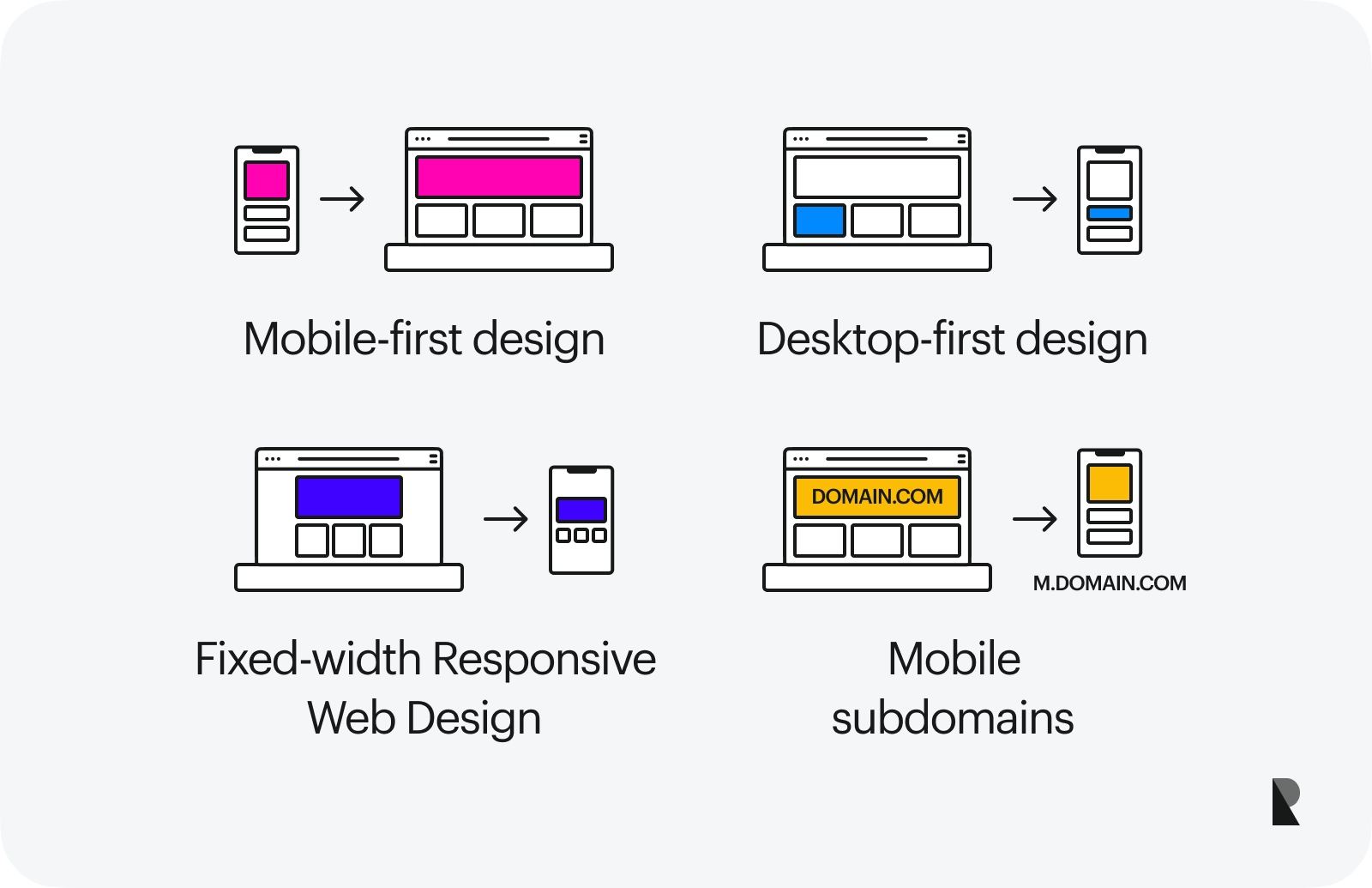
1. Mobile-first design
These are designed to work well on mobile devices, and then adapt to larger screens. This is the most popular approach for responsive sites, but not necessarily the best one for your project. The problem with this approach is that it can create sites that feel clunky and slow on large screens. If you have the resources, consider building separate desktop and mobile versions of your site.
2. Desktop-first design
These are designed first for desktop screens, then adapted for smaller devices like smartphones and tablets. Responsive design libraries like Bootstrap use this approach by default. This approach is more likely to result in a site that feels fast and responsive on all devices. However, it can be more complicated to build, especially if you’re just getting started with web development.
3. Fixed-width responsive web design
This type allows you to customize your website so that it changes depending on what device it is viewed on. This means that everything from navigation menus to font sizes will change depending on if you are viewing it on a desktop computer or mobile device. This type of responsive web design can be difficult to manage as every page must be customized depending on the device being used by your visitor at any given time.
4. Mobile subdomains
This type of responsive web design is a little different than the one described above. Instead of having a single domain name for your website, you will have two separate ones; one for mobile devices and one for desktop computers. This can be useful if you want to create custom versions of your website that are optimized specifically for each device type.
History of responsive web app development
The history of the web began in 1990 with the release of the first version of HTML by Tim Berners-Lee. The next year, in 1991, the first graphical browser was released by Marc Andreessen and Eric Bina at NCSA Mosaic. The browser was included with their first popular web server software called NCSA HTTPd (later renamed to Apache).
The idea of responsive design is not new. It's been around for a while, but in the last few years, its popularity has grown exponentially. The reason for this is simple: the web has changed and so have the devices we use to access it.
The term "responsive web design" was coined by Ethan Marcotte in his 2010 article, "Responsive Web Design". The idea behind it was to create websites that would adapt themselves to look good on a variety of devices, rather than having different versions for different devices.
The first website to be created using responsive web design was the Audi.com website in 2001.
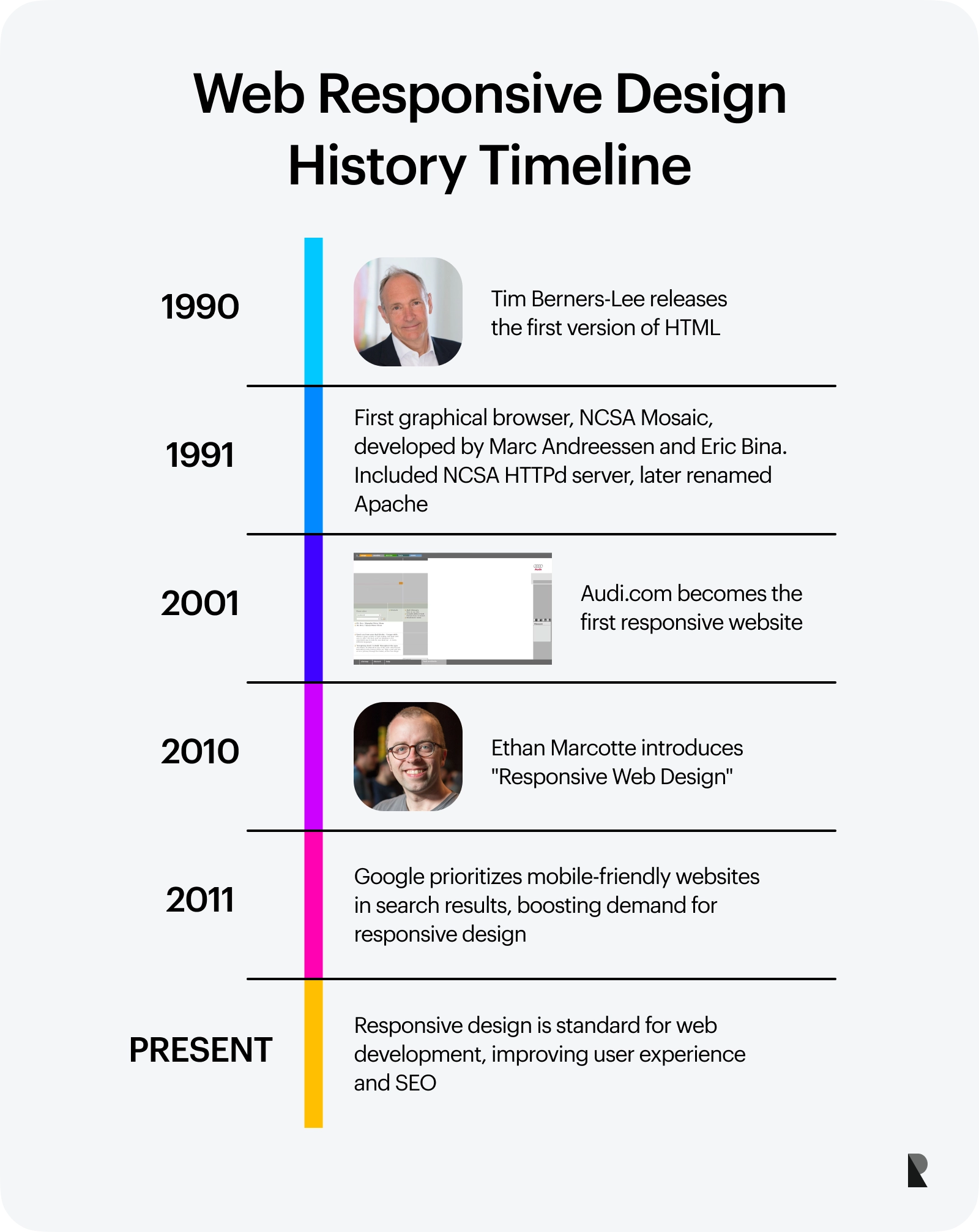
In 2011 Google started supporting "mobile friendly" websites in its search results. This meant that if your website was not optimized for mobile devices then you would lose out on traffic from Google searches. This led to a rapid increase in demand for responsive web apps.
Responsive web design is now an essential part of any web app development. In fact, most web developers will tell you that it is the best way to build a website. It’s easy to see why responsive design has become so popular: it allows you to create one web app that can be viewed on all devices, meaning that you don’t have to worry about creating different versions for each device type.
Responsive app design is also a great way to boost your SEO, as Google prefers websites that are optimized for mobile devices. If you have a responsive web application then it will be easier for Google to rank your site higher in search results.
Significance of responsive web application development
Responsive web application development has become the need of the hour for all business houses, irrespective of the niche they operate in. The reason behind this is that responsive web application development is a solution that not only helps you to meet your business objective but also ensures that your brand is perceived as an innovative and user-friendly brand.
Responsive websites are those which can be viewed across different devices and platforms like desktop computers, mobile phones, tablets, and others. The main advantage of developing responsive websites lies in the fact that it helps you create a uniform look for all the visitors across all platforms, thereby ensuring greater customer satisfaction.
The significance of this approach is very crucial for businesses as well as individuals. It helps them to reach out to a wider audience and to cater to their needs without having to worry about which devices they use. Also, there are no issues related to compatibility or device compatibility issues which are usually faced by regular web development services.
Here are some more reasons why you should go for responsive website development:
- 1. Reduces bounce rate: Bounce rate refers to the number of single page visits made by visitors on your website before they leave without performing any action on your site. When visitors land on your website through their mobiles or tablets, they often tend to leave due to poor navigation or slow loading time.
However, if you develop a responsive website that is compatible with all devices then there will be no such obstacle in their way and mobile users will be able to browse through your website easily without having any problem whatsoever with navigation or speed while using it on their mobile devices.
- 2. Increases conversion rate: A responsive design website is able to provide a better user experience than a non-responsive one, which improves the overall conversion rate of your site. The increase in conversion rates can help you make more money from your website as it encourages visitors to click on certain links or buy products from your eCommerce store.
- 3. Increases user engagement: A responsive design website is more user-friendly than a non-responsive one, which can help you increase your overall user engagement. This will allow you to get more customers and increase your sales in the long run.
- 4. Improves website rankings: A responsive design can help improve your website’s rankings in search engines like Google and Bing. The fact that it is mobile-friendly means that more people will be able to see your site when they use their smartphones or tablets, which increases your chances of getting more traffic and sales from organic searches.
Benefits of responsive web application
Some of the benefits of responsive web applications are:
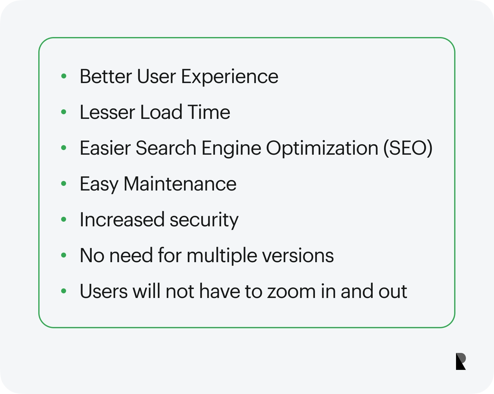
1. Better user experience
The user experience gets better because of responsive design. The users can easily access their desired information on any device they use. This is possible because of the flexible layout and resizing of images and content in responsive websites.
2. Lesser load time
A responsive website loads faster than other types of websites because they are lightweight as compared to other web pages which have heavy content with graphics etc., So less load time means more visitors staying on your page for a longer duration of time and hence increasing your profits!
3. Easier search engine optimization (SEO)
SEO has become the most important part of any business today as more traffic means more sales and revenue for any business owner! So having a responsive design for your website makes it easier for search engines to crawl through your entire site since all the content is in one place and it is easy for the crawlers to read through. This will help increase your rankings on search engines like Google, Yahoo, Bing, etc., which in turn helps you get more traffic!
4. Easy maintenance
Responsive web applications are easy to maintain because they can be accessed from any device or browser without any problems. So, if you make a change on your website then you don't have to worry about how this will affect other devices like smartphones or tablets because they automatically adjust themselves according to their size and resolution so as not to give you any difficulty in accessing them.
5. Increased security
With many people using mobile devices as their first point of contact with the Internet today, it's important that any online activity is secure. With responsive web applications, you don't need to worry about this because everything happens in the browser — there are no downloads or installations required by users before they can start using your site!
6. No need for multiple versions
Responsive web application technologies make it possible for you to create one version of your site that works on all devices, from smartphones and tablets to desktop computers and laptops. Users no longer have to download different versions of your website for each device type, because there is only one version! This means less work for you and better user experiences for everyone.
7. Users will not have to zoom in and out
While reading content on mobile devices, which makes it easier for them to read articles and navigate your website’s menus.
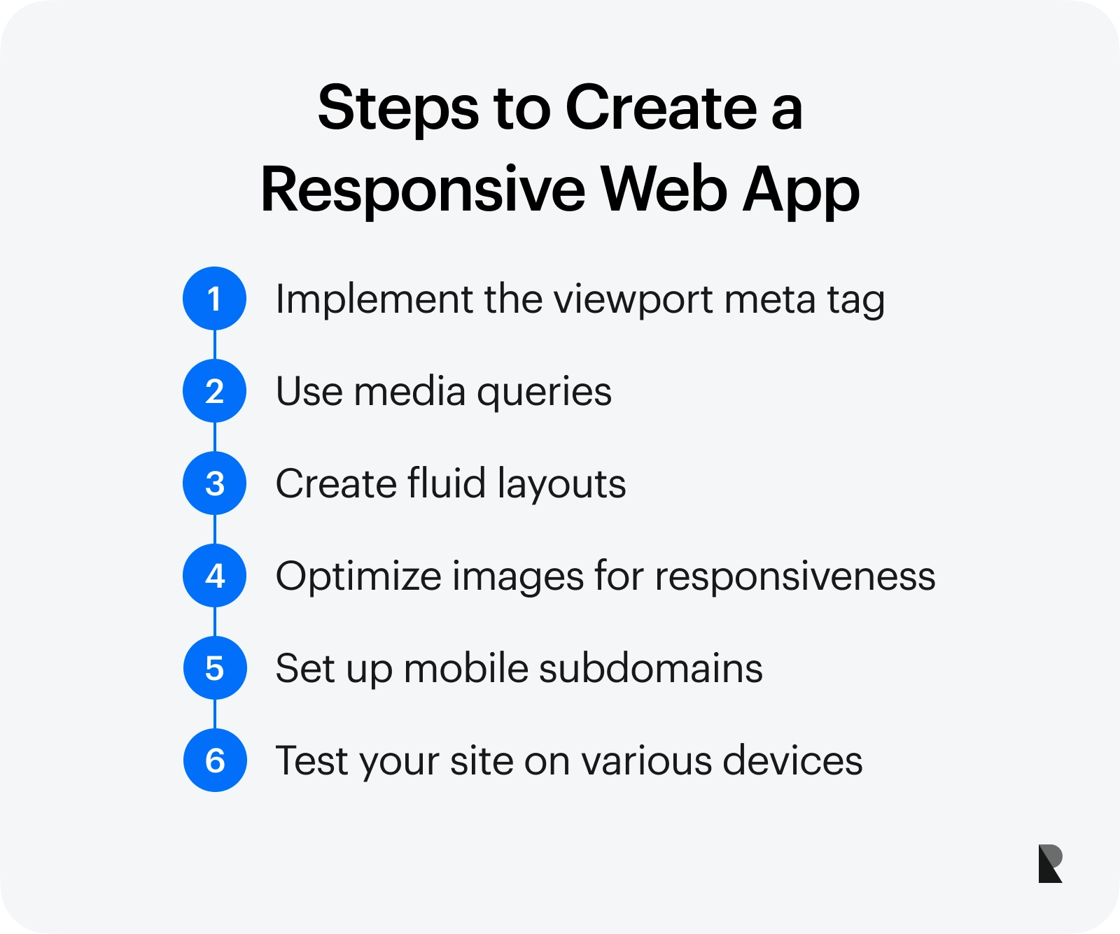
Steps to create a responsive web app
Now that you know what the Responsive Web App is, it’s time to learn how to create one.
1. Using the viewport meta tag
To create a Responsive Web App, the first step is to set up your website so that it can be viewed on multiple devices. To do this, you’ll need to add a viewport meta tag in the head section of your HTML document. The viewport meta tag tells mobile browsers how they should display web pages on different screen resolutions and orientations.
The viewport meta tag has two parts: the width and height of your page, and a scale value. The width and height tell mobile browsers how big they should make your page when it loads on their device. For example, if you want your page to be 800 pixels wide on a mobile phone, you would set this value to “width=800”.
The viewport meta tag can be added to the head section of your HTML document like this:
<meta name="viewport" content="width=device-width, initial-scale=1">2. Media queries
Media queries are a way of telling mobile browsers how to display your page based on the screen size. For example, if you want your web page to be 800 pixels wide when viewed on a large desktop browser but only 320 pixels wide when viewed on an iPhone 13, you would add this media query to your CSS:
@media only screen and (max-width:320px) {
    .header {
        width: 100%;
    }
}
The viewport meta tag is great for setting the initial size of your page, but it doesn’t do anything to help you change how it looks on different devices. That’s where media queries come in. A media query is a CSS rule that lets you target specific screen sizes, orientations, and resolutions.
Media queries let you customize the layout of your HTML document based on screen size and orientation. For example, if you have one set of styles for mobile phones, another set of styles for tablets, and yet another set of styles for desktops, you can add media queries to your CSS file to tell it when to apply each set of styles.
3. Fluid layouts
Responsive websites are built using fluid layout techniques so they can resize themselves automatically to fit any screen size and orientation. They also use relative units like percentages or ems instead of fixed values like pixels so that they can scale as needed.
This is a big deal because it means that your website will always look good and fit properly on any device. Now you can focus on creating something that’s visually appealing without worrying about how it will display on different screen sizes, which saves you time and money.
4. Responsive images
Responsive images are another important part of the equation. They allow you to display different-sized images depending on the device viewing your website, which means it always looks good no matter what size screen someone is using. This is especially useful for things like product images, since they’re usually used on websites in different sizes depending on where they appear (in a slideshow or gallery, as an image gallery with thumbnails).
Responsive websites use flexible images that resize themselves to fit any screen size. These images are often called srcset or picturefill, and they work by detecting the width of the browser window and displaying different versions of the same image accordingly. This means that if someone comes to your website on a phone with a small screen, they won’t have to load large images.
5. Mobile subdomains
Mobile subdomains are also a good idea, especially if you want to create separate mobile versions of your website. This can be done by creating two subdomains (e.g., m.example.com and www.example.com) or by using a free tool like Cloudflare to set up a separate domain with different server hosting.
While this does mean that you’ll have to create a second website, it can be worth the effort if you want to provide a better user experience on mobile devices.
6. Test your website on different screen sizes
There are many different ways of testing your website on different screen sizes. The easiest way is to open the browser and resize it until it reaches the size you want to test, then refresh the page. As consumers are increasingly using smartphones and tablets to access the internet, you need to make sure your website is mobile-friendly.
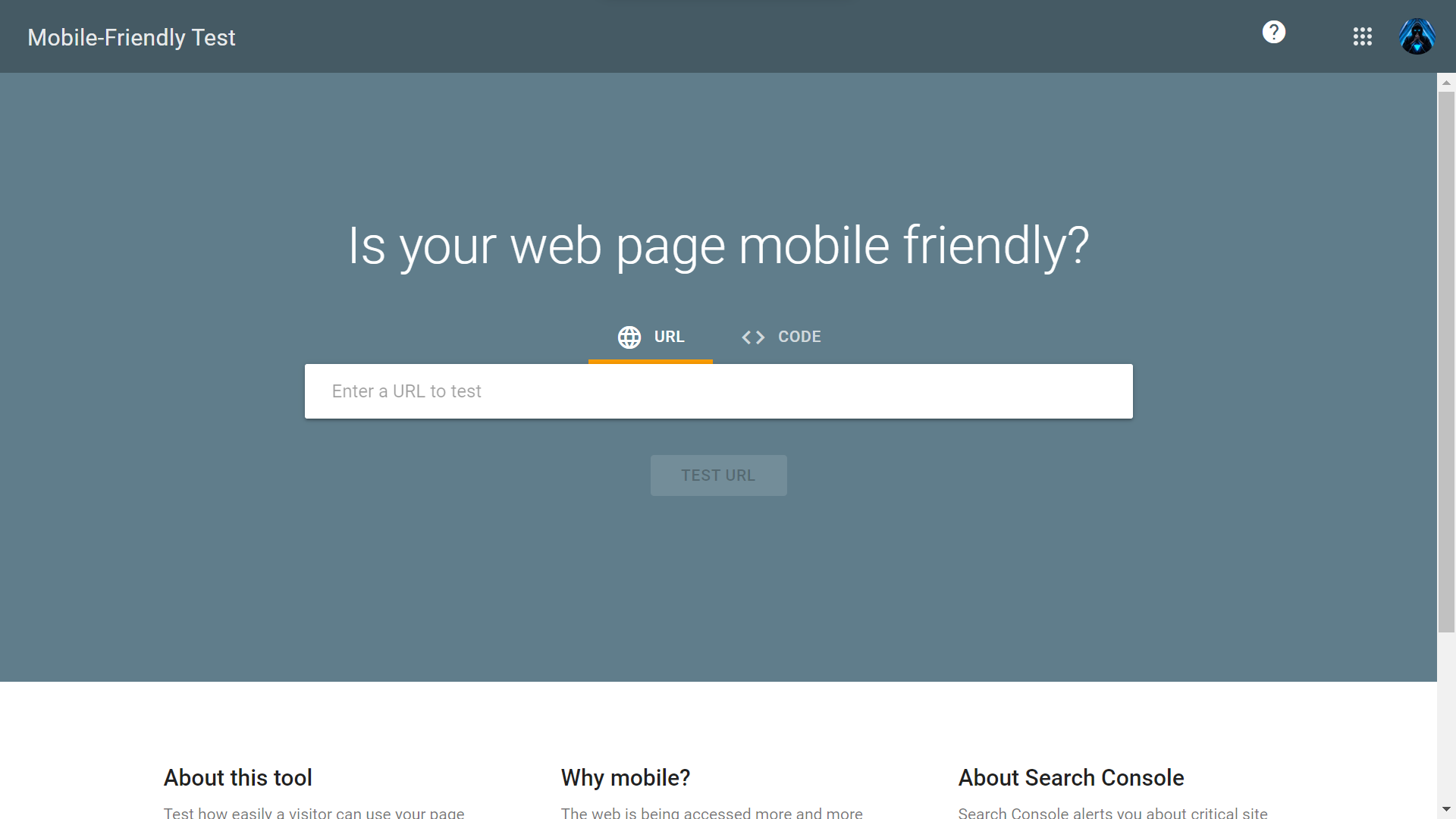
You can test how your site looks on different screen sizes using Google’s Mobile-Friendly Test. If you find that there are any issues with your website being mobile-friendly, it may be time to look into updating it.
Conclusion
There's still plenty of room for improvement in web app development. That's not to say that web apps aren't adequate for most jobs; they certainly are. But the fact remains that, in their current state, there are some limitations. Luckily, the limitations will soon be lifted by forward-thinking developers who understand what it means to work with the Web and responsive design.
The Web is a powerful tool for creating engaging user experiences that work seamlessly on all kinds of devices—and as site owners and designers, we should all take advantage of this ability whenever possible.

Creates insightful, strategy-driven content that translates complex design and branding concepts into accessible knowledge, supporting Ramotion’s mission to elevate digital experiences.