
Introduction
Typography is one of the key UI elements in mobile app design. Communication in all areas of life is based on written text, not only in mobile apps. In mobile apps, user interaction is generally provided through texts. Therefore, mobile apps typography forms the building blocks of mobile app design. It constitutes an essential part of the mobile UI. When used correctly, typography allows users to navigate the app smoothly.
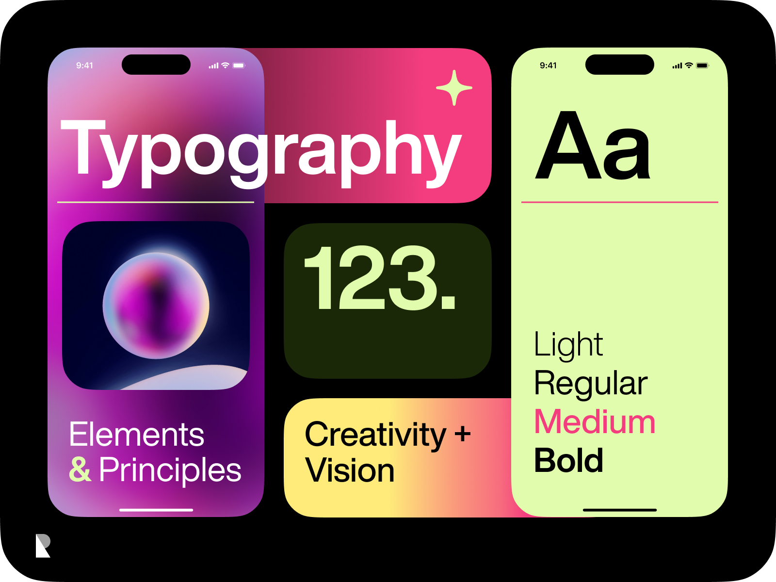
In addition, typography enables the creation of a hierarchy within the application. Other UI elements such as headings, subheadings, and body text created through mobile typography determine the order of importance within the context.
In the first impression, mobile typography also plays a vital role in creating brand awareness and presenting ideas about the brand to users.
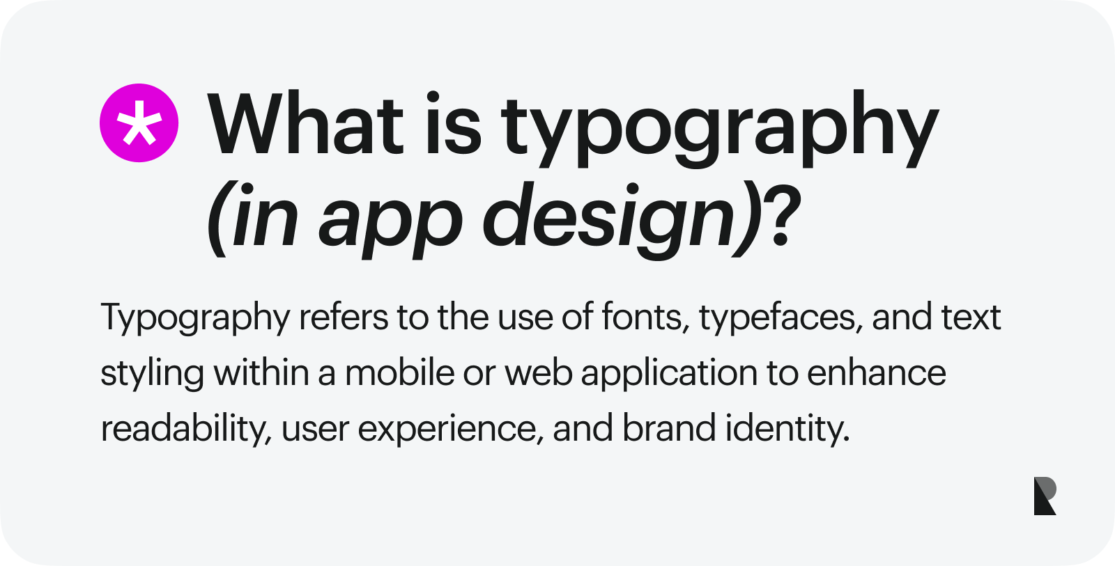
Introduction to typography in mobile app design
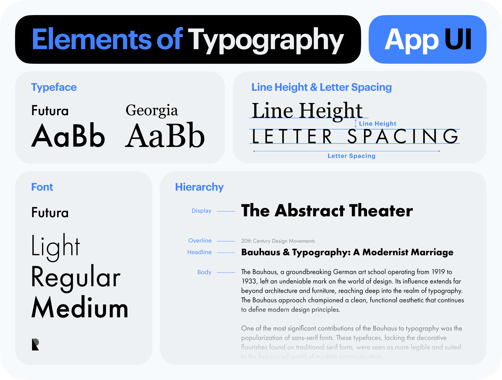
There are specific mobile typography rules in mobile app design, which ensure the app is easily understandable and provides a better user experience and user interface design. In the context of mobile app design, typography refers to determining the characteristics of text styles such as size, style, color, contrast, and layout.
From an aesthetic standpoint, selecting good typography for mobile UI design contributes to the app’s modern and clean appearance. There are many resources to get inspiration when choosing a good font. Brands with operating systems such as Google and Apple offer free fonts. These resources offer plenty of serif typefaces and sans serif typefaces.
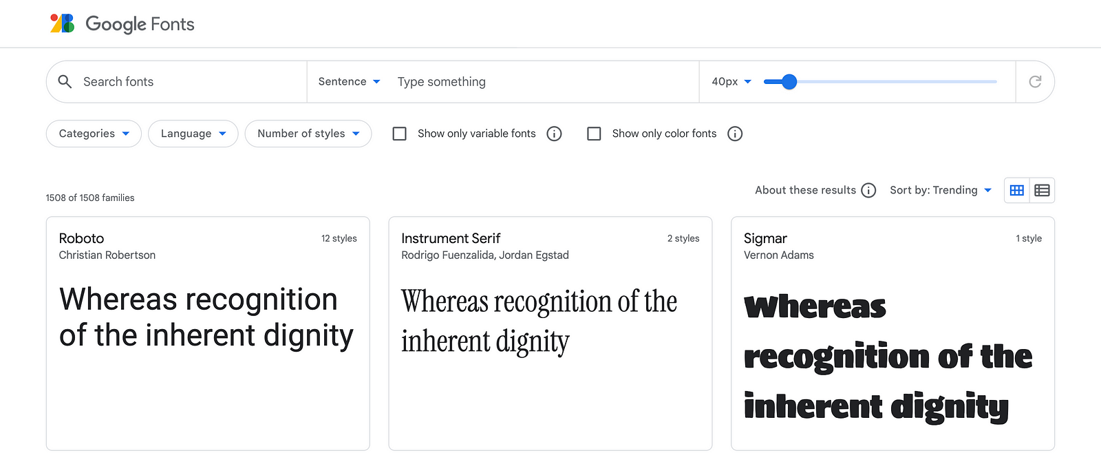
Google Free Fonts (link)
For instance, Apple has default fonts used in its apps. The serif font is New York, while the sans serif font is San Francisco. Additionally, there are a few font variants. These fonts can serve as a source of inspiration for font selection.
The importance of typography in mobile app design
One of the first things to consider is the mobile screen size of mobile devices. When designing an app for the mobile world, it is important not to create an experience thinking of infinite mobile screens or wider screens like desktop screen. Since screens on mobile devies are smaller, presenting information can be more challenging and requires good user experience design. Therefore, choosing the right font size is important as it affects the space it will occupy on the mobile screen. To ensure the proper and effective use of mobile typography, designers or app design experts with years of experience in this field can be consulted.
Knowing the theoretical aspects of typography, such as letter spacing, line height, line length, kerning, etc., can be advantageous after selecting the appropriate typography. Typography is a separate design and learning field, with many details to consider. Specializing in typography can have a significant positive impact on mobile design.
Key Copy Elements of Typography in App Design
How is the minimum font size determined in a mobile app?
Minimum font size in mobile app design should be determined primarily based on the target audience. If possible, the app should be developed with its own default font settings to avoid the need for users with visual difficulties to select a specific app setting.
In new-generation applications, especially in text-based applications, it can be observed that the device's default settings work integrated with the application. In text-based applications, being able to adjust the font size within the app provides a good user experience and user interface.
In addition, in designs that will appeal to the general user, the operating system of the device used should be focused on. Mobile device manufacturers have typography recommendations based on the devices they produce and the software they use. The documents of Apple’s iOS and Google’s Android operating systems, which are the most well-known and standardized in the industry, are sources of inspiration when designing mobile apps. Thus, better mobile apps can be designed.
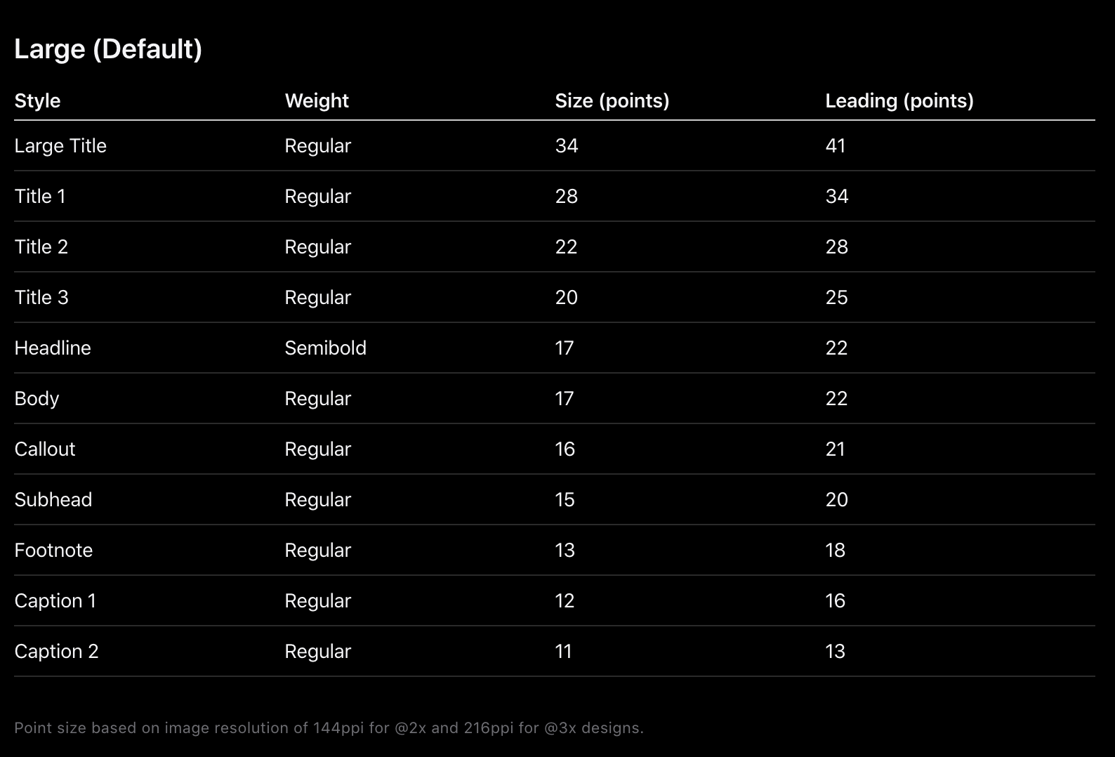
In mobile app design, readability is important, so a minimum font size of at least 12px is recommended. However, it is not advisable to use this size throughout the entire design, as this size is only a minimum recommendation. Whenever possible, values lower than these should not be used. It should also be noted that the sizing units used in the two examples are different. iOS uses points while Android uses pixels.
If we give an example from iOS, when the system font is used, it is possible to use a font size of up to 11 points. However, different values can also be used depending on the application. Mobile typography skills can be improved by examining mobile apps.
How is the headline size determined based on hierarchy and balance?
In mobile app design, the heading should be balanced with other design elements harmoniously. The main factor to consider when determining the heading size is the body text size. The heading should be distinguishable from other texts in the design and easily scannable. There are some important factors to consider when determining the heading size:
Hierarchy
Headlines help determine the importance level of content. Therefore, the headline size should be determined according to the importance level of the content. For example, main headlines are usually displayed in larger sizes and more prominently, while subheadlines are displayed in smaller sizes and less prominently. The least prominent is the body text under these headlines. Using font variants like regular, medium, bold, etc. can also help to highlight the text styles that need to stand out more clearly.
Sometimes, a secondary font may be preferred to differentiate headings and body text in applications. Different font usage can also create a hierarchy.
Application purpose and style
If we take an example, in a news mobile app, displaying copy elements is emphasized, while in social media apps, visuals are more prominent. Therefore, it is smart to show headlines more prominently to users in applications where text is more important. However, the same is not true for social media applications that contain visual elements. Users focus on visuals rather than headlines.
Clean Interface:
Sometimes, it may be necessary to rely on design sense rather than rules for a clean and appealing look. Even if all the rules are followed, the design may not be eye-catching and clean for various reasons, including typography. The chosen font style alone can cause this situation. Here, relying on experience, an initiative can be taken for a design that appeals to the eye.
How to create contrast for color combinations and readability
Human psychology perceives two objects that are close to each other as if they are together (source). Therefore, the spacing used in writing is very important in creating contrast. The separation of which paragraph belongs to which heading and the differentiation of headings from each other are achieved through correct spacing usage based on the most fundamental principle.
The title and the corresponding paragraph should be kept close to each other. Another title and body text combination that comes after this group should be distinguishable from the others.
On the other hand, text colors also help create contrast. As a small but valuable tip, high saturation text colors in text-based applications will make readability difficult. As a safe zone, using black and gray tones for text colors will be a lifesaver for mobile design. Also, choosing a headline color in darker tones than the text color will create a clean contrast.
Scalability according to mobile devices and screen resolution
Mobile devices have screens of different sizes and resolutions. This is a factor that needs to be considered for responsive mobile device typography to adapt to screens. Font sizes should be adjusted to be legible and usable on every device. Sometimes designers don’t design for every screen size and work with developers to discuss the best way to scale for each device. Seeing the mobile prototype design before starting the app development will speed up the process.
One of the most commonly used methods is to adjust the font size according to the screen size. This is one of the methods for responsive typography. However, the difference in screen size on mobile devices is much smaller compared to computer screens. Therefore, the responsive issue in mobile apps is less common and rare. One of the rules that designers follow is to start designing according to the device with the smallest mobile screen size used in the market. This way, automatic compatibility is ensured even on devices with larger screen sizes.
Line length for readability
Suitable line length should be provided for readability in mobile design. Compared to computer screens, line length is less complex in mobile devices. The thing that users struggle with is eye strain while reading longer text than necessary. Therefore, a length of 50–75 characters is recommended. However, since mobile screens are small, line length cannot be used wider. That’s why multi line text components are frequently seen in mobile apps. Thus, the eye strain problem is eliminated. The only thing to be careful about at this point is to position texts within the safe area zone. To ensure legibility, attention may also need to be paid to letter spacing as it affects the line length.
Balance in whitespace usage for a better user experience
Balancing visual weight and reducing eye strain can be achieved by regulating the design layout and the distance between design elements through the use of a whitespace. To create an appealing design, it is important to properly space visually fonts, as this can greatly enhance the overall look and readability of the text. No matter how accurately color selection, typography, and font size are used in the design, it is impossible to create an appealing interface without proper spacing. Creating a visually appealing mobile UI clean design requires more than just color selection, typography, and font size.
When choosing spaces, don’t forget the grouping theory mentioned above. Elements that are close to each other, that is, elements with less space between them, are perceived as a group.
Why Typography Matters in Mobile Design
In mobile apps, typography is an important design element that directly affects user experience and the success of the application. This is because typography directly or indirectly affects readability, brand identity, user experience, user demographics, the hierarchical structure of the design, and the appearance of the interface in mobile app design.
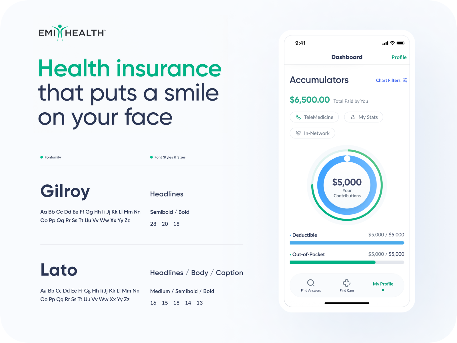
Typography made by Ramotion for health insurance application EMI Health
Considering these reasons, selecting the right typeface can enhance the readability and user experience of the application, strengthen the brand identity, and assist in creating a cohesive design.
How typography impacts user experience
In mobile app design, the concept of user experience encompasses the entire design. User experience is possible not with a single element, but with the whole design as a whole. Therefore, each element must be in harmony with the other elements.
If we consider typography, since it is also a part of the whole, it should be consistent within itself. When it comes to typography, issues such as legibility, the selected font, and fluency affect the user experience.
Typography is also the building block for other and clickable elements such as buttons and tabs. To design a productive mobile UI, it is necessary to choose clickable fonts and sizes. Tiny fonts will make clicking difficult.
In a well-designed interface, for example, users can quickly access what they are looking for. The proper use of typographic hierarchy in mobile UI design can greatly improve the ease of navigating through the application interface.
Accessibility in typography
When designing a mobile app, it’s important to consider that different user profiles may use the app. Even though it may not be immediately apparent, there is a significant number of users in society with disabilities. When designing a mobile app, various user profiles with visual impairments or color blindness should always be considered in some part of the design process. Accessibility is of great importance in this context.
As mentioned before, when attention is paid to appropriate font size, contrast, line spacing, and hierarchical consistency, accessibility problems are generally eliminated. Adding captions to visuals used within the mobile app and creating alternative texts are critical details that are often overlooked in most apps.
Designing an accessible app is not difficult if the guidelines of mobile operating systems are followed. Using the default system fonts for typography as much as possible allows full use of the system’s accessibility features. Accessibility issues are already resolved by default in system fonts.
Typography's impact on brand identity and consistency
Brands must have a consistent typography style. To create a consistent brand image, they must display the designated typography styles at every point of the design. Because typography is a part of the brand identity. In mobile design, the same font and typographic styles should also be used.
A small detail can have a big impact; typography can affect the target audience, brand tone, age range, and many other factors. A brand targeting a younger audience may choose a modern and unconventional font, while a more traditional brand may opt for a classic and familiar font. Additionally, the characteristics of the font are also important.
Conclusion
In summary, typography plays a crucial role in mobile app design, directly influencing user experience, brand identity, consistency, UI design, accessibility, and prominent design elements. When selecting typography, attention should be given to factors such as readability, style, color, size, and spacing, among others.
The right font choice makes it easier to read thoughtfully designed typographic mobile interface texts. Typography is the first and most frequent element that users interact with.
In light of all this information, the proper use of typographic elements noticeably improves overall mobile UI design. The examples presented above have shown how it enhances user experience in designed mobile apps. Paying attention to the typography element in existing or mobile apps will benefit both the user and the brand.
Also, remember that typography is not just about typefaces and text. Typography has the power to transform the interface as a whole along with the user experience. It is evident that mobile interface designs that use typographic rules as a handy reference and practical guide will stand out.

Creates insightful, strategy-driven content that translates complex design and branding concepts into accessible knowledge, supporting Ramotion’s mission to elevate digital experiences.