When websites first appeared on the internet, they were commonly used to share basic linking documents that were standardized through a simple proposed internet-based hypertext system which consists of the initial and comparatively plain text web design of HTML. When the hypertext-based systems were assisted by other standardized technologies such as Cascading Style Sheets (CSS) and JavaScript, the web appeared to change. It had built a massive distribution of more meaningful web-based content accompanied by a series of early web design and development principles and practices.
Eventually, even all that was not enough as web design and development trends and technologies advanced. To create a modern website that is dynamic and compelling, you need to add extra bells and whistles comprising updated web components and elements that website visitors can enjoy and utilize more than just the usual content that you see on a website in former times.
With all of the hype about new web technologies and concepts, one particular foundational content factor of a website will not depart from the list of requirements of the web design process – web typography.
Since the beginning of the world wide web, typography has played a significant role in web design and development as its the most essential element used in web content and information presentation. For more than thirty years, typography has widely affected our way of communication with different words of every shape, weight, size, and arrangement. The fact that typography is all around us; from what we read on our devices to television shows, from books and magazines to online products, our society is filled and consumed with typography.
Web typography starts with letters, the foundational text elements from words to phrases, and then sentences. The type of font choices, such as font family, font size, font color, and font styles for your entire website, affects the underlying substructure communication of every content. Each text element on every web page conveys your content's visual hierarchy, emotions, tone, and message, which provides valuable information cues to website visitors. Improving text readability affects the overall usability of a website.
Web designers and developers need to understand the basics of web design typography to express a compelling and clear message to readers. In many modern projects, teams reference the structured approaches with assistance of a creative web design agency to better align typographic choices with broader visual strategy.
The ultimate goal of the web typography design process is to optimize communication through the legibility and connotation of system fonts and web fonts by choosing the right fonts and utilizing existing methodologies such as Cascading Style Sheets (CSS). CSS provides ways to optimize and control different text properties and blocks through horizontal or vertical space to achieve effective and professional web typographies.
Typography is both an art and a scientific process. Web designers and developers should learn the foundation of timeless typographic knowledge and thoroughly understand the design system of optimizing text without resorting to graphics that slow down the website loading time.
A Brief History of Web Typography
In the 1980s, computers replaced typesetting machines, opening the world to various typographic potentials. Controlling designs through different kinds of typefaces became possible for the first time. The world started using a vast range of new fonts through the discoveries of various companies. One such company is the International Typeface Corporation (ITC). The ITC made a way into the transitioning of metal and phototype into the new digital typesetter era. These new digital typesetters can compose text and incorporate graphics and layout, all in one computer.
In the early 1990s, Tim Berners-Lee introduced the concept of Hypertext Markup Language (HTML) which works side by side with Hypertext Transfer Protocol (HTTP) and Uniform Resource Locator (URL). These are used in creating basic text-based document presentations using system fonts that are linked together and interpreted by a web browser of a computer.
Fast forward to 1998, the Cascading Style Sheet (CSS) Working Group presented the concept of the @font-face CSS rule, which suppose to enable users to use a particular font in an HTML document on Microsoft's Internet Explorer 4 browser but failed. Finally, in 2008, Apple Safari and Mozilla Firefox were two pioneering browsers that successfully integrated the CSS @font-face rule, which started the innovation of different typographic web-based technologies and platforms such as Typekit and Google Fonts.
The twentieth century continued to advance typographic technology as the @font-face CSS rule was supported by major modern browsers such as Google Chrome, Firefox, Safari, and Edge. This has led to various options for typographic technologies and practices, including making fonts responsive on different viewports, including desktops, tablets, or mobile phones.
Website Typography Basics
The internet has exceptionally impacted how typography works and is presented in just a short time. Progressively, programmers created new ways to design web typography, which brought more flexibility that resembled printed designs. Typography has affected both graphic and web media platforms and has become a great medium of visual communication connecting people in positive and meaningful ways.
For leadership teams partnering with website design and development companies, aligning typographic standards early helps protect brand voice and readability as the experience moves from concept to build. Good typography helped attract the right audience, send the right message, and sell more products and services.
Most web content consists of words. A website's words should be read by visitors, which should create a good reading experience. Hence, typography can determine the experience and how the words are comprehended, which can either be poor, average, or excellent. That's why web typography consists of tiny details such as the font sizes, weight, styles, and even the line height of the font stack and letters adding up to the greatness of the website design.
Excellent typography and typefaces can bring so much to the overall output of the design. While typography can sometimes be a form of self-expression, it can be chaotic if you use random typefaces from thousands of online fonts without a clear goal. More than emotions or tone, the primary role of typography is always to ensure legibility and readability to illuminate the structure and relationships with other web components.
What is typography in web design basics?
Typography plays a vital role in web design basics by selecting and using suitable typefaces to ensure the readability and comprehension of every text-based content of a website. Like the print design, typography is included in the design process, particularly in utilizing the suitable typeface with the right size, style, weight, line height, color, shapes, and CSS manipulation to create a balanced and pleasurable reading experience.
Typography Basic Terms
As a web designer and developer, it's essential to understand the key terms of typography. If you don't know what key terms are being pointed to, it would be hard to efficiently work with some of the typographic concepts for the valuable purpose of enabling readers to consume text in an immersive manner.
Below are some of the standard terms in typography:
Web Typography
Web Typography is the concept and practice of selecting and using type for web design, development, and other digital applications or platforms. In summary, it's the process of using typeface or primary font selection for the web using a variety of text properties to achieve professional and compelling content. Additionally, web typography involves using various letterforms and symbols that could affect the overall tone, emotion, and general output of the information being presented.
Typeface
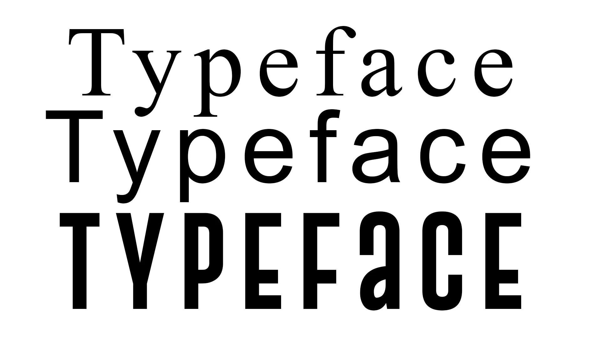
A typeface is a set of specific design letterforms, numerals, and other characters categorized based on style, weight, height, variant, balance, and spacing.
Font
A font, in technical terms, is the actual typeface file installed on your computer with different variations, such as weight and size, which sometimes can be determined through its typeface style, such as bold, italic, condensed, etc.
Web Safe Fonts
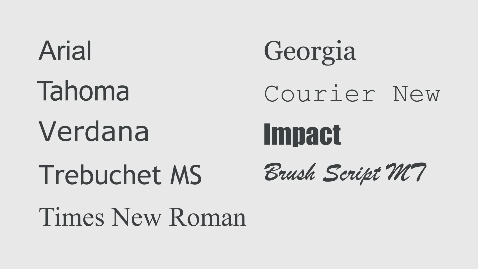
Web safe fonts are the typefaces that are commonly preloaded on most types of devices, be it a computer, laptop, or other significant devices. The typical web safe fonts include serif, sans-serif, monospace, decorative, cursive, and MS fonts.
Web Typography Font Categories
Typography creates the ideal form for the structure of the text, which has its font, size, style, and weight. However, typography can only be utilized through the use of fonts. The choice of the font you use on your website determines the basis for the clear communication of your web content.
All fonts fall into two major categories: serif, and sans-serif.
Serif Fonts
This type of font has tiny feet or tails at the end of strokes of letterforms. A typical example of this typeface is Times New Roman or Georgia.
Sans Serif Fonts
This type of font has no serif or extra tail or feet at the end of each letterform. Sans serif typefaces are commonly used for a bit of informal text composition. An example of Sans Serif is Arial, Futura, and Helvetica.
The Elements of Web Typography
In web design, there are a few essential elements of typography that you need to play with to achieve the proper text composition. This includes the tiniest and simplest details from style, line spacing, line length, and arrangements which sometimes almost seem trivial to the naked eye but contribute to the overall aesthetic of the web components using typography.
These elements can be versatile and convey far more than the text content itself. These tiny details will lead you to the proper composition of the web component taking advantage of typographic design. Remember that understanding these elements will help you further uplift and amplify the website message, which can compose a good amount of emotion, tone, dynamism, and variation far beyond the letters or words.
Symbols, Entities, and Accents
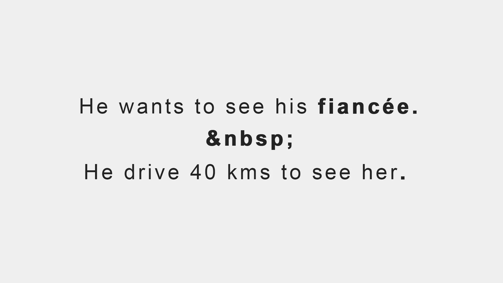
Aside from the regular typeface used in web typography to create text-based components, symbols and characters are also helpful in organizing a particular paragraph or text block and making it readable. Symbols are often made up of punctuation marks or characters, such as the widely used period . and the comma ,, to indicate a pause while reading the text. In some cases, a non-breaking space HTML entity (&nbps;) can be used to separate words together in one line while avoiding breaking words into separate lines.
On the other hand, accents, also known as diacritics, are valuable elements of web typography. These are small marks often seen above or below glyphs to indicate the word's proper pronunciation correctly. For example, the words: doppelgänger,fiancée, and flambé are all excellent samples of the accent. Symbols, entities, and accents must be used appropriately and indicated in typography, or it could confuse the reader.
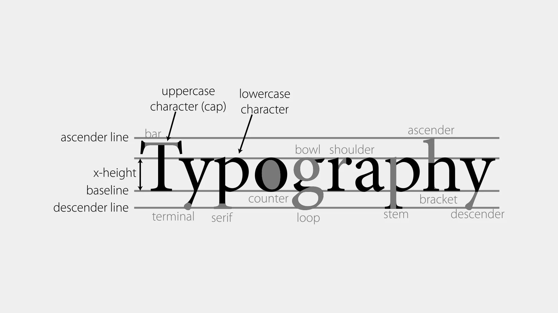
Baseline
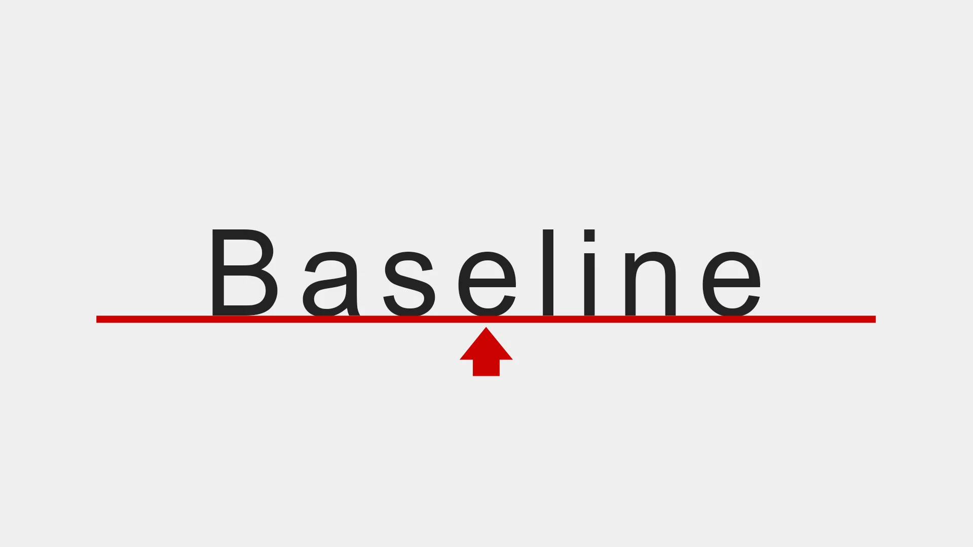
A baseline is an imaginary line that is used as a guide where each typeface or letter sits. In most cases, each typeface or letter sits on a baseline at the bottom of the text. However, there are some instances where some typeface or letter, such as p and g, override the baseline and extend their bottom part below the bottom baseline.
Baselines are also used to measure x-height and adequately align the text in a typographic element. It ensures that each text or word is appropriately aligned, placed, and spaced within the boundaries of a baseline.
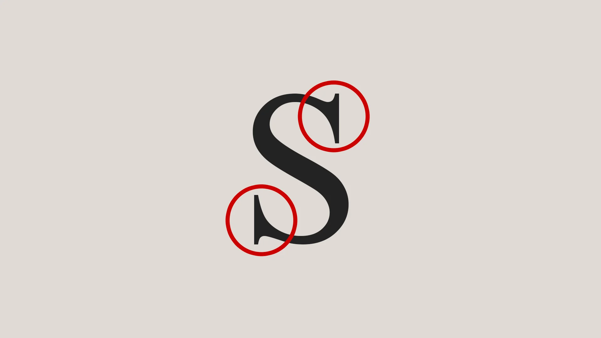
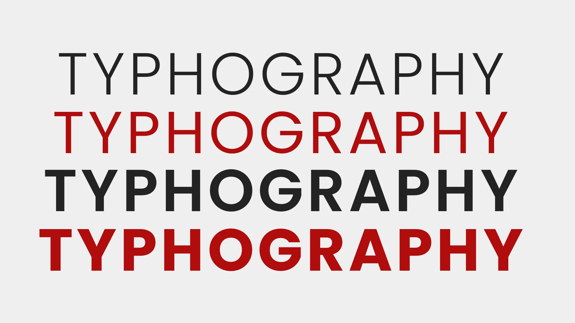
Kerning
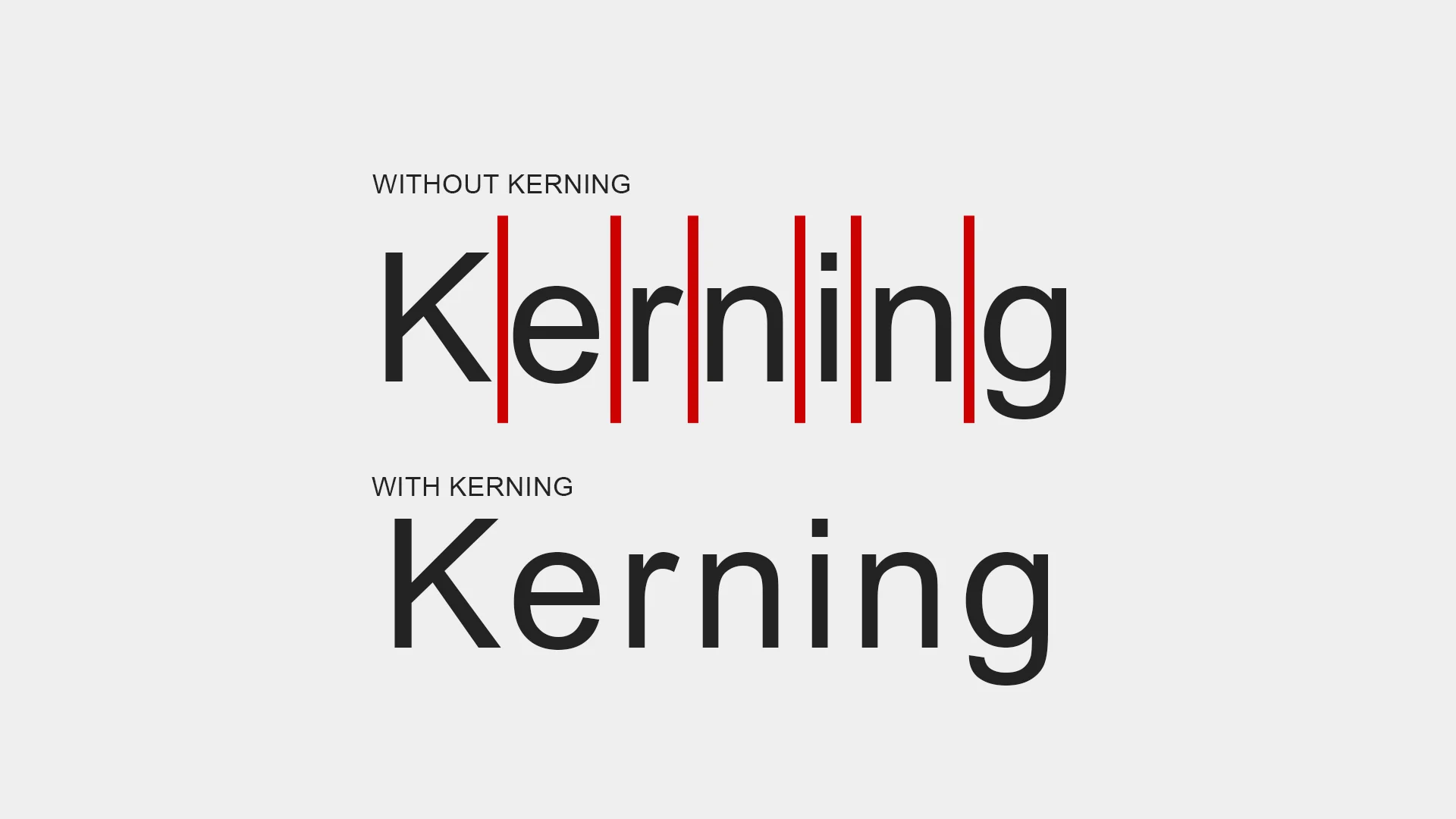
Kerning refers to the spacing between different typefaces or letters. Each letter often has a default set of spacing around each letter, sometimes producing inconsistencies. In some cases, each letter may appear too close or too far apart.
Working with kerning enables you to adjust the space between individual letters or symbols to produce a visual balance typography element. With proper kerning values, the outcome is a much better-proportioned word and eliminated suboptimal letter spacing.
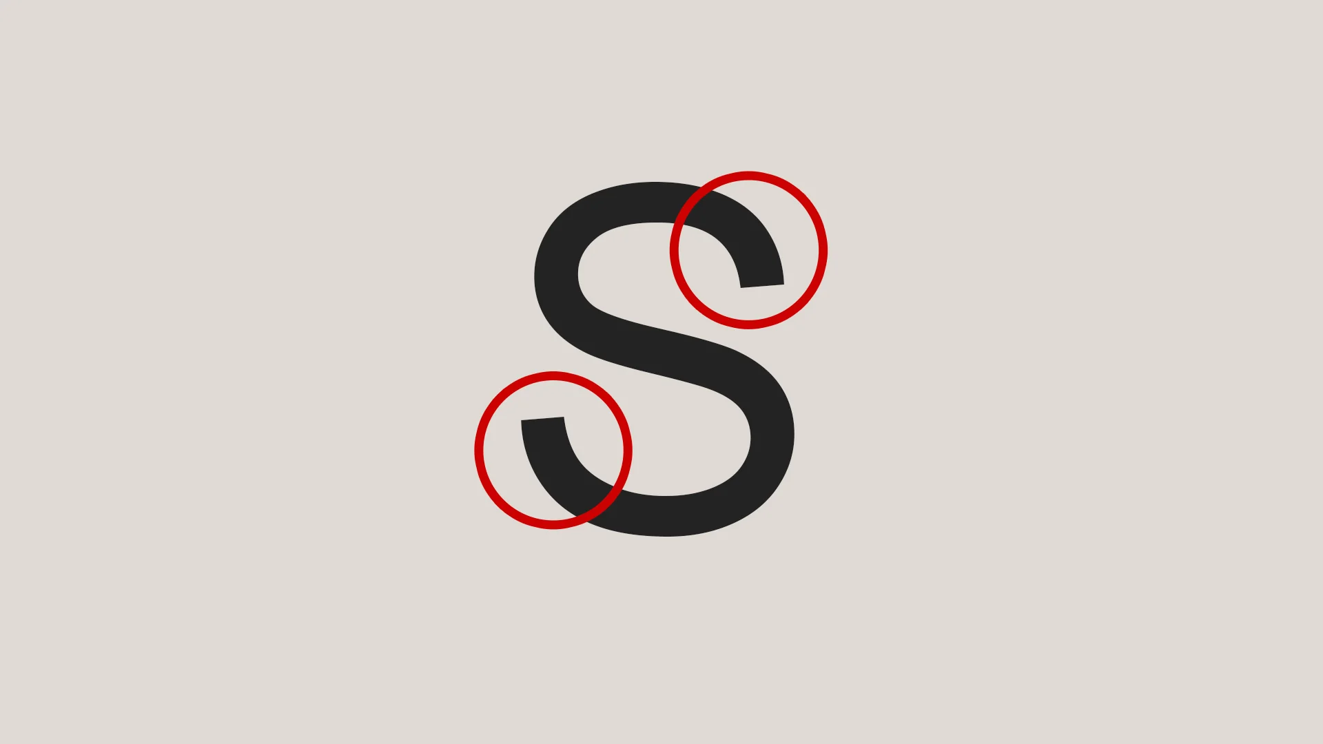
Tracking
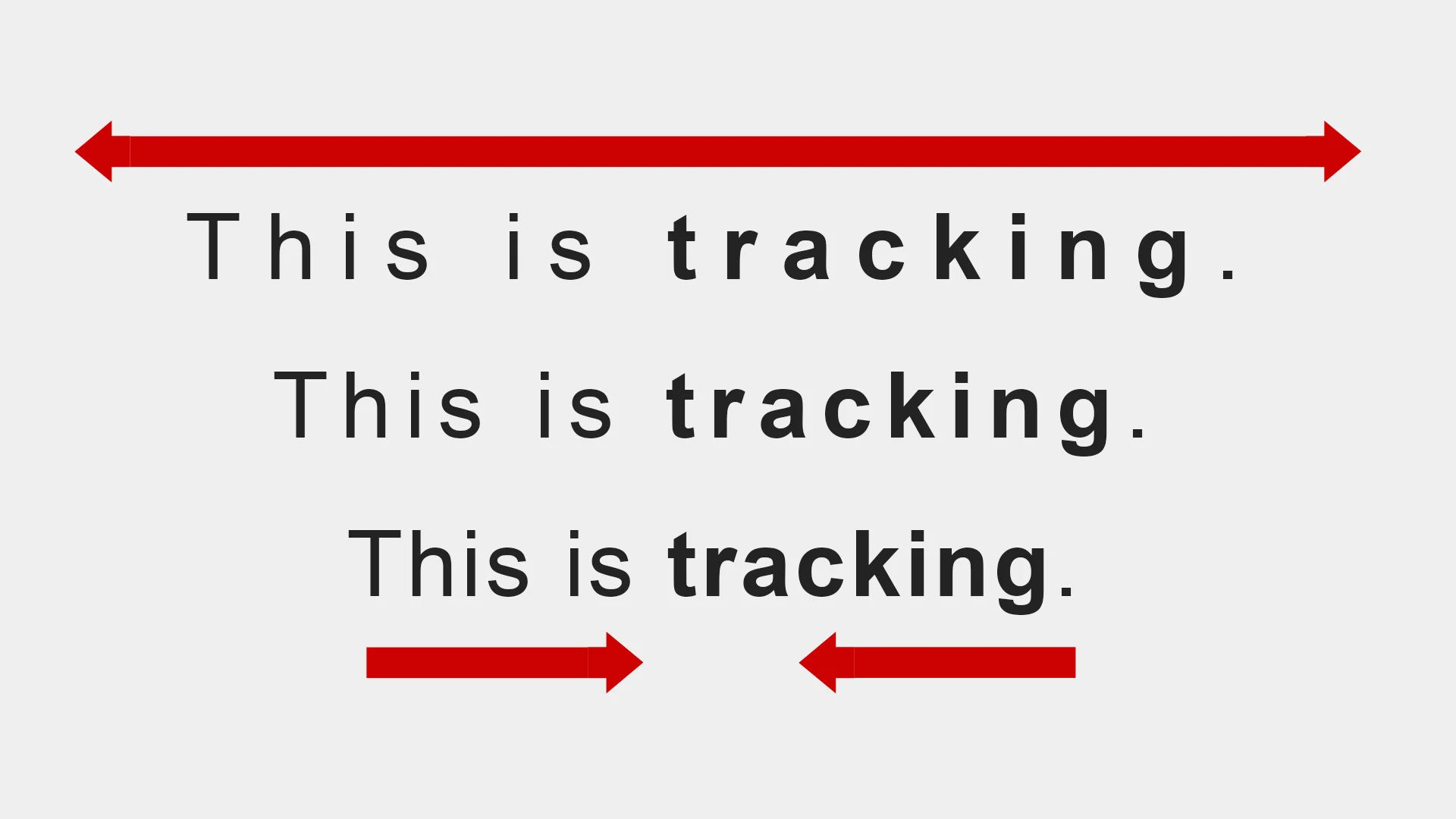
Tracking is the spacing between overall typefaces or text. It is often confused with kerning, the space between typefaces or letters. Tracking is generally used in total word adjustment to make a word splendid and more readable text. Tracking is more valuable when it comes to the legibility of all-caps text.
Leading
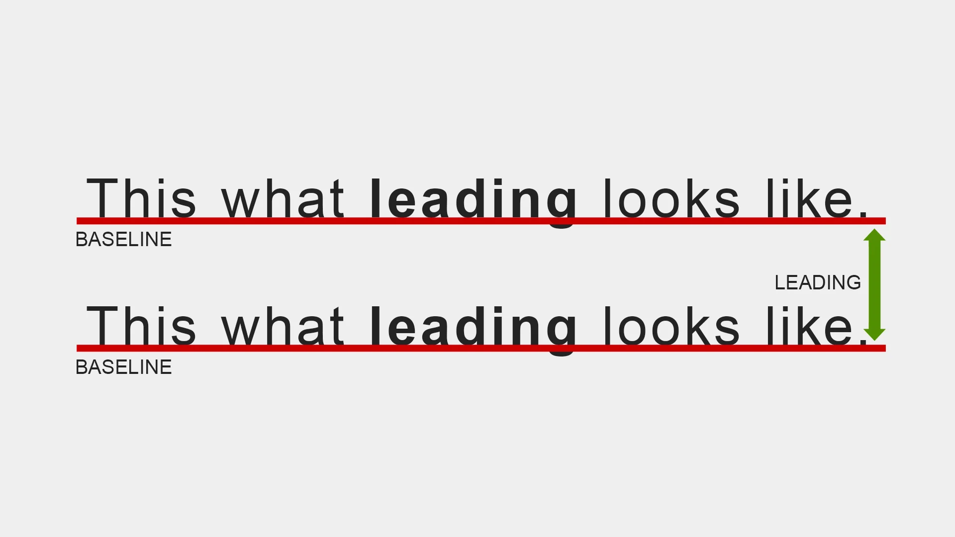
Leading, also known as "line spacing," is the vertical space between the baselines of each line of typefaces or text. Leading is usually used as the primary element for line height to balance the rhythm in typography. It helps in modifying the texture of sentences on a particular text block.
When proper leading is implemented, it can help create visually appealing text that is pleasing to the reader's eye and creates an easy-to-navigate sentence from one line to the next. Leading is the best possible customization you can make to build a stable text composition.
Rhythm
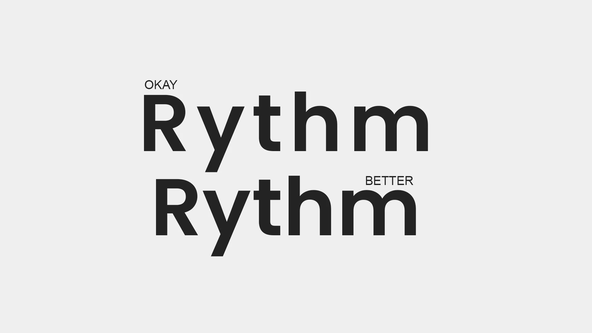
Similar to rhythm in music, which refers to the use of time to properly simulate a good music composition, the same benefit of space provides good rhythm in typography. Rhythm determines the flow of the text block, which can be a disjointed text block or a visually appealing text. Without rhythm, the reader becomes disorientated, which makes the text hard to read or understand. Establishing a well-tuned rhythm in typography with proportional text makes it easier to read and more pleasurable to absorb and comprehend by the human eye.
In typography, rhythm can be determined by a horizontal and vertical rhythm which defines the proportion balance of the text.
Contrast
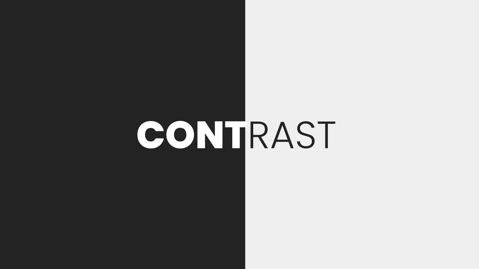
Contrast is one of the primary contributing factors when it comes to typography. The contrast refers to the weight or heaviness of a typeface. It determines the difference between the thickness and thinness portion of a typeface stroke and showcases an angle of distinction in text design.
Color
When dealing with typography, color doesn't directly mean a text's regular color scheme. The typography color refers to how heavy or light a black typeface looks on a white canvas. This determines the general presence of a text block in a particular component instead of the actual color palette that showcases different moods or tones.
Hierarchy
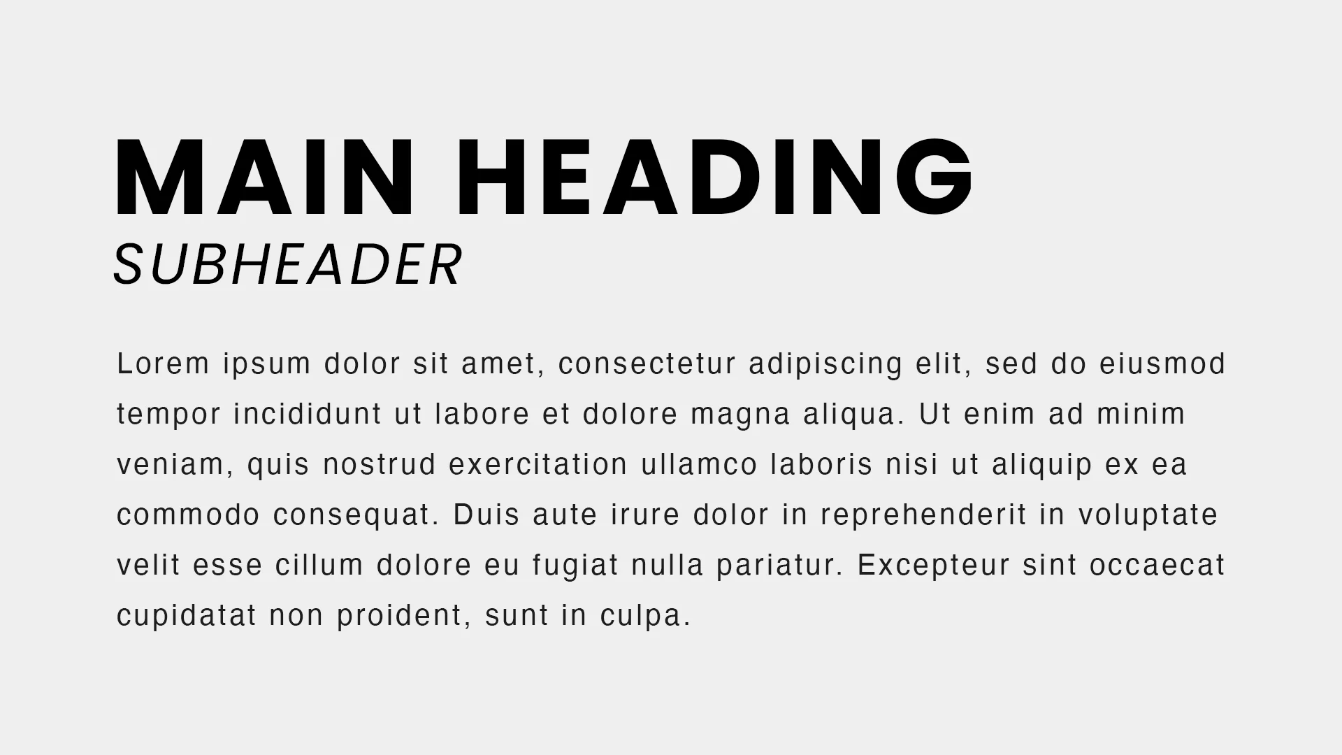
Hierarchy is a system in typography that involves the rational and appropriate choice of typeface style, size, spacing, case, position, and color to create a hierarchical division of aesthetically pleasing content that indicates a certain level of importance. Hierarchy often goes side by side with text composition as it determines the proper order of one piece of information after another.
Website Typography Design Guidelines
Designing websites using typography can be a strange but pleasurable task. With the advent of thousands of web fonts online, designers and developers have plenty of options to choose from and play around with the different typographic design factors such as size, weight, style, and more.
Before beginning any typographic design, it's essential to know a few things about the proper way of doing it. Below are some guidelines you can use when working with typographic design.
Use ems instead of pixels.
The benefit of em in CSS is that it provides a unit of length specifically for typography. Ems enables anyone using it to design scalable web content. Ems is used for widths, heights, margins, paddings, and other web-based measurements in vertical and horizontal spaces and provides an equal distance to the font size.
Choose a sans-serif typeface for the body text.
Sans serifs are more legible when compared to serifs when it comes to creating typography for the web. Sans serif fonts such as Helvetica can be easily read in contrast with the decorative-styled font.
Use mobile-approach text.
Responsive web design has been around for years. To ensure that the text block looks good across all devices, you must first consider designing for mobile devices using CSS media queries when starting with typography design.
Use the default font size for paragraphs. When designing for typography content, it's recommended to use the browser's default size. The standard initial size set by almost every device is 16px.
Be careful when using uppercase text.
Sometimes, using uppercase text can be inappropriate as it can express strong emotion and tone. If you want to do some emphasis on a specific text, you can always play with the font-weight as needed.
Use typefaces with a purpose.
Using multiple typefaces can be chaotic. The more typefaces you use together, the harder it can be read and comprehended by your audience. Simplicity is always the key to any typography design. Using two to three standard fonts at most is recommended to ensure consistency and relation to your content's subject.
Examples of Excellent Typography on Websites
Content is what defines a website. As the famous saying once said, "Content is King." While content can be king, how you present the content through typography affects every detail of a website or application.
Below are some excellent illustrations of beautiful examples of web typography.
Département Créatif
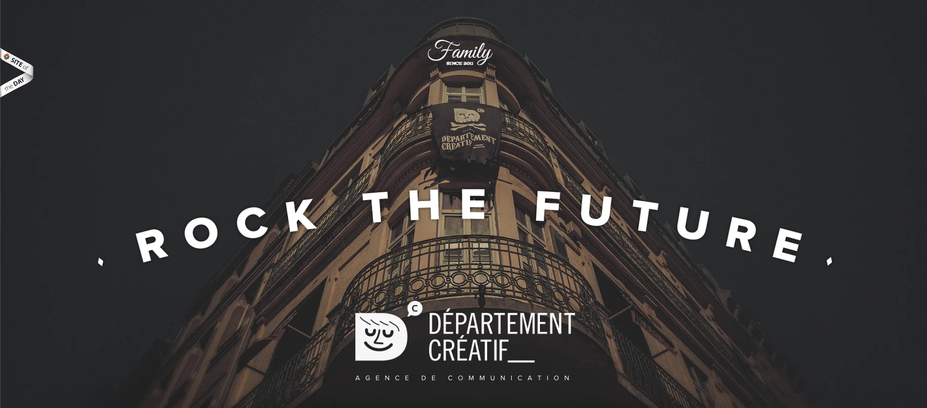
Département Créatif website combines a good combination of contrast and color while keeping the visitors' attention on the big white text along with its readable text content sections.
Red Antler
Red Antler showcases a nice slider, logo, and text animation while keeping its typography presentation clean and pleasing to read.
Hix Snedeker
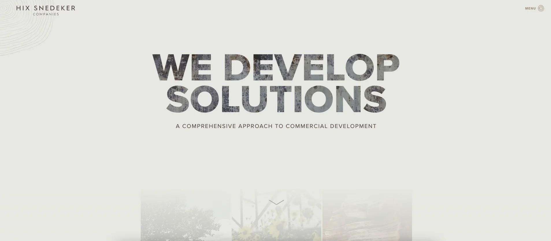
When it comes to clipping text with an image effect, the Hix Snedeker website did a great job on its typography header. The project section also showcases clean titles with nice and smooth hover animation.
Ade Mills
Ade Mills' website is one big typography animation. It showcases a good contrast between the background and text color while keeping extravagant through its glitch effects.
Planet Propaganda
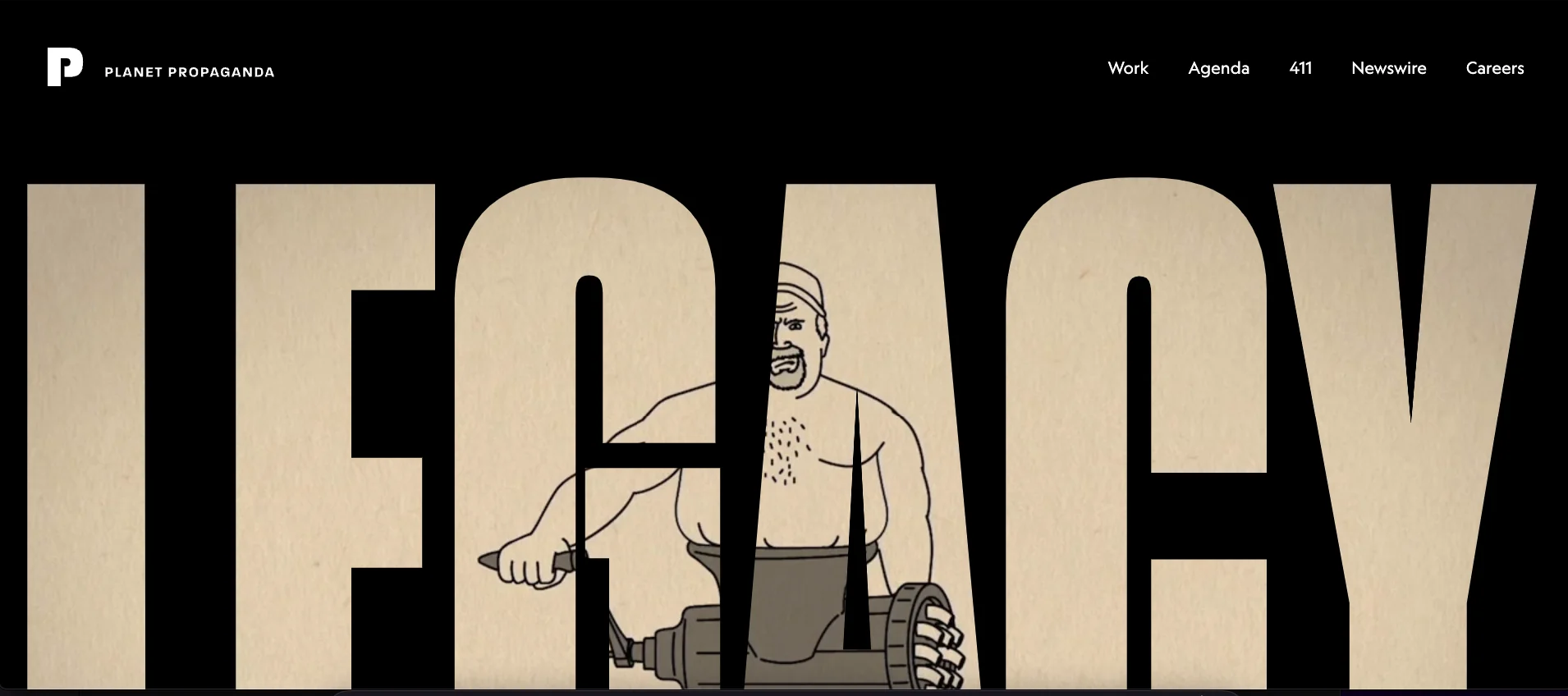
Planet Propaganda is yet another excellent example of clipping text effects. It presents a big clipped text with video backgrounds while showcasing a balanced color scheme. What's even fascinating about its website is that it illustrates an excellent example of how you should use uppercase and how to balance them to regular paragraphs or text blocks.
Wrapping Up
Typography comes in all shapes and forms. With increasingly advanced devices being built each year, website designers and developers need to aspire to create flexible, scalable, and adaptable web typography that is pleasing to the reader's eye and easy to understand.
Familiarizing yourself with the typography fundamentals and its design process will enable you to create better typography for your website or application.

Creates insightful, strategy-driven content that translates complex design and branding concepts into accessible knowledge, supporting Ramotion’s mission to elevate digital experiences.