How can design guide your gaze to specific elements? When you open a website, the large hero image or bold text at the top instantly grabs your attention. The smaller components, like buttons or ads, take longer to notice.
This intentional arrangement of visual elements is known as visual hierarchy. For product teams refining hierarchy across multiple screens and flows, working with experienced partners, such as those featured in this overview of top UI/UX design agencies, can be a pragmatic way to validate whether attention is being guided as intended. An effective visual hierarchy enables users to experience an interface as intended, much like a good story that gradually introduces characters.
What about this visual system makes some elements stand out while others fade into the background? And how can you harness it to create beautiful and functional UI/UX design?
What is Visual Hierarchy, and Why Does It Matter in Design?
Visual hierarchy is a design principle that organizes elements logically and visually appealingly. It's about leveraging colors, sizes, spacing, and other components to create a good visual structure that's easy to follow.
If you read a news article, you may first notice the headline written in bold letters or the huge photo right below it before you even read the rest of the story. Such an order helps readers understand what to expect from the headline and photo so they can decide whether to proceed with reading the whole article.
The same concept applies to UX/UI design. For example, you're in the mood to watch some videos but are uncertain about the topic. Heading to YouTube, your home page displays a huge video thumbnail, which YouTube thinks you'll like the most based on your viewing history. Shaping these perception cues often benefits from partnering with a forward-thinking UI/UX design company that can validate how attention flows across a layout.So your eyes go there first. Smaller thumbnails of other relevant videos are shown below or on the side.
Below is an overview of how visual hierarchy impacts user experience (UX) and user interface (UI).
| Key aspects | User interface (UI) | User experience (UX) |
|---|---|---|
| Goal | Provide clarity and ease of use through visual cues | Organize content and engagement to meet user needs and expectations |
| Integration | Apply design principles to create a clear distinction between interface elements, like buttons, images, icons, and menus. | Create a structure for content and a precise navigation flow that reduces cognitive load, resulting in an effortless and intuitive experience. |
| Expected outcome | Balanced aesthetics for a functional and intuitive interface | Ensures users can easily find and interact with content for a satisfying user experience |
We must delve deeper into the brain's inner workings to fully understand visual hierarchy.
The Psychology Behind Visual Perception
The human eye functions like a camera, capturing the information it perceives. The visual cortex then processes this information, assessing if it recognizes anything and assigns meanings. But we process what we see as a group.
Gestalt psychology explains how we perceive things as a whole rather than as individual fragments. For example, people rarely examine web pages item by item. Instead, they quickly scan and skim, deciding if the content meets their needs.
Visual eye tracking patterns
Researchers have identified common eye-tracking patterns that inform effective visual hierarchies: the Z-pattern, F-pattern, spotted pattern, and layer-cake pattern.
Z-pattern
Users scan a page from the top left to the right in a Z-pattern, then zig-zag to the bottom right. This occurs on simple layouts like landing pages, which are designed to direct users' attention to essential elements, like calls to action.

Z-pattern example via ExpressVPN
F-pattern
The F-pattern involves users examining the top horizontal section of a page, then the second horizontal block, before finally scanning vertically to the left side of the content. This pattern is typical when users scan text-heavy content, like articles and blogs. It allows them to review the content naturally, especially in a hurry.
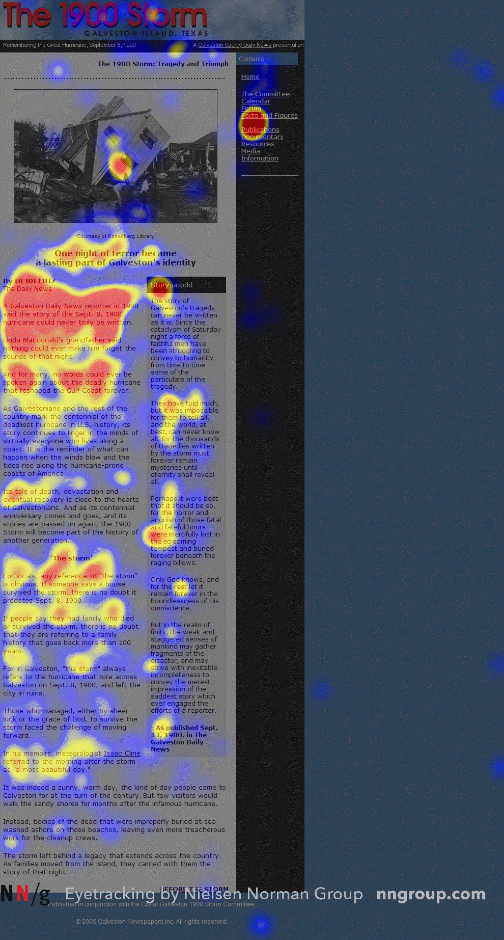
F-pattern example via Nielsen Norman Group
However, the F-pattern is not ideal for UX/UI design. While it is a valuable concept, particularly for content-heavy interfaces, designers should use it as a baseline and explore layouts to encourage deeper engagement and interaction.
Spotted pattern
The spotted pattern is more spontaneous, with users scanning for a specific set of words or any elements that pop out. These could be italicized quotes, important text in bold letters, or hyperlinks. This makes the eyes dart from one spot on the page to another.
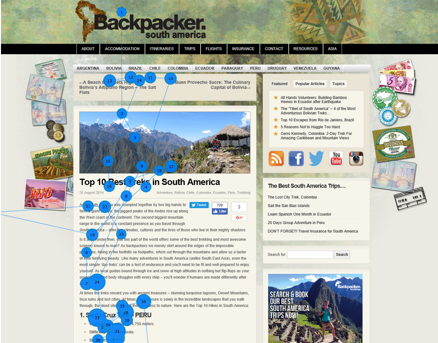
Spotted scanning pattern study done by Nielsen Norman Group
Layer-cake pattern
The layer-cake pattern focuses on the most prominent visual elements to assess relevance quickly. In web design, this calls for a clear visual hierarchy with headings and subheadings, which creates a visual pattern resembling horizontal layers or stripes of a page.
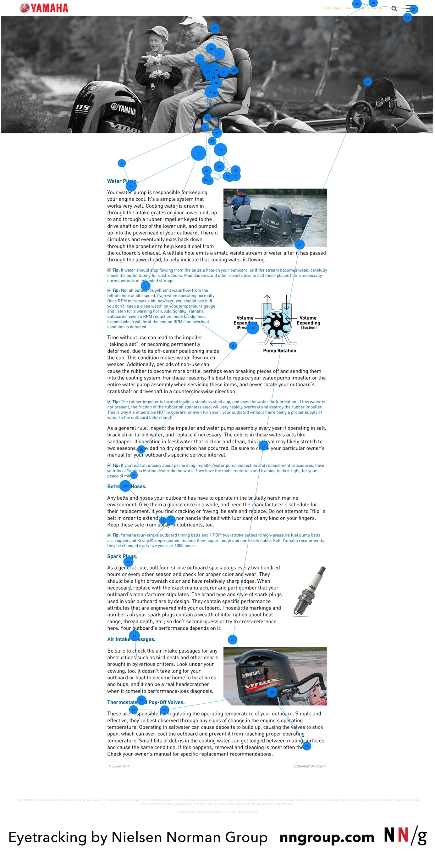
Spotted scanning pattern eye tracking study by Nielsen Norman Group
Core Principles of Visual Hierarchy
Understanding eye-tracking patterns helps designers learn how people interact with screens, allowing them to arrange visual elements in a natural and easy-to-follow way. If a button is hidden where no one naturally looks, people might miss it.
But, there is more to influencing visual perception than integrating eye tracking patterns. Let's tackle some core principles of visual hierarchy.
Size and scale
The size of your visual elements can make things appear larger, so people notice them first. The same concept applies to article headings and subheadings, which are larger than the body text, making it easy for readers to scan for key information.
Remember that not everything has to be big and bold; otherwise, nothing stands out. Use size only to guide the eyes of the users and show them what's most important, less important, and least important. This results in a design that is easy to interact with.
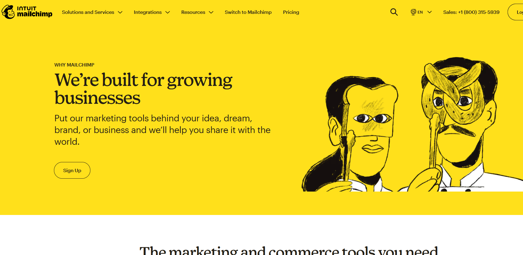
Fonts, icons, and illustrations in different sizes via Mailchimp
Color and contrast
Color and contrast can help specific elements stand out or recede into the background. There's also the concept of color psychology, where certain hues can evoke particular emotions.
While size and scale can make things appear bigger or smaller, color and contrast can make elements stand out or recede, regardless of size. This creates a more dynamic visual experience.
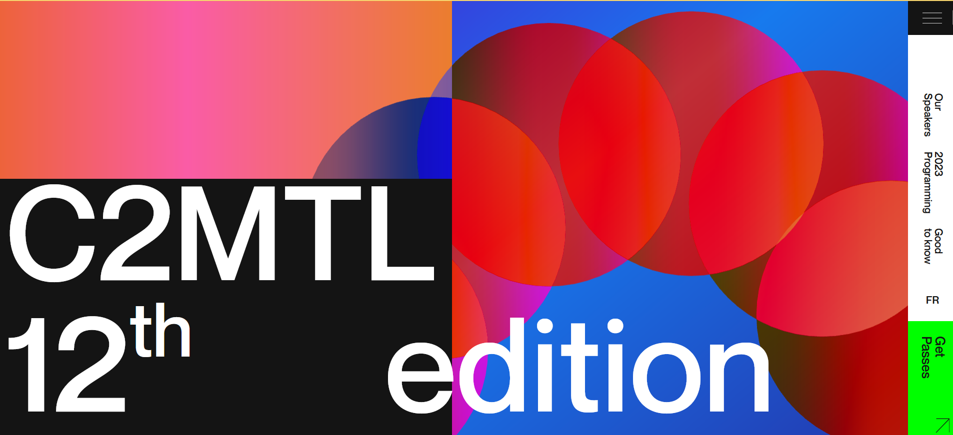
Harmonious blend and contrast of vibrant and dark hues. Image via C2MTL
Choosing colors can be tricky. Other factors to consider include readability, color theory, contrast ratio, and accessibility for users who are colorblind or visually impaired. In such cases, balance is key.
Use bright colors sparingly, reserving them for visual elements that need immediate attention. Consider a high contrast between text and background to ensure readability. Be conservative with your color palette, sticking to only a primary and a secondary color to avoid visual clashes.
Typography and font weight
Typography creates a beautiful presentation of text through different font types and ensures that it reflects its importance and significance. One key part of this is the font weight—how thick the letters look, where heavier (bold) fonts are more noticeable than lighter fonts.
Typography and font weight, combined with the correct font size and scale, can underscore the importance of visual elements.
Typography and font weight in web design via Awwwards
Spacing and proximity
Spacing refers to the distance between visual elements. This "white space" around each component allows the design to breathe, creating a clean and organized look that makes it easier for people to identify focal points.
Meanwhile, proximity groups related objects together. When items are close to each other, our brain perceives them as a cohesive unit. For example, on a restaurant website, the menu links for main courses should be grouped closely so users know they belong to the same category. Seeing unrelated items, like beverages, mixed in can create a sense of disorder.
Alignment and positioning
Alignment and positioning emphasize the importance of arranging visual elements predictably and intuitively. Doing so unburdens the mind when processing what the eyes see. For example, placing the exit button at the top right of a page works because people expect to find it there.
It helps to follow a grid to create order and make scanning easier when aligning texts and images. Consider the logical placement of buttons or text blocks so users can easily identify which elements belong to the same section.
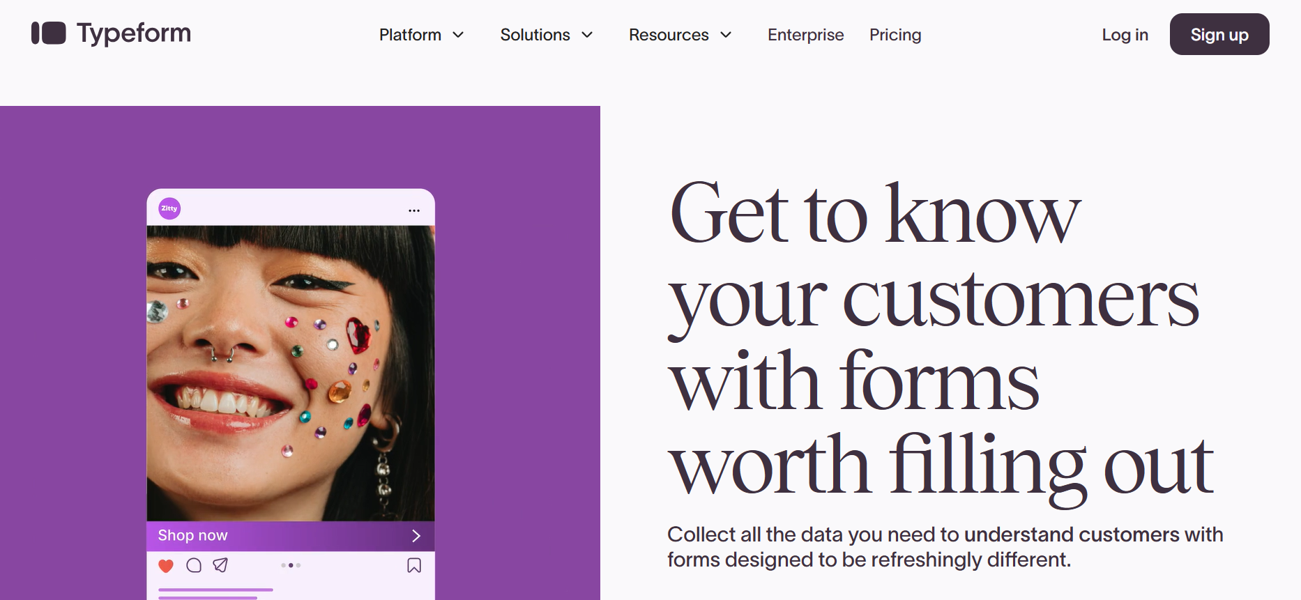
Texts and images are aligned neatly in blocks. Image via Typeform
Repetition and rhythm
Repetition in design occurs when patterns or design elements are repeated multiple times, allowing the brain to recognize them easily. If all buttons on a website are the same color and shape, users quickly know what to click. When the repetition is predictable, people know what to expect. This builds trust and makes the design easier to understand.
Rhythm is the guiding beat, so users do not get lost as they interact with your design. It is created by repeating elements in a pattern, like increasing sizes or changing font colors in saturation. Thus, rhythm is of interest to the design while helping users know where to look next.
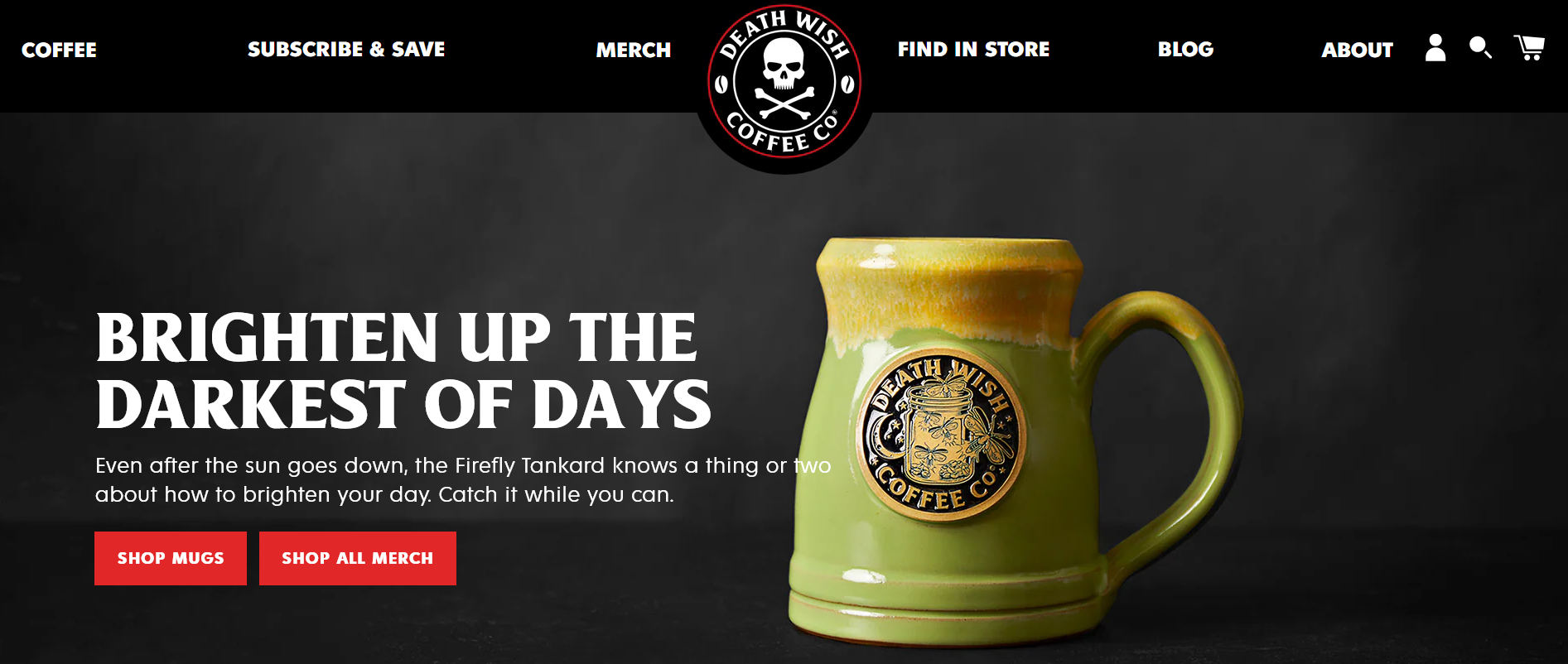
The consistent use of the same font style and typography across all pages results in a predictable flow. Image via Deathwish Coffee
Common Mistakes in Applying Visual Hierarchy
Visual hierarchy may be a simple concept, but it can be tricky to implement. Here are some common mistakes you should avoid.
1. Overcrowding visual elements
Creating a chaotic design is easy, especially if too many elements are involved and placed too closely together.
For example, you may have used clashing bright colors or bold shapes everywhere, or you may not have observed enough whitespace around each element to help the eyes rest and focus. Images that don't match and fonts in different styles can also cause an overwhelming look.
These lead to a confusing and overwhelming visual design.
What can you do?
Apply the principles of visual hierarchy strategically to make the most important things stand out. Keep your layout simple and remove features and visual elements that are purely decorative and do not contribute to achieving your design goals.
2. Lack of content logic
A designer might focus too much on creating an attractive design but forget how things should be presented. This often happens when there is no established flow in your visual design.
What can you do?
Start the design process with a clear plan for which key information to highlight. Then, you can decide how to do so using size, contrast, colors, and placement.
It's also essential to group related elements spatially to reinforce and create a clear structure. For example, an e-commerce website can group related products for consistency.
3. Not testing for accessibility
Accessibility testing verifies that visual elements adhere to proper color contrast, sizing, spacing, and grouping guidelines. Skipping this step can harm the achievement of a good and well-balanced visual hierarchy.
Poor contrast can lead to elements blending in the background, making it hard for the eyes to spot what's important. An incorrect heading structure can disrupt the order of content.
What can you do?
Use tools like WAVE, CCA, and Chrome DevTools to ensure colors have enough contrast. Consider also leveraging screen readers and listening to how your content is read aloud to check if the order and emphasis make sense. And while automated tools are efficient, they can overlook finer details. So, manually test your design with real users, including those with disabilities.
How to Design Effective Visual Hierarchy: A Step-by-Step Guide
Step 1: start with user intent and content priority
Knowing your users like the back of your hand can be a game-changer in implementing a visual hierarchy. With relevant information about your audience, you can create a design that meets and predicts their needs.
Conduct user research through surveys, focus group discussions, observation, and, if available, analysis of past data on user behavior to understand what users are trying to achieve with your design.
It is also essential to establish user intent, which can be classified into four categories: informational, transactional, commercial, or navigational. Qualifying them can guide you in visualizing and prioritizing intents during design.
Suppose you're designing a mobile app for an online grocery store with a transactional user intent. In that case, the product pictures and "Add Purchase" button should stand out more than other information, like reviews or shipping details.
Step 2: wireframe your layout first
Wireframing entails organizing your content so users first notice your layout's most important visual elements. It's a skeletal framework that helps ensure a design is easy to understand and use.
Start by drawing your key elements—title, menu, or hero image—at the top or center, where people usually look first. Use boxes to indicate and group related elements together. Leave more space around necessary boxes so they stand out.
Draw shapes and lines as placeholders for images, buttons, or text so you know where to put them. Finally, arrange the elements accordingly and consider the best pattern you want to implement.
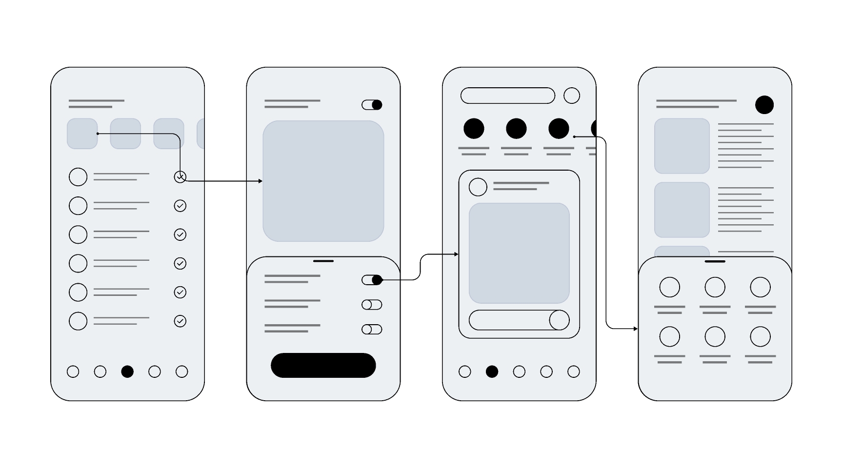
Wireframe for a mobile app via Figma
Step 3: apply visual principles strategically
Now that you have a blueprint for your design, it's time to integrate visual principles. Consider the context you're designing, like the user environment and intent. If you're applying visual hierarchy on a small screen, prioritize size and color contrast when designing easy-to-find buttons.
Mastering the core principles of visual hierarchy and understanding your audience is key to creating designs that are not only pretty to look at but also highly functional and user-friendly.
Step 4: test and iterate based on user feedback
Always test your visual hierarchy with real users to see if they can identify elements according to the intended organizational flow. Based on this feedback, you can iterate and optimize your visual hierarchy.
Here are some ways to test if you have a good visual hierarchy strategy.
- A/B testing: Compare two versions of the same design with different layouts for key elements and determine which version users prefer.
- Surveys: Ask questions to help determine if the visual order makes sense to users.
- Usability testing: Observe how users interact with your design and see if they encounter difficulties accomplishing tasks.
- First-click testing: Identify what users notice first when they see your design. The hierarchy works well if they click on essential elements, like the central button or headline.
In addition to mastering the core principles of visual hierarchy, various tools are available to help enhance your design process. You can start with UX/UI design tools like Figma and Adobe XD to help build wireframes and prototypes. These software programs often include ready-to-use templates and UI kits and feature cross-integration capabilities for better collaboration with your team.
Tap the Invisible Influence of Visual Hierarchy
Visual hierarchy can be detrimental to a design's success. With the right visual arrangement, however, it can guide users' attention, encourage engagement, and create an intuitive user experience. However, achieving an effective visual hierarchy requires mastering UX design.
Jul 4, 2025

Creates insightful, strategy-driven content that translates complex design and branding concepts into accessible knowledge, supporting Ramotion’s mission to elevate digital experiences.