Grids have been a part of design history for centuries, originating from the principles of information presentation used by the old printing press companies. The grid system and its underlying approaches came from the print design industry. It was used to arrange typography on print resources such as papers and magazines and was eventually adapted into the manuscript layout.
As publishing companies became more sophisticated, so is the usage of grids on print designs which were used primarily for the orientation of different headlines, text, illustrations, and drawings for the viewer's excellent reading experience. Despite the rapid evolution of technology, grids and layout systems remain relevant in the succeeding years.
The concept of grids persisted in graphic design during the early 20th century with the development of the modernist movement. Designers such as Jan Tschichold and Josef Müller-Brockmann promoted the use of grids in graphic design to attain clarity, order, and efficiency in design. Grids also became a great tool to emphasize the importance of structure and organization in design. The use of a grid system remains a fundamental principle in graphic design, and it continues to be applied in various design disciplines, especially in web design and development.
Before the days of website grid based design, web designers and developers could only develop print design style and boxy-style website layouts that were mostly empowered by HTML tables and images. Most websites at the time had the same rigid and contrasty design primarily developed for old desktop computers. Web elements and layouts were fixed, and the website grid design is not an imperative concept that needs to be considered or concerned.
Later on, different devices with various sizes and shapes dominated the marketplace. The era of fixed layouts and inflexible heavy-flash animation websites has finally ended. Web professionals faced different issues with the structure and responsive design. Many screen densities arise, and the need to create design solutions to make layouts and structures work for different devices, operating systems, and browsers has become a hot trend in the web design and development community.
With its popularity and flexibility, grids have become an intricate part of every website design process, which requires great design skills to be utilized. Grids enabled web designers and developers to create complex layouts with multiple rows and columns and the ability to overlap and layer elements. This provides a level of flexibility and control that was not previously possible with other layout grid layout options. The website grid design system has become a widely adopted standard in the industry. Every website design agency integrates grid-based layout into their workflows, toolkits, and third-party frameworks.
Defining Website Design Grid
What is a grid in Web Design?
A grid is a visual structure of invisible lines of columns and rows (vertical, horizontal, or both, hence the term grid) used to organize and align content on a webpage.
Depending on the grid layout, these columns can be fixed grid or fluid grid, which can help determine the alignment and placement of elements in page layout design.
Grids allow pieces of the design to be laid out separately of their layout regions which helps to create a consistent and balanced layout, making it easier for users to navigate and go through the information on the page. Because the grid effectively becomes a shared “contract” between design, engineering, and content, selecting responsive web design companies is often easier when you ask how they translate grid logic into a maintainable design system and component library.
Grids typically comprise a set number of columns or multiple columns (regardless of how many columns) and gutters (controlled by gutter widths) that define the size of a content area or grid section on the page. The size of the columns and gutters can be adjusted based on the needs of the design using different properties such as column spans and column widths.
If you break down the standard of modern grid systems, you'll realize that grids are a compound of pixels of guidelines that form columns. This can be seen in today's web design and development phases, including wireframing, prototyping, and coding.
Website Grid Elements
How do grids work?
Grids can be utilized by dividing a web page into a set number of columns and rows where you place elements. Each element can be placed within those columns and rows. The columns and rows of the grids are set by the CSS properties that specify their width, height, and spacing.
For example, a simple grid structure can have 12 columns from which each section column will take a width of 1 of the total width of the page grid layout. The gutters (which can be set by gutter width) might be set to a fixed grid or a percentage of the column width. Content can then be placed within those column grids by specifying which column or columns it should occupy.
When learning about grids in the context of web design and development, several terminologies need to be tackled to grasp the whole concept of web design grids:
Units
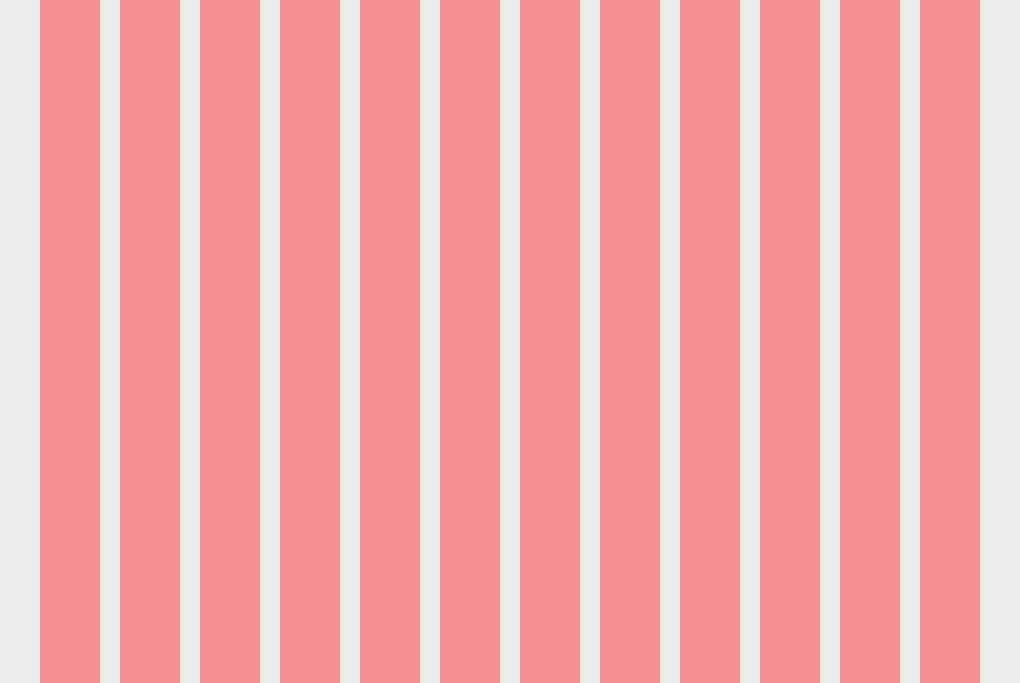
Units are the smallest building block or divisions of every grid. This refers to the square or rectangle figure, which serves as a reference to the dimensions of an element within a layout. Units are typically measured in pixels or points.
For example, below is a website with a 12-unit grid with green stripes, each representing one unit.

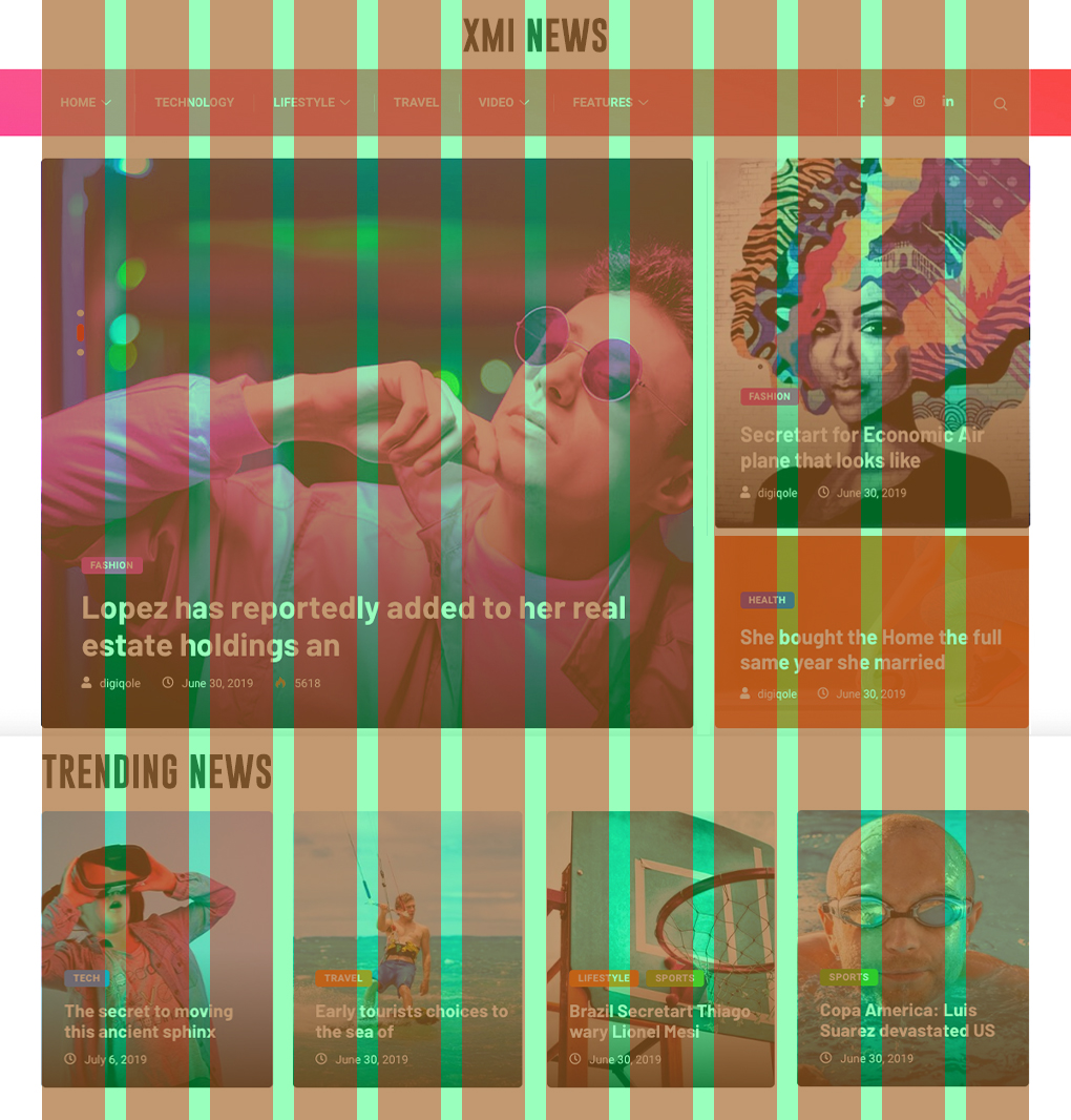
Gutter
A gutter is a space between two adjoining units in a grid layout. Gutters are a form of empty space separating columns, rows, or modules from each other, providing some visual separation to improve readability.
Below, you can see the light green lines, which illustrate the gutter of the 12-unit grid.
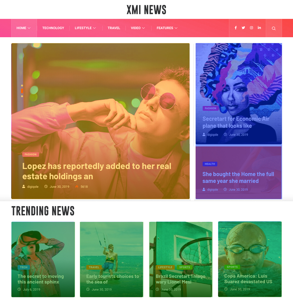
Column
This refers to the vertical grid division (also known as column grids) that serves as a container to place elements or contents. It contains units that run from the top to the bottom of a layout and arrange web content in a vertical stack.
Below is a mix-up of different column illustrations using different colors.
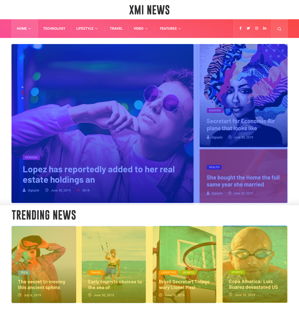
Field
A field refers to the section within a grid that is comprised of multiple units in horizontal divisions of pages. It can be a group of columns or rows that are combined to create a larger area for content.
As seen below, fields are often used to create larger content blocks, such as a hero image or a blog roll section.
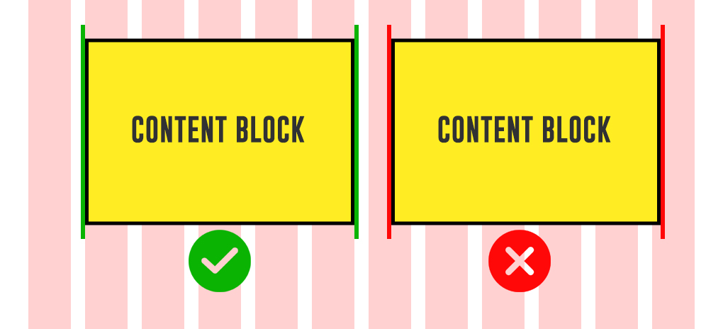
Margin
Margins are the white space on the left and right corners of the page. Margins provide a breathing room around the content, giving the design a sense of balance and proportion.
For example, the yellow lines from both ends of the webpage layout represent the margins, as seen below.

Breakpoints
Breakpoints refer to the specific points where the website's layout and elements change or adjust based on the screen size or device used to view it. The concept of breakpoints is widely discussed in terms of responsive web design. The content adjusts to fit the screen size using a responsive layout grid according to the device screen size, whether it’s a mobile, tablet, watch, desktop, or even on larger screens.
Importance of grids in website content organization
Utilizing a grid system in your project ensures efficient and organized content. Whether for web or mobile design, grids can help you form a consistent structure and layout hierarchically.
Below are some notable reasons why grids are essential for the content organization:
- Grids provide a consistent visual structure by intuitively setting up layout rules and hierarchical grids.
- Grids can create a sense of balance and harmony in the layout design while avoiding negative space. Using grids, you can control the layout and placement of design elements within the column grid on a webpage.
- Grids help to incorporate a visual hierarchy. This makes the content more readable and provides a great user experience when browsing the content.
- Grids are adaptable and can be used on various content types and formats, including blogs and landing pages.
- Grids provide a framework to speed up the design and layout process. Grids come with a pre-defined grid system that you can use in creating and organizing content regardless of the screen sizes it’s being viewed and without worrying about the overall structure of the design.
Why Are Grids Important in Web Design?
When designing for web and mobile, the grid system can bring various benefits in creating a visually appealing website. The grid system provides a consistent structure that helps to unify the design and structure. This ensures that important elements such as headings, illustrations, and call-to-action buttons are aligned and spaced consistently throughout the website, making it easy to get read by website visitors.
Grids can divide web pages horizontally and vertically. With rows and columns, it is easy to control alignments and the size of elements through column widths inside a grid layout. Grids can also provide a modular approach via modular grid when designing elements for multiple web pages or layouts.
Using a suitable grid layout (ex., column grid, baseline grid) and column widths in a grid layout helps to avoid a cluttered or chaotic look and creates a sense of harmony and order that is visually appealing. Using a large column grid (fixed grid or flex grid) for important elements and a smaller grid for less important ones can create a better user experience as you emphasize the subject. Grids are flexible design tools that can be adapted to suit different devices and screen sizes using the responsive grids approach regardless of screen size threshold, whether its mobile size or desktop size.
Impact of Grids on Web Design
Grids impact the process and outcome of web design in a number of factors, including:
- Visually Balance Design. Grids create a more balanced and visually pleasing website by ensuring that elements are correctly aligned.
- Visual Hierarchy. Grids can help web designers establish a visual hierarchy within grid layouts, guide visitors through the content, and emphasize important information.
- Responsive web design. Web creators can use the responsive grid system to ensure the website adapts or resizes on different screen sizes and devices.
- Consistency. Using grids ensures that all website elements align and work together seamlessly.
- Usability. Grids provide ease of use with which website visitors can comfortably interact with the website.
How to create a web design grid?
While there are various design tools that you can use to create a grid in web design, the two most commonly used software these days are Figma and Adobe XD.
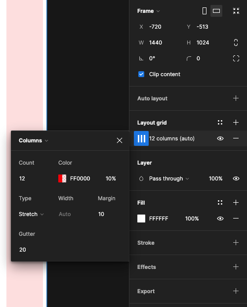
For example, if you create a new desktop frame in Figma, you can click on the Layout Grid section on the right panel menu. You can select the type of grid you want to create, either column, rows, or grid.
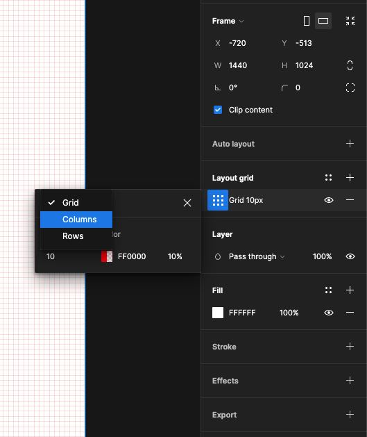
As seen in the image below, you can also set up the number of columns, gutter, width, and margin in one place.
Tips for designing an effective website grid
When creating grids for your project, you must know a few tricks to create an effective website layout faster and avoid pitfalls. Below is a list of tips that you can follow when creating your grid:
Define your content hierarchy
This means determining which web content is most important and how they relate to one another.
Use a pre-built grid system
like the 960 Grid System to streamline your website design workflow. These systems provide a framework for organizing content on your website and can save you time and effort in the design process.
Break the grid when needed
There are times when you need to break the rules significantly if it benefits the overall aesthetics of your website design project.
Use whitespace
whether it's a negative space or a common white space. White space can improve readability and create a more balanced layout.
Test and iterate
Once you've designed your grid, testing it with real users and noting possible improvements is essential.
Examples of best practices in grid design
In this section, we'll look at three notable website grid examples.
USA Today Website

Our first example is from USA Today, a news publishing company. The website design of USA Today used a column grid layout to organize its content into three columns. This means that there are three elements or a group of elements you can put in these columns per row. The grid structure and elements are organized and properly aligned. The gutters are also consistent and provide room for separation between each news block and links. Overall the website has a balanced design that is easy to navigate even if you are just a first-time visitor on their website.
LM Chabot
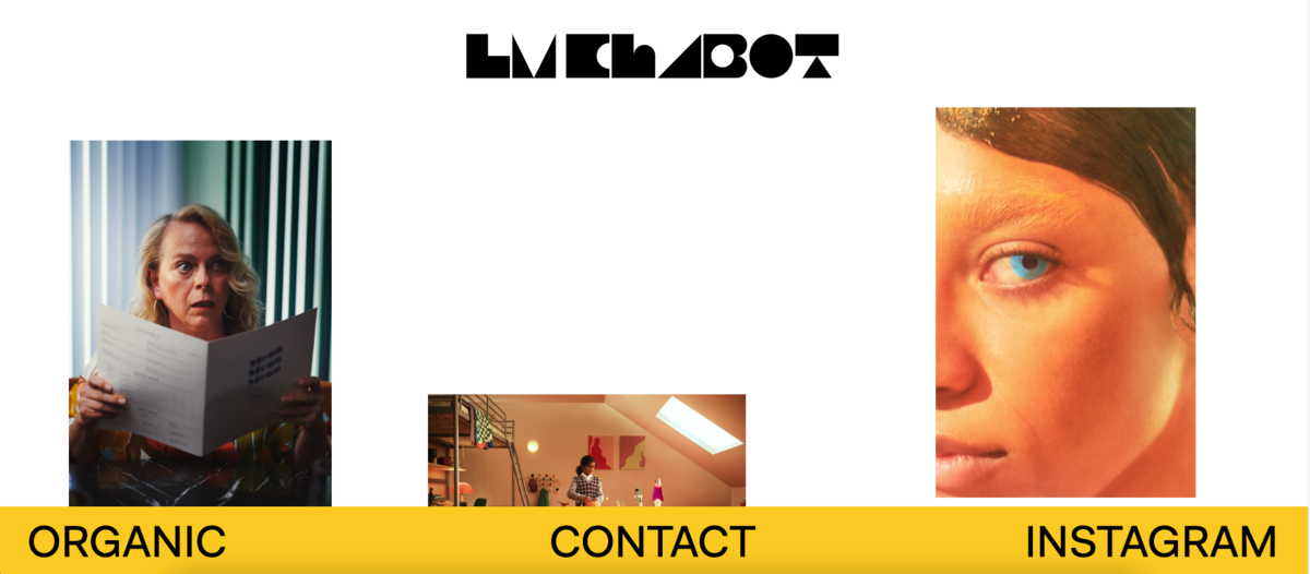
The second example is from LM Chabot, a photographer's website. This website features an asymmetrical and unconventional layout, showcasing off-centered images from a white background. The design integrates irregular content placement to create a unique visual experience while preventing tired row-column displays typically seen on most websites today. While the website breaks the standard grid formats, it presents the featured work in a minimalist yet conveying way.
Dribbble
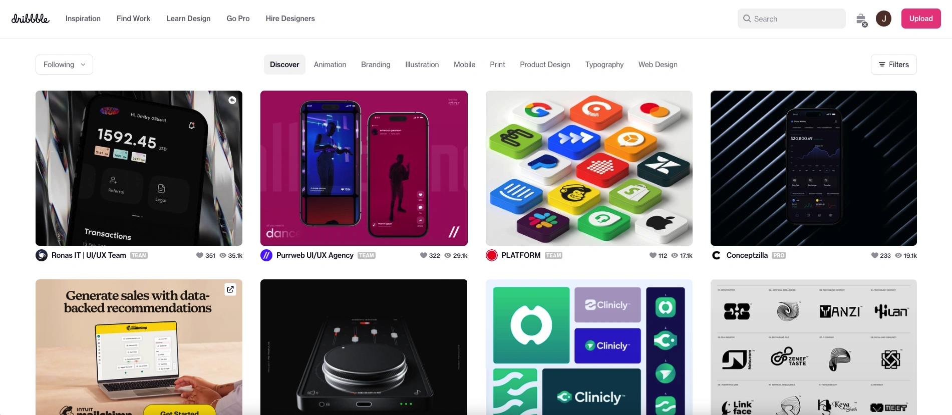
The last example is from Dribbble, a design library website. Dribbble utilizes a modular grid and consistently uses equal-sized modules for every breakpoint. The gutters are also equally sized horizontally and vertically and contain proper margins, making the content more readable and providing a great user experience even on different viewports.
Types of Grids in Web Design
There are three typical grid types used in website development. Depending on your goal, each grid may be best for a particular case.
1. Column grid
The column grid is the most common website design and development grid system. Column grid works by dividing the layout into a series of vertical columns where you organize and align web elements or contents—the column grid help to develop a design for various sizes of screen devices.
In summary, the column grid provides limitations that allow you to quickly decide how to arrange the web contents without overthinking.
2. Modular grid
The modular grid is an extension of the column grid, which displays content in a modular or block-like format. A modular grid includes the junction of columns and rows to create a series of equally sized modules or blocks, which can be used to organize the content.
Modular grids do not specifically use material design as many designers assume, but they can be used with material design principles to create a consistent and cohesive design system.
3. Hierarchical grid
A hierarchical grid organizes content using columns and rows to be displayed hierarchically. This involves dividing the layout into a series of horizontal rows and vertical columns, where the most important elements or content are placed at the top and the least important at the bottom.
What is a responsive grid?
While a responsive grid is not a part of the common types of grids, it is an essential design element when creating mobile-friendly websites. A responsive grid system is used in website design to create a grid layout that can adapt to different screen sizes. It utilizes a combination of flexible units, such as percentages, rems, and media queries (using minimum and maximum width) to make a responsive layout.
Best Practices of Using Grids in Web Design
Grids can help you arrange different types of content across grid layouts intuitively. Understanding the basic terminologies of a grid system and implementing the principles of design and best practices will enable you to create a professional-grade and effective website that provides a great user experience.
Below are some of the best practices to consider implementing when working with grids, especially if you’re just getting started:
1. Choose the correct type of grid for your needs
There are different types of grid layouts that you can use, such as column grid, baseline grid, hierarchical grid, modular grid, and responsive grid (more on this later). Choosing the best grid system for the project can help you compose a better visual design and consistency for your website. Most grids contain elements of design that are helpful for many situations.
For example, a hierarchical grid may be the best choice for a web page with only one or a few essential items. On the other hand, modular grids may be more suitable for a web page with a lot of varied content, as it provides more room for arranging and grouping content.
2. Use a consistent grid throughout your design
A consistent grid is crucial to creating a cohesive and organized design for your website. This will help your visitors navigate your website and find what they want.
3. Place your content within columns, not gutters
Columns and gutters create a structured and organized design in a grid-based layout. To ensure that content is aligned correctly, it's important to always place content within the columns and not in the gutters. The gutters should always remain empty to create a form of separation between the contents.
4. Create a balanced grid
A balanced grid to create a harmonious design ensures that every content has the same size, same width and is evenly spaced. This also ensures that white space is added between each element. White space is crucial in web design, promoting readability, hierarchy, scalability, and breathing room between elements.
5. Incorporate responsive design
Responsive design has been a widely used concept, and integrating it into your grid design will benefit your project significantly. A responsive grid will look good on all devices regardless of screen size when a web page is designed responsively. A responsive grid or fluid grid is a grid system that automatically adjusts its layout and spacing based on the screen size of the device it's being viewed on. This allows the content to be arranged and aligned in a grid layout (with the same size and same width) that logically represents its information hierarchy.
6. Always test your grid
Testing has always been a crucial part of every design and development process. Once you've established your grid structure, you must conduct grid testing to ensure that your content and all elements are aligned and positioned correctly. If necessary, make adjustments to create a seamless and practical design.
Common mistakes to avoid when using grids
While grids are very helpful in creating visually appealing and well-organized design layouts, it's easy to make many mistakes with their underlying concept and practices, especially when you are just starting.
Below are some common mistakes when using grids in web design:
Not using the right grid
For every type of content or website component, there is always the right grid system depending on your project need and goals.
Not aligning content within the column
Aligning content or elements within the column is one of the notable mistakes most web designers make when using grids. Placing contents within the gutters and not inside the columns can create an unbalance and disorganized layout design.
Over-reliance on pre-built grid systems
It's okay to rely on existing grid systems to speed up your workflow. However, you should also analyze if the pre-built grid system you are trying to use is the best grid for your project. Sometimes, you need to build your own depending on what you are trying to achieve.
Not considering responsive web design
Grids should be flexible and responsive, adapting to the size of the screen. Make sure that your grid works well on different devices and resolutions.
Using too many columns
While columns are the building blocks of every grid layout, having too many columns in your grid can make your design feel cluttered and overwhelming.
Overused of wider gutters
Wider gutters mean less space for content. If the gutters are too wide, the content can feel cramped and difficult to read.
Overthinking about breakpoints
While breakpoints help utilize responsive design, you don’t need to define breakpoints every time. In particular situations, a content's width/size and appearance are sufficient for most viewports.
Not using proper spaces
White space is essential to any design, and grids can help ensure your spacing is consistent and balanced. Using the right amount of space can make your website more organized and manageable to read and understand.
Wrapping Up
Grids not only provide web creators a structure to start but can also provide design elements to create professional-grade websites that are readable, adaptable, and organized. Utilizing a grid system in your project can help you build well-aligned and predictable grid-based interfaces that can structure contents logically and efficiently.
How you use and set up grids can affect the overall results of your design efforts as it reflects every detail of your content’s hierarchy and appearance.
To end, it's essential to familiarize yourself with a grid system's common terminologies, principles, and best practices to create a cost-effective website that can attract and engage visitors.

Creates insightful, strategy-driven content that translates complex design and branding concepts into accessible knowledge, supporting Ramotion’s mission to elevate digital experiences.