Introduction
Website forms are a universal element of the web. Almost every person who has access to the internet has filled out forms online at least once in their lifetime. They are part of every website, blog, landing page, and e-commerce store.
Many meaningful interactions on the web are associated with them, from a registration form, checkout form, and even inside our e-mail inboxes. Web forms are used in various industries, such as business, government, and health.
Without forms, the web would lack essential features and become a one-sided, passive experience where users can only consume content without any means of interaction.
Web forms play a vital role in making the website interactive and dynamic. They allow users to create, update, delete, and perform various other actions. Whether creating user accounts, purchasing products, collecting data and user insights or working on a full-scale business service.
They serve as a bridge between users and digital services, allowing individuals to interact with websites, applications, and online platforms efficiently and effectively.
These interactions are necessary to prevent the web from being so dull and static, making it look like you are reading a magazine or an old-school static webpage.
While some people dislike filling in web forms, there are plenty of reasons why form design matters. Forms may not be the most compelling part of web design, but every design detail of a website form is pivotal.
Website forms connect users to the database side of every website or application and perform actions to achieve their end goal. Poor form design can lead to confusion and an unpleasant user experience. In contrast, a good form design can provide excellent service and enhance user experience.
When the website design team craft web forms, users should be able to understand the instruction and communicate their desire easily without leading them to any form of potential errors. In some cases, it is more efficient to work with an experienced web design agency that can refine complex forms and keep them aligned with usability best practices. With aesthetically pleasing web forms, it's feasible to entice visitors to fill up every required field and submit the intended information.
However, achieving a positive user experience goes beyond the beautiful visual appeal, interactivity, and technical functionality. A great form consists of many aspects to guide users effectively and fulfill their expectations, such as providing an intuitive layout that follows standard design conventions, visual cues to indicate the type of information, real-time validation, etc. (more on this later).
The impact that form design can have on crucial metrics such as form completion and error rates depends on various factors, including business goals, user needs, and the specific context in which the forms are used.
What is a Web Form?
A web form is an interactive website element that people fill out inside the browser. This enables users to fill out input fields, click radio buttons, choose from drop-down menus, perform interactive actions and submit information.
Web forms collect data from at least one party and deliver it to others to accomplish a particular purpose. This can be purchasing a product, giving feedback, sending inquiries, signing up or signing in, or simply searching for information on a website.
Technically speaking, a web form is based on three core technologies: HTML, CSS and JavaScript. However, web forms can be built using popular front-end frameworks, libraries and page builders to streamline the development process and enhance the form's features, including:
Why are web forms essential?
A web form is one of the best ways to get input from users and indirectly establish a connection with them. For organizations treating forms as revenue-critical touchpoints, it can be effective to collaborate with best website design companies so the form experience supports brand trust, accessibility, and conversion goals end-to-end. Web forms are integral parts of the web for several reasons, including:
- It allows you to collect, save, and manage essential and sensitive user information.
- It enables you to actively engage with the users, forming a two-way communication method between users and websites.
- Facilitates user registration and login processes. Forms allow you to create, update, delete, and maintain user accounts.
- Provide real-time feedback and user guidance and avoid errors to complete online transactions faster.
- It enables you to collect feedback from visitors and customers. Forms can be used to conduct surveys and gather user feedback.
- Automatically streamline data collection and processing.
- Provides a tool for lead generation and marketing methods.
- It allows you to make personalized content, offers, and recommendations using collected information or insights from visitors and potential customers.
Essential Principles for Web Form Design
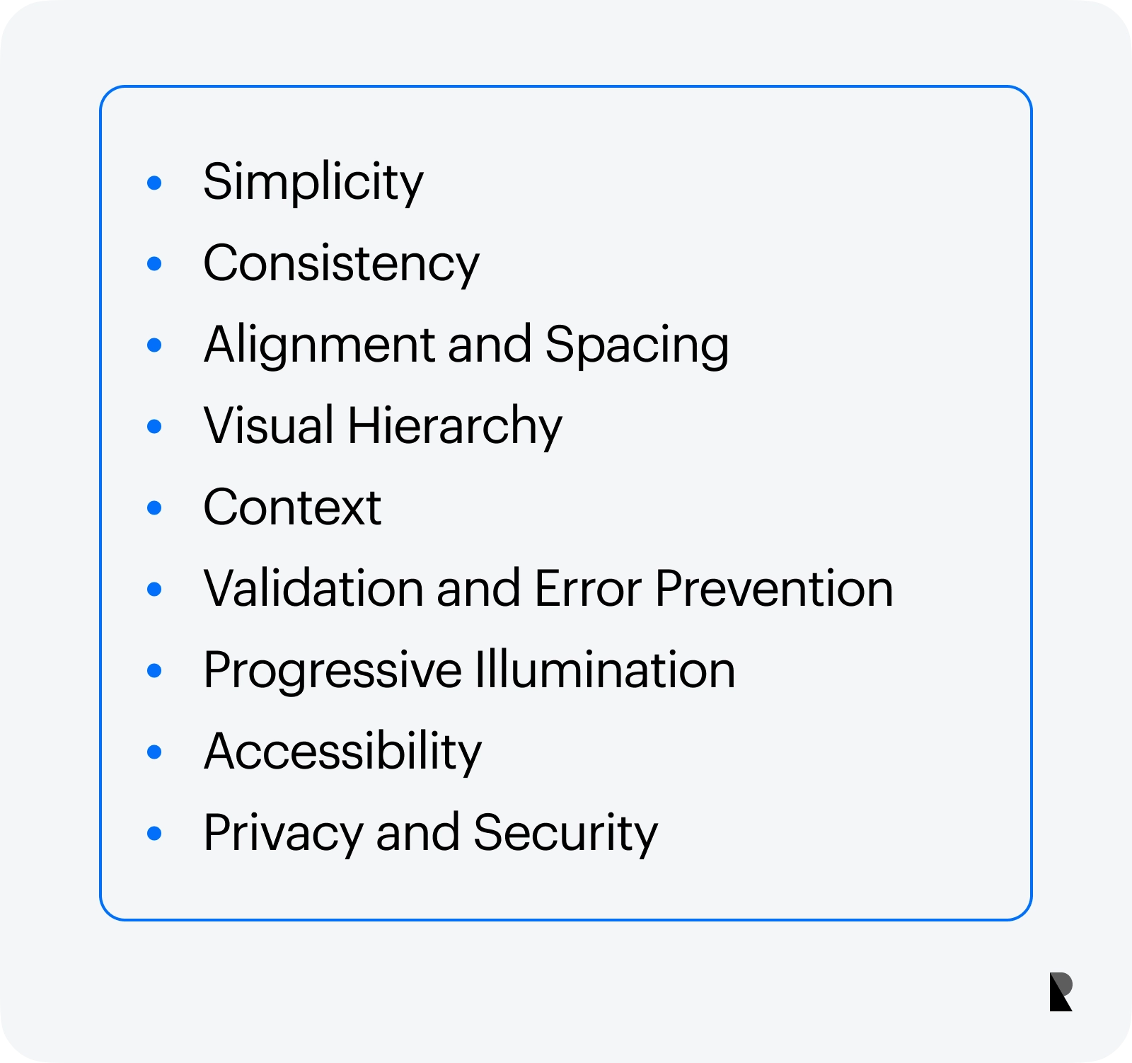
Web form design principles are the guiding light for optimized and effective form strategies. They articulate the fundamental goals of web forms to help you create practical, user-friendly, and aesthetically pleasing form designs.
As a web developer, adhering to these principles can increase your form's completion rate, minimize potential errors, and improve the overall user experience.
Simplicity
Users only have a little time to check what lies on the other side of a form. Keeping the form layout clean and straightforward can speed up completing forms.
Get rid of irrelevant input fields in a form and use concise labels, instructions, and error messages to guide users through the form.
Consistency
Web forms served as a bridge for conversation between customers and the website. Maintaining consistency can ensure that your website looks coherent and works harmoniously across other web elements. Use consistent fonts, colors, and visual cues on your form fields to provide a cohesive user experience.
Alignment and Spacing
Not only do you need to make the form simple, but also readable and organized. Proper alignment and spacing create a visual structure between input fields to improve overall readability and efficiently navigate it.
Visual Hierarchy
Do not throw fields everywhere when creating web forms just because you can. Layout elements logically and strategically by highlighting required input fields, labels, and CTAs to direct users' attention. This gives users easy navigation and a positive experience when filling out form fields.
Context
Web forms do not usually exist in isolation. They are usually part of a broader context that influences their design, purpose, and usage. Group related information into one block. Use them in the context where they belong to showcase the resemblance of the flow of questions for a particular context.
Validation and Error Prevention
Users tend to create errors. It's essential to consider users' experience when they deal with error messages. When they are frustrated, there is a big chance of abandoning the form.
Anticipating user errors and designing the form to minimize them can help avoid this situation. Use inline hints and examples to assist users in providing correct information.
In addition, you also need to implement real-time validation to catch errors as users enter data and provide clear error messages to help them fix the error.
Progressive Illumination
The goal of every form is to get it filled by the users. But how can people complete the goal? This can be achieved by presenting a single column or one column in every form field on short forms to avoid confusion and converting complex and lengthy forms to multiple steps (also known as stepped forms) to avoid overwhelming users.
This is extremely helpful when working with a checkout form. If necessary, reveal additional fields dynamically and add a progress bar for the users to follow the process flow easily.
Accessibility
To provide an inclusive and seamless user experience across diverse users (such as those with disabilities) and screen sizes, considering accessibility across all field settings and devices must be carefully integrated.
Use the correct labels, ARIA attributes, and form elements that work with assistive technologies. Make it responsive or adaptable on various devices, especially for mobile users.
Privacy and Security
In most cases, online forms aim to collect personal and sensitive data from users, such as names, addresses, and e-mail addresses. Communicating how user data will be protected and secured is essential to every form design.
Integrating privacy measures (e.g., GDPR in the European Union) ensures regulation compliance and helps avoid legal consequences. Display trust badges or security symbols can also boost user confidence when filling out the forms on your website.
Website Form Design Best Practices
User experience involves more than visually appealing form designs with robust code. Here are some best practices you can use in web form design.
1. Keep it simple
Create forms with a simple layout and uncluttered information. A simple form can be completed faster than a complex and crowded form. When designing forms, only include vital information to avoid overwhelming users with unnecessary fields or complex structures.
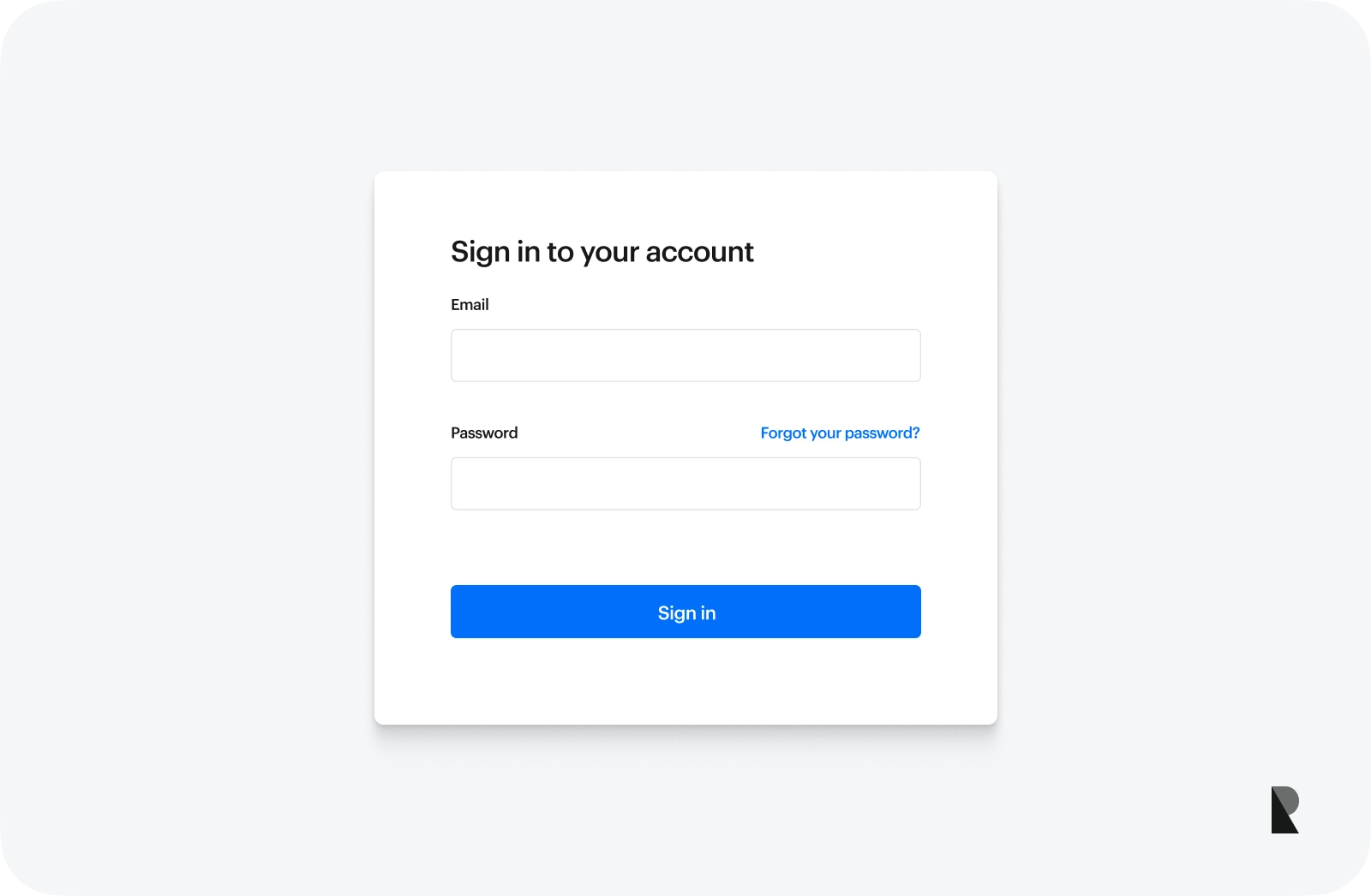
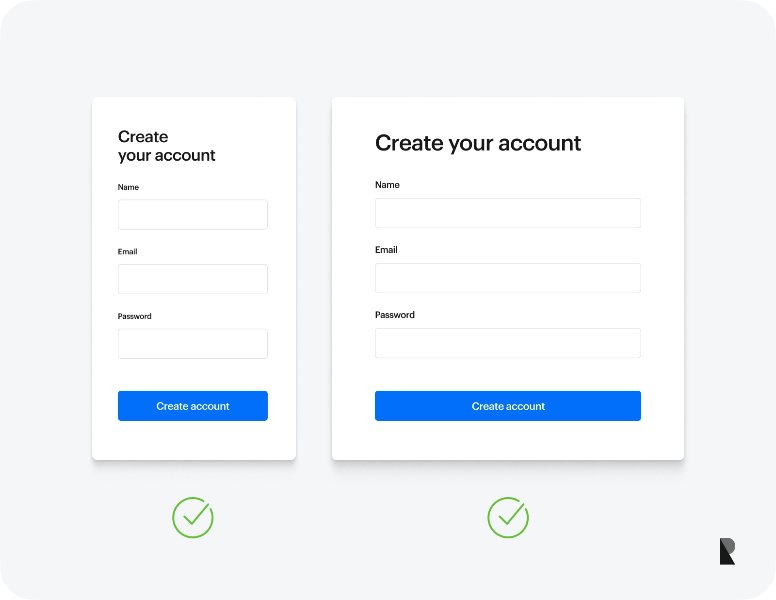
2. Use a single-column layout
According to a study conducted by the CXL Institute, users completed the linear, single-column form with an average speed of 15.4 seconds faster than the multi-column form. This is 95% faster than the average form completion process.
One column or single column layouts are easier to read, comprehend and complete, especially when filling up a web form on mobile and tablet devices. This is extremely helpful when creating a long form or multiple-step form. A long form contains many fields or questions for users to complete. Using a single column layout with interactive steps can ease the scrolling actions and save users time filling out long forms.
3. Use multiple columns only when necessary

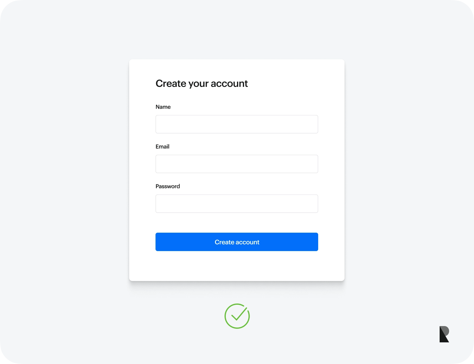
Sometimes, you need to use a multiple column layout for longer forms. For example, if a sign up form contains many fields, you can use multiple columns to reduce the overall length of the form and make it more visually appealing. However, it would be best to group closely related fields, such as personal and educational information, to ensure user clarity when filling out the sign up form.
Another instance is when selecting a product or service package with different features or having a long list of options (multiple choice). Breaking them into multiple columns can reduce the vertical scrolling of the website form.
4. Always align text to the left
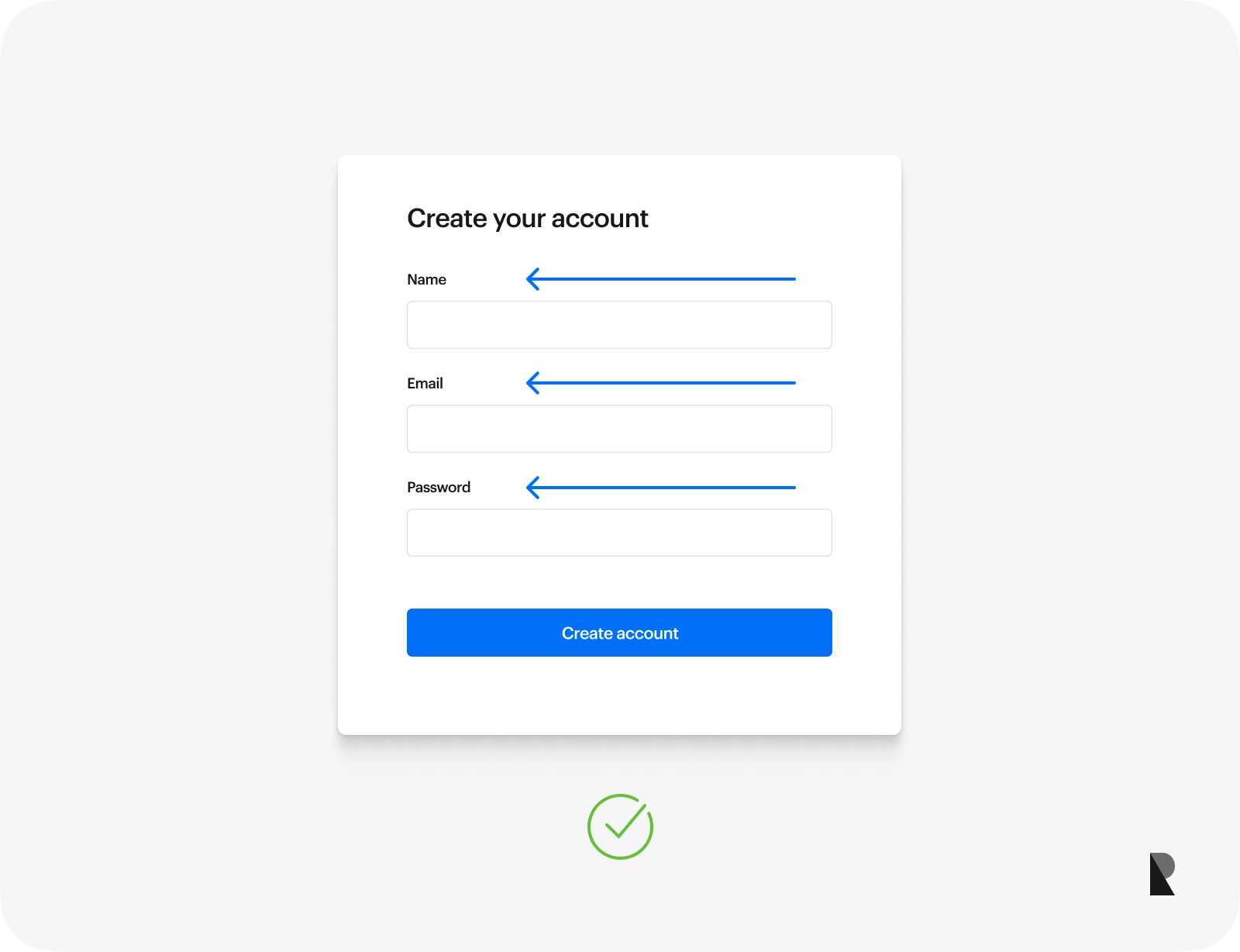
Website forms can be positioned freely anywhere on a web page. However, all text, including labels, fields, and placeholders, should be permanently left aligned to create a clean and organized form field structure. This increases the legibility of every form field and decreases the user's eye movement across the web page.
5. Provide real-time validation and feedback
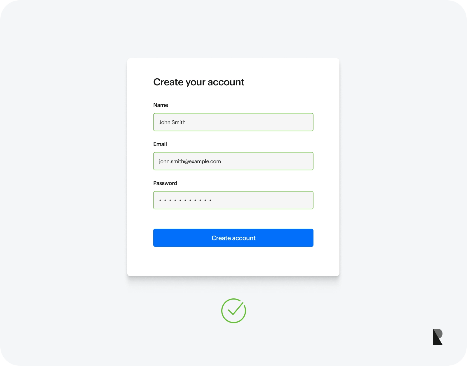
Users are prone to and will always make mistakes. Providing them with real-time validation can ensure complete and correct responses. Use tooltips to display error messages gracefully.
However, only validate form fields after each input field is filled. This is extremely important, especially on a sign up form, as it's annoying to see an error message before you even finish typing in the form field.
6. Group related form fields together
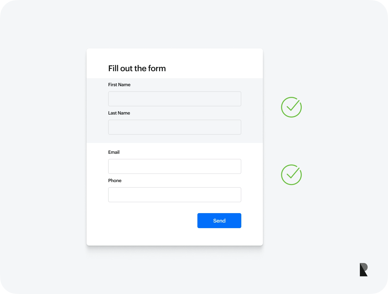
Form fields should be grouped appropriately and organized according to their relation. This helps users understand the context of the information being required.
For example, in a sign up form, personal information fields like name, e-mail, and address should be logically grouped.
7. Take advantage of the browser's autocomplete feature
Re-entering your personal information for the nth time is very tiring. Autofill or autocomplete feature comes with modern browsers (such as Google Chrome, Mozilla Firefox and Microsoft Edge). It automatically fills out a website form according to previously filled-in form fields.
A web form design should include form field attributes such as name, e-mail or address to allow the browser to autofill the form fields and help the user complete the form.
8. Incorporate reCAPTCHA
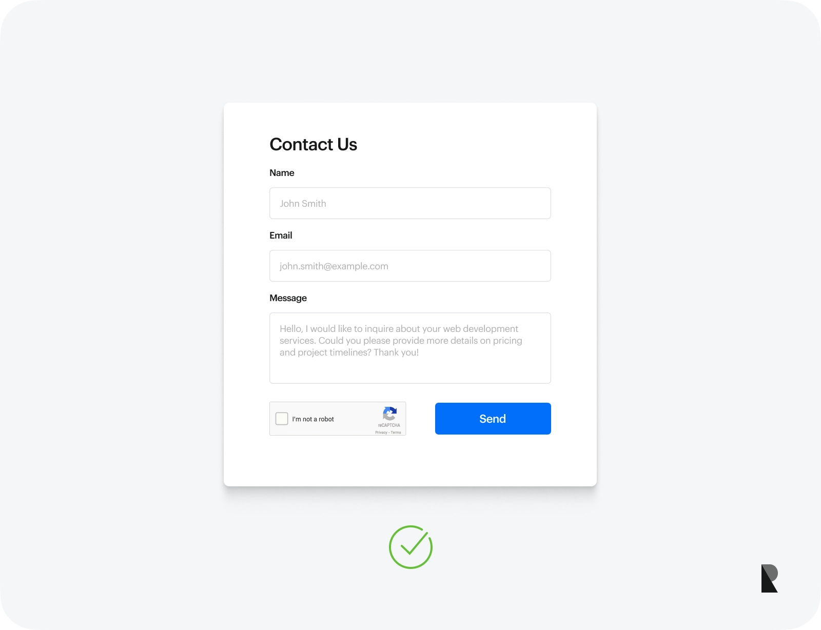
One of the most significant parts of the website form design is integrating reCAPTCHAs instead of traditional CAPTCHAs. reCAPTCHA is an improved version of CAPTCHA made by Google and is more advanced than the traditional CAPTCHA.
Google's reCAPTCHA offers more user-friendly verification challenges by solving puzzles or identifying an object to secure a website form. This is a less frustrating and more accessible way for users to prove their identity as humans.
9. Integrate accessibility and responsive design
With the increasing use of mobile devices, a significant portion of website traffic comes from mobile and tablet devices. Creating a web form design that is responsive and accessible across a wide range of devices and screen sizes can provide a better user experience for mobile users and other smaller devices, ensuring that users don't need to zoom in or scroll horizontally to view and fill in your forms.
Furthermore, using ARIA attributes can enhance the accessibility of dynamic or custom UI components and make it understandable for individuals who rely on screen readers.
10. Use a form builder/page builder to speed up the form design process
For most CMS like WordPress and Joomla, you can use a form builder to speed up your web form design process. Form builders come with a user-friendly interface that allows you to drag and drop form elements with pre-designed templates and themes that contain consistent and customizable design across your forms.
A form builder reduces manual coding, making the development process faster and more intuitive.
Common Mistakes to Avoid When Designing Web Forms
Mistakes can hurt your chances of converting prospects to customers, whether in a sign up form or checkout form. To avoid designing forms that make users confused and displeased, here are the common mistakes in form design.
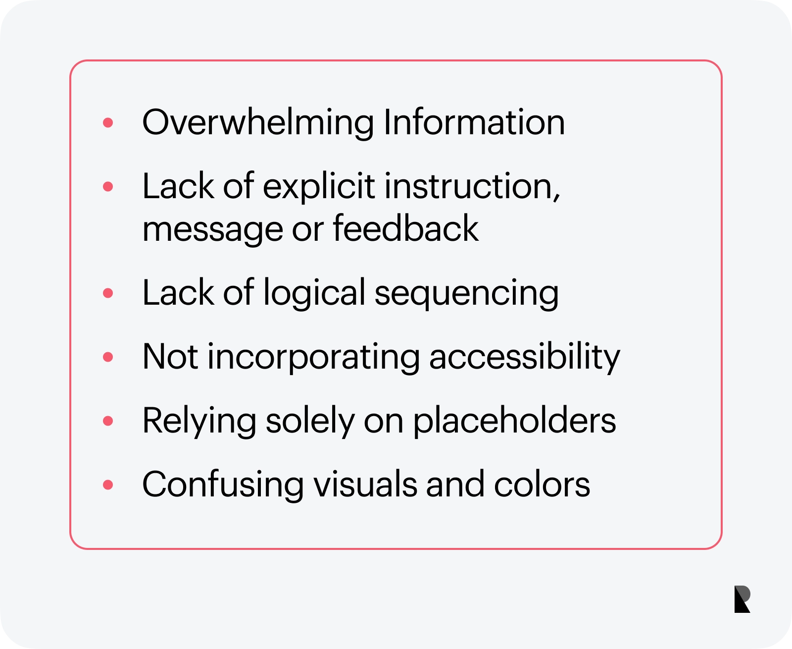
1. Overwhelming Information
Time is gold. The same goes for the user's time. Asking for excessive or unnecessary information can overwhelm users and lead them to abandon your form. Keep your forms concise and straightforward. Only asked for essential details and provided fields directly relevant to the form's purpose.
For example, if you create a contact form, limit your input fields to name, e-mail and message. Do not add too much information, such as address, birthday or other complex fields that aren't necessary for this purpose.
2. Lack of explicit instruction, message or feedback
Instructions or messages are an essential part of every web form. Excellent web forms design are often accompanied by descriptive messages and visual cues and offer contextual guidance on rectifying the issues. Failing to provide clear instructions and feedback can confuse and frustrate users.
3. Lack of logical sequencing
Placing form fields all over the web form section can be a baffling experience. Organizing form fields logically and orderly set users' thought processes on what to be asked next. Group related form fields together and provide explicit instruction on isolated form fields. For example, group the personal information and credit card or bank details in one section or column if creating a checkout form.
4. Not incorporating accessibility
Designing web forms to be responsive and accessible ensures that all users, regardless of disabilities or use different types of devices, can effectively interact with and complete the forms.
Not using responsive web design techniques to cater to different screen sizes and orientations can make it difficult for users to view and fill in your form. Furthermore, not using proper labels, semantics, and ARIA (Accessible Rich Internet Applications) roles and attributes can limit the users you can support.
5. Relying solely on placeholders
While placeholders can provide a visual cue on what to expect on a form field, they can create usability issues, especially after disappearing once the user types something on the input field.
To create a more positive user experience, use labels and placeholders to ensure users understand what to put in the input field even after entering data.
6. Confusing visuals and colors
Visuals and colors convey essential information on a web form. Using the wrong type of visuals, such as labels, text, colors and icons, can confuse the users.
Consider adjusting the text properties, highlighting fields with errors using a border or background color, and using icons to make the form fields evident in what you want the user to enter. Using colors to indicate success, errors, or warnings can also help users understand the status of their input.
How to create a website form?
There are many ways to create a web form, whether through coding or using various CSS libraries and platforms. Below is a guide that takes you from the ground up on how to build a form, along with the key elements you need to consider:
Step 1: Identify the purpose of your web form.
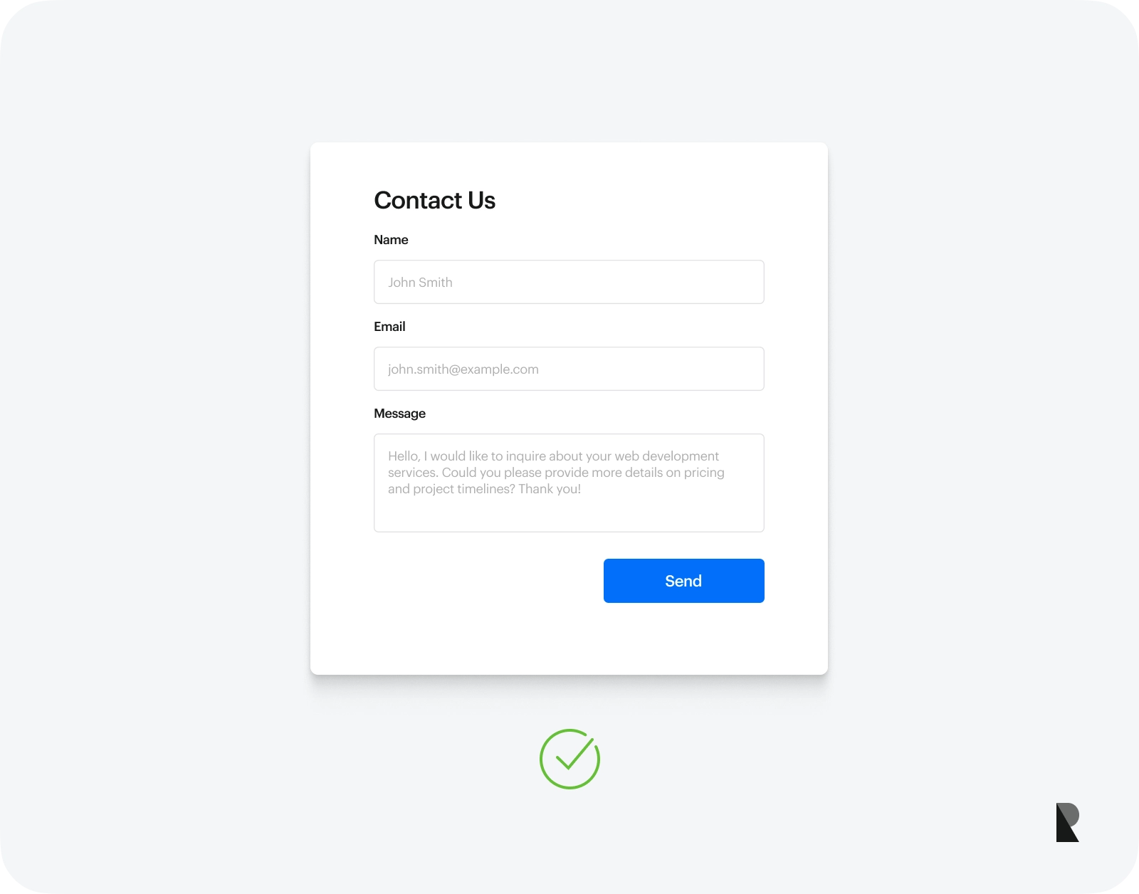
Before you can start building web forms, you'll need to define the purpose of your form. Are you creating a contact form, signup form, or subscription form? You need to determine what type of web form you want to create.
Note: For the sake of an example, we will build a simple contact form in this part of the article. We won't dive deep into the server-side code due to its complexity and the required time.
Step 2: Determine which form fields are needed
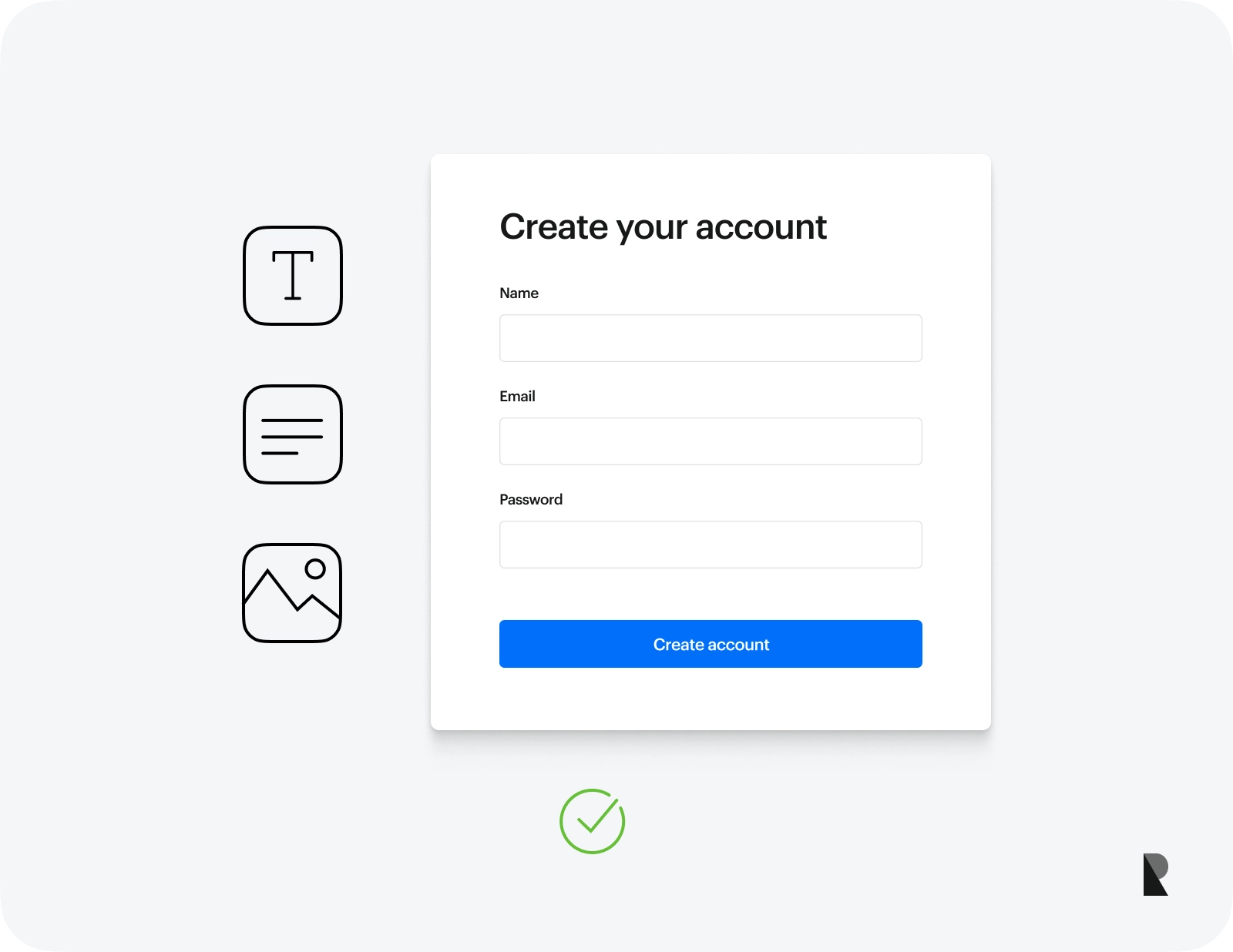
Once you've identified what type of web form you want to build, you need to list all of the user information you want to collect on your form. This can include name, e-mail, address, phone or other relevant information.
We will include our example's name, e-mail, and message input fields for our example.
Step 3: Choose a development method.
As cited above, there are many ways to build a form. The most common way to make a web form is by manually coding it in HTML and CSS.
If you are uncomfortable coding, use a CSS framework like Bootstrap or a CMS form builder called Elementor (for WordPress) or SP Builder (for Joomla).
We will use HTML and CSS to build our form for our example.
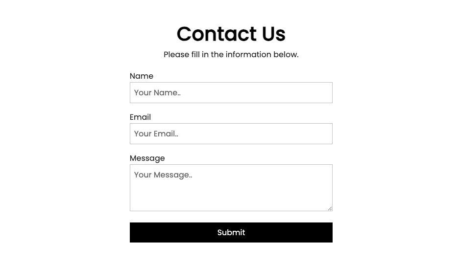
Step 4: Create the markup
HTML5 has a form tag representing a document section containing all form fields. For this example, we will create an input text field for the name and e-mail and a text field for the message. We must include a submit button to capture and submit users' data.
See the code below.
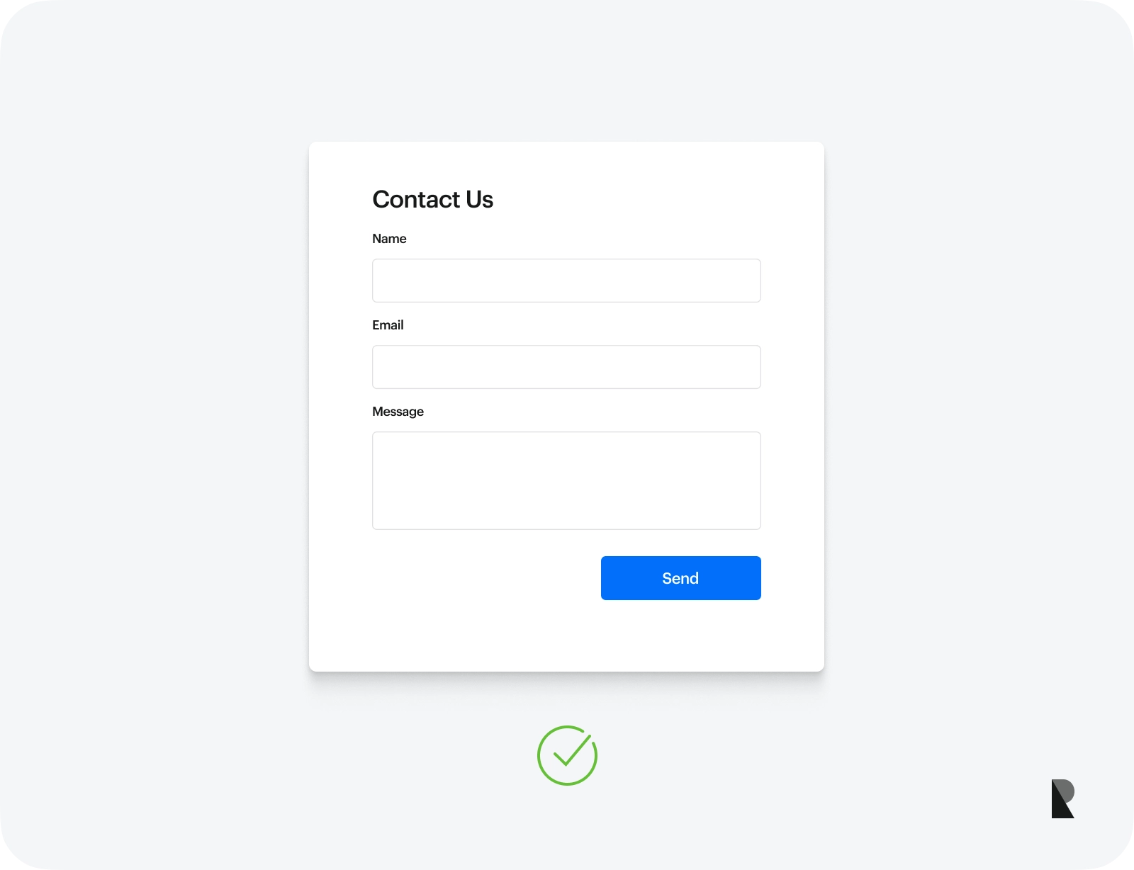
<h2>Contact Us</h2>
<p>Please fill in the information below.</p>

    <form action="" method="post" autocomplete="on">

        <label for="name">Name</label>
        <input type="text" name="name" placeholder="Your Name.." required>

        <label for="email">Email</label>
        <input type="email" name="email" placeholder="Your Email.." required>

        <label for="message">Message</label>
        <textarea name="message" placeholder="Your Message.."> required</textarea>

        <input type="submit" value="Submit">

    </form>
Note: On the code above, we use the required attribute to specify that input fields must be filled out before submitting the form. This is an example of a browser-based validation. Nonetheless, you can use JavaScript to add more advanced form validation.
Step 5: Add style with CSS3
CSS allows you to style web forms according to your preferred design. Many underlying style properties target HTML tags, including headings, paragraphs, labels, input fields and buttons.
Below are the styles for our example contact form.
@import url('https://fonts.googleapis.com/css2?family=Dancing+Script:wght@400;500;600;700&family=Josefin+Sans:ital,wght@0,100;0,200;0,400;0,600;1,100;1,200;1,300;1,400;1,500;1,600&family=Nunito:ital,wght@0,200;0,300;0,400;0,600;0,700;0,900;1,200;1,300;1,400;1,600;1,700;1,800;1,900&family=Poppins:wght@300;400;500&display=swap');

*{
  margin: 0;
  padding: 0;
  box-sizing: border-box;
  font-family: 'Poppins', sans-serif;
}
body, html {
  color: #333;
  display: grid;
  max-width: 100%;
  place-items: center;
}

h2 {
  margin: 0;
  font-size: 2.5em;
  font-weight: 600;
 color: #000000;
  margin-top: 5rem;
}

p {
  margin-bottom: 1.2rem;
}

form{
  width: 50%;
}

form label{
  font-size: 1rem;
}

input, textarea, button {
  width: 100%;
  font-size: 1.2rem;
  padding: 0.5em;
  border: none;
}
input[type="text"], input[type="email"], textarea {
  margin: 0 0 1em;
  border: 1px solid #cccccc;
  outline: none;
}

textarea {
  height: 6em;
}
input[type="submit"], button {
  background: #000000;
  color: #fff;
  cursor: pointer;
}
input[type= "submit"]:hover, button:hover {
  background: 'black';
}
Step 6: Add server-side code functions to enable the form submission
For the form to submit and capture the user data, a server-side programming language such as PHP or Ruby should be integrated into the code.
We won't add advanced server codes in our example as it would be a lengthy topic. Please refer to the PHP and Ruby documentation to learn more.
Step 7: Publishing your web form on the web.
The last step that you need to do is to upload the HTML and CSS files on your server. By default, once you upload the contact form codes on your server, the output will look like this:
Examples of Website Forms Design
Below are some of the most inspiring web forms you can learn by example to revolutionize your web form design skills.
1. Toptal Multistep Form

Toptal seamlessly used the multi-step form to guide users through the process while incorporating the suitable form fields to ask. Instead of using a multi-column layout, they used a dynamic step form while conversing with users on each step. At the end of the form, they capture users' data to pitch their platform and services more personalized according to their potential customer's needs.
2. Spotify Pets
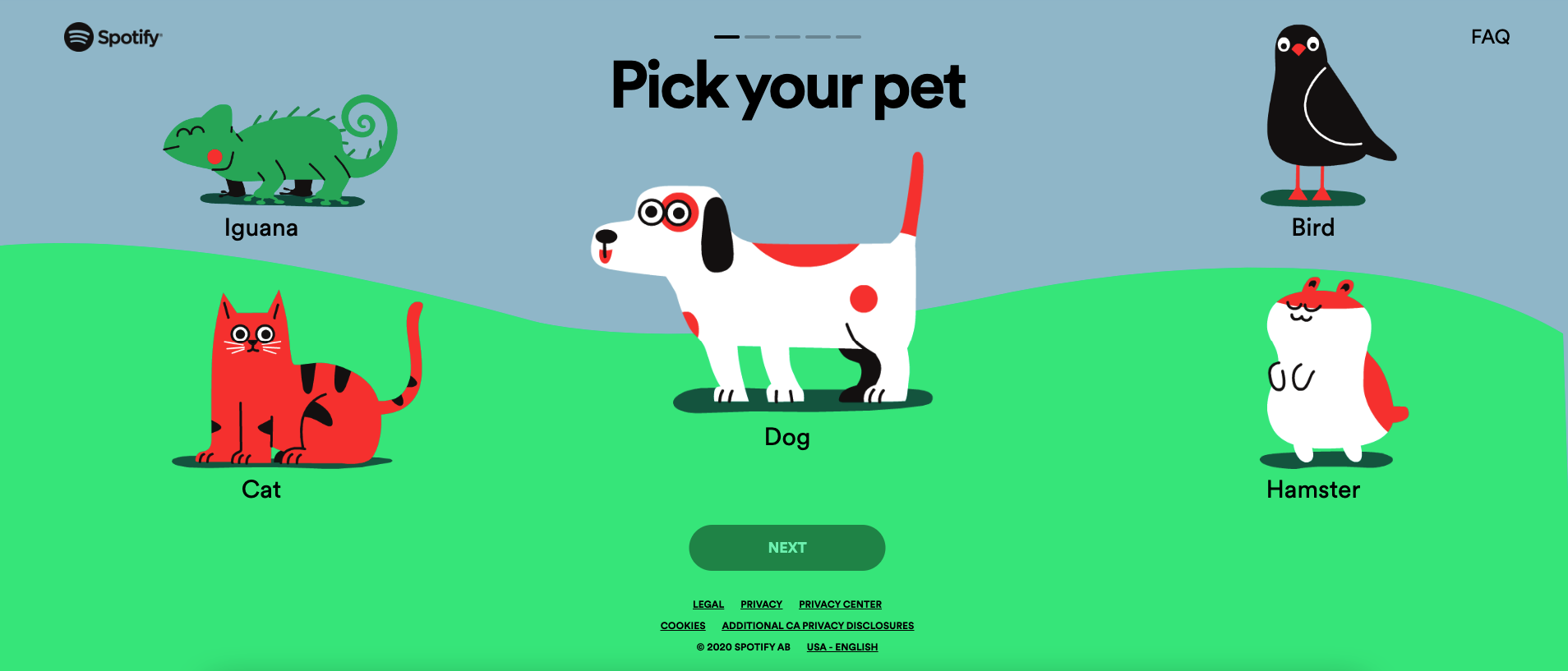
Spotify Pets has raised the standard for questionnaire forms by integrating graphical interfaces and animations. This innovative feature exists within the larger Spotify platform, known for its music and podcast services. It utilizes the platform's sophisticated algorithm to generate playlists tailored for pets and owners.
3. Bed, Bath & Beyond Checkout Form
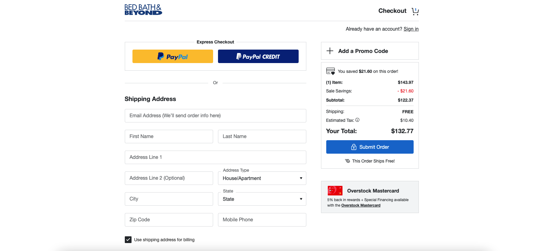
Bed Bath & Beyond, a global homeware brand company, offers its users a clean, straightforward and intuitive checkout process by effectively demonstrating the principles of a user friendly checkout page. With a wide array of bedding, bathroom, kitchen, and home décor products to check out from, it focuses on essential information and form fields to minimize checkout friction.
4. Duolingo Onboarding Page
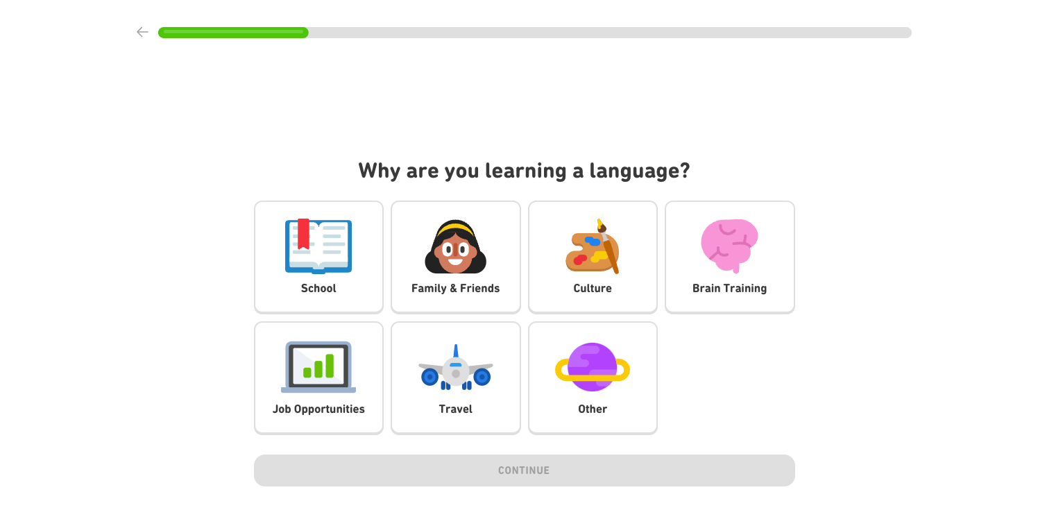
Duolingo's personalized onboarding form process showcases a smooth approach to user engagement and goal-setting. Known to be a language-learning platform, Duolingo's onboarding form assists users in defining their language-learning aspirations.
It provides a flat design-inspired multi-step form for users to select the language they wish to learn and identify their learning path. Duolingo's personalized forms for language selection and learning path set a benchmark for seamless onboarding experiences.
5. GetResponse Signup Form
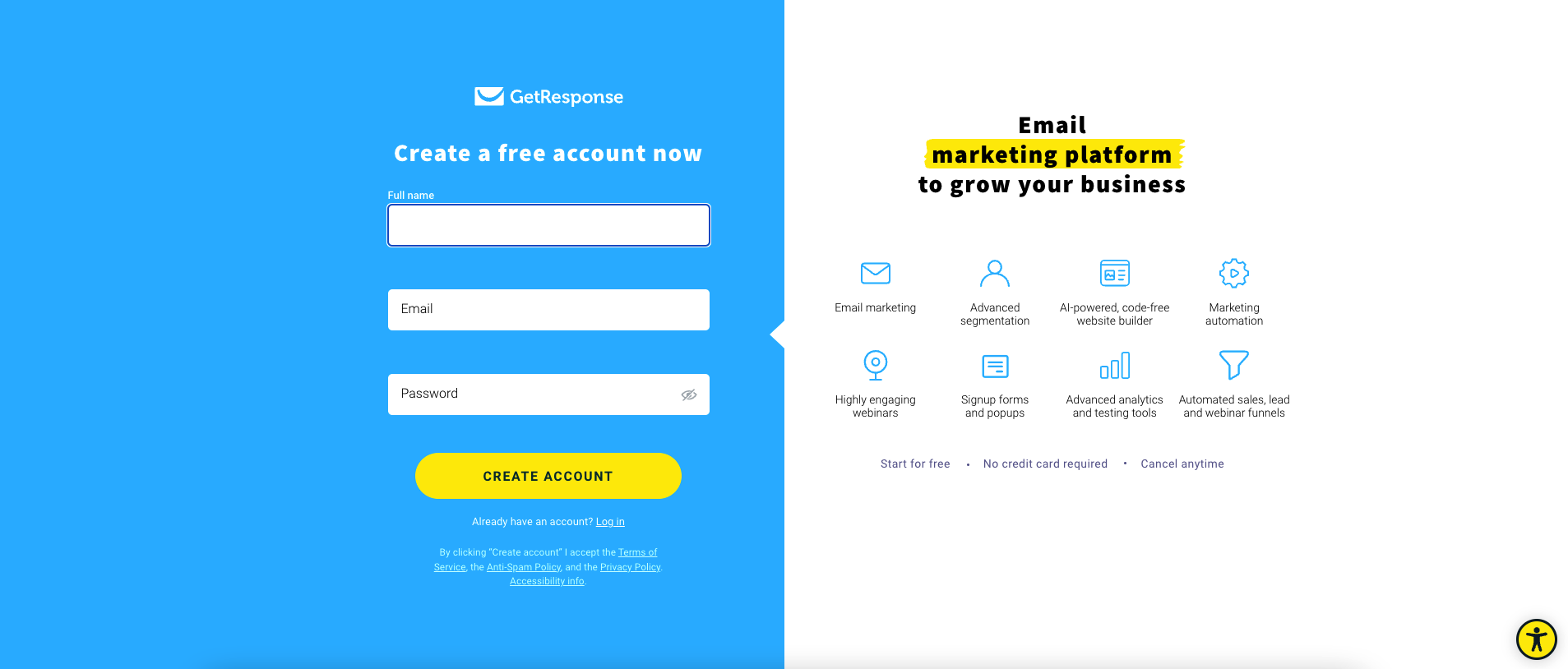
GetResponse, a prominent e-mail marketing and lead generation software form, combined design aesthetics with effective communication on its signup page.
The signup page harmoniously integrates the signup blue background theme form with a strategic pitch of its services on the right column. Its form layout reflects a careful balance between informing potential users about the software's capabilities while maintaining a visually appealing interface.
Craft your forms prudently
Web forms are a crucial part of every type of website. Creating and optimizing visually appealing and user-centered forms can enhance the user experience and form completion. Whether you're involved in e-commerce, service-based industries, or any other type of business, a well-designed form can significantly impact user engagement and satisfaction.
Always consider the appropriate form information, visuals, and functionalities to make the form submission process efficient and pleasant, ultimately leading to higher conversion rates.

Creates insightful, strategy-driven content that translates complex design and branding concepts into accessible knowledge, supporting Ramotion’s mission to elevate digital experiences.