
The website carousel remains one of the most debated design patterns in modern web design and user experience (UX).
For some web designers, it is an appealing approach to display various types of content inside the confines of a limited space in a webpage. This means visitors only see one thing at a time while they scroll or navigate through the slides. Others see it as a usability flaw that hides crucial information behind slides most visitors never see.
Carousels are usually seen in homepages and landing pages for presenting a set of content items like featured products, testimonials, and promotional messaging. They are normally vertically compact, but they can allow content to flow horizontally. A carousel can be an effective alternative to a grid, particularly on mobile devices or in layouts with limited screen space.
Of course, carousels are not without trade-offs. Research from the University of Notre Dame found that only about 1% of home page visitors interacted with a carousel, with roughly 84% of those clicks occurring on the first slide. The findings shows that content on subsequent slides may receive fewer views and less engagement, suggesting that the extra slides are a dubious use of design effort rather than useful navigation tools.
In this article, we'll take a deep dive into the role of website carousels in modern website design, explore the common types, examine the design rules that separate a usable carousel from a frustrating one, identify the UX mistakes that affect them, and look at real examples done well.
What Is a Website Carousel?
A website carousel is a user interface (UI) component that displays multiple types of content, including images, cards, and messages within a single space on a webpage. It can automatically cycle through the content or allow users to navigate between items manually.
Most websites utilize carousel components to feature content in different formats like:
- Hero sliders for featured content
- Product sliders for catalogs and promotions
- Testimonial sliders for customer reviews
- Horizontal card carousel for browsing collections
- Post carousels for articles or blog content
- Icon sliders for features, services, or partner logos
These carousel formats display content one at a time, reusing the same space on the page. Users can access each content through navigation controls such as next, previous or slide indicators by swiping on touch-enabled devices, or by letting the slides change automatically in succession.
Contrary to some misconceptions, the term "carousel" doesn't refer to one fixed design or predefined layout. Instead, it refers to a family of related UI patterns that share the core idea of displaying multiple items within the same space. Each implementation can have a different orientation, navigation, and animation style.
Thus, its success depends on the design of the carousel, the context in which it is applied, and the content it presents.
Should You Use a Carousel?
In modern web design, a carousel is often considered a compromise rather than a default layout choice.
Whether it's a content slider, or product carousel, the decision to use one can affect the overall user experience, accessibility, and performance.
While they can help reduce visual clutter and encourage content discovery, they can also create usability issues and generate motion that distracts users from the content that matters most.
In fact, multiple studies have found that carousels deliver limited results beyond surface-level engagement. Let's consider the following findings:
- A case study by Search Engine Land found that for three B2B websites, homepage carousels had click-through rates of 0.65%, 0.22% and 0.16%. On one site, the carousel received only 32 clicks from approximately 5,000 visits, a CTR of 0.65%.
- Jakob Nielsen of Nielsen Norman Group (NN/g) noted that users frequently ignore carousels due to banner blindness, causing many slides and their messages to go unnoticed.
- Bryan Barnes (UMBC) observed that carousels are often less effective on mobile devices because users primarily scroll rather than swipe.
- An SEO split test conducted by SearchPilot highlighted how certain carousel implementations can indirectly influence SEO through their impact on page performance metrics.
A Better Approach: Consider Simpler Alternatives First
With the studies presented above, it's reasonable to treat a carousel as a compromise that should be considered after ruling out simpler options.
Before implementing a carousel, consider whether a simpler and more effective solution can achieve the same goal, including:
1. One strong static hero
If you have one most important message, display it in a hero section.
Don't rotate over numerous messages. Use a striking image, a simple headline and a compelling call to action.
2. Static grids
A carousel can hide content that may be just as important as the first slide. Even if you want every item to be seen, you have little control over whether visitors will actually view them.
A static grid allows you to place your top three or four items side by side. Each item can have its own image, title and link. Visitors can see all alternatives accessible at a glance and click straight on what interests them.
3. Tabs
Visitors to the website can customize what matters to them by categorizing content, instead of waiting for a carousel to turn to the proper slide.
Tabs can solve space issues and keep the interface focused and free from extreme motion.
4. Stacked dections
If you would like your website to convey a story or provide information in a sequence, then stacked sections are the way to go.
Each segment has its own dedicated space, and gives users more natural browsing experience.
Still need a carousel?
Okay, so you've exhausted all the options and you're still considering a carousel for your site. Before you go any further, ask yourself these 4 critical questions:
- Do all slides matter the same, or is one more important?
- Can visitors understand the content quickly from a picture or simple view?
- Will people really look at more than one slide, or will most be missed?
- Am I using a carousel to improve user experience, or just because I like the design?
If your answers are mostly "yes", you may proceed, but only if you apply best practices and ensure the implementation does not compromise the user experience. We will cover those in the following sections.
Common Website Carousel Types
Each carousel website design has its own format and design, but most uses fall into a few practical categories.
Here are the most common types of website carousels you'll find on modern websites:
1. Hero carousels

Hero carousels are the most common type of carousel found on modern websites. They are typically presented as large, full-width sliders at the top of a page, taking up valuable above-the-fold space before visitors have even begun browsing the home page. (Image Source)
This is the most common style of carousel you’ll see on modern websites. Oftentimes, they are displayed as large, full-width sliders positioned at the top of the site, consuming valuable above the fold space before visitors have even begun browsing the home page.
Hero carousels are typically used to highlight key marketing campaigns, prominent products and noteworthy announcements where visual impact is essential.
They work well with large backdrop photos or videos. Each slide features a concise, self-explanatory headline, a supporting subheading, and a clear call to action that visitors can easily read and understand.
2. Product and card carousels
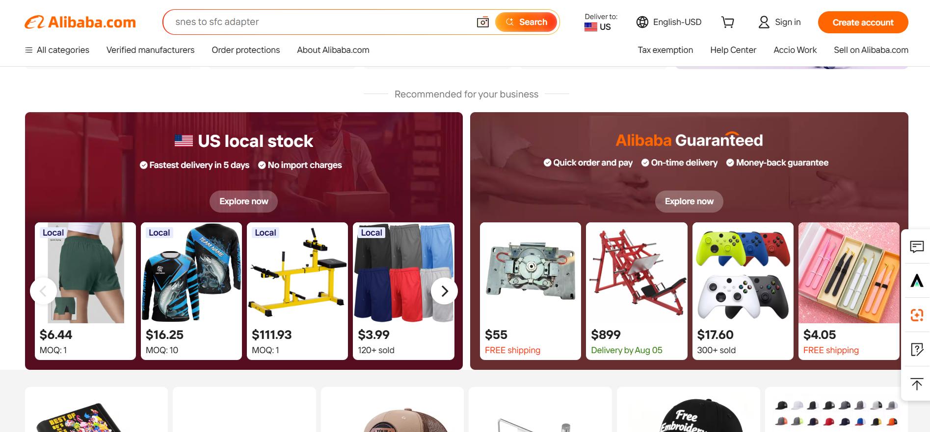
A product carousel, sometimes referred to as a card carousel, displays products, articles, case studies, or categories as a series of horizontally scrollable cards. These carousels typically combine images and text to showcase different pieces of content. (Image Source)
A product carousel (sometimes called a card carousel) is a carousel that features products, articles, case studies, or categories on cards that scroll horizontally. They typically combine pictures and words to show different pieces of content.
Unlike hero carousels that rotate automatically, these carousels are generally managed by the user, making them a familiar and intuitive browsing pattern. This interaction creates the same kind of feeling as scrolling through things on an e-commerce website or exploring material on video streaming sites.
To make them scannable, each card should have a bold, shortened title, an identifiable image, a single supporting data item, and a clear call to action. Navigation needs to be consistent and user-friendly across all viewports and devices so visitors may navigate their options at their own pace without guessing how the buttons work.
3. Testimonial and content sliders
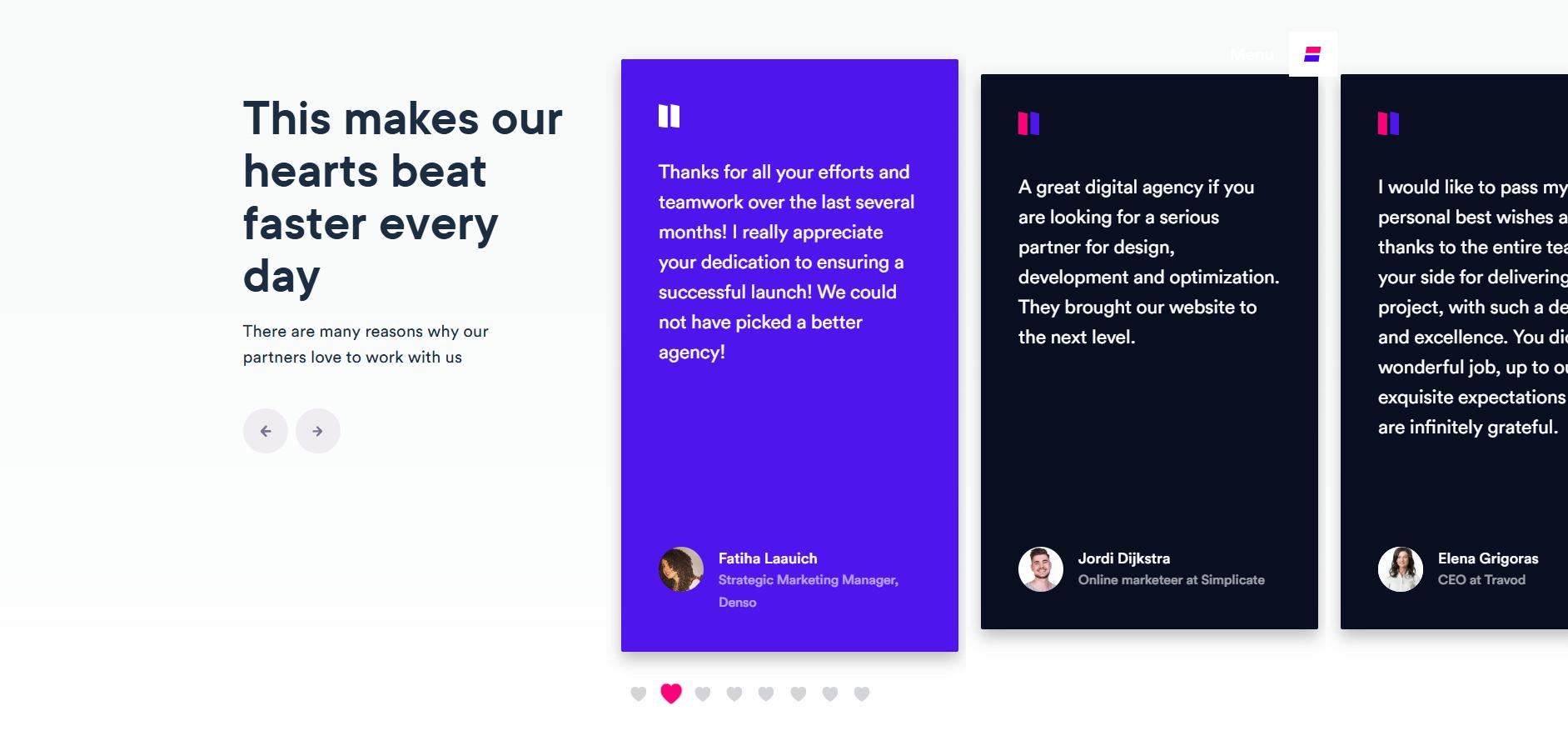
Testimonial and content sliders are rotating displays commonly used for testimonials, speaker profiles, news updates, or featured content. These types of carousels help organize visual elements while drawing attention to individual pieces of content. (Image Source)
Testimonial and content sliders are rotating displays used for formats such as testimonials, speaker profiles, news, or featured content. These types of carousel formats help present multiple types of content within a compact space by displaying one item at a time to arrange visual elements while drawing attention to individual pieces of content.
To maintain usability, make each slide short and easy to scan. Because users rarely view every slide in a carousel, avoid placing information that requires them to remember content from previous slides. Each slide should deliver its message independently so users can understand regardless of where they enter the sequence.
How to Design a Usable Carousel?
Carousels don't have the best reputation, and for good reason. However, if you've said “yes” on the four core questions from the previous section then, it's perfectly reasonable to use one.
Regardless, if you're still on the fence whether a carousel is the right choice for your website, custom website development companies can evaluate your needs and ensure it is implemented thoughtfully using usability and accessibility best practices instead of relying on generic templates or following design trends.
Below are some practical design principles you can apply when using carousels to help users discover content without creating unnecessary confusion or friction.
1. Give each slide one job
When designers have multiple messages to share, it's tempting to overload each carousel slide with too much information.
Keep each slide focused on one objective. Every slide should have only one message, one product, one CTA, or one visual element. Remove competing text, secondary buttons, and any other elements that pull attention away from the main point.
2. Make carousel navigation clear
Many users ignore carousel navigation controls because they are either difficult to see or don't exist at all.
Clear navigation controls help users understand how to move through the carousel and where they are within it. Visitors should never have to guess how many slides are available or how to navigate between them. Use familiar interface elements such as previous and next arrows, pagination dots, thumbnails, or progress indicators, and ensure they are clearly visible and easy to understand.
To provide more context, display the current slide number along with the total number of slides. This allows users to see how much content there is, and whether they want to keep exploring. In addition, make the navigation controls easy to tap on a mobile device, and don’t rely solely on swipe motions as not all users are accustomed to gesture-based navigation.
3. Use autoplay carefully
Avoid carousels with autoplay as much as possible. If done wrong it can ruin the user experience, lead to banner blindness and discourage visitors from continuing to browse the carousel. This is especially true of text-based material, as viewers need time enough to read and absorb each presentation, rather than waiting for the cycle to begin anew.
Most carousels should not autoplay. Instead, let users control the browsing pace. However, if autoplay is necessary, make sure you follow these guidelines:
- Display each slide for at least 5–7 seconds when it contains only a headline and image. If the slide includes more than five words of text, allow 8–12 seconds instead.
- Stop autoplay when the user's mouse hovers over the carousel, when keyboard focus enters the carousel, or when a navigation control is selected.
- Provide clearly visible "Pause" and "Play/Resume" controls. Manual control should always be available so users can stay on a slide for as long as they need.
- Once a user pauses the carousel, do not restart autoplay automatically.
4. Optimize carousels for mobile
Optimizing a carousel for mobile isn't just about the navigation controls but the content being readable as a whole.
Rather than decreasing desktop typography to the point where it’s hard to read, ensure that the text remains large enough, and provides sufficient contrast against images or background colors. Make your arrows, buttons and pagination controls large enough so users can comfortably tap them without accidentally tapping the wrong one.
It’s also worth checking if a carousel is the best choice for mobile in general as some implementations don’t adapt well to smaller screens. In many cases, a better solution is to replace a rotating carousel with vertically stacked material, horizontally scrolling cards or a simple static layout that makes all content immediately available by scrolling.
In the end, optimizing a carousel for mobile comes down to readability, usability, and the overall user experience.
Carousel UX Mistakes to Avoid
While carousels can contribute to a visually appealing website, they can also become one of the most common sources of friction for website visitors if not implemented carefully.
The following checklist highlights some of the most common carousel design mistakes and how to avoid them.
1. Too many messages in one slider
Many designers get tempted to cram too much information into each slide, especially when there is a lot of information to share.
Cognitive Load Theory states that our working memory can only take so much. Slides with extensive paragraphs, multiple topics, or several calls to actions take longer to understand, remembered less, and are more likely to be skipped altogether by users.
Limit the amount of slides, and make sure each one delivers a clear message. If a slide is not pulling its weight, ditch it instead of fighting for limited space within the carousel.
2. Autoplay that moves too fast
One of the biggest problems with auto-rotating carousels is that users read at different speeds. When a slide changes automatically, it interrupts visitors who are still reading.
The Nielsen Norman Group has cited that users frequently ignore or miss carousel content, especially when slides rotate automatically before they have finished reading. This problem is particularly noticeable in hero carousels and slides containing important calls to action, where the content may disappear before visitors have a chance to click it.
Set the autoplay speed based on how long users need to read, and decide whether to click. Whenever possible, avoid autoplay altogether and let users control the pace. Manual navigation is nearly always better for a user experience.
3. Hidden controls and slide count
Hidden navigation controls and slide indicators can leave visitors feeling lost as they move through rotating content.
When arrows, pagination dots, or progress indicators are difficult to find, users may never discover additional slides, especially when there is more content to explore.
Navigation controls should remain visible, recognizable, and optimized for different screen sizes and devices.
4. Using a carousel instead of a simpler layout
Using a carousel simply to save space or create a more dynamic interface isn’t a good enough reason to add a carousel to your website design.
When displayed in a static form, visitors can often read and grasp content more readily. Before you decide, look at other alternatives such as responsive grids, tabbed interfaces, card layouts or vertically stacked sections and compare them to a carousel.
Choose the pattern that is easier to read, understand and engage with, especially when it provides your visitors with a better experience.
Website Carousel Examples to Inspire
To help you better understand the proper use of website carousels, here are a few live examples from well-known websites that demonstrate effective carousel design.
1. Squarespace template carousel

Squarespace offers three creative and dynamic carousel layouts that combine autoplay and manually controlled carousels on the same page. These carousel types can work effectively together when each serves a clear purpose and doesn't compete for the user's attention. (Image Source)
Squarespace offers multiple creative and dynamic carousel layouts that combine autoplay and manually controlled carousels on the same page.
The first carousel example can be seen at the top of the page, where it automatically cycles between 3 photos of website templates. Autoplay is great for ambient, low-priority information that grabs your attention without requiring any intervention.
The second example appears further down the page as a manually controlled carousel with previous and next buttons, play and pause controls, and navigation dots. This approach is better suited for content that users need to read or compare.
The third example is a card-style carousel with manual control and no autoplay, which provides an alternative option to cycle through its contents.
These examples demonstrate that different types of carousels can work effectively together when they have a clear function, and don’t compete for the user’s attention.
2. Usain Bolt full-screen image carousel

The Usain Bolt website is a terrific example of an image-led hero carousel. Its thumbnail navigation and clearly visible controls make it easy for visitors to jump directly to the slide they want without having to wait for the carousel to rotate automatically. (Image Source)
The Usain Bolt website design is a great example of an image-led hero carousel. Its thumbnail navigation and clearly visible controls allow visitors to jump directly to the slide they want without waiting for the carousel to rotate automatically. Alternatively, visitors can click the green button on the left side of the screen to hide the carousel for a distraction-free browsing experience.
This design shows that visual elements can communicate information effectively while preserving the overall usability of the interface.
3. Benz hero image slider
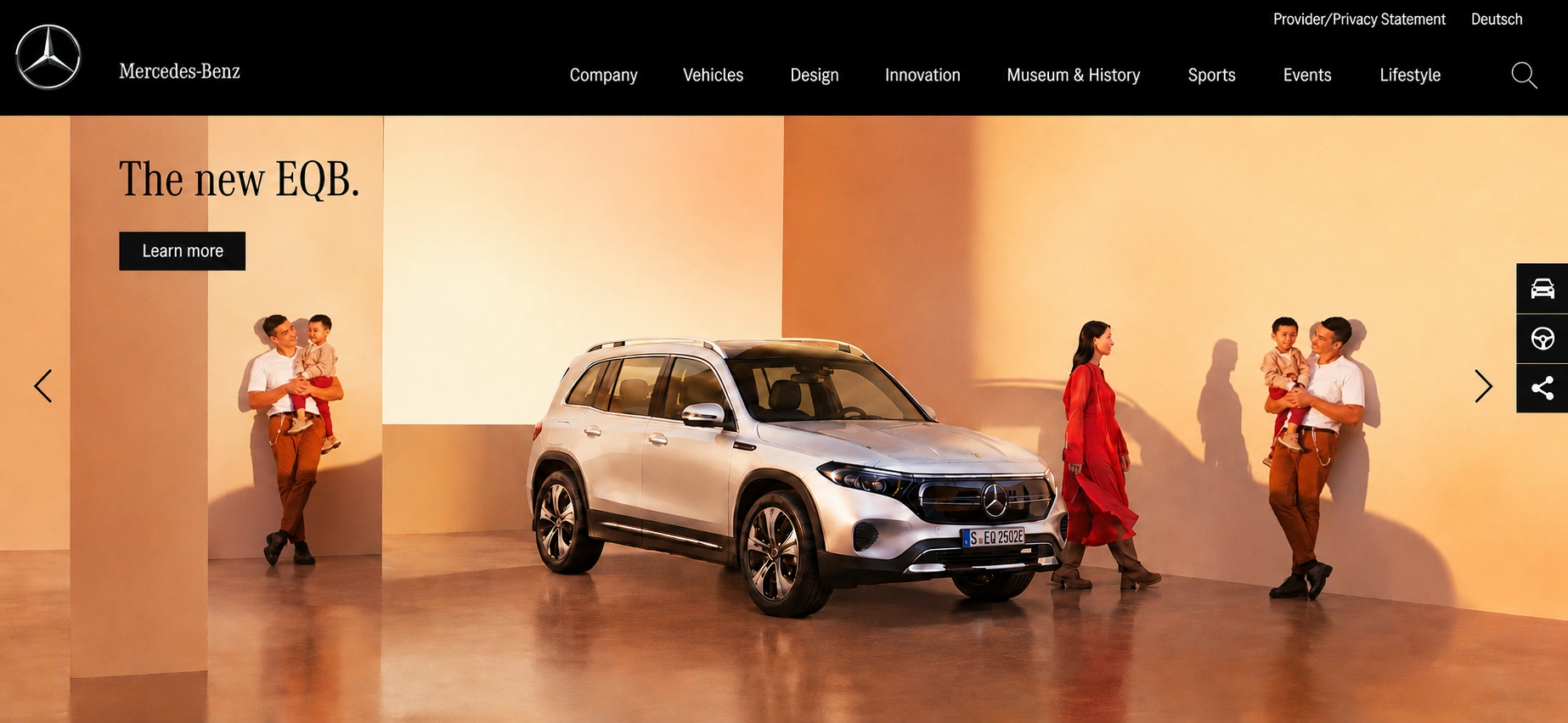
The previous Mercedes-Benz website design showcased a great example of a hero image slider, combining stunning visuals with brief, focused copy on the homepage. Each slide featured a high-quality image of the company's featured vehicles, a simple headline, and a clear call-to-action (CTA) button. (Image Source)
The previous Mercedes-Benz website design showcased a perfect example of a hero image slider with stunning visuals and brief, focused copy on the home page.
Each slide features a high-quality image of a vehicle, a simple headline, and one clear call-to action (CTA) button. The slider’s transition speed is carefully optimized to allow visitors ample time to digest the content before moving on to the next slide.
The Benz site's design focuses the user’s attention on one message by limiting the quantity of information on the screen. Most of its visual impact is in the stunning imagery, which is complemented by a short headline.
4. Toyota auto-playing card carousel
The previous Mercedes-Benz website design showcased a great example of a hero image slider, combining stunning visuals with brief, focused copy on the homepage. Each slide featured a high-quality image of the company's featured vehicles, a simple headline, and a clear call-to-action (CTA) button. (Image Source)
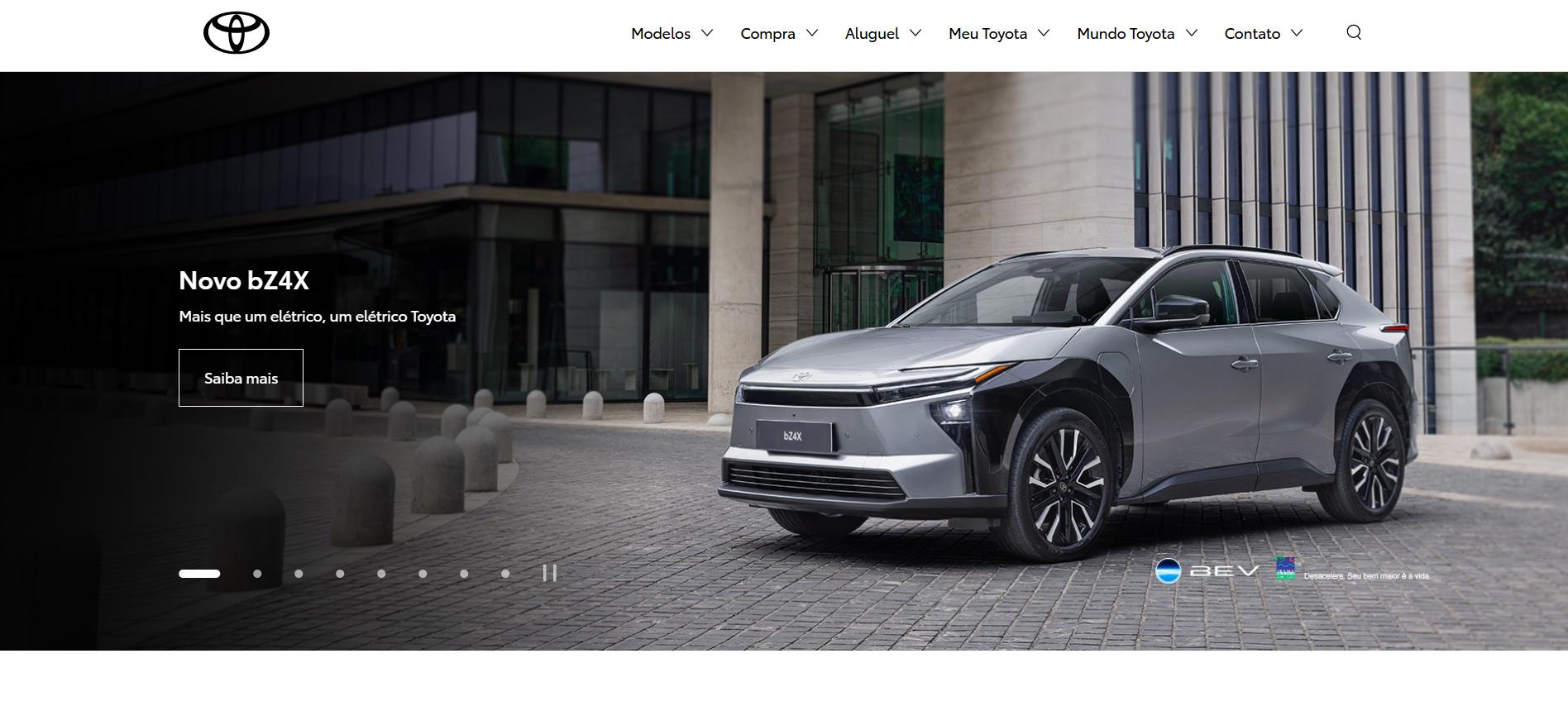
The official Toyota Motors Brazil website illustrates how an auto-playing card carousel may be built intuitively.
It comes with an autoplay feature, with a visible indicator of progress displaying how far the slide has advanced. Visitors can also use the manual navigation controls, which allows them to browse the content at their own pace.
5. Zendesk testimonial carousel

Zendesk features an excellent example of a testimonial carousel that provides social proof without relying on excessive motion. Users can also browse testimonials based on industry, use case, company size, and location, making it easier to find stories that are most relevant to their needs. (Image Source)
Zendesk features an excellent example of a testimonial carousel that provides social proof without aggressive motion.
It utilized testimonials in a compact, visually balanced form, while still giving users the ability to select stories by industry, use case, company size and location. This allows visitors to focus on the testimonials rather than the interface, making the content easier to browse and compare.
6. Product card carousel
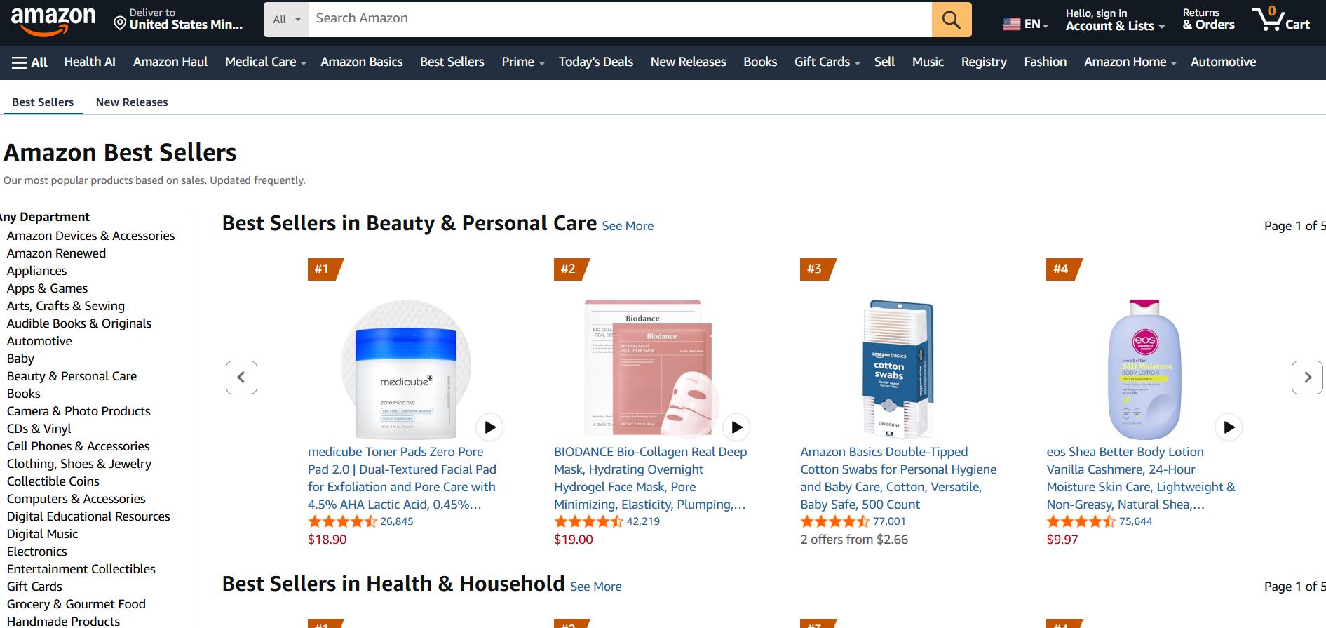
E-commerce websites such as Amazon, eBay, and Shopify commonly use product card carousels designed for quick and effortless browsing. Their clean card layouts, horizontal scrolling pattern, and minimal interface clutter make it easy for visitors to scan, compare, and explore multiple products before deciding which ones to purchase. (Image Source)
The product card carousel is one of the most widely recognized carousel patterns for e-commerce and content browsing.
E-commerce websites such as Amazon, eBay, and Shopify commonly use product card carousels designed for quick scanning. Their clean card layouts, horizontal browsing pattern and minimal interface clutter make it easy for visitors to browse, compare several products and decide more quickly the ones they want to purchase.
Each card typically includes information such as image, title, price, short description, and call to action such as “Add to Cart” or “Buy Now”. Navigation is also extremely predictable with prominent arrows and partially visible cards, helping consumers see that there is more content available while retaining the focus on the given products.
Conclusion: Make Carousels Intentional
An effective website carousel has a clear goal, supports a positive user experience, and delivers content that is easy to understand and navigate. When utilized intentionally, carousels can increase content discovery and provide a more enjoyable browsing experience for users.
Carousels should not be treated like a default feature of web design but a design decision that should only be used when it brings greater benefits than simpler design elements. A successful carousel integration prioritizes focused content, readable slides, and intuitive navigation. navigation.
In the end, the best carousels organize a small amount of meaningful content instead of trying to cram massive amounts of unrelated information into a small space where everything is competing for the user’s attention.

Creates insightful, strategy-driven content that translates complex design and branding concepts into accessible knowledge, supporting Ramotion’s mission to elevate digital experiences.