The login page is your business’s digital front door; the first interaction many customers and returning users have with your product. If it looks outdated, behaves unpredictably, or hides security signals, users may assume you don’t take their security or experience seriously. That’s why login page design matters.
A Frontegg study of American consumers found that over 80% who encountered frustrating login obstacles (especially with passwords) abandoned purchases. So how do you build a login experience that’s convenient, secure, functional, and satisfying? This article explores what an effective login page must do and industry best practices.
What a Login Page Must Do Fast
A well-designed login page answers three questions immediately: *Where am I? How do I sign in? How do I recover access if something goes wrong? *
If those are clear within seconds, users complete the process confidently and conversion improves.
1. Where is the user? Make your login page consistent with your brand (logo, colors, tone, typography), so users know they are in the right place. Ensure security cues (badges and certificates) are easy to find to build trust without overwhelming the design interface.
And if users arrive from a campaign or a deep link, display relevant context to reduce cognitive friction. For example, “Welcome back; please sign in to continue shopping.”
2. How can users log in? The login process should be smooth and quick, meaning it should present clear entry points and a predictable visual hierarchy so users immediately see the primary (email/password) and secondary (SSO, passkeys) login paths.
3. How can users recover access? Offer self-recovery options when users encounter login problems so users don’t abandon the flow. Minimize steps while preserving security.
When a login page design conveys clarity, confidence, and security quickly, conversions, satisfaction, and brand trust follow.
How to Design a Clear Login Page?
Login page design choices depend on user behavior, technical skills, security risks, and business goals. The following practical strategies keep the experience fast and reliable.
Keep the form simple
Ask for straightforward information, like the user's email and password. Display clear login paths and help buttons to avoid frustration. At the bottom of the page should be a prominent, action-oriented CTA. Instead of “Click Here” or “Go,” a more helpful CTA is “Sign in” or “Continue with Google.”
Show alternative login options
Alternative login options allow users to enter the site/dashboard conveniently. Offer options that match user personas— SSO providers, biometrics, or device-based authentication. While it is tempting to include everything, limit them to 2 to 4, and prioritize those your users actually use.
Support account recovery
Forgetting a username or a password can be really inconvenient. If this happens, your login page should redirect users to recovery paths quickly before they exit the page or get locked out due to multiple failures.
Do this by:
- Placing explicit “Forgot Password?” text immediately below the password input field
- Displaying recovery options tailored to a specific user account
- Integrating an overlay window that pops up immediately after multiple login attempts
- Adding an account recovery assistant or a floating action button (FAB) in the login screen
Use trust signals
Online security concerns—like phishing scams and potential hacking—can make users doubt login pages. Trust signals are security badges, certificates, HTTPS/SSL padlock, etc, that tell users you are serious about keeping their credentials safe and private, potentially increasing conversions by 42%.
Consider adding these trust signals:
- HTTPS/SSL padlock: Secures data transmitted between the user and server through encryption.
- Single Sign-On (SSO) badge: Anchors credential management to highly trusted, third-party tech platforms like Google and Apple.
- Compliance badges: Show the login page adheres to relevant compliance authorities.
- Security portal link: It details infrastructure practices for users.
Key Login Page Elements
A login page should focus on core elements that prevent errors, offer recovery, and reinforce security. Below are foundational elements to start with and practical tips.
Email or identifier field
An email address or username identifies the account to confirm and determine the correct authentication flow.
Login Page Design Tips:
- On mobile, trigger email-optimized keyboards showing “@” and “.” keys.
- Use visible labels and helpful placeholder examples to reduce input errors.
- Enable auto-complete/suggestion for saved usernames or email addresses.
Identifier field with a placeholder text. Image via Dribbble
Password field and error states
Passwords verify if users have the necessary credentials to enter. But because of strict security standards, users are forced to create unique passwords that are sometimes difficult to recall. This leads to errors, which can create friction.
Login Page Design Tips:
- Add an eye icon that reveals the typed characters. This feature reduces error and frustration dramatically.
- Give specific error messages that help the users. If the password is too short, say “Password must be at least 8 characters” instead of “Invalid password”.
- Warn about sensitivities. If entering a capital letter results in an error, tell users when Caps Lock is on.
- Put the error message right below the password box. Don’t let users search manually for what they got wrong.
Forgot password help links
Provide options to users who cannot access their accounts—click a self-service recovery link or contact a support line for real-time help. These paths involve an identity verification step and safeguards to protect against unauthorized account lockouts.
Login Page Design Tips:
- Place “Forgot password?” directly below the password field and avoid using vague phrasing.
- After the password reset, redirect to the login page.
- Add a dropdown button that expands to a tooltip with IT contact information.
- If the login page supports both email/password and SSO, ensure the ‘forgot password’ flow only applies to email-based accounts.
SSO and third-party login
SSO logins provide a faster entryway through trusted third-party partners, like Google, Microsoft, Apple, etc. It is a shortcut for users who already have an active session. Do not implement SSO-only unless your entire user base is enterprise.
Login Page Design Tips:
- SSO logins are always secondary to email/password forms. Place this option below.
- Label buttons “Continue with Google” to cover both new and returning users.
- If SSO fails, display a clear error message conveying what went wrong and the recommended next step.
Call-to-action button
The CTA button is the ultimate conversion button, communicating what is about to happen. Being the final step, it should be effortless, easy to spot, and clickable.
Login Page Design Tips:
- Use your brand’s most visible color so users can find it.
- Make the button size adaptable to different screen sizes, ensuring it is easy to see.
- If login fails, re-enable the button immediately with the error message above or below the form.
Security and legal footers
Login pages should reassure users that they are protected. The page should include a privacy policy and compliance badges, signalling that the company that owns the platform is a legitimate business.
Login Page Design Tips:
- Reduce visual clutter by limiting to three links: Privacy Policy, Cookie Policy, and Terms of Service.
- Use badges instead of full certification names to avoid visual clutter.
- Include a copyright line at the bottom of the page.
Common Login Page Mistakes: What Not to Do Plus More Tips
Now that you know what goes into an effective login page design, learn the common design mistakes even established brands commit.
1. Adding too many unnecessary elements
Background videos, carousels, mission statements, and animated illustrations—these elements can prettify a page, but they can easily overwhelm users, too. They increase load time and force the designer to make the login form smaller so everything can fit on screens.
Every element on your login page must help the user complete the action faster or with fewer errors. If they don’t, ditch them.
2. Hiding recovery links
While some login pages hide recovery links for a cleaner aesthetic, not finding help when you need it can be very frustrating for users, which ultimately leads to a higher abandonment rate. Place your recovery links along the path where they will naturally look. It can be above, inline, or below the password field.
3. Writing unhelpful error messages
*“An error occurred. Please try again.”
“Error 500: AuthException - Database connection timeout; token invalid.”
“Your account is locked. Please contact support.” (But there’s no support link)*
Flashing error messages that do not tell users what went wrong and how to fix it can lead to a disappointing experience. Some also use too much tech jargon, which can alienate non-techie users. And then there are the endless loop messages, failing to provide a button, link, or email address to actually resolve the issue.
Next time you write an error message, answer the following questions:
- Does the user know exactly which field caused the issue?
- Does the message explain how to fix it?
- Is the language accessible to a non-technical person?
- Does this message reveal too much information to a potential hacker/scammer?
4. Offering too many login choices
To accommodate and keep every stakeholder and user group happy, some login pages end up with overwhelming login choices. However, this can lead to visual clutter and decision paralysis, causing users to forget which method they previously used to sign up, leading to duplicate accounts.
Keep in mind that users only spend a few seconds figuring out how to access their dashboard. So, it’s best to limit login choices to three or fewer buttons. You can also just prioritize what your main users use. For example, a SaaS login page might offer Google, Microsoft, and LinkedIn. Meanwhile, a page directly catering to consumers may only offer Google and Apple.
Hire professional website development companies and avoid these mistakes!
Best Login Page Examples to Inspire You
We handpicked examples that illustrate practical, modern, user-centered approaches to login design. Be inspired and check out what works to match your audience, security needs, conversion goals, and implementation considerations thoughtfully applied.
Notion
Notion prioritizes a less cluttered, user-focused design with its organized layout. It successfully circumvents multiple sign-in options, apart from the traditional email/password form, through its minimalist auxiliary buttons.
The necessary security and policy links are in gray, smaller font, but they remain visible to users. Finally, the design aligns with Notion’s brand identity, leveraging white space, clean black typography, and structural simplicity. The result is a focused and familiar design.
What we like:
- Minimal layout with essential options and visible policy links.
- Everything is on-brand—the choice of colors, typography, and the intentional use of negative space.
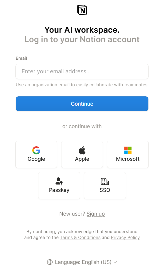
Image via Notion
Wix
Wix’s login page splits the authentication process into distinct screens (also known as a sequential email router). From a behavioral standpoint, this allows users to process one info at a time. First is to fill in their email address, and if that checks out, the password field shows up.
Above the traditional form are the SSO buttons, which help Wix optimize for mobile traffic, maximize immediate conversion rates, and lower security overhead. It also works perfectly for its main audiences—business owners, freelancers, and creators—who often have multiple email addresses and social accounts.
What we like:
- Multiple login paths for different audience groups.
- Sequential flow designed to optimize conversion
- Background image subtly hints at “building websites and portfolios” without distracting from the main login section.
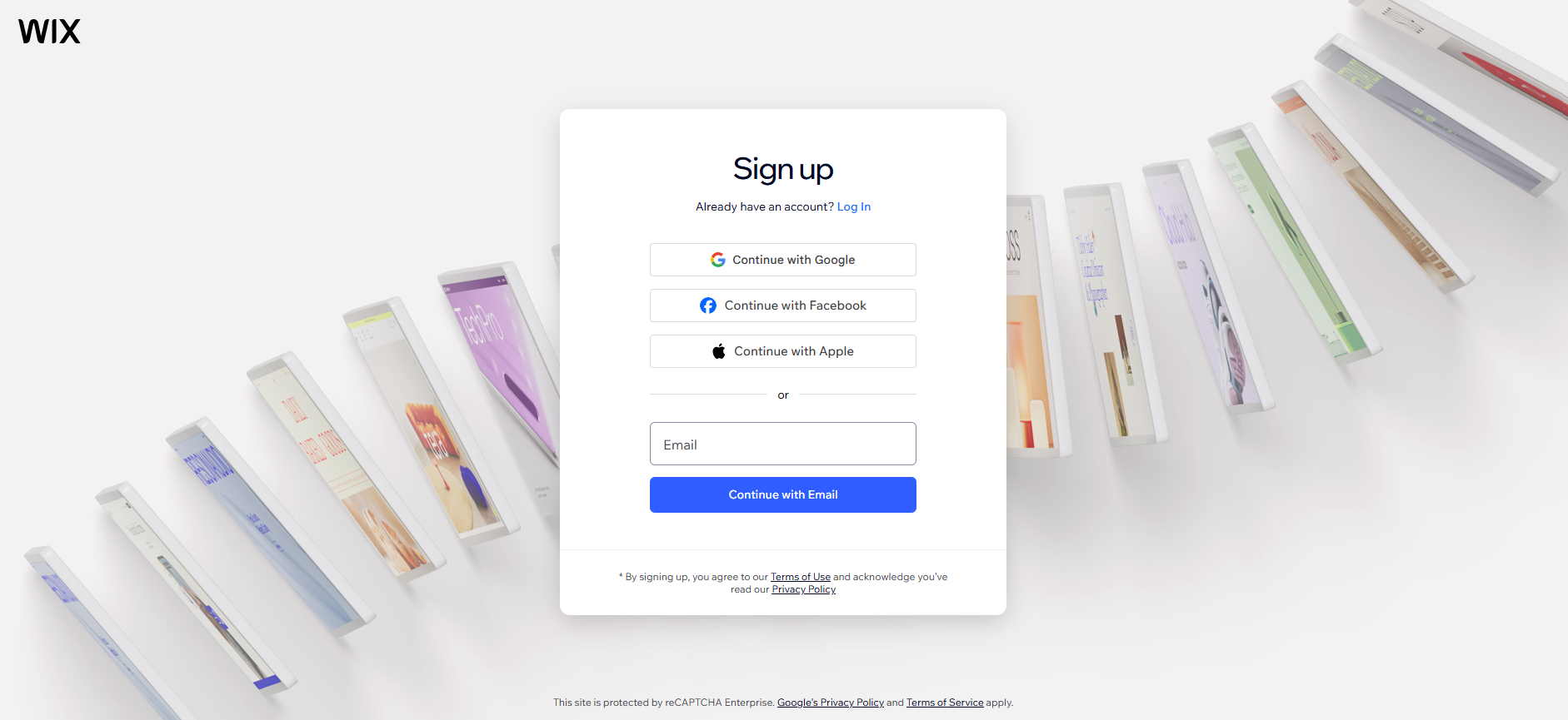
Image via Wix
Canva
Canva takes an even shorter, more direct login experience than our previous examples. The login page only displays multi-option buttons, skipping the text-entry step entirely. Doing so streamlines the main view while keeping the interface clear for users with specific account requirements.
The design goal is emphasized with a message above that says, “Log in or sign up in seconds.” The collage of illustrations in the background also adds character to the login page.
What we like:
- Straightforward UI/UX
- Streamlined entry paths for its enterprise users
- Prioritizing easily clickable buttons lowers cognitive strain
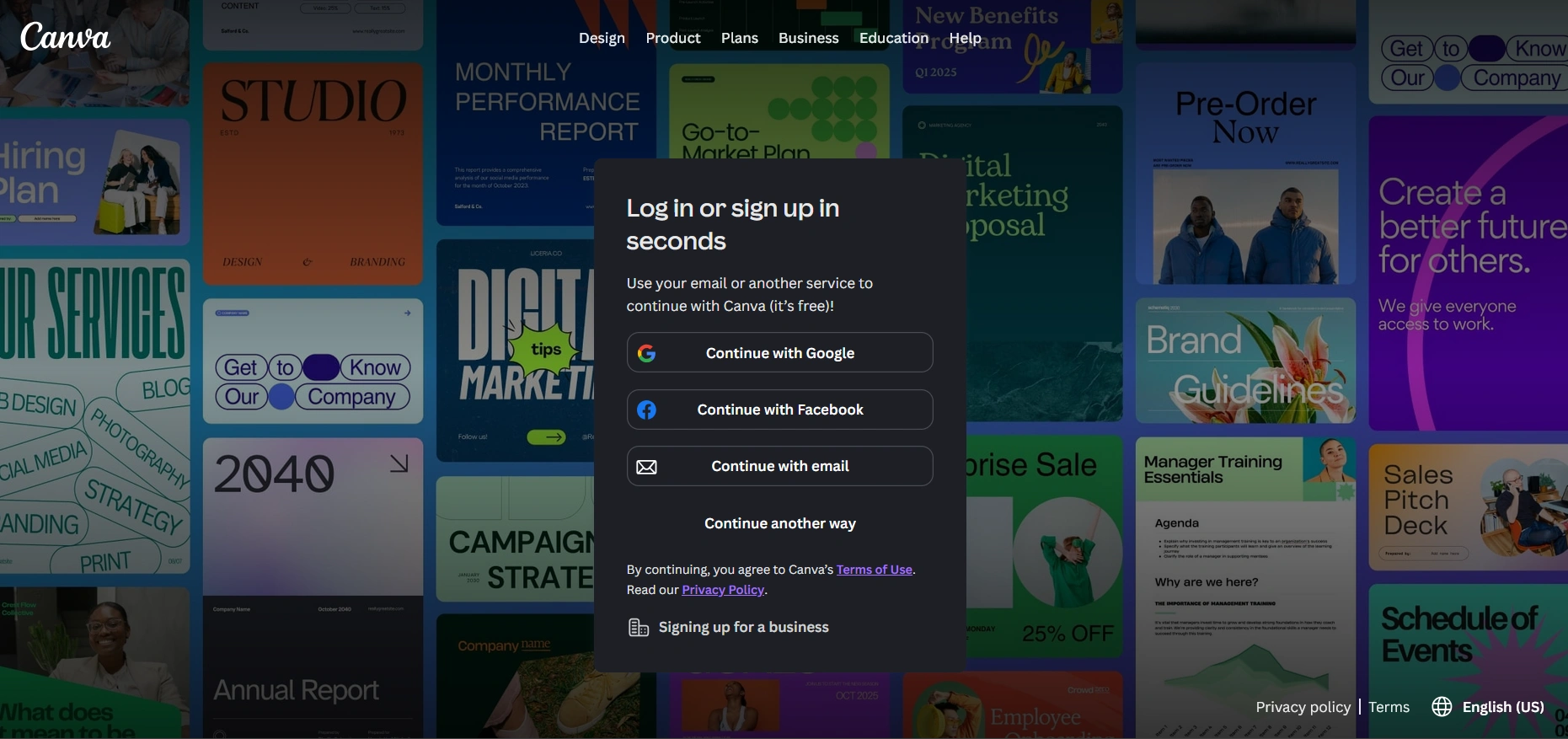
Image via Canva
BrightPay
BrightPay is a payroll management software that caters to B2B accounting and payroll professionals. That said, social SSO’s are excluded as users have to input company emails instead.
The page also creates an external sign-up diversion with a secondary text that says, “Don’t have a BrightID? Sign up.” It prevents existing users from accidentally registering a new profile, while prospective users are instantly routed away to a separate business verification workflow.
What we like:
- By forcing a strict corporate email and password login, the risk of having accounts hijacked is low. This is critical for a platform that deals with money.
- The dark navy blue and pure white backgrounds create a strong contrast.
- External sign-up path for new users keeps the primary funnel clear.
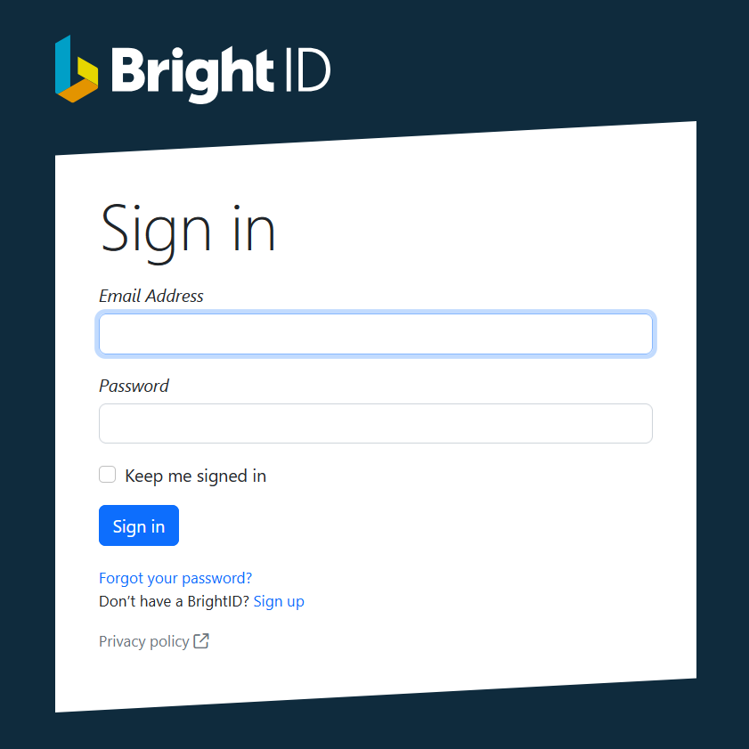
Image via Brightpay
Adobe Express
What makes Adobe Express’s login page stand out is how it showcases the fully interactive workspace behind the login, nudging users to complete the process so they can access it immediately. It builds excitement and adds a visual appeal to the login page.
The page also segments individual/business users from students/teachers, ensuring the latter don’t waste time entering corporate credentials that do not apply to them. At the bottom is a “Not ready to sign in? Continue as a guest” link, removing the mandatory barrier. In effect, potential users are not pressured to commit, which actually increases conversions.
What we like:
- The guest escape option reduces the anxiety of potential users.
- The colorful dashboard background creates a contrast that increases flawless readability.
- User segmentation ensures the individual gets the right login form/options.
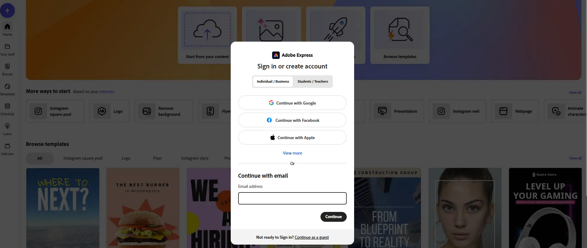
Image via Adobe Express
Stripe
Stripe mainly targets developers, e-commerce merchants, and business owners. That said, the UI is designed to make standard logins the priority over alternative sign-in options. It ensures that business administrators are guided into a highly-secured workflow immediately, without getting distracted by social buttons.
*What we like: *
- Passkey support lets developers and merchants authenticate using native device hardware, like Face ID or Apple Touch ID.
- Isolating the main credential form from the SSO buttons creates a clean visual hierarchy.
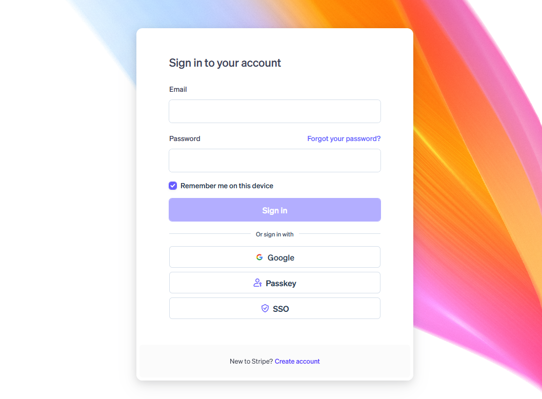
Image via Stripe
Workday
Workday designed its login page for a convenient experience for corporate HR, conference events, or internal portals. When an employee or attendee can’t log in, it is rarely a simple password typo. They might not be registered yet or have no internal clearance, or they might be violating a corporate rule.
Placing a dedicated resource section on the left side of the page creates a self-service helpline for users to explore and try before contacting the administrator. The explicit “Business email” label on the login field also prevents confusion, ensuring employees enter official company emails.
*What we like: *
- Comprehensive self-help section that is easily accessible to all users.
- Strict business email field label
- Complete instructions inside the blank text input boxes
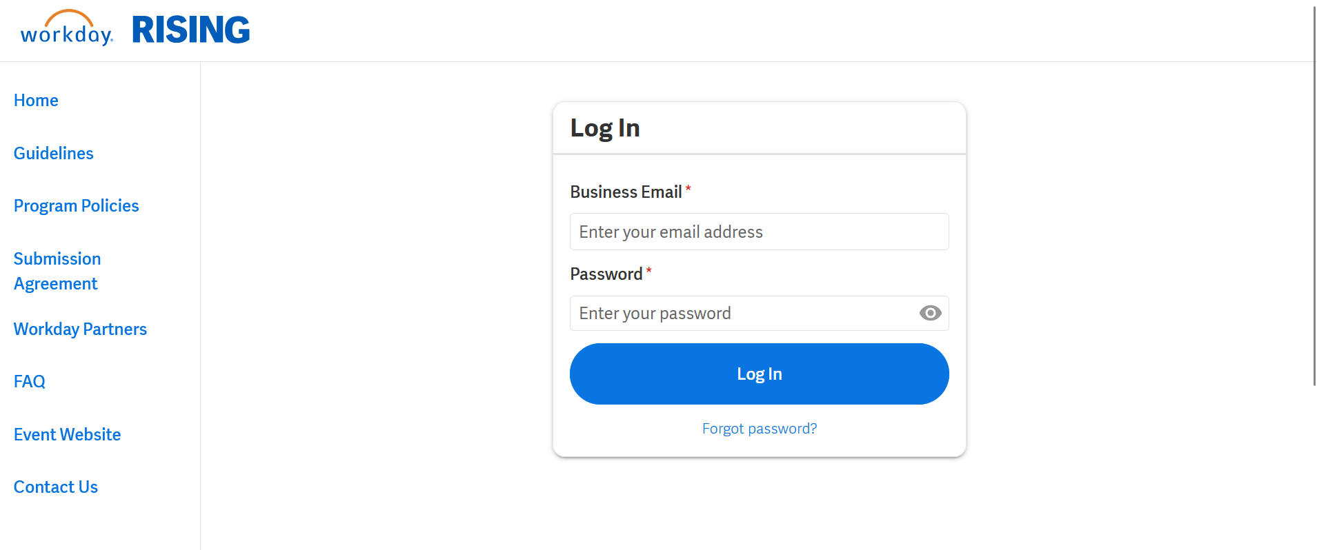
Image via Workday
Effective Login Pages are Fast and Predictable
Your login page design can spell the difference between a frustrating or satisfying user experience. Centering the design on user personas, accessibility, and user flow transforms a simple form into a seamless digital portal or gateway. And that gateway directly impacts your conversions, revenue, and retention rates.
So, your login page design should prioritize speed, security, and predictability. These design qualities reduce user anxiety, lower cognitive load, and demonstrate that your company values its users.

Creates insightful, strategy-driven content that translates complex design and branding concepts into accessible knowledge, supporting Ramotion’s mission to elevate digital experiences.