Whenever you log on to a web application, you have a certain task to complete — a goal to achieve. For example, when you sign in to a cryptocurrency trading application, you want to get certain information up front, such as the recent trends of currencies, your wallet, and access to your account settings. All of this information, if not presented in an organized and structured way, can be extremely overwhelming. It would also not be a good experience for you if you have to navigate to these essential pieces of information with multiple clicks every time you log in to the app. This is one example where dashboards can come in handy.
The home screen of any web application is of immense importance and a well-designed dashboard can make it even more valuable. There are several types of dashboard designs based on the goals of the digital product or service. From financial management and audience analysis to marketing and project management, dashboards serve a number of purposes. Dashboard design also comes with certain challenges where the designers have to go back to the basics of user experience to ensure better interaction.
Partnering with an experienced UX design company can also help ensure that dashboards follow strong usability principles, transform complex data into intuitive visuals, and align with the product’s overall user experience goals.
In this article, we introduce the concept of dashboard design for UI/UX professionals. We discuss the types and components of typical dashboards along with the principles and best practices. You will also find some really interesting examples serving as an inspiration for your future projects.
Determining Dashboard in UI/UX Design
Before talking about the design of good dashboards, it is important to understand what dashboards really are. Think of a physical dashboard, such as the dashboard of a car.
It contains controls for pretty much everything in the car. From the radio and camera to the heating and cooling controls, a dashboard has all the essential elements to help you feel comfortable inside your vehicle. Similar to a physical dashboard, web applications need a centralized screen where all the important content is available and accessible, and dashboards serve this purpose.
What is a dashboard in UX design?
The dashboard is one of the most important screens in any application. It is designed to provide all the necessary information in a single glance to the users. Often designed as the home or landing page of an application, a dashboard is where the users get an overview of the data.
One of the critical questions in the design process of an online application concerns the interface of the dashboard. A number of design choices are made in the process, focusing on the needs of the target audience and the goals of the product or service. The aim is to make sure that the users have everything they need on a single screen or they can at least navigate to everything they need with ease.
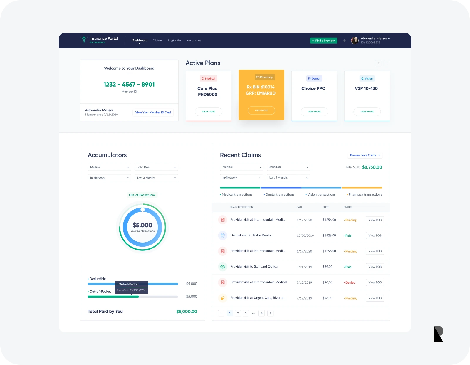
Dashboard should provide key information
Importance of dashboards
Useful and usable dashboards are imperative to the success of any web application. The dashboards are the screens that users get to interact with the most. Therefore, these should be pleasing to look at, but also be useful in the sense that the audience gets the most value out of them. Successful dashboard designs are helpful in a number of ways, some of which are highlighted below.
Holistic view
Dashboards are comprehensive in the sense that they provide a holistic view of the entire application. Just by looking at the dashboard, the users can get a clear idea of the key figures and the most important information that they need. This aspect is equally valuable for web applications designed for personal use, such as smart home applications, and project management in businesses. The responsiveness of dashboards allows the users to get more details on anything they want. However, in many cases, an overview of everything is extremely helpful.
Data representation
Another advantage of dashboards is that they can help communicate data in an effective and professional manner. With the help of visualizations and graphs, such as bar charts and bubble charts, dashboards can present complicated information in an understandable manner. This helps in saving time when looking at the overall effect of the data and also makes analysis a lot easier.
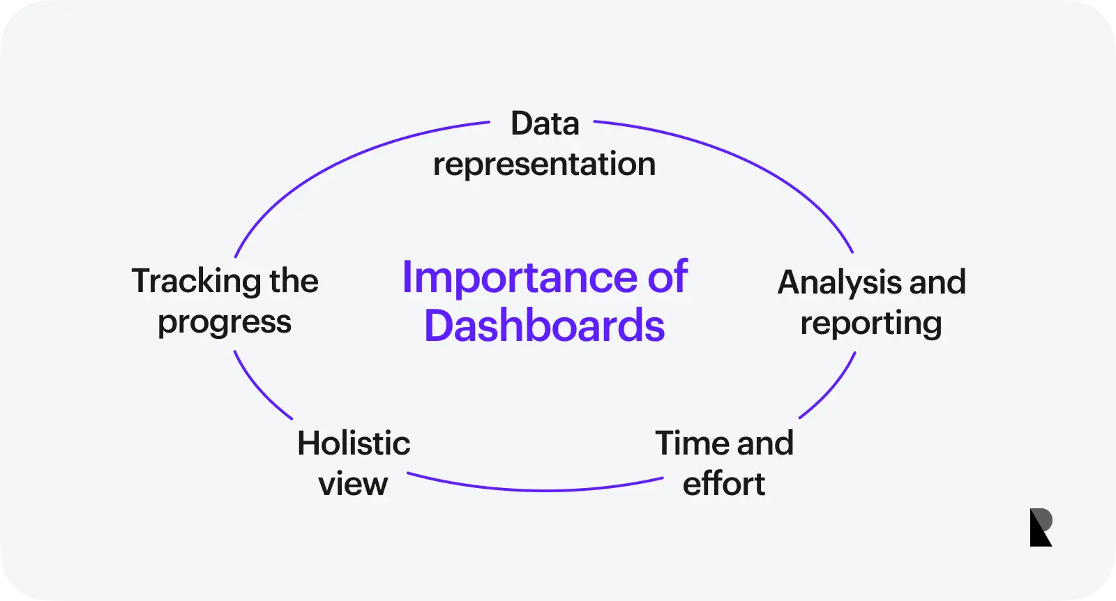
Analysis and reporting
Modern businesses are all about conducting quality analyses and making the most out of them. A good dashboard can add value to such analyses. By clustering the right information using line charts or pie charts, dashboards make it a lot easier to analyze specific sections of data and create useful reports. Some additional features in several dashboards, such as filters and customized reports, can be of added value, making the analysis more effective.
Tracking the progress
Project management and product development are other areas where dashboards come in handy. Well-designed dashboards can be used to present relevant data about a project in a way that its progress is understood in a single glance. For example, providing information about pending tasks and the status of in-progress projects on a single screen can really help in saving time during important meetings.
Time and effort
Dashboards save time for everyone on the team. The presentation of key information in an understandable manner makes it a lot easier for team members to collaborate on big projects. Additionally, on an individual level, it saves a lot of time and effort when organizing multiple tasks and making sure that you’re on top of everything. One important way to judge the usefulness of a dashboard would be to assess the time it takes the users to complete a certain task, along with their level of satisfaction.
Most Common Dashboard Design Components
When it comes to the design of a dashboard, there are several elements that the users expect to see. For example, the users would want to have access to some customization tools and the appearance of the dashboard itself. On the other hand, the principle of familiarity in UI/UX design also dictates which elements to include in a good dashboard.
What are the most common dashboard components?
Following are the elements found in successful dashboard designs.
- Profile settings
- Dashboard settings
- Navigation
- Search bar
- Filters
- Notifications
- Data elements
The important elements of a successful dashboard design are discussed below.
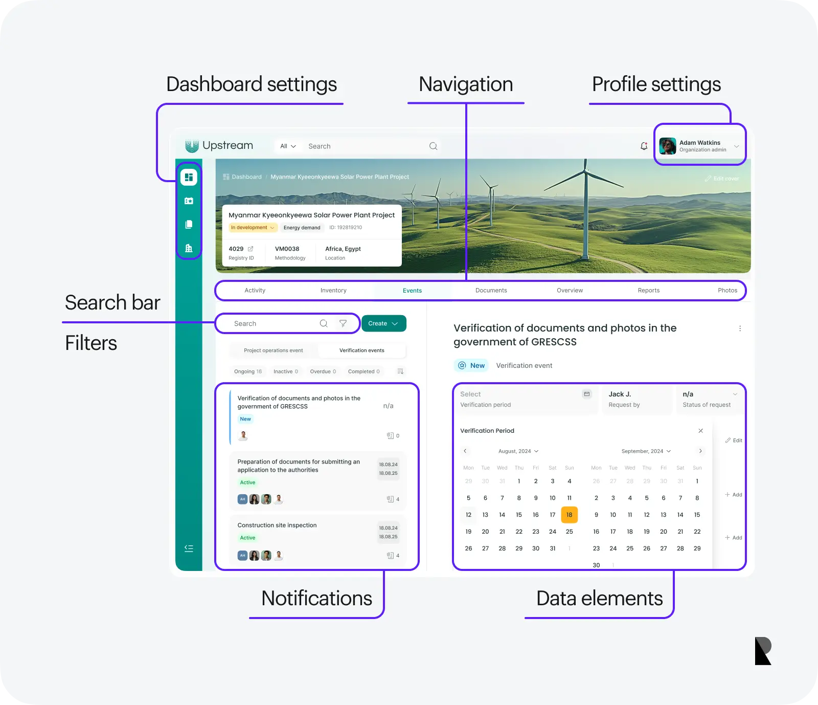
Profile settings
Whenever the users log in to a web application, they do so using their account credentials. It is both logical and necessary to provide them with an option where they can edit and manage their profile. This can be taken care of by adding the name and/or picture of the user on the dashboard or by creating a menu entry with the label “Profile Settings”. This option is also important as it makes the tool or service more personalized.
Dashboard settings
The appearance of the dashboard is almost always customizable in web applications. Therefore, designers need to ensure that such settings are readily available to the users. Based on their goals with the dashboard or the nature of their role in a team, the users may want to keep or remove some aspects of the content. This is also where dashboard settings can be helpful.
Navigation
For dashboards, just like any other digital platform, navigation is one of the most critical features. With the help of good navigation, users manage to find the right content and accomplish their tasks in less time. Dashboards should always have navigation options readily available.
Search bar
A single screen on any digital device cannot possibly present all the information at a single time. This is why a search feature is extremely important for a dashboard. The presence of a search option allows users to find information quickly and it also gives them access to the content that is not available on the home screen.
Filters
When reviewing and analyzing complex reports, filters can be of great value. If the dashboards provide ready access to filters, where the users can look at specific sections of data closely and get a better understanding of the content, it makes their lives easier than ever. Filters can be of various types. For example, the option to look only at the ascending currencies on a cryptocurrency trading dashboard or to look at the projects completed in the last three months on a project management dashboard.
Notifications
Most dashboards designed for collaborative tasks and analyses need one way or the other to provide updates to users. This is where notifications are helpful. These notifications can contain various types of information, such as the comment of a team member on a task, changed status of a project, updates to the dashboard design itself, etc.
Data elements
Another important feature of a dashboard is related to key data elements. This is the information resource where all the elements are meant to provide useful information to the users. UI/UX designers can present this content in various ways, being creative with data points and visualizations. However, it is important to provide some control to the users, so they can reorganize the content based on their comfort level.
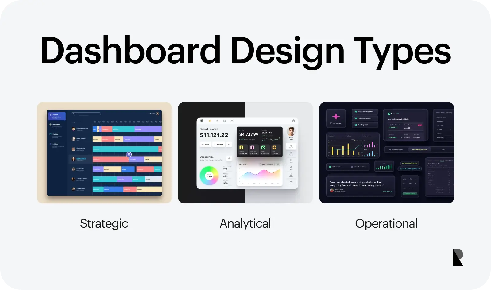
Dashboard Design Types
The way dashboards are designed has a lot to do with their purpose. A dashboard used for project management will be different from the one used to analyze the traffic on a website. Similarly, the type of dashboard also varies based on the target audience. A dashboard designed for an enterprise will have different design patterns compared to the one created for the personal use of an individual customer. These and other factors dictate the design of a dashboard, dividing them into three different types.
What are the major types of dashboard design?
There are three major types of dashboards used by different platforms.
- Strategic dashboard
- Analytical dashboard
- Operational dashboard
We introduce the different types of dashboards in the following discussion, based on their distinguishing features and purposes.
Strategic dashboard
A strategic dashboard, as the name indicates, is one that focuses on tracking and highlighting the short and long-term strategy of an organization. The strength of such dashboards is to give a comprehensive overview of the entire strategy at a glance. It is important to choose the right key performance indicators so that the users do not get unnecessary information and the useful content is not overlooked.
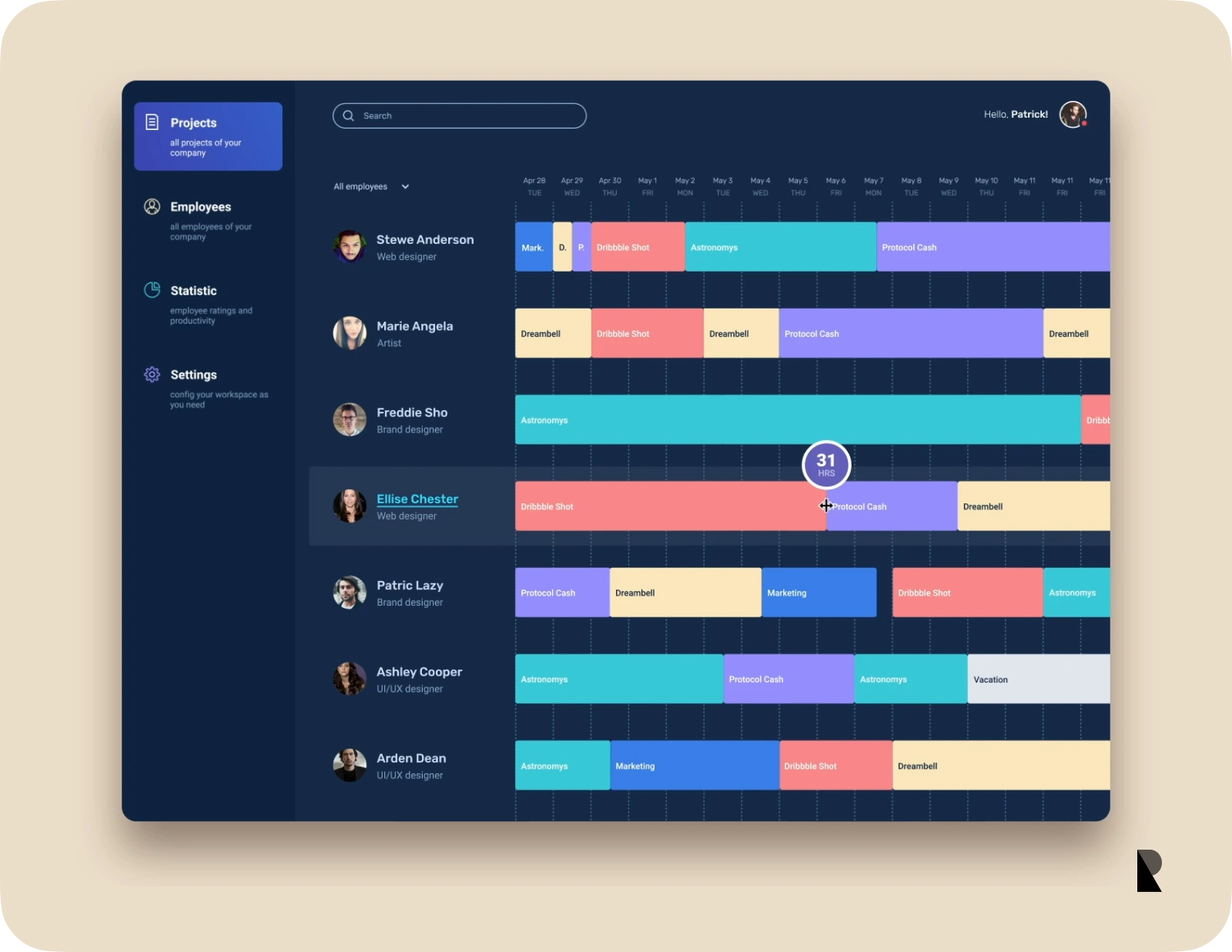
The best use case of a strategic dashboard is for project management, particularly when it comes to product or software development. In such a case, it will be a good idea to give a summary of tasks in progress and the status of the project, along with some useful analytical data.
Analytical dashboard
Analytical dashboards make up the other category of dashboard design. These dashboards are mostly used to provide complex data in the form of useful charts and visualizations. The goal is to clearly communicate information and compare values that would otherwise be overwhelming and time-consuming.
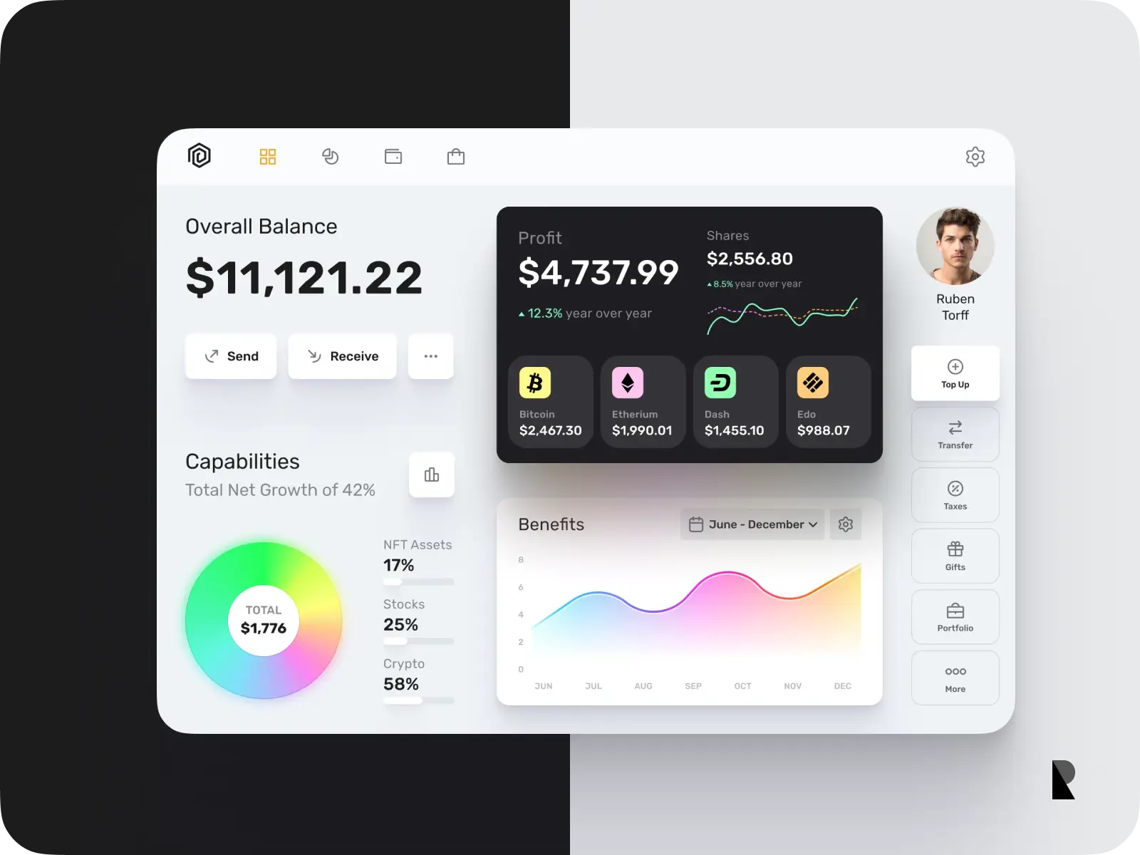
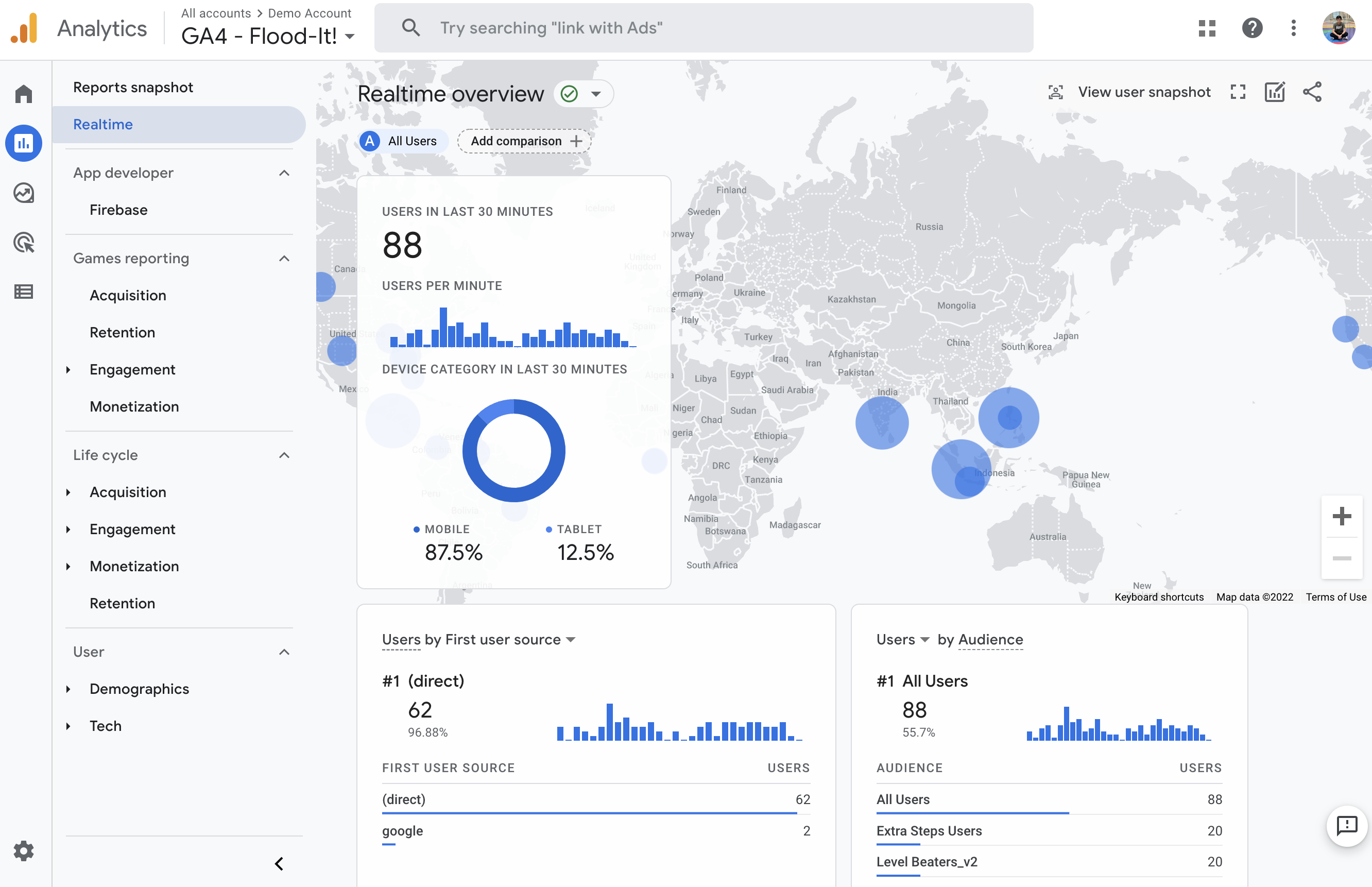
The best example of an analytical dashboard could be a tool used to analyze website traffic, such as Google Analytics. In such cases, there is a lot of analytical content that needs to be simplified and presented in a way that the users can make the most of it. Additionally, there needs to be a good amount of customization so the users can make the most out of it.
Operational dashboard
Operational dashboards are the most flexible kinds of dashboards, in the sense that they are designed to update frequently, as much as multiple times a day. The information on these dashboards is fluid and can go up and down depending on multiple factors. The goal of such a dashboard is to provide access to all the dynamic factors in a manner that the users can also get a comparative understanding of the data.
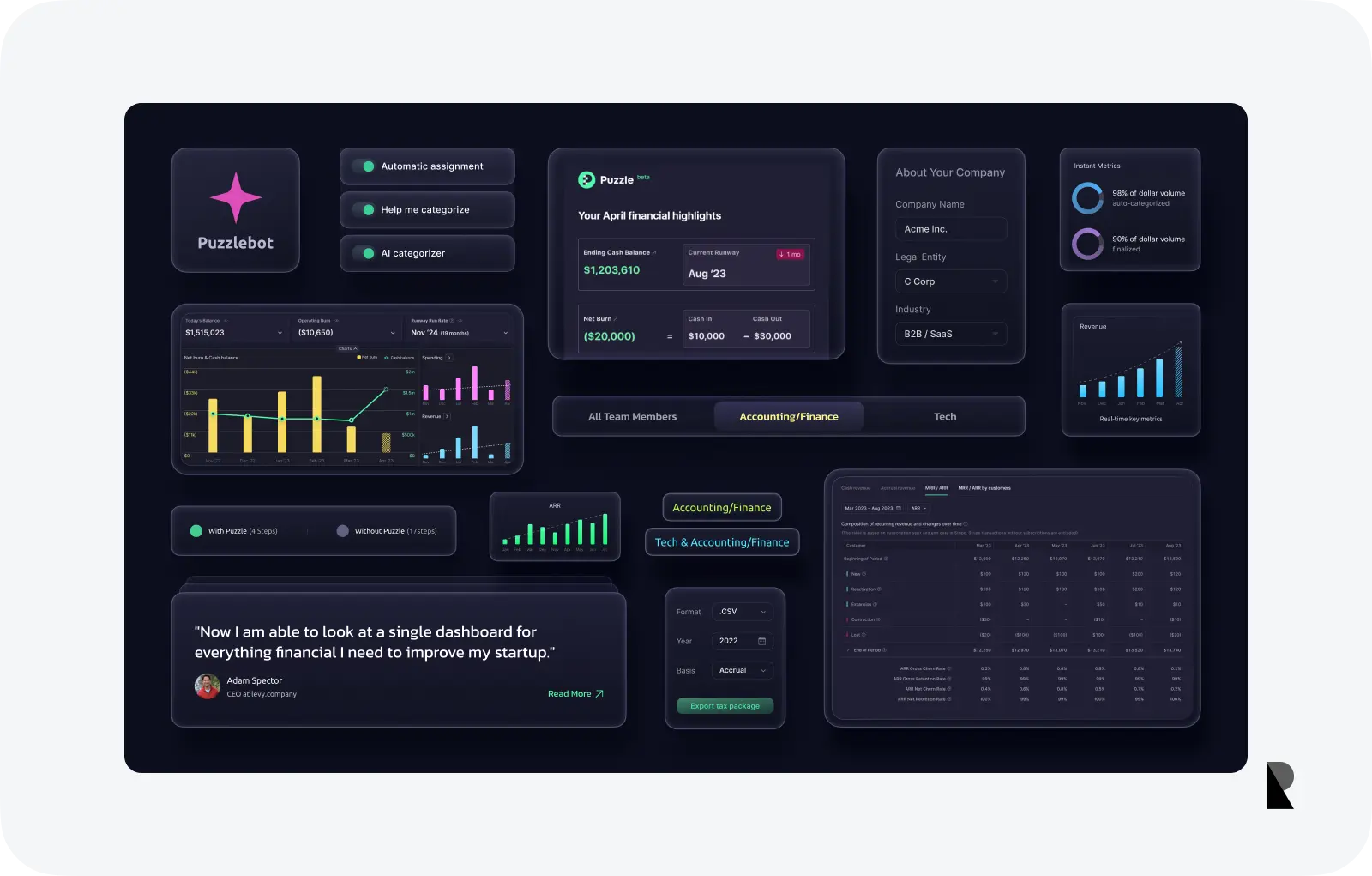
A classic example of such a dashboard can be a customer relationship management (CRM) tool. For such a tool, it is important to have important dynamic information such as the percentage or number of conversions readily available for the marketing professionals.
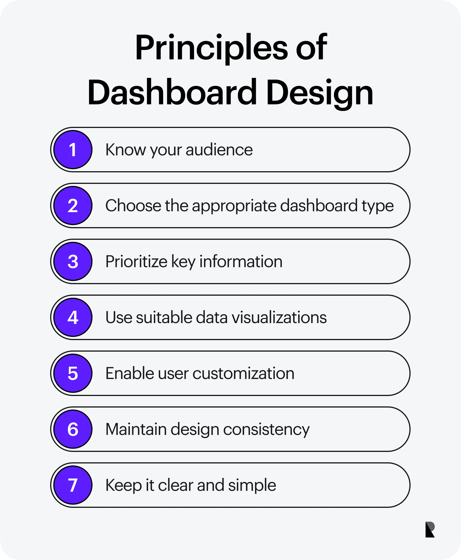
Dashboard Design Principles
Just like any other practice in the field of UI/UX design, there are certain usability principles for dashboards. The basic design principles, such as simplicity, familiarity, and consistency are as important for the design of dashboards as they are for any other product, service, or application. It must be noted that none of the principles are set in stone and can be modified based on the goals of the dashboard and the target audience.
What are the basic principles of dashboard design?
Here are some basic principles of dashboard design.
- Understand the needs of the audience
- Choose the right dashboard type
- Make key data readily available
- Select the right type of data visualizations
- Allow some level of customization and control
- Ensure consistency in design
- Keep the design simple and understandable
For designers who are new to the concept of dashboards and even UI/UX professionals, the following set of best practices can be of great help.
Understand the needs of the audience
One of the most important principles of dashboard design is to understand and meet the needs of the target audience. UI/UX designers can seek great help from user personas and profiles where they can identify the major concerns of different audience groups and then address those by the design of an interactive dashboard.
Choose the right dashboard type
It is important to choose the right type of dashboard for any digital platform. This is critical for the success of any dashboard design process. If the type of dashboard does not meet the goals, it will never be able to meet the needs of the audience.
Make key data readily available
When using any dashboard, the users expect to see some key metrics by spending little time and effort. Therefore, it is important to provide all the important content upfront, so an overview of the analysis or process is readily available. This can be achieved by creating attractive charts and summaries of important data elements.
Select the right type of data visualizations
When presenting any quantitative information, it is always critical to choose the right type of data visualization. Statistics in the form of data tables can only do so much.
In practice, organizations that are hiring or partnering to accelerate this work often review how top UI/UX design agencies approach visualization strategy, especially the tradeoffs between clarity, comparability, and decision speed at the executive level. UI/UX designers need to collaborate with engineering, marketing, and content creation teams to pick the right visualizations and to use them effectively in the dashboard.
Allow some level of customization and control
One of the key principles of UI/UX design is to put the users in control. When creating dashboards, it is always a good practice to let the users customize the fonts, brightness, and color scheme in whatever way they want.
Ensure consistency in design
Consistency is critical to the aesthetics of any dashboard. Designers should take great care when selecting the layout, color palette, and visual hierarchy of the dashboard. The design elements should be used in a consistent manner so the users do not get confused or overwhelmed.
Keep the design simple and understandable
The end goal of a dashboard should always be to simplify complex data and provide information in an understandable manner. If the design is overcomplicated, the users will not be able to utilize the content in the best way. The navigation, icons, and written content should be simple with the purpose of making things simple for the target audience.
Great Dashboard Design Examples
There are a number of quality dashboard design examples that UI/UX designers can use as inspiration. In such successful and attractive examples, the principles of good dashboard design and the necessary components are applied in a creative manner. These dashboards show that there is always room for creative solutions in the field of design without compromising the basic principles of usability and usefulness.
What are some examples of great dashboard design?
Here are some of the best examples of effective dashboard design.
- Google Analytics
- Stripe
- Atlassian Jira
- WallQ Wallet
Some of the best examples of good dashboard design are as follows.
1. Google Analytics
Google Analytics is one of the best and most comprehensive examples of a dashboard done right. When you look at the type and sheer volume of information that Google Analytics deals with, it is incredible to see how all that is summarized so effectively on a single screen. However, it must be noted that since the content is quite complicated, using Google Analytics to the fullest requires some experience and learning.
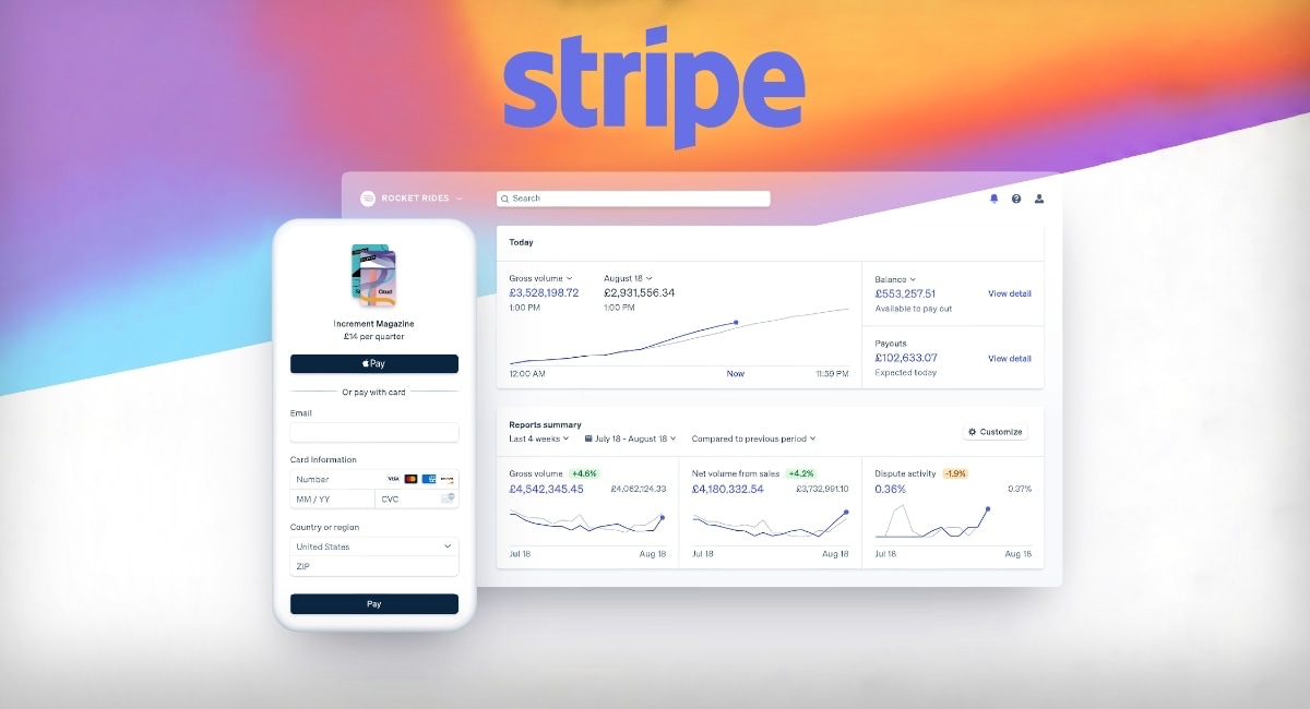
2. Stripe
Stripe provides one of the great dashboards to its users. The access to settings, easy navigation, notifications, and the search feature works really well for a dashboard used for financial purposes. Another important aspect of this dashboard is that it provides data in a very simple manner, thus not complicating any content.
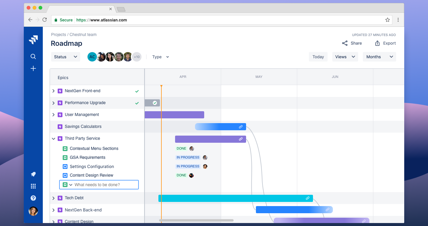
3. Atlassian Jira
Jira is a remarkable tool for managing and tracking complex projects, particularly when working in big product or software development teams. One of the distinguishing features of Jira is the UI design of its dashboard, making it a really good example to follow. The users have a lot of control when using this dashboard and they can view the progress of a project in a variety of ways, making them comfortable with the tool.
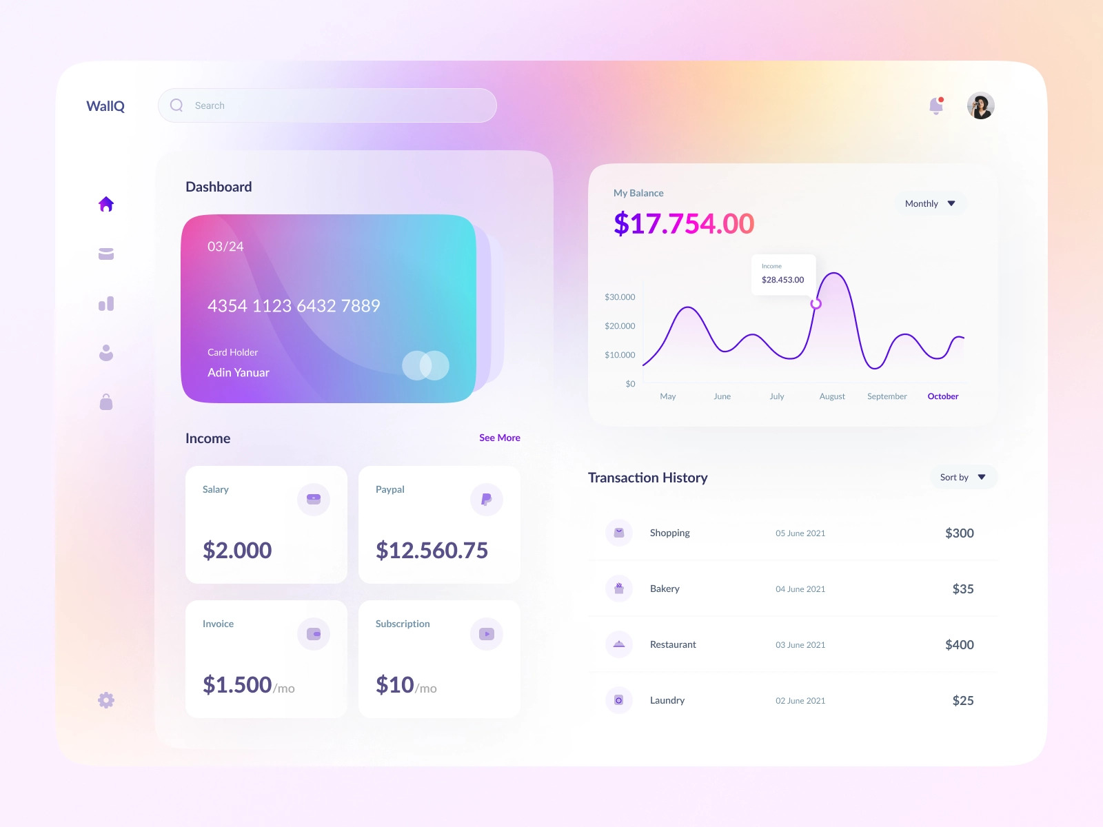
4. WallQ Wallet
Another excellent dashboard example is the WallQ Wallet, designed for the concept of a digital wallet. It can be regarded as one of the most pleasing and effective dashboard design ideas, following pretty much all the best practices discussed above. The best feature of this dashboard is that it utilizes the screen in a creative way, making sure that the right information is highlighted for the audience.
Conclusion
With an increase in web applications and digital solutions, dashboards are becoming more and more popular in the field of design. There are several examples of good dashboard design online, both in the form of concepts and working applications, that UI/UX designers can seek inspiration from. Similarly, there are also some examples of dashboards where things do not go well. This can be because of the wrong choice of dashboard type, inappropriate data visualizations, or simply not meeting the needs of the target audience.
In order to avoid common mistakes and to create successful dashboards, UI/UX designers should always follow the basic principles of design. Additionally, the guidelines and best practices listed in this article can serve as a great resource for beginners as well as professional designers when working on dashboards. If you’re just starting your journey as a designer, chances are that you’re going to come across several projects where you’ll have to create some type of dashboard for the users. Remember, it is always important to develop a good understanding of the product goals and the needs of the audience, before creating any design product or service. The same holds true for dashboard design.

Creates insightful, strategy-driven content that translates complex design and branding concepts into accessible knowledge, supporting Ramotion’s mission to elevate digital experiences.