Many traditional SaaS (Software as a Service) websites overwhelm visitors with jargon, excessive illustrations, and unclear (or sometimes inexistent) pricing. For non-tech users—the very people SaaS tools aim to help—this is a huge turnoff. Potential customers quickly lose interest, wasting your efforts to get them to your site.
So, how do you create a SaaS website that entices users and delivers results? By applying strategic SaaS web design principles that prioritize clarity, rewarding user experience, and intuitiveness.
Read on and learn how successful SaaS companies utilize SaaS web design principles to turn their websites into conversion machines.
What is SaaS Web Design?
SaaS web design focuses on creating websites for Software-as-a-Service companies that explain features, foster trust, and convert visitors into paying users. A good SaaS website is functional, scalable, intuitive, and clearly communicates value so visitors quickly understand why they should trust you.
So, what makes an effective SaaS website?
Key Elements of a High-Converting SaaS Web Design
Below are must-have features and strategies that form the very foundation of high-performing SaaS websites.
Clear Value Proposition Above the Fold
It takes one glance for people to decide whether they like what you offer. Take advantage of your above-the-fold section by clearly stating your value proposition. For example, Notion positions itself as an “...AI workspace that works for you,” speaking directly to busy teams and managers.
Test your value proposition on someone outside your industry. If they can’t explain what your software does in one sentence, rewrite it.
SaaS homepage above the fold via Notion
Product demo and UI preview
Show. Don’t tell.
SaaS websites should show how products work, not overwhelm users with long texts. Use brief demos, UI previews, or visuals to help visitors picture using your software. Focus on demonstrating a single key workflow instead of everything all at once.
Feature sections that sell benefits
List your software features, but lead with benefits and outcomes. This demonstrates that your product is not just cool; it can also deliver results. Group features into core categories (by role, industry, or workflow) and add a short summary sentence above each.
Social proof and trust signals
Social proof and trust signals keep user anxiety at bay. Use customer quotes, reputable client logos, and case studies with measurable results (e.g., ROI, revenue growth). Add images, graphs, and illustrations to make the page engaging.
These signals nudge curious visitors from interest to trial or demo requests.
Transparent SaaS pricing
Don’t hide pricing behind a “Contact Us” button. Display clear plans and tiers, highlight a recommended plan (maybe placed in the middle), and use plain language to show what’s included. Consider a comparative table so they can match prices and features. And if you can, offer a free trial or a money-back guarantee so users feel safe committing to your product.
Essential SaaS Website Pages
Every successful SaaS website consists of a few essential pages, each with a unique role in educating users, building trust, and persuading them to convert. Let’s go over what makes each of them effective.
1. SaaS homepage
The homepage is your first handshake. It should answer “what is this and why should I care?” within seconds.
Key page components:
- Hero section. Capture attention with a strong headline, a supporting subheadline, a product image/video, and one clear Call-to-Action (CTA), like “Free Trial”.
- Value proposition. State who the software is for, what it does, and why it’s better than competitors.
- Social proof and trust indicators. Testimonials from actual clients serve as straightforward opinions about your products. These increase confidence in your company.
- Security and compliance info. Highlight key privacy and compliance certifications above the fold; secondary ones go in the footer.
The homepage isn’t a catch-all brochure. Focus on educating users, building their confidence, and convincing them to take the next step—like booking a demo or signing up.
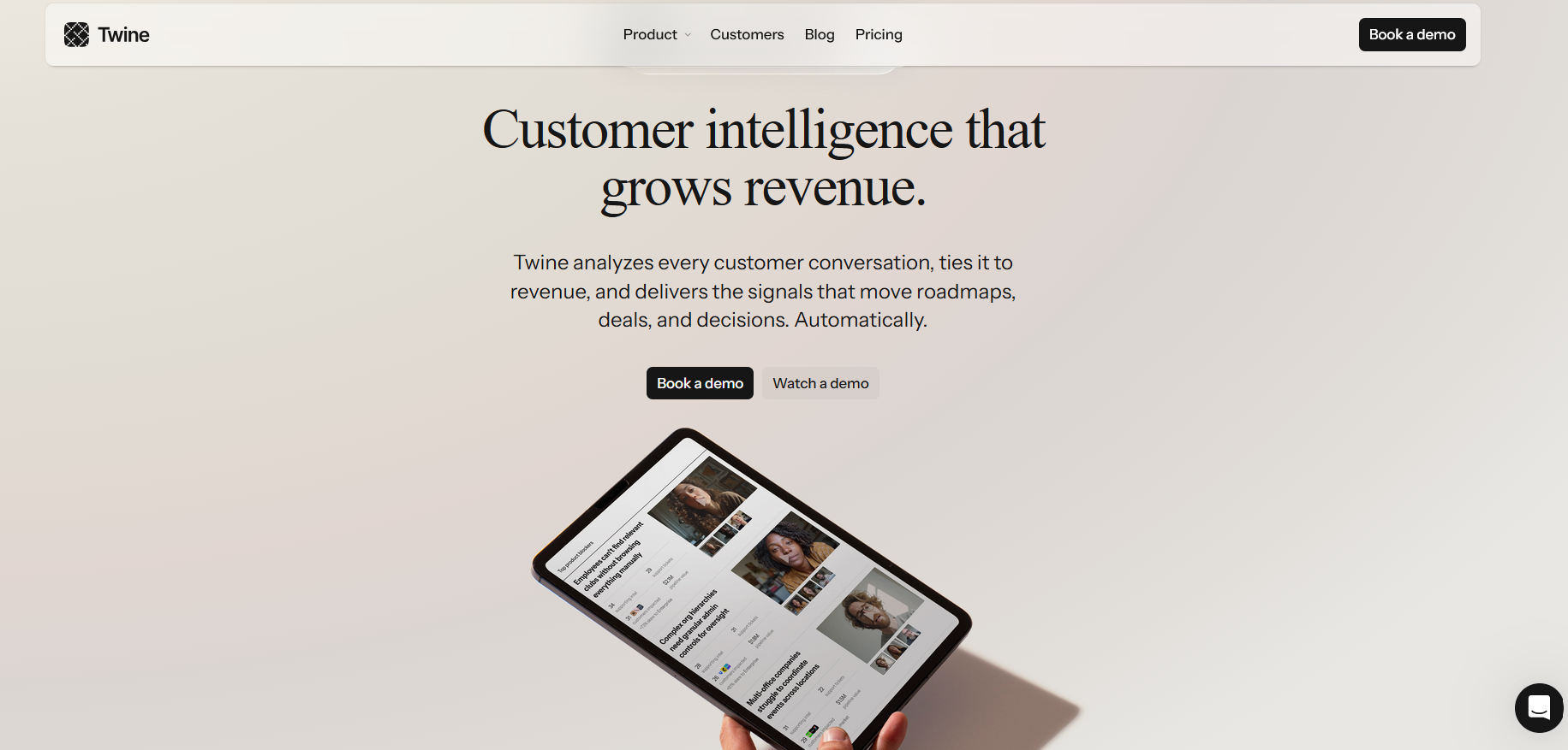
SaaS homepage with clear value proposition and CTAs. Image via Twine
2. Product features page
The product features page is a curated collection of unique features, matched with benefits, visuals, and use cases.
Key page components:
- Features list. Frame each feature with context and user benefit. Instead of simply stating “Role-based permissions”, it can be written as “Role-based permissions so teams avoid workflow conflicts.”
- Dashboard screenshots, illustrations, or GIFs. Highlight each key feature with visuals and a short explainer text.
- CTAs. Place CTAs close to features to remind them of their next steps; sign up, book a demo, create an account, etc.
Lead with your strongest features and place the rest in an expandable section. Include CTAs next to features, like “Request a Demo”, as many users don’t need to read every detail to take action.
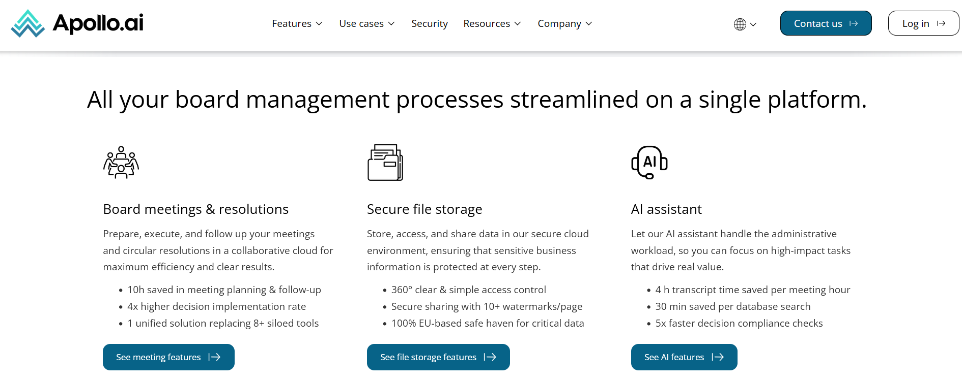
Product features page via Apollo.ai
3. Use case/solution pages
Demonstrate how your product applies in the real world. Use case studies and highlight breakthrough projects. Add variety in the types of problems your software solves to show its full capabilities.
Key page components:
- Audience-specific section. Segment your use cases according to who will read them. Example, ’for marketing teams,’ ‘for software engineers,’ and ‘for small business owners.’ This ensures your page is organized with relevant content that is easy to find.
- Before/After scenarios. Show how your software solves problems, from initial challenge to successful result.
- Testimonials. Make each use case personal by adding direct quotes from your clients.
- CTAs. End with a call-to-action for each section.
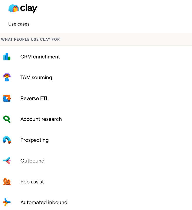
Use cases menu via Clay
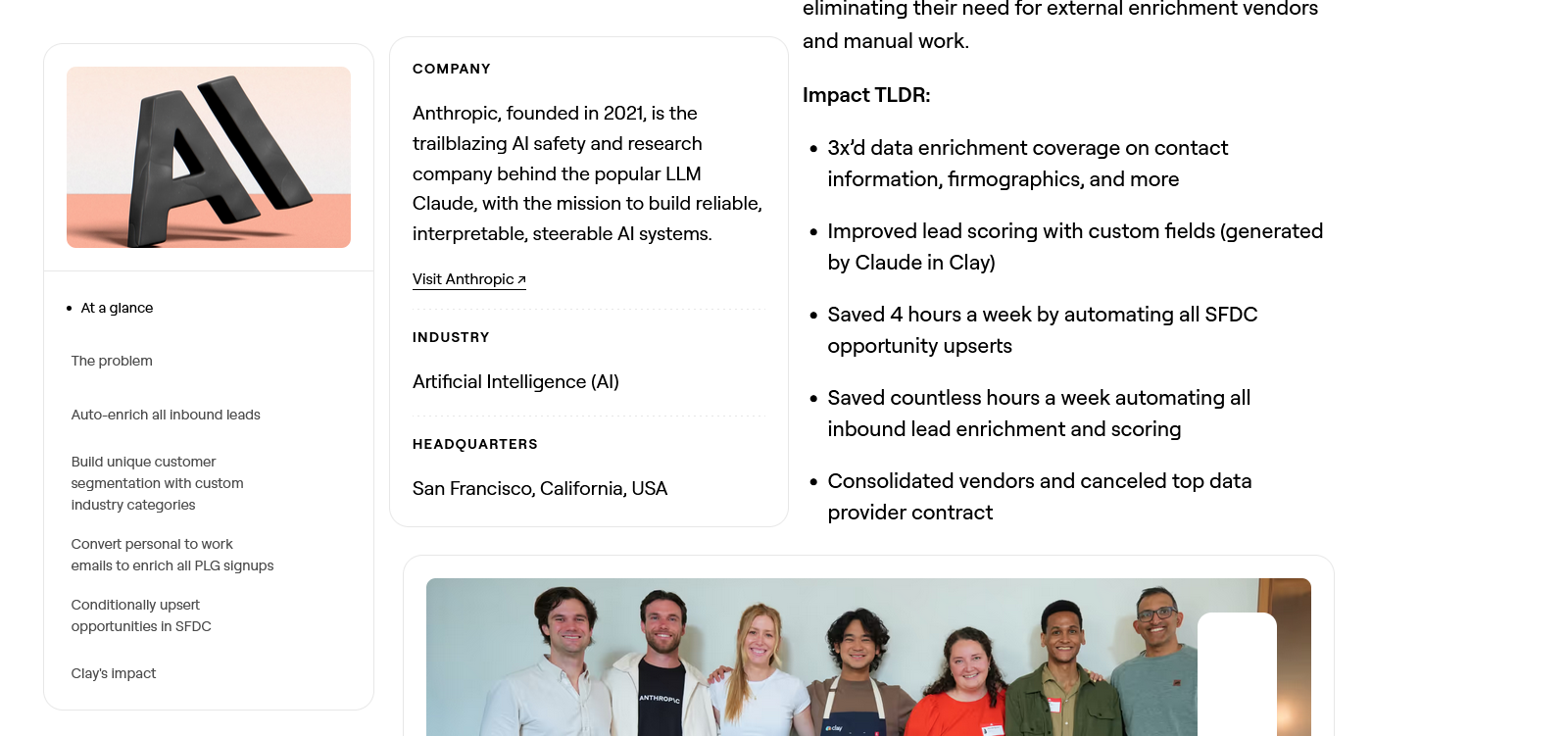
Case study on Anthropic’s inbound enrichment plus results. Image via Clay
4. SaaS pricing page
A SaaS pricing page should quickly show what’s included, what’s not, whether it's customizable, and whether upgrades are possible.
Key page components:
- Plan or package names. Use package names that are simple and clearly indicate what users can expect. Examples include ‘Starter, Pro, Premium’ or ‘Basic, Advanced, Elite’.
- Price per user prominently displayed. Indicate whether you are charging per user monthly, quarterly, or annually.
- Package feature comparison grid. Provide a side-by-side comparison of each plan to set expectations.
- Pricing FAQs. Provide clear answers to frequently asked questions about billing. This includes cancellation policies, payment methods, and switching plans.
Win customers by being transparent and design the page so they can decide quickly. Use clear labels, separate by colors, and highlight your most popular package for easy selection.
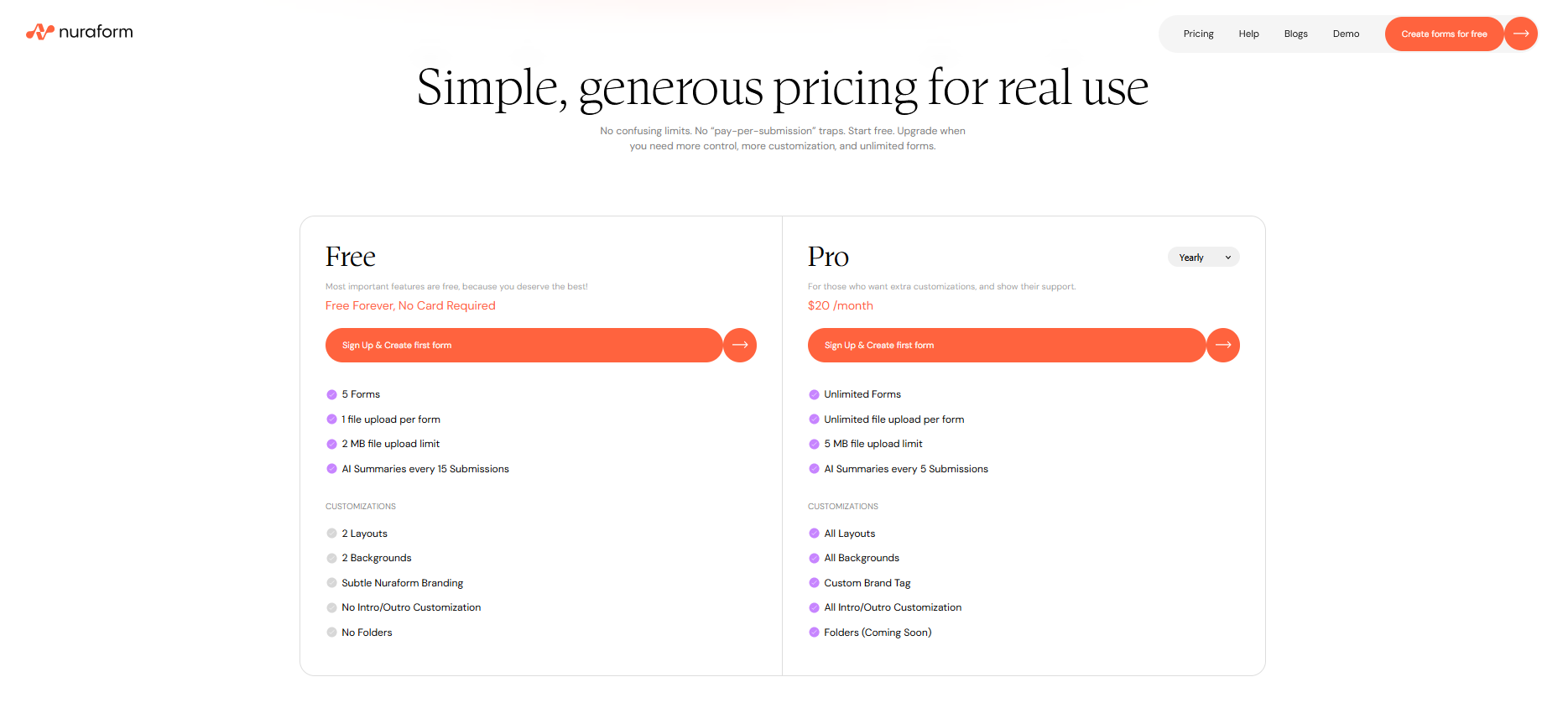
Simple price page with a list of what’s included in every package. Image via Nuraform
5. Blog and resources section
Articles, blogs, and other resources help undecided users learn more about your product and improve search engine ranking through keywords. Create content for real users, not just search engines. Use clear language, update regularly, and link related articles at the end of each post.
Key page components:
- Diverse content. Write about trends and the latest technology relevant to your customers. Let articles or videos answer the most common problems they encounter.
- Search bar and filtering. Help users find content that’s relevant to them in one search query.
- Clear categorization. Organize your content into categories. For example, you can segment between ‘product tutorials’ and ‘industry scoop.’
- Email capture. Turn a reader into a lead by placing sign-up options for your mailing list.
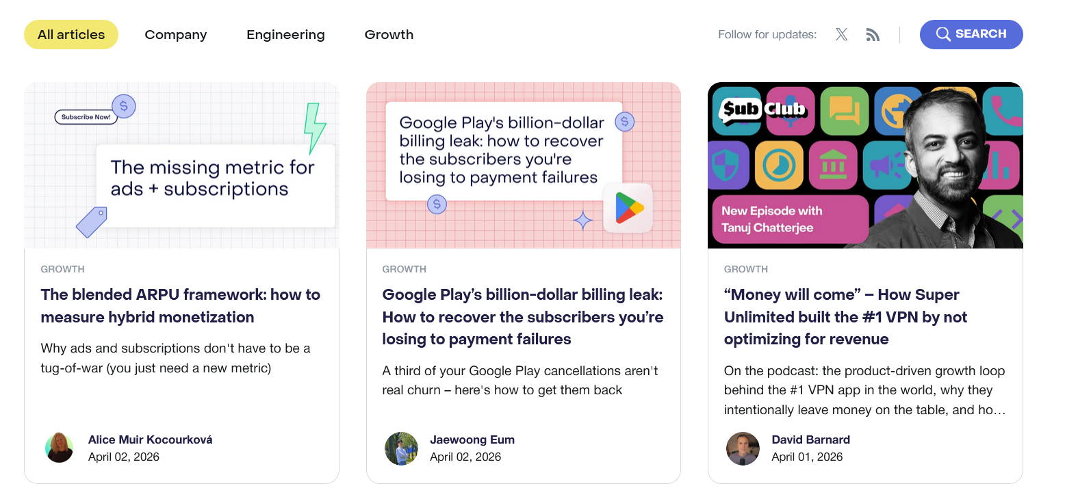
Blogs are segmented into three main categories for easy browsing. Image via RevenueCat
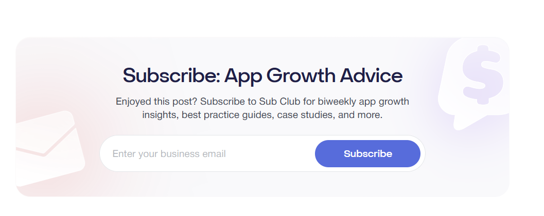
All blogs end with a call-to-action. Image via RevenueCat
Strategically place strong CTA buttons across these pages to guide the users in their journey. They should be easy to spot but not so prominent as to steal attention from other key content.
Remember to design SaaS pages to keep users moving and create opportunities to turn them into warm leads. You can consult with one of the leading custom website development agencies to deliver just that!
SaaS Web Design Best Practices: Core Design Principles for a Website That Works
Explore the following web design best practices and how they help SaaS companies stand out in the real world.
Minimalist SaaS design
Minimalist design prioritizes key content, reduces noise, and clarifies your product’s value. This keeps potential customers engaged and confident in your product.
*SaaS Web Design Tips: *
- Use a clean layout and strong visual hierarchy. Guide attention with color, typography, and whitespace.
- Use a single headline, subheadline, and CTA above the fold. This creates a clear flow that helps users understand your offer.
- Pick one CTA for every section. This prevents confusion or decision paralysis.
Fast website loading speed
Every second counts. A slow SaaS website often leads to lower customer retention and search engine performance.
Designers and engineers must work together to meet Google’s Core Web Vitals—Largest Contentful Paint (LCP), Interaction to Next Paint (INP), and Cumulative Layout Shift (CLS)—and deliver a better user experience. Search engines often prioritize websites that qualify.
*SaaS Web Design Tips: *
- Compress heavy images, videos, and illustrations. Only upload compressed media without compromising quality. For instance, target 200kb for hero images and under 50kb for thumbnails.
- Lazy load secondary elements below the fold. Design your page to load content only when they’re about to enter the user’s screen as they scroll down, instead of loading them all at once.
- Prefer system font where possible. Custom fonts strengthen brand identity, but they take longer to load than system fonts. So, use them only in key areas, but default the rest to system fonts.
Mobile-first responsive design
Statistics show that over 90% of people who access the internet do so on their phones rather than on computers. So, it makes sense to design for phones first with simple layouts, clear CTAs, and touch-friendly controls. Then you can scale up to a desktop with progressive enhancements. But you do not veer away from the design focus that mobile-first design forced you to have.
*SaaS Web Design Tips: *
- Simplify navigation. Use hamburger menus and clear categories to avoid cluttering your interface and user frustration.
- Follow the minimum tap target size: 44x44 pixels. The average human thumb pad is 10-14mm wide, which is approximately 44×44 px on phones. Anything smaller, and users may miss the button.
- Leverage responsive typography. It keeps text legible regardless of screen size.
- Test on real devices and different network conditions. Ensure everyone gets the same version of your SaaS website—layout, tap targets, load speed, etc. — no matter the device or internet speed.
Clear navigation and user flow
Navigation is the backbone of UX (user experience). If it’s messy, it can cost you users and conversions.
SaaS Web Design Tips:
- Use clear labels. Choose clear words to label your menu items. For example, use ‘Products,’ ‘Prices,’ and ‘Features.’ You can also opt for action-oriented words like ‘Solutions,’ ‘Discover,’ or ‘Learn.’
- Stick to five or fewer primary menu items. Doing so avoids overwhelming users. Use secondary links accessible from the footer.
- Add a search bar. Let users find content quickly. Place the search bar in a predictable location, like the top of the screen.
Most importantly, design navigation to help users complete tasks, not just guide them from page to page.
SaaS Website Design Examples
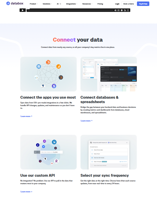
Databox: clear structure and information hierarchy
Databox is a business analytics tool powered by AI. It caters to those who need quick business performance analysis and related reports for data-backed decision-making.
Databox excels in designing an intuitive navigation where every page has a clear role. This leads to a clear information hierarchy.
For example, the product page is a workflow (Connect - Prepare - Visualize - Analyze - Report - Plan); the pricing page is a comparison tool (Free Trials - Compare Plans - Add-ons - FAQs); and the AI page is a standalone explainer (what it does, who it’s for, how to start).
*SaaS web design highlights: *
- Features plus outcomes, always. The website leads with outcomes for each feature, bringing clarity to what the product does without focusing on technical details.
- Minimalist menu. Pages are neatly categorized into six items, and each piece of information is segmented by role, industry, and use case. This creates an easy-to-follow navigation so users don’t have to hunt for what they need.
- Action-oriented product page headers. Each section has a short header, a sentence or two explaining what happens at that stage, followed by a bullet point of specific actions.
The headers guide users on how to use the product. Image via Databox
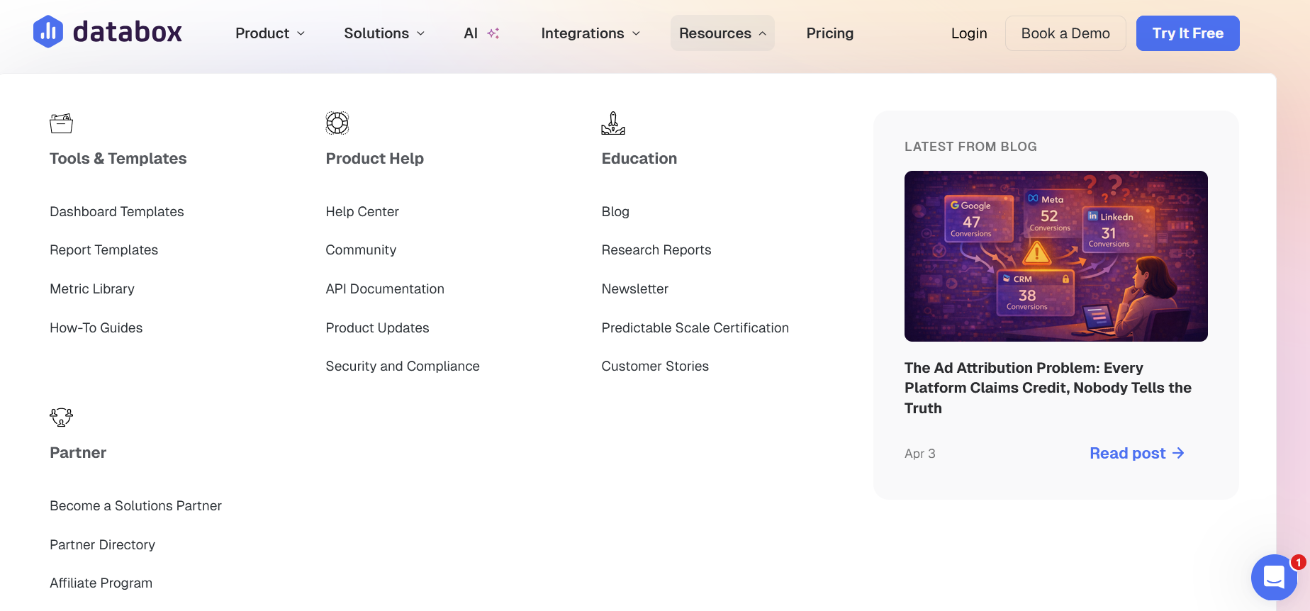
Well-organized menu for easy navigation. Image via Databox
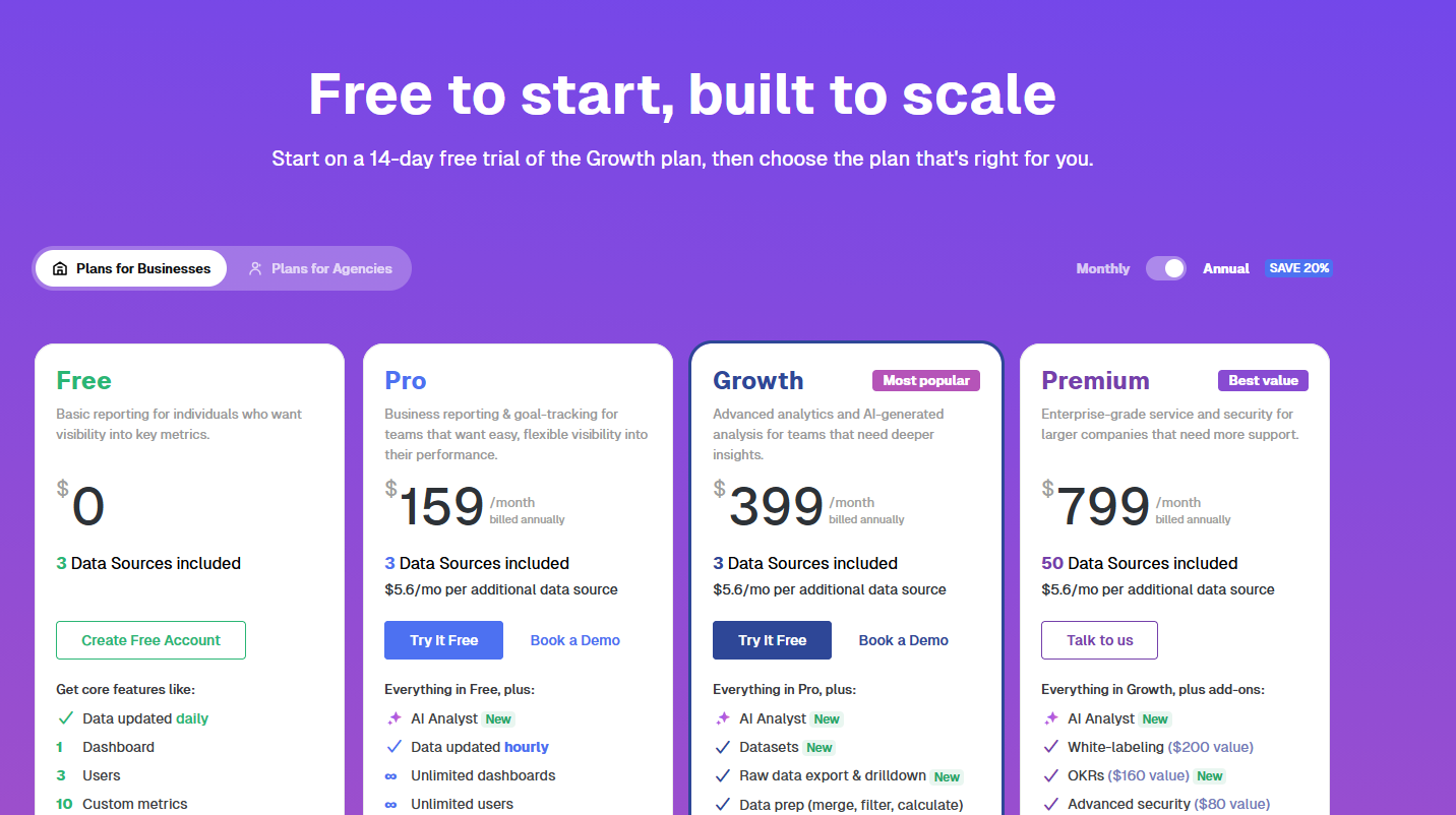
Price page via Databox
Attio: minimalist web design
Attio is a CRM (Customer Relationship Management) platform that lets users automate workflows and ask AI anything about their business. The company’s decision to implement a minimalist design helped prioritize what matters first.
SaaS web design highlights:
- Interactive homepage. The homepage lets users click around and get a feel of what the product is like right from the start. By the time you scroll down to the bottom, you already understand the core product without having to read a single feature list.
- Simple navigation. Attio uses menus as filters so the pages users really want to see appear. Users do not get lost or overwhelmed.
- Strategic use of whitespace. The explanations are short, and there’s a breathing room between each section. It results in a clean look in which elements don’t compete for attention.
A minimalist approach leads to fewer decisions on what to click next. This encourages users to progress faster towards a signup or a free demo.
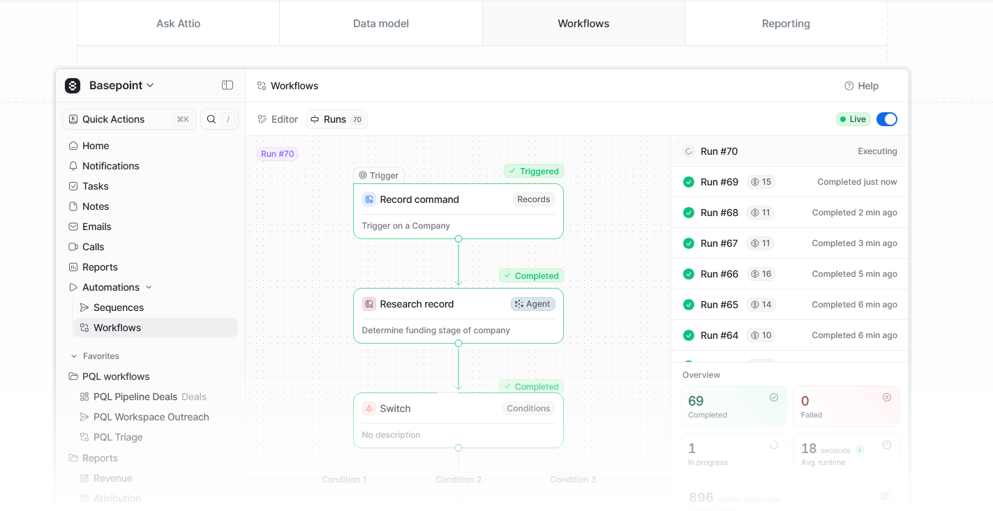
Users can click around and see overviews of Attio’s capabilities. Image via Attio
The use of negative space makes the website easy on the eyes. Image via Attio
Huly.io: Interactive UX
But what if you’re a maximalist? Then take your cues from Huly.io, an open-source “everything app” for those looking for a virtual office, chat, documents, project management, and planning tools, all in one platform.
The website uses bold contrasts, animated grids, and avatars, among others. It also integrates interactive features with its virtual office mockups, complete with avatars, meeting rooms, and video controls.
Maximalism can be heavy and confusing, but the interactive elements distribute the cognitive load, allowing users to continue engaging.
SaaS web design highlights: * Animated visuals. Every product feature comes with animated clips and images that demonstrate how it works on the spot. * Demo platform. Users gain access to an interactive platform to test-drive the product before committing.
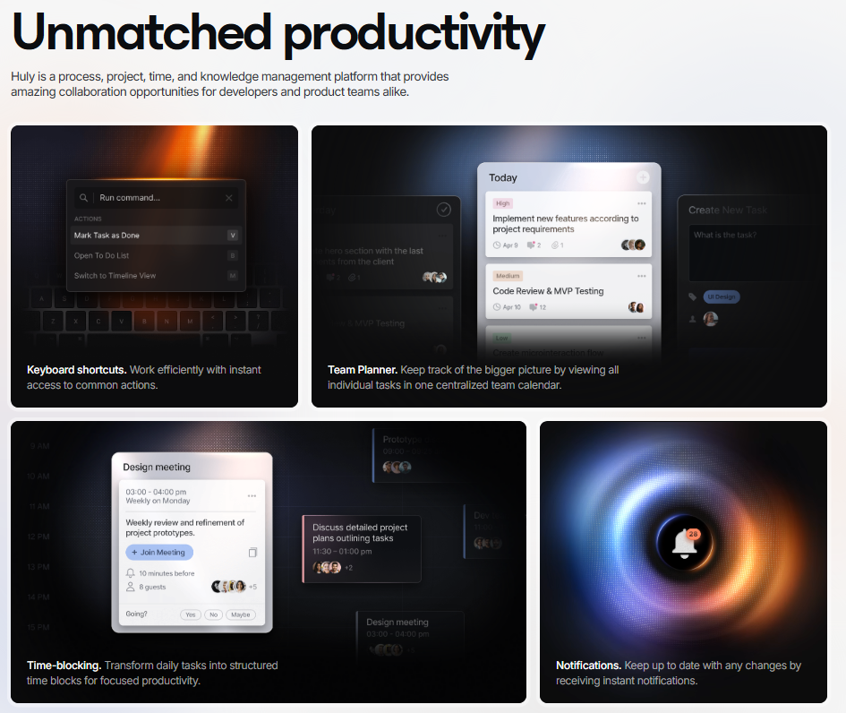
Animated grid of product features. Image via Huly.io
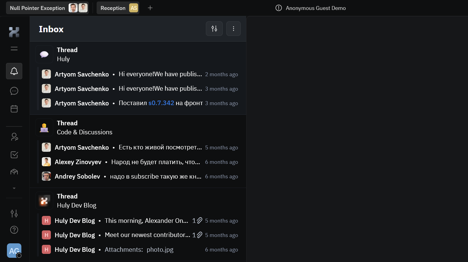
Sandbox platform via Huly.io
Build a SaaS Website That Delivers Results
Creating a SaaS website that converts goes beyond adding cool effects or graphics. It’s about centering your web design on users, educating them, understanding their behaviors and triggers, and earning their trust.
Start with the basics: a clean layout, a compelling value proposition, and strong CTAs. Prioritize mobile responsiveness and speed, as most users will judge your product within seconds on their phones. Be transparent with your prices, place social proofs strategically, and keep navigation simple. And finally, iterate on your website using customer feedback and analytics.
When you concentrate on these core principles, the user experience improves, visitors stay, and turn into loyal users.
Tags:

Creates insightful, strategy-driven content that translates complex design and branding concepts into accessible knowledge, supporting Ramotion’s mission to elevate digital experiences.