As a startup company, advertising can feel challenging. Whether you’re launching a new product quickly or building long-term relationships with future customers, getting your message noticed is more competitive than ever.
The good news? Landing pages can help you take those goals in front of millions, even billions of users who could potentially become sources of revenue and loyal repeat customers. As a matter of fact, a study by MarketingSherpa found that landing pages with a clean design can maintain conversion rates as high as 300%, according to a report by Zyntics.
A startup landing page can serve as a gateway to grab attention, engage visitors, convey key information, and direct them toward a specific action, which can help convert visitors into customers and generate more income for your startup company.
Landing pages can help startups collect leads, validate product ideas, and build early traction. Compared to a full website that tries to do everything at once, landing pages are built to turn interest into action.
Whether you’re promoting a new product, growing an email list, testing an offer, or generating leads, a well-designed landing page can make all the difference for startups by providing the focus and clarity needed to turn a quick visit into a lasting connection.
In this article, you’ll learn about the key benefits of landing pages, their different types, key elements, and the common mistakes to avoid. You’ll also gain inspiration from successful landing page examples to make your own page more discoverable and help early adopters connect with your brand.
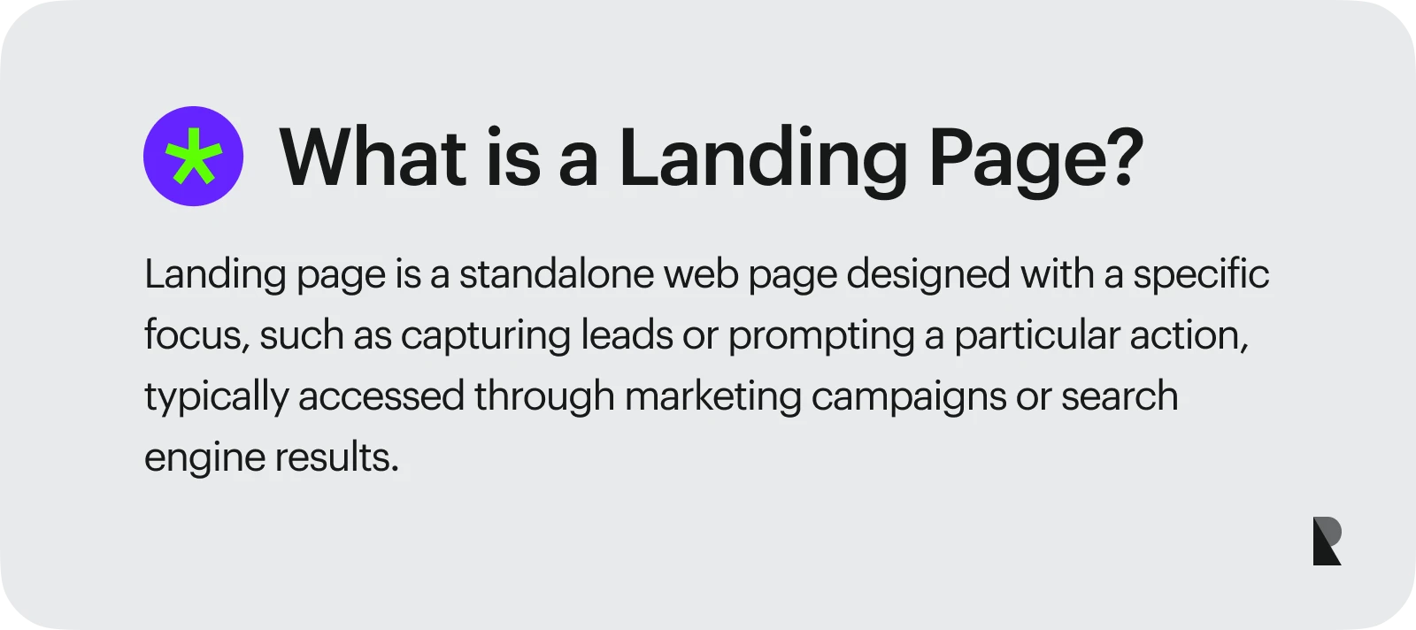
What Is a Landing Page?
A landing page is a standalone web page created for a specific marketing or sales campaign. Unlike a main website, it focuses on a single goal, which is to guide visitors toward a specific action, such as making a purchase, booking a service, or sharing important information. Landing pages help businesses generate leads, validate ideas, and drive early conversions while attracting potential customers who want to engage with the brand.
It's easy to tell that a landing page has a unique design. It doesn't have the essential parts of a fully developed website, such as the main navigation menu, sidebars, and more than one internal page. Instead, a landing page directs a visitor’s full attention to the offer and its call-to-action or CTA buttons.
In marketing and sales campaigns, landing pages are highly effective because they remove distractions that might pull users away from taking the desired action. Since competing links and excess information that users don’t need to complete the goal are purposely excluded, it becomes easier to build a clear user journey that leads directly to conversion benefits.
Landing Page vs. Homepage vs. Product Page
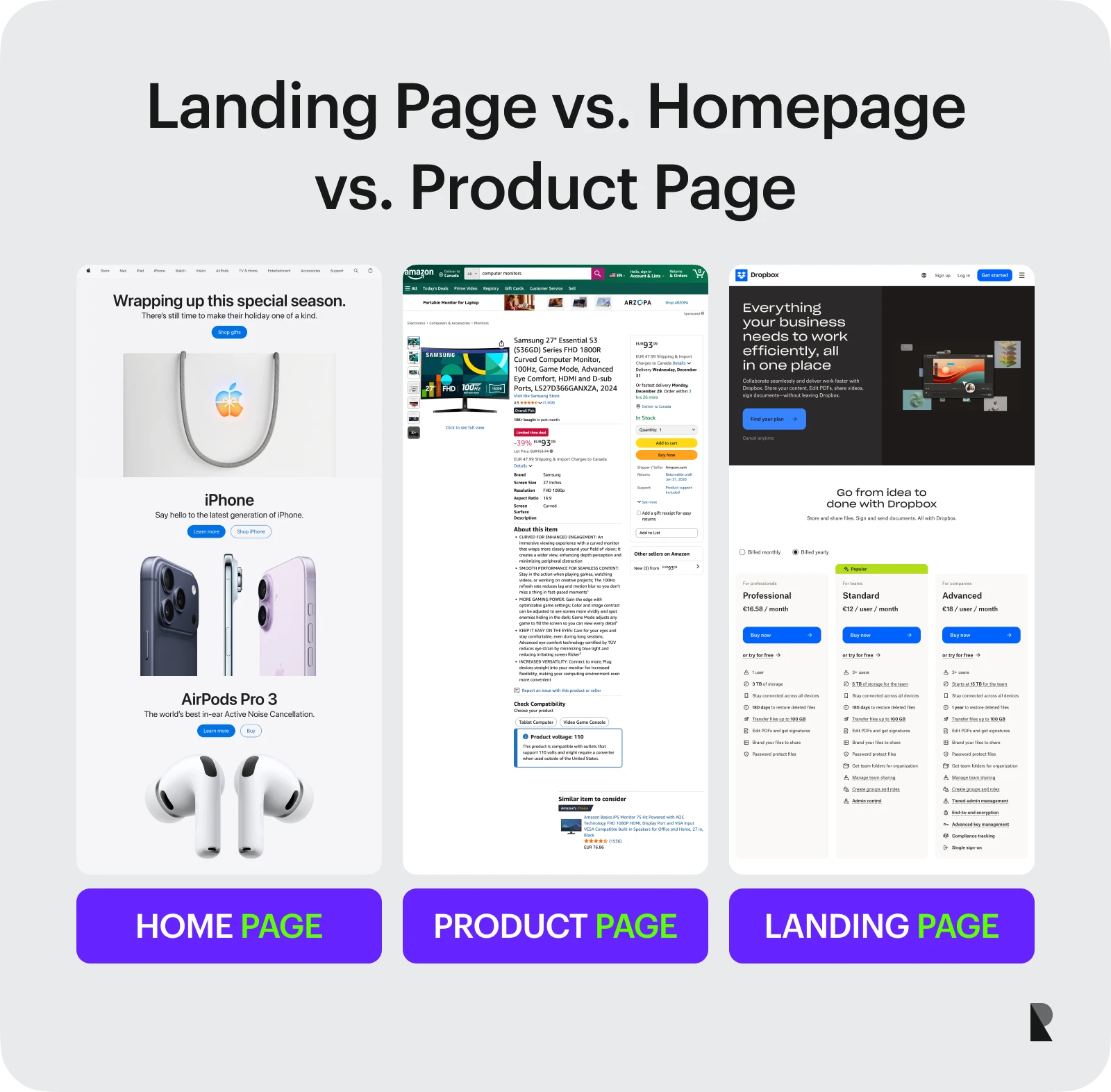
For every website, there are several types of web pages that may be included, each serving a specific purpose and following its own design approach.
1. Homepage
When someone visits the website's main URL, the homepage is usually the first or top-level page they see. It is the main web page, where people can learn about the brand, see its most important products, and get to other parts of the site.
A homepage usually contains all the primary elements of a full-featured website, including:
- navigation menu
- about section
- service or product listings
- blog or resource links
- contact information
- footer with social links
- legal details
2. Product page
Product pages are often found on online stores or e-commerce sites. They provide detailed information about a brand's catalog of products or services. It usually has call-to-action buttons, high-quality images, detailed descriptions, prices, available variations, and technical specifications.
The main goal of a product page is to get people to buy something or sign up for a service. It builds trust and credibility by putting all the important information in one place. It also makes the buying process easier and connects online browsing with the lack of physical interaction.
3. Landing page
A landing page is different from both the homepage and the product page because it has only one goal. It’s not aiming to show off the brand or a lot of different products. Instead, it was made to lead visitors to one clear action.
Landing pages are specifically designed for users who arrive through a targeted ad, email campaign, or social media link. Every element from the copy and visuals to the form and call-to-action is ideally crafted to encourage that specific action, such as subscribing, making a purchase, or downloading a resource.
Main Types of Landing Pages
There are three main types of landing pages, each serving a distinct purpose in the customer journey.
1. Lead generation pages
This is the most common type of landing page. According to a Landing Page Statistics Roundup by Backlinko, about 43.6% of marketers say their primary goal for creating landing pages is lead generation.
Lead generation pages are designed to capture user contact information, such as name, email, phone number or address in exchange for a valuable resource like an eBook, free trial, webinar, or any digital resources.
The main goal of a lead generation page is to encourage visitors to complete the form, converting anonymous traffic into potential customers also known as "leads” that can be nurtured through targeted marketing efforts later on.
2. Click-through pages
Compared to lead generation landing pages that focus on collecting user information, a click-through page acts as a bridge. It gives users short bits of information and persuasive content to help in their decision making, which leads them to another page where the final action happens (like making a purchase or signing up for a service).
Click-through pages are especially useful for upselling, directing users to a shopping cart, or leading them to a more detailed sales page that finalizes the conversion.
3. Sales pages
A sales page is a dedicated web page created strategically to sell. They usually highlight the main benefits of a product, answer questions, and help people who are interested in buying it.
It's easy to spot these kinds of landing pages that get a lot of conversions. They are usually longer, use persuasive language, show social proof, and have a clear "Buy now" or "Order now" CTA button as the main goal of the conversion.
Sales pages work especially well for high-value products, online courses, digital subscriptions, software plans, or any offer that requires more information and trust before purchase.
Why Landing Pages Matter for Startups
For many new business ventures, a startup landing page can be considered one of the most cost-effective and high-quality campaign resources, as well as the easiest method to determine whether a product or service is a good idea without having to develop a full website or application.
It’s a low-risk but high-impact way to attract early users and drive growth, especially when you work with a web design agency for startups that understands how to design with strategy, clarity, and conversion in mind.
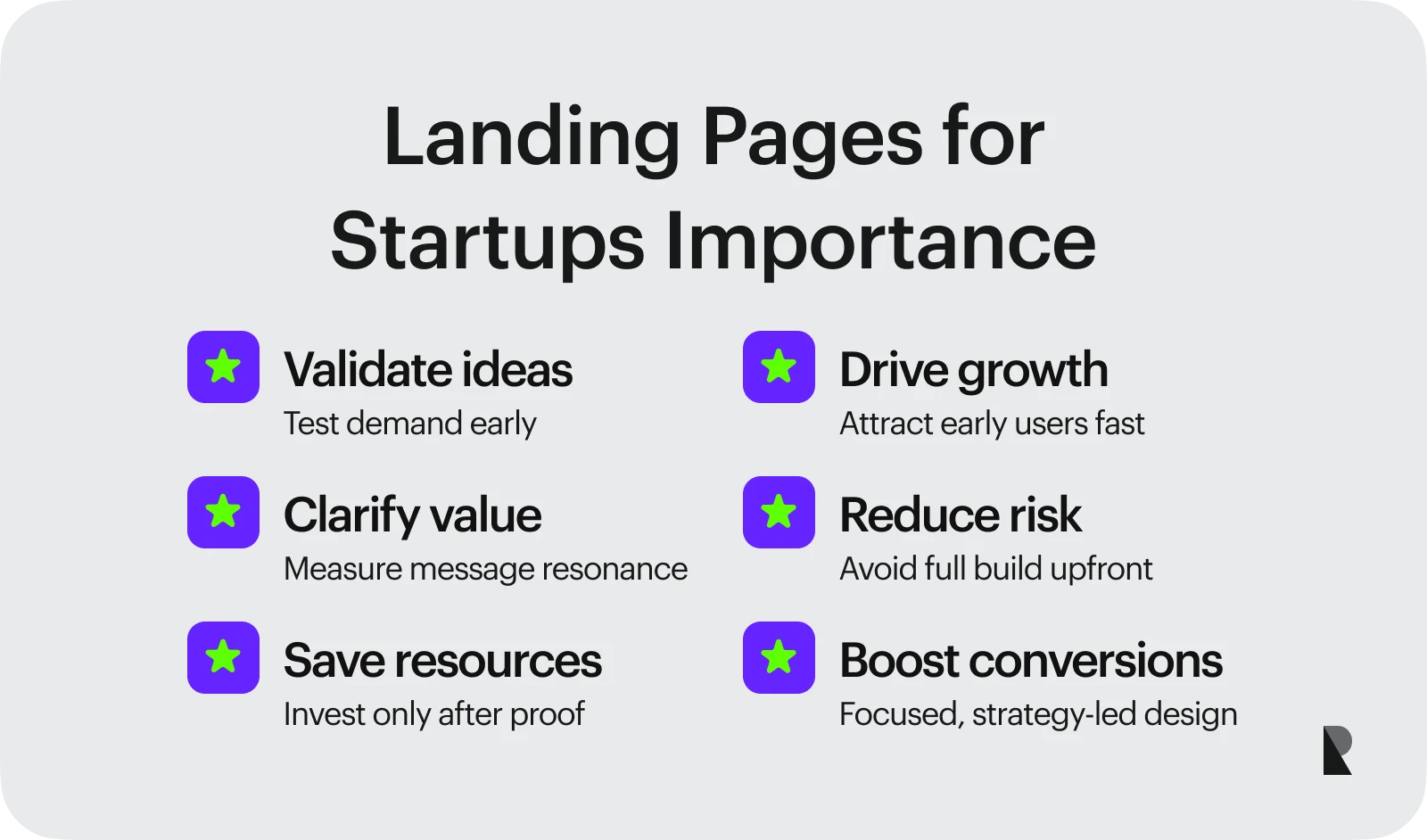
A startup landing page enables business owners to test the market, measure their value proposition, and determine whether visitors quickly connect with what the company offers before investing more resources in development or advertising.
The Primary Purpose of a Landing Page
Landing pages have one primary purpose: to drive conversions.
It isn't just a way to access information, provide entertainment, or engage in general browsing. Its main goal is to encourage people to take a specific action for conversion, such as turning casual or first-time visitors into leads or customers.
A landing page differs from other types of websites, such as company sites, online stores, or complex apps that serve multiple purposes. It focuses on a single clear goal and guides users smoothly throughout the page, minimizing distractions.
Here are some common conversion goal examples for a landing page:
- Demo booking – encourages visitors to schedule a live demonstration or consultation by filling out a form.
- Waitlist signup – spark interest of potential customers in a new product or feature by letting them sign up for a waitlist.
- Product purchase – motivates visitors to buy a specific product or service.
- Lead generation – encourages users to share their contact information in exchange for valuable resources, such as an e-book, a video, or digital materials.
- Account creation – get visitors to sign up for a new account on the website or download the app to make profiles.
Benefits of Landing Pages for Startups
A landing page can bring numerous benefits to startups. It allows them to test ideas, determine demand, and convert leads into customers quickly, affordably, and with minimal risk, without needing to build a full website or app.
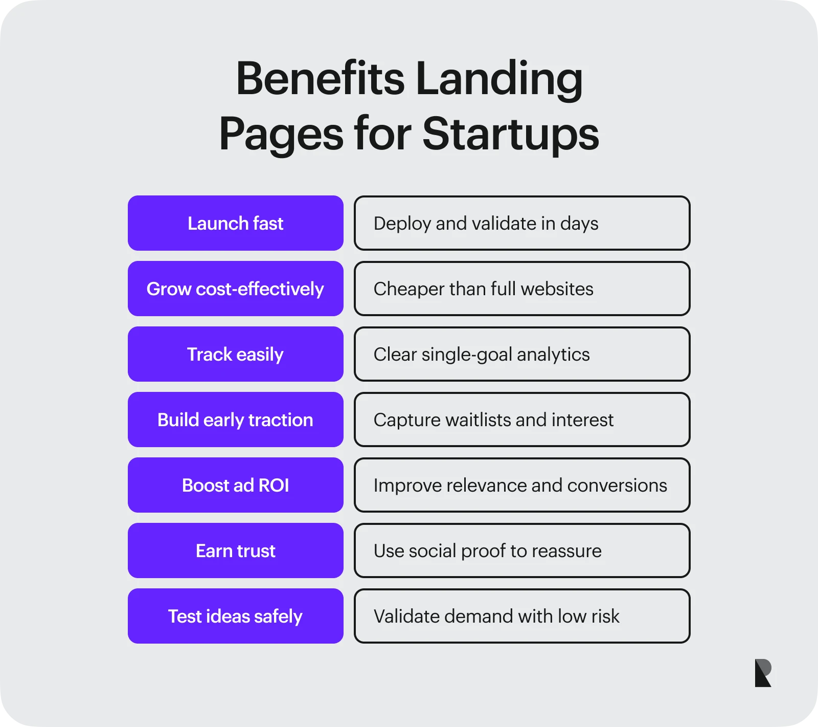
Here are a few benefits an excellent landing page design can offer to startups:
1. Speed of deployment
The primary benefit of a startup landing page is its ability to be launched quickly.
You don’t need complex development or coding to start building an eye-catching landing page design. Within days (not months), you can validate your idea, capture leads, and measure growth even before your product officially launches.
In fact, according to Linear Design, a simple landing page can be created within 8 hours to 2 days, while a medium-complexity page typically takes 3 to 7 days only.
You can also use modern page builders to create a startup landing page. These tools enable you to create pages quickly and easily, without requiring code or pre-made templates. However, many founders still prefer to hire website design companies to ensure the design is unique, strategic, and aligned with their brand goals.
2. Cost-effect£ive growth channel
A full-scale website or application can cost you more money than a startup landing page.
A landing page includes only a few key elements, making it incredibly inexpensive to build. You can make a professional startup landing page design that is easy to update and optimize as your business grows with just a minimal amount of investment.
3. Easy conversion tracking
Because a startup landing page focuses on a single, actionable goal, it’s much easier to track and measure its performance through key metrics such as conversion rate, bounce rate, and click-through rate.
Startups can see clear, measurable results from their marketing efforts with the help of KPI tracking tools like Google Analytics and Hotjar.
4. Drive early traction and build community
A landing page is a great way to capture people's interest in your products or services before they even arrive.
For example, creating a “Waitlist startup landing page” ensures your product or service already has an interested audience and doesn’t launch to an empty room. Studies by Waitlister reveal that top-performing waitlist pages can achieve conversion rates of 25%–85% from visitors to sign-ups when properly optimized.
5. Higher ROI from Ad campaigns
A well-optimized startup landing page can deliver a higher return on investment (ROI) when paired with paid advertising.
According to a case study by Instapage, the people management platform Lattice achieved a 41% increase in advertising conversion rates after implementing optimized landing pages. This demonstrates that a well-designed and optimized landing page can significantly enhance the relevance of ads, increase conversions, and boost the overall return on investment (ROI).
6. Builds credibility and trust
A good startup landing page doesn't just get people to buy things; it also helps visitors trust and believe in the company.
Many effective landing pages feature testimonials, case studies, certifications, or trust and security badges that instill confidence in the choice people make when they take the desired action.
Key Elements of an Effective Startup Landing Page
Every great startup landing page is made up of key elements that make it effective and highly converting. These building blocks work together to guide the user journey toward a single, defined goal.
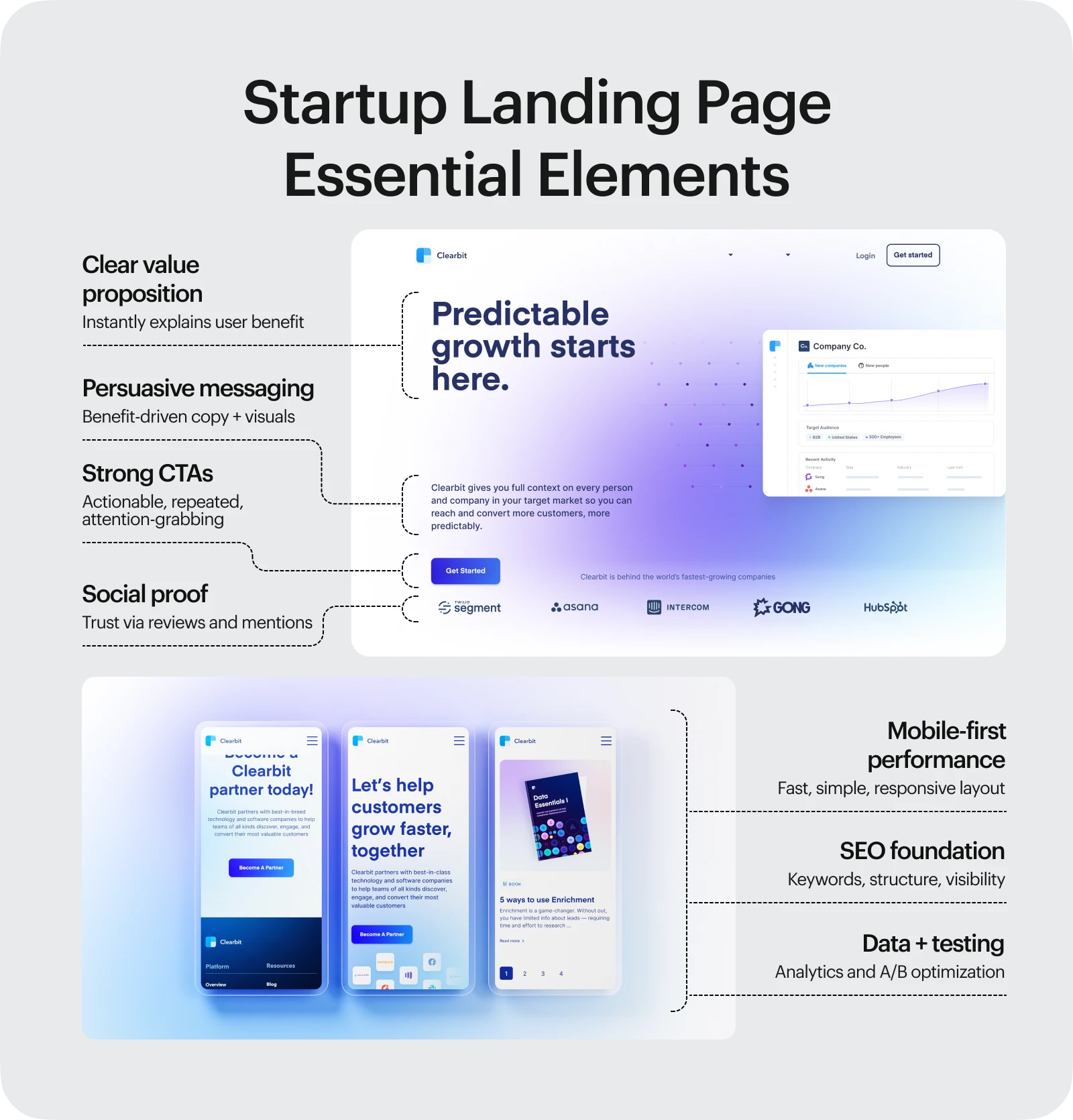
Here are the main key elements of an effective startup landing page:
1. Clear headline and value proposition
The headline is the first thing visitors see when they go to your startup landing page, and it's often the most important.
Your headline should clearly convey what you offer and why it matters. Within seconds, visitors should be able to easily and directly answer the question, "What's in it for me?" and understand how your offer will benefit them.
2. Mobile-responsive, fast design
According to Statista, the majority of website traffic today originates from mobile phones, accounting for over 62.5% of global web traffic.
As a new business, ensure that your website is both fast and easy to use on all devices. A landing page that works well on mobile devices should be simple, easy to understand, and clutter-free. This ensures that visitors have a good experience, regardless of the device they use to visit your site.
3. Persuasive copy and engaging visuals
A case study by Cybertek Marketing demonstrates how one company utilized persuasive copywriting to achieve top keyword rankings and a 40% increase in leads. The copywriting generated high-quality traffic and motivated visitors to take action.
This shows that persuasive, benefit-driven copy, along with excellent visuals such as high-quality images, videos, or graphics, can easily persuade users to take what you have to offer on your startup landing page.
4. Strong, repeated calls-to-action (CTAs)
Once users understand your offer, you should guide them toward the next step. This is where your CTAs on your startup landing page play an important role in encouraging this action.
Your CTAs serve as the driving force behind your conversion goals. To make them effective, they should be:
- Action-oriented – Use strong and clear verbs like “Get it now,” “Join free,” or “Get in touch.”
- Prominently placed – Put them in places that will convince people to read them, like at the top of the page and above the fold.
- Visually distinct – Apply contrasting colors to make them stand out from the rest of your landing page.
5. Social proof and media mentions
People often trust what others say more than what brands claim to be true.
For a new startup, trust is your strongest asset, and social proof is one of the ways you can earn it.
Your startup landing page should include:
- Customer testimonials
- User reviews and ratings
- Media mentions
- Third-party seals and logos
- Platform endorsements (e.g., Trustpilot, Google Reviews, or Birdeye)
6. SEO, analytics, and A/B testing
To drive traffic and conversions, your startup landing page must be search-optimized, data-driven, and continually tested.
Here’s how to implement them effectively:
- Use target keywords, optimized meta descriptions, and structured headings.
- Integrate analytics tools, such as Google Analytics and Mixpanel, to track user behavior and performance.
- Run A/B tests using tools like Optimizely and Unbounce to identify what drives the best results.
Common Landing Page Mistakes to Avoid
Landing pages can make or break your marketing efforts. Get them wrong and you could lose conversions and money.
Landing pages play a crucial role in every marketing campaign.
Getting them wrong can lead to low conversions and wasted ad spend.
Below are the most common landing page errors startups make, and how you can avoid them to improve results.
1. Overloaded or unclear messaging
Putting too many words, and visual elements in your message can make it less clear and keep visitors from focusing on what you want to convey. Visitors can quickly lose interest and leave without doing anything when your startup landing page tries to say too much at once.
Prevention: You need to keep your content simple and focused. Use one clear message with a single conversion goal per landing page, then highlight your main benefit through a bold, attention-grabbing headline that immediately communicates value.
2. Weak or missing call-to-action (CTA)
CTA's are supposed to motivate visitors to take a specific action.
Using weak language or unpersuasive words may cause visitors to miss the point and not know what to do next.
Prevention: Don’t just use strong verbs, but also focus on motivating users and guiding them at every scroll level.
3. Poor load speed or mobile usability
As mentioned earlier, most traffic today comes from mobile devices.
Even if your startup landing page has great design and copy, it won’t convert if it loads too slowly or doesn’t display properly on mobile screens.
Prevention: To keep your landing page flexible across screen sizes, use CSS frameworks like Bootstrap CSS or Tailwind CSS or implement a responsive design approach. Before you launch, test your landing page on a variety of devices and browsers to make sure it works well and is easy to use.
4. Missing trust signals
People won’t share their sensitive information if they don’t trust your brand. Most users rely on peer reviews and recommendations from others who have already tried and succeeded with a product.
That’s why social proof is one of the most vital elements of a startup landing page.
Prevention: Add user reviews, testimonials, privacy and security badges, or press logos, to boost confidence. Include a link to your privacy policy near any data collection forms to increase trust and credibility.
Examples of High-Converting Startup Landing Pages
Not every landing page works, but looking at successful and high-performing startup landing pages can give you ideas and inspiration for your own projects.
Here are five of the best startup landing page examples that can show you what works and what you can use in your own design.
1. Dropbox
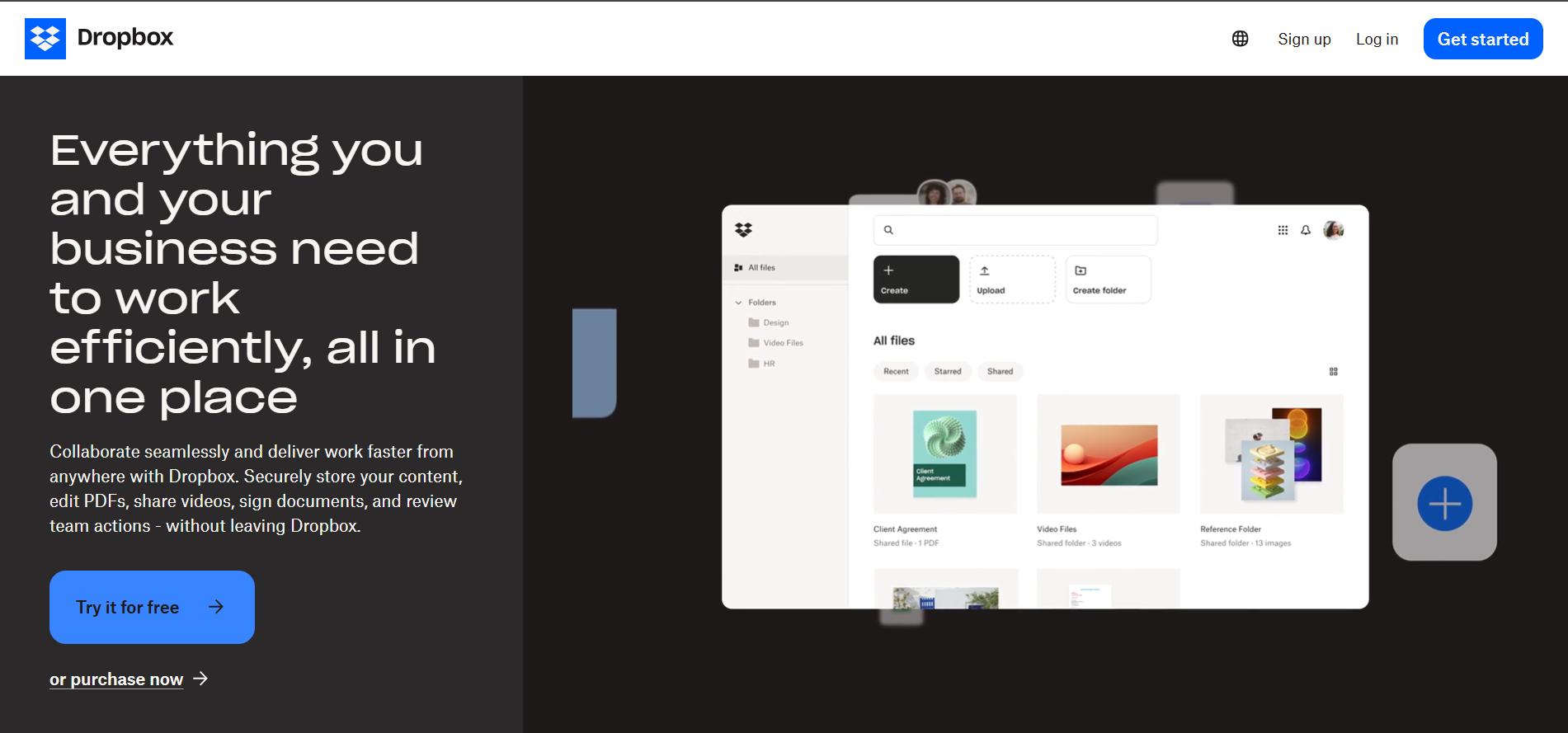
Dropbox’s landing page has a clean structure and smooth text flow from the clear headline. (Image Source)
Dropbox is one of the best landing page examples with simple yet clear minimalist design and message. The flow is clear and easy to follow, from the headline, "Everything you and your business need to work efficiently, all in one place," to the call to action, "Try it Free."
It doesn't use complicated technical language or too many images, instead, it just tells users how to sign up or download the app based on the pricing level they choose. Users can easily understand what they need to do next because of how simple it is.
2. Slack
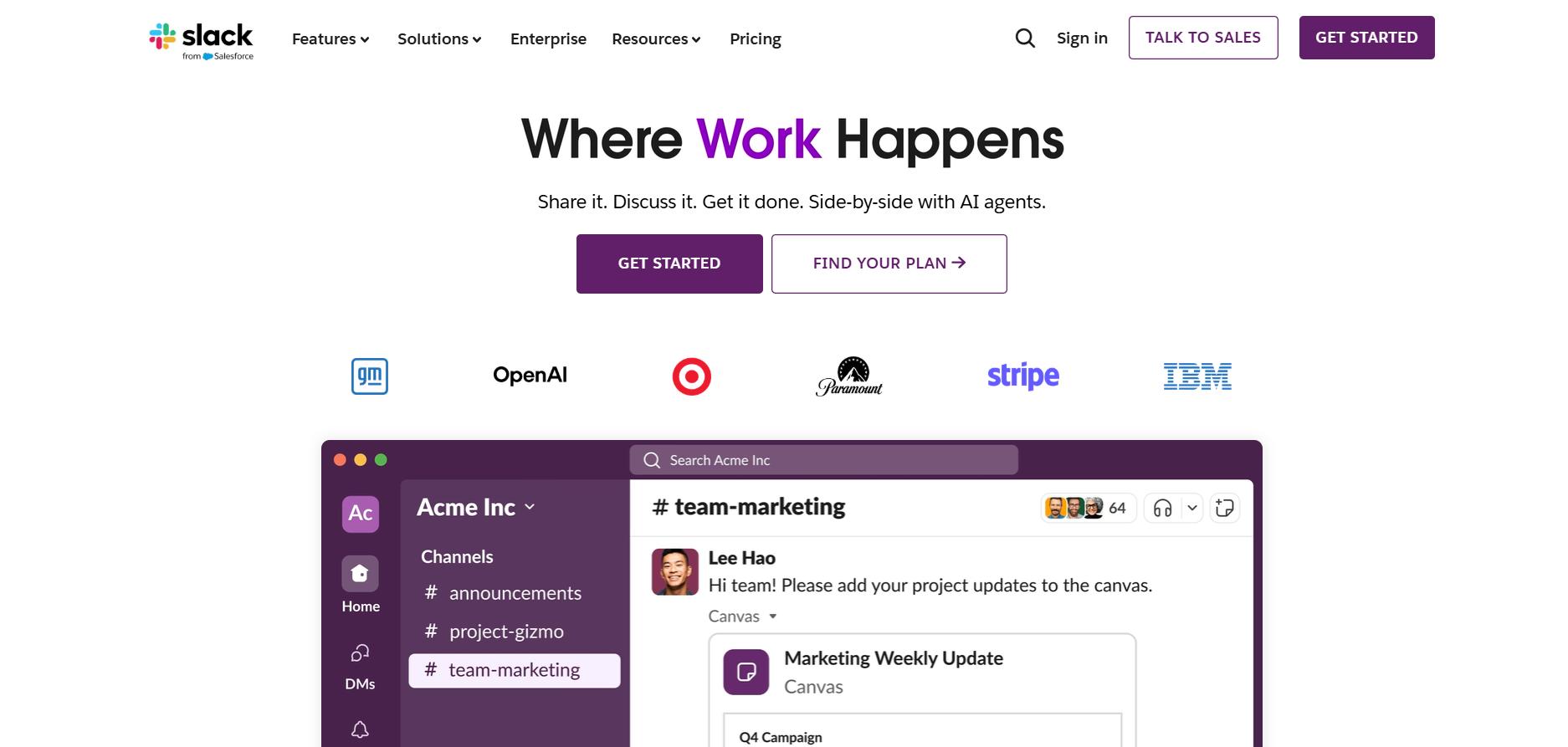
Slack stands out with product-focused storytelling, friendly illustrations, and smooth animations.(Image Source)
Slack is yet one of the great landing page examples known for its product-first storytelling, friendly illustrations, and smooth animations.
It has good visuals and an easy sign-up process that makes it clear right away how Slack makes communication at work easier.
Its most powerful message, "Where Work Happens," along with simple calls to action like "Get Started" and "Find Your Plan," makes it more credible and encourages users to act quickly.
3. Airbnb
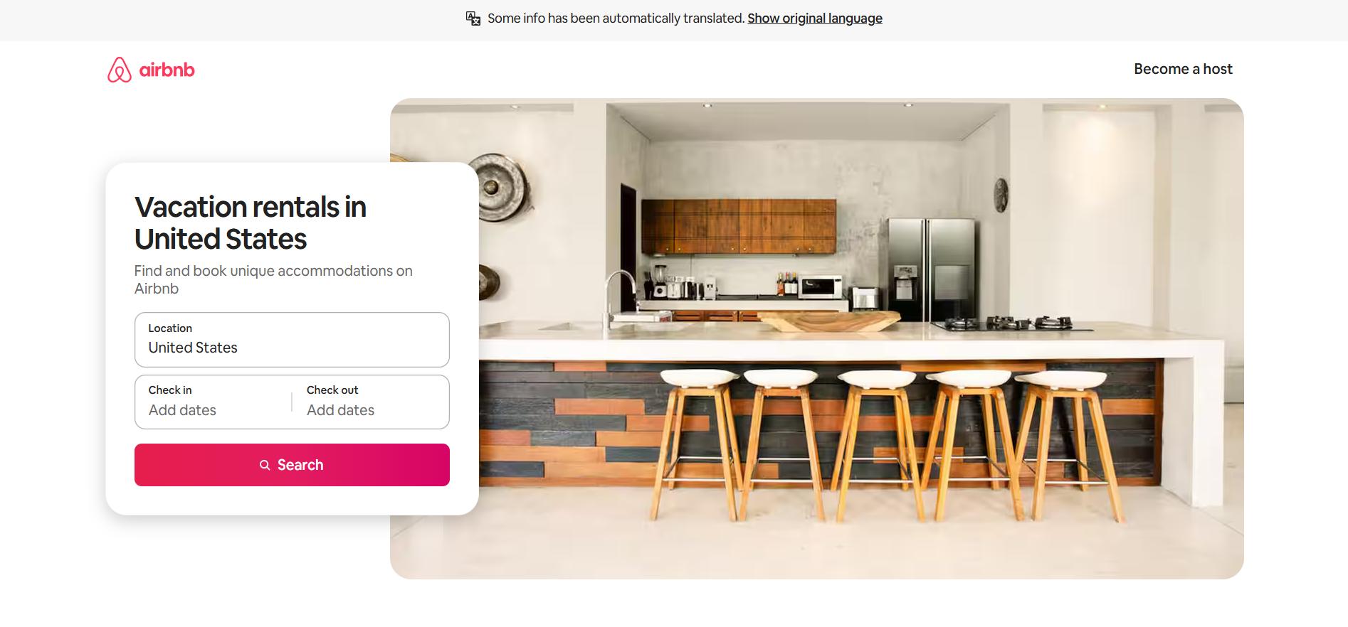
Airbnb uses an emotional storytelling approach on its landing page.(Image Source)
Airbnb stands out for its emotional storytelling approach. This is one of the best booking-related landing page examples. It gets people curious with its great design, beautiful icons, and personalized suggestions.
By featuring real photos, host testimonials, and compelling headlines like "Don’t just see [Location], experience it," Airbnb builds a sense of trust and belonging while inspiring visitors to take action.
4. Notion
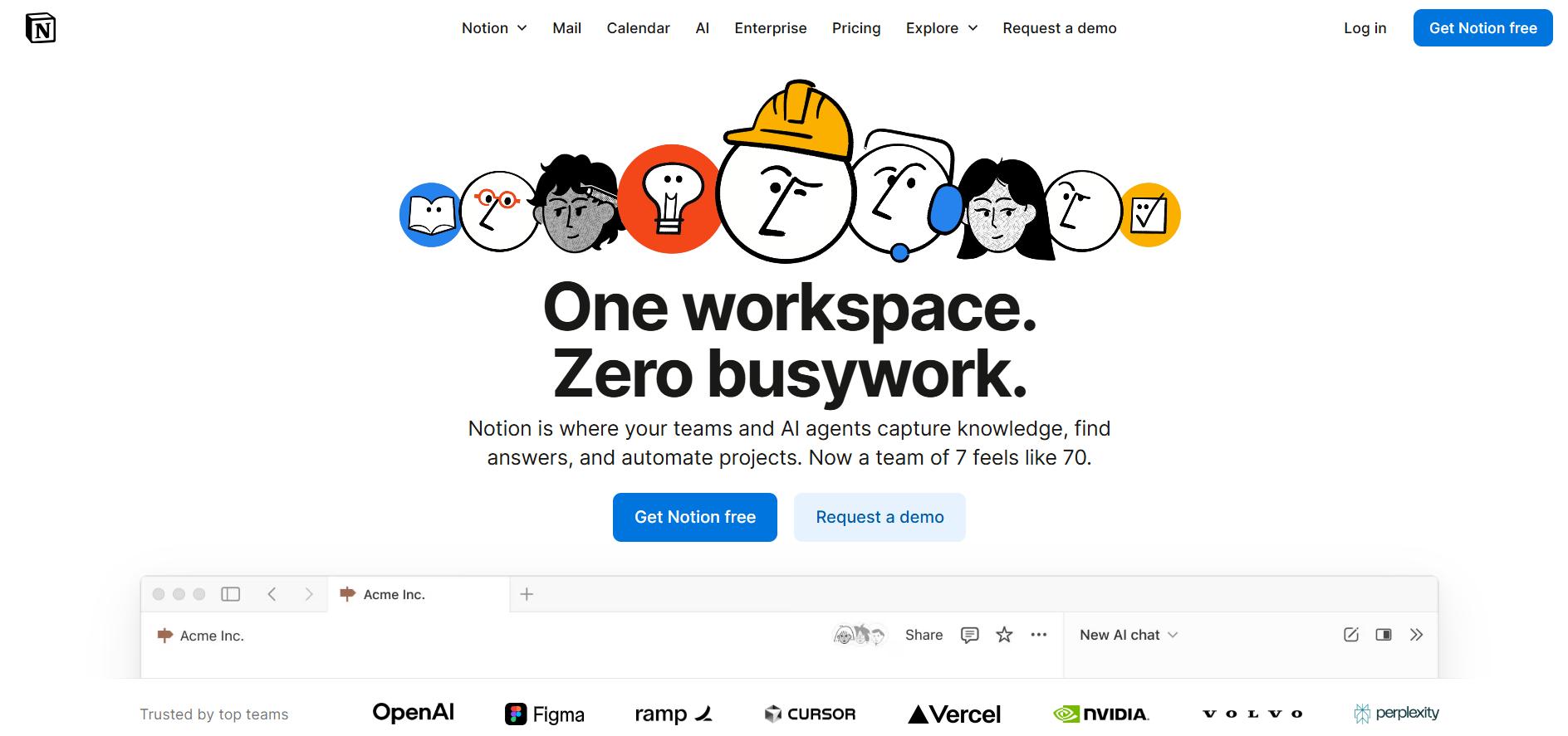
Notion makes smart use of white space and clean layout. (Image Source)
Notion's landing page is a great example of how to use white space efficiently. It also positions itself as a powerful all-in-one workspace for many types of users.
Its product benefits are communicated through short, looping videos and quick how-to animations, almost similar to Slack’s approach, showing the product in action rather than just describing it. Notion also builds strong credibility through social proof from big companies like Toyota and Ramp.
The headline that says "One workspace. Zero busywork." is short, easy to remember, and comes with a short explanation that makes it clear what the platform is all about.
5. Stripe
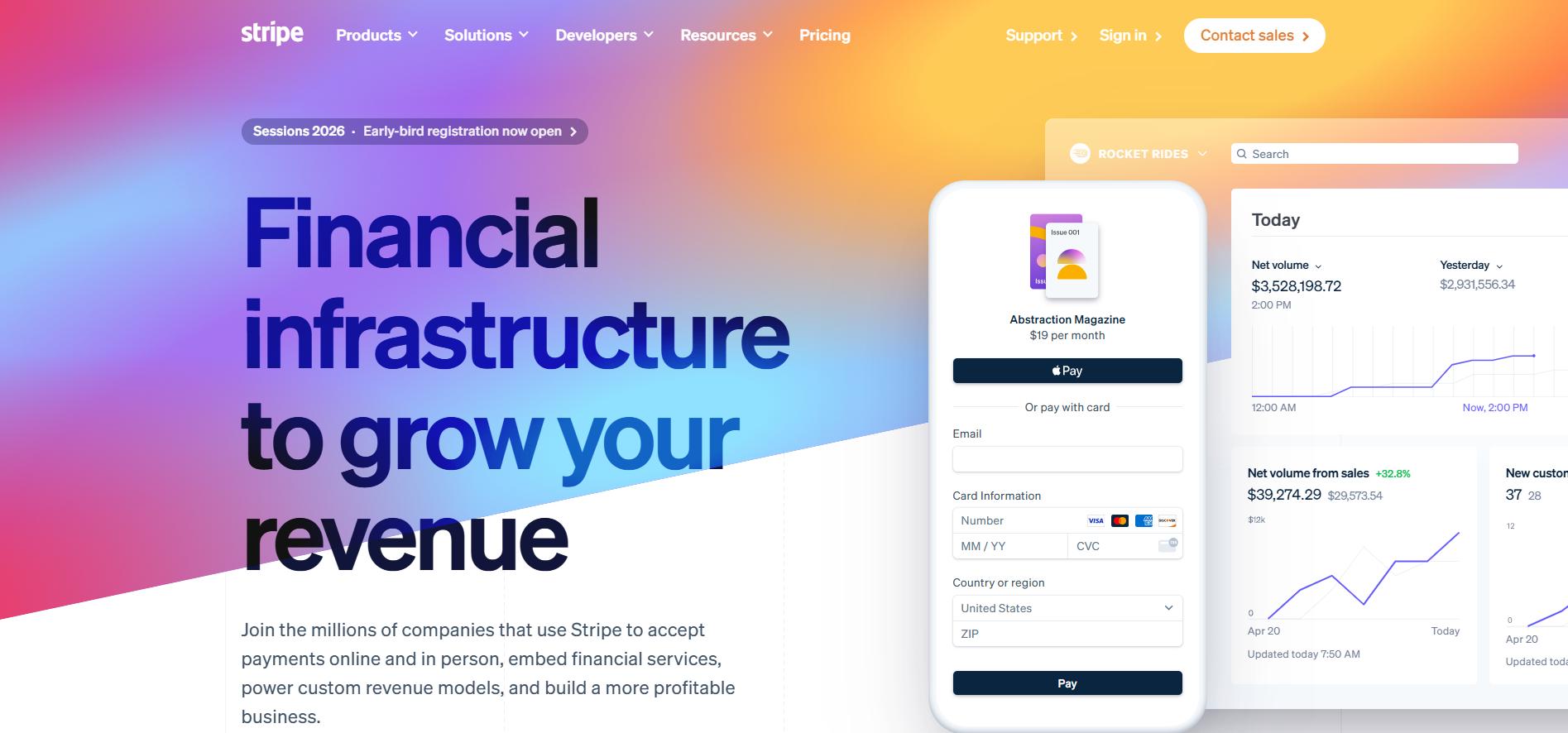
Stripe combines sleek design with colorful graphics and animated elements that appeal to developers. (Image Source)
Stripe's landing page is one of the best examples of a landing page to learn from because of its sleek, developer-focused design, colorful images, animated illustrations, and CTAs that drive conversions.
It makes it easy for users to start an integration by using a bold headline that says "Financial infrastructure to grow your revenue" and a "Start now" call to action button, which ensures that no potential visitor gets lost.
Conclusion: Landing Pages as Startup Growth Engines
A winning startup landing page is more than just a page that promotes the business. It's a growth engine for validation and measurable results.
There isn't one perfect way to make a startup landing page, but a well-designed one can help you test ideas, get people interested, and drive conversions in a short possible time.
Keep in mind though that a good landing page isn't built overnight. The process includes using best practices, learning from examples that work, avoiding common mistakes, and adding important things like persuasive copy, strong CTAs, and social proof.
Investing in a startup landing page strategically isn’t just another marketing task. It’s one of the most impactful and cost-effective steps you can do early on in your startup journey!
Dec 2, 2025

Creates insightful, strategy-driven content that translates complex design and branding concepts into accessible knowledge, supporting Ramotion’s mission to elevate digital experiences.