The way we access websites has dramatically changed over the past years.
Web design was much simpler in the early 2000s. Most websites were built for a single fixed resolution: a desktop monitor set at around 1024 × 768 pixels (see Wikipedia’s Display resolution). Back then, the real challenge for web designers and developers was getting websites to work consistently across browsers like Internet Explorer and Netscape Navigator. Smartphones and tablets were not a concern, as these technologies may still be in their early stages.
Fast-forward to today, and people have many options to view websites and applications across multiple devices, including smartphones, tablets, laptops, desktops, and even 4K smart TVs. Each screen has different dimensions, resolutions, and capabilities compared to fixed-width websites.
Statista shows that by 2025, the number of mobile users worldwide is projected to reach 7.49 billion. In addition, Exploding Topics reports that over 64% of website traffic comes from mobile devices, and 96.3% of internet users access the internet using a mobile phone. This makes it essential for businesses to build websites that look good on larger screens and are easy to use on mobile devices to avoid higher bounce rates and lower conversions.
The move from desktop to mobile makes Adaptive Web Design valuable. Instead of forcing one layout to fit every screen, adaptive design creates separate versions of a site, where each is finely tuned to work best on a specific type of device.
But what is Adaptive Web Design really? What does it mean? How does it work?
In this article, we’ll walk through the fundamentals of Adaptive Web Design, what it is, the principles behind it, and why it matters. We will also compare it with Responsive Web Design, and when to choose Adaptive Design. By the end, you’ll clearly understand which strategy works best for your next website project and how to avoid common pitfalls.
Defining Adaptive Web Design
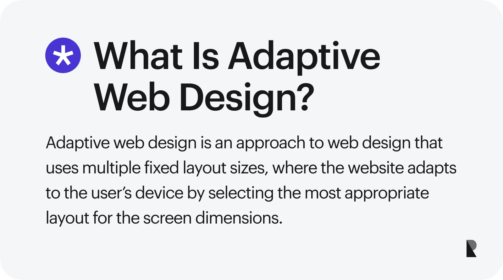
Adaptive Web Design is a strategy in website layout creation where designers and developers build two or more pre-made versions of a site’s layout to ensure it looks and works best across different devices.
It involves detecting the device a user accesses a website with and then displaying the version that best matches their screen. This approach is constructive when targeting specific devices, as it provides a better user experience and addresses usability concerns while browsing.
To make sure your adaptive design truly delivers the right experience on every device, consider working with a best web design firm that understands how to balance performance, accessibility, and aesthetics.
The biggest takeaway for Adaptive Web Design is that it helps prevent problems that drive users away. Adaptive design handles this by giving web designers more control, allowing them to adjust websites for specific viewports and multiple devices.
Once you understand how or why adaptive design works, you’ll see that it’s quite simple!
Let’s dive into the fundamental details of Adaptive Website Design, including its definition, core principles, layout strategies, and adaptation methods.
Visitors expect a clean interface that’s easy to navigate.
Imagine browsing through a website where navigation links, buttons, and text appear jumbled because they don’t fit the screen, with some elements either too large or too small.
Would you still enjoy browsing it? Do you know what to do next?
Adaptive Web Design solves these problems by creating a pre-designed layout matching the user’s device. Unlike other web design strategies, it does not scale fluidly across all screen sizes. Instead, it delivers device-specific layouts by selecting the most suitable version from pre-defined templates.
Core Principles of Adaptive Website Design
When using Adaptive Web Design, it’s important to understand its unique properties, limitations, and how each layout behaves across different screen sizes. The purpose of Adaptive Website Design is to ensure that each visitor gets an experience that feels custom-made for their phone, tablet, or desktop.
Adaptive designs can improve user experience, reduce loading times, and enhance overall usability if appropriately implemented.
Here are some of its core principles:
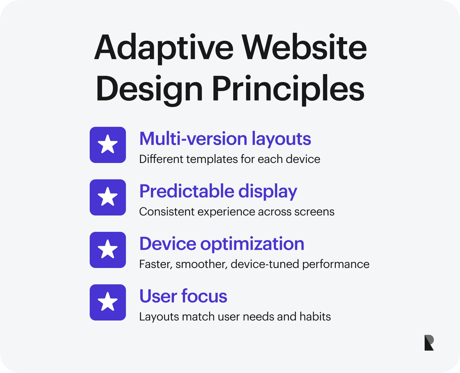
Multi-version layouts
Adaptive design relies on multiple fixed-width templates, each built for a specific screen size such as desktop, tablet, or mobile. Instead of simply shrinking or stretching one layout, every version is intentionally arranged so that text, buttons, and graphics naturally look good on the device.
This principle is especially valuable for funnels and email designs, where most traffic today comes from mobile phones and tablets.
Predictable display
Predictability is a core principle of adaptive web design.
Because each layout is built ahead of time for a specific device, users can expect a consistent and reliable experience whether they browse on a desktop, tablet, or mobile phone. This consistency helps maintain quality and convenience across all supported screen sizes.
Device-specific optimization
Since Adaptive designs use pre-defined layouts for each screen size, every version can be adjusted for specific devices and resolutions.
These optimizations can result in:
- Faster load times
- Smoother animations
- Reduced data usage
- Better performance
- Improved usability
Targeted user-centered design
Designing specific layouts for different devices makes prioritizing user needs and goals easy.
This approach considers user behavior, motivations, and preferences to ensure a more personalized and practical user experience on every device.
Device Detection and Layout Selection
Adaptive websites detect the type of device a person uses when accessing the site. This relies on device detection methods to select and display the right template for the right screen.
Here’s the typical pattern an adaptive website follows to detect and deliver the correct layout:
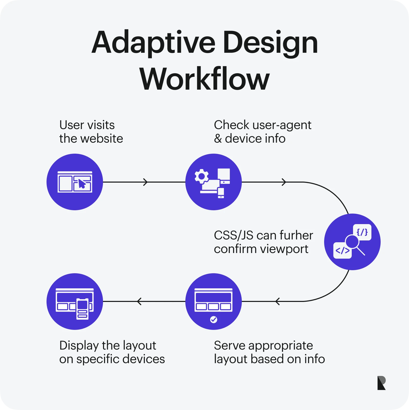
Adaptive design uses device detection to select and display the right template for each screen.
Phase 1: The website checks the User-Agent string or other device information to identify the type and screen width.
Phase 2: CSS and JavaScript can further confirm viewport width, height, resolution, and orientation.
Phase 3: Once the device is identified (whether mobile, tablet, or desktop), the server or client serves the most appropriate pre-defined template and ensures the correct layout is displayed.
Server-Side vs. Client-Side Adaptation
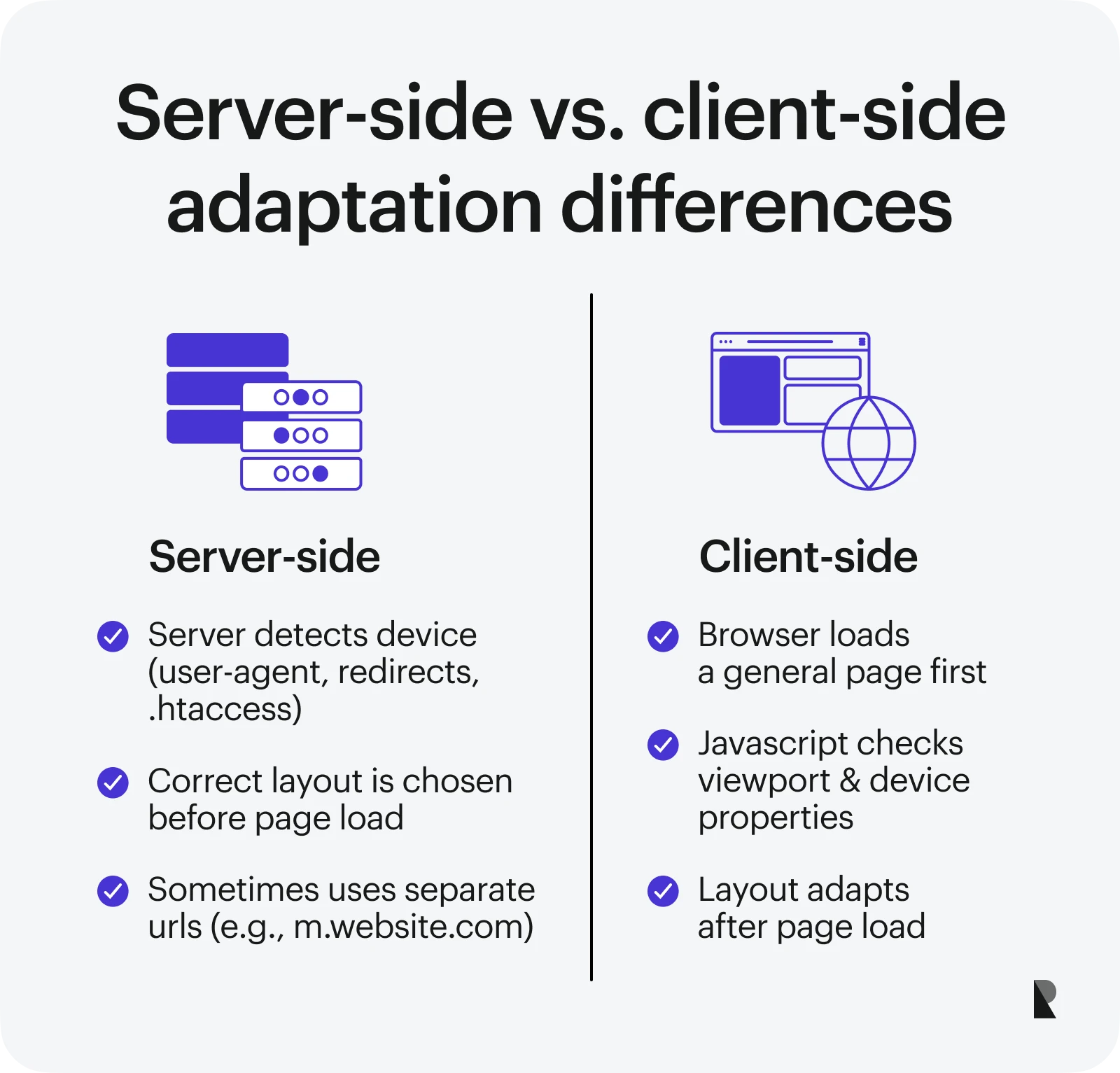
Adaptive layouts can be delivered through either server-side or client-side methods.
Adaptive layouts can be delivered using either server-side or client-side methods.
Both approaches get the right layout in front of the user, but they work differently under the hood, and each has its own trade-offs in speed and performance.
Server-side adaptation
With this approach, the server detects the device (usually using the User-Agent string, server-side redirect methods, or .htaccess) and delivers the correct layout before the page loads.
In some cases, different URLs are used (for example: m.website.com for mobile and website.com for desktop)
Advantages:
- Can be extremely fast to load
- Content can be customized to device capabilities
- Reduced bandwidth usage
Drawbacks:
- Requires additional backend resources
- Device detection may be inaccurate if the database is outdated
- Maintenance is more complex
Client-side adaptation
With client-side adaptation, the browser first loads a general page version. Then, using JavaScript, it detects device properties such as:
window.innerWidth (viewport width)
window.innerHeight (viewport height)
window.devicePixelRatio (screen density)
window.orientation (portrait vs. landscape)
See JavaScript window object properties for more options.
This information allows the browser to load or switch to the correct template or stylesheet.
Advantages:
- Easy to set up and update
- No heavy server logic required
- Same URL across devices
- Simple caching and SEO management
Drawbacks:
- Slightly slower
- Device detection can be less reliable
- Limited ability to restructure HTML
Why Adaptive Web Design Is Essential?
By default, people can use a wide range of devices to access websites, from small foldable phones to tablets, large desktop monitors, and even TVs.
This is why websites built with adaptive design remain usable and accessible to anyone, regardless of their device or browser, due to their targeted layout design.
Adaptive Web Design is one of the go-to strategies for businesses aiming to provide dependable experiences across all devices. As users demand faster, clearer, and more intuitive browsing, adaptive web design ensures that each content and element remains accessible, even if certain advanced features or enhancements are not supported on specific platforms.
Here are some of the primary reasons why adaptive website design should be a priority in your next project:
Improving UX across devices
Adaptive designs reduce common UX problems like small text, broken layouts, or overlapping images and provide a distinct experience for each targeted device. They also solve most of the "pinch-and-zoom" problems, where users need to manually zoom into the screen just to interact with the site.
Serving device-specific layouts, adaptive website design creates a smoother, more enjoyable, and “native-like” user experience.
Supporting accessibility standards
According to Click-Away Pound, 71% of disabled customers with access needs will leave a website if they find it difficult to use. This shows the importance of supporting accessibility standards, especially for those with disabilities.
Adaptive designs not only work with multiple screen sizes, but they also help you follow accessibility rules. Adaptive design helps make things more inclusive by letting you change each layout to fit your needs, such as:
- Adequate color contrast combination for better visibility.
- Readable font sizes on every device to improve text recognition for users with visual handicaps.
- Navigation controls that are easy to use with screen readers, touch, and the keyboard.
While accessibility is a must-have feature for any modern website, it's not simple to get it right quickly.
Boosting engagement, conversion, and retention
A well-optimized layout for each device and screen size can significantly boost engagement, conversions, and retention. In fact, 38% of users stop engaging with a website if its design is unattractive, according to a report cited by The Realtime Report.
You can deliver a more intuitive, user-centered experience through careful implementation of adaptive website design.
After all, if users can navigate smoothly without running into usability issues, wouldn’t they be more likely to stay longer and engage on your site?
Key Benefits of Adaptive Web Design
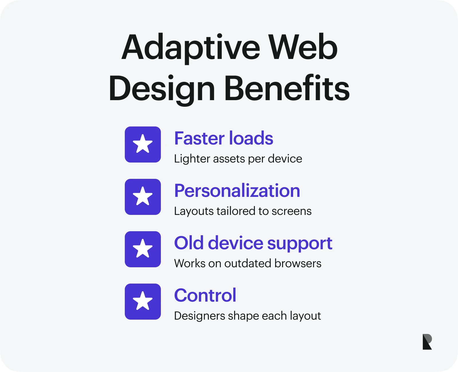
Below are four main benefits of Adaptive design and how it enhances both user experience and development flexibility:
Faster load times
Even in 2025, loading speed is one of the most important elements for Google ranking. According to Google research, 53% of mobile consumers leave a website that takes more than three seconds to load.
Adaptive design delivers only the resources for each target device to optimize speed.
For instance, Adaptive design can optimize what mobile users on slower networks receive on their devices. Instead of loading the same heavy assets that desktops get, you can serve smaller files and lighter code to mobile devices. This can increase page speed, reduce bounce rates, and provide a more enjoyable browsing experience.
Device-specific personalization
Adaptive Website Design ensures every user gets the proper device layout and screen size layout.
Instead of forcing users to squint at tiny text or deal with stretched graphics, adaptive design can personalize the experience.
For mobile users, you can use compressed images, simplified navigation, and remove non-essential features that are not useful for their devices. You can use high-resolution graphics and more interactive elements on desktop computers without performance issues.
Superior performance on older devices
According to Firstpost, 23% of users still rely on outdated web browsers.
This shows the shocking reality that despite rapid technological advancements, not all users have access to the latest software or browsing technology.
Adaptive Website Design manages this by delivering lightweight layouts that run flawlessly on older devices and provide reliable support for outdated browsers.
Check out MDN Web Docs for practical guidance on building fallback layouts and assets that remain functional in older browsers.
Pro Tip: If you’re still unsure how to implement these techniques, hiring professional web design agencies is often smarter. They can save you time, prevent costly trial-and-error, and assure your adaptive website meets accessibility standards, performs well across devices, and delivers a polished user experience.
Precise designer control
With adaptive web design, every layout is developed specifically for a device category, giving designers complete control over how elements, components, and content appear.
Instead of relying on flexible grids that may warp or compromise certain features, adaptive layouts can guarantee each version looks intentional and custom-made for the target screen size.
Adaptive Web design vs. Responsive Web Design: Key Differences
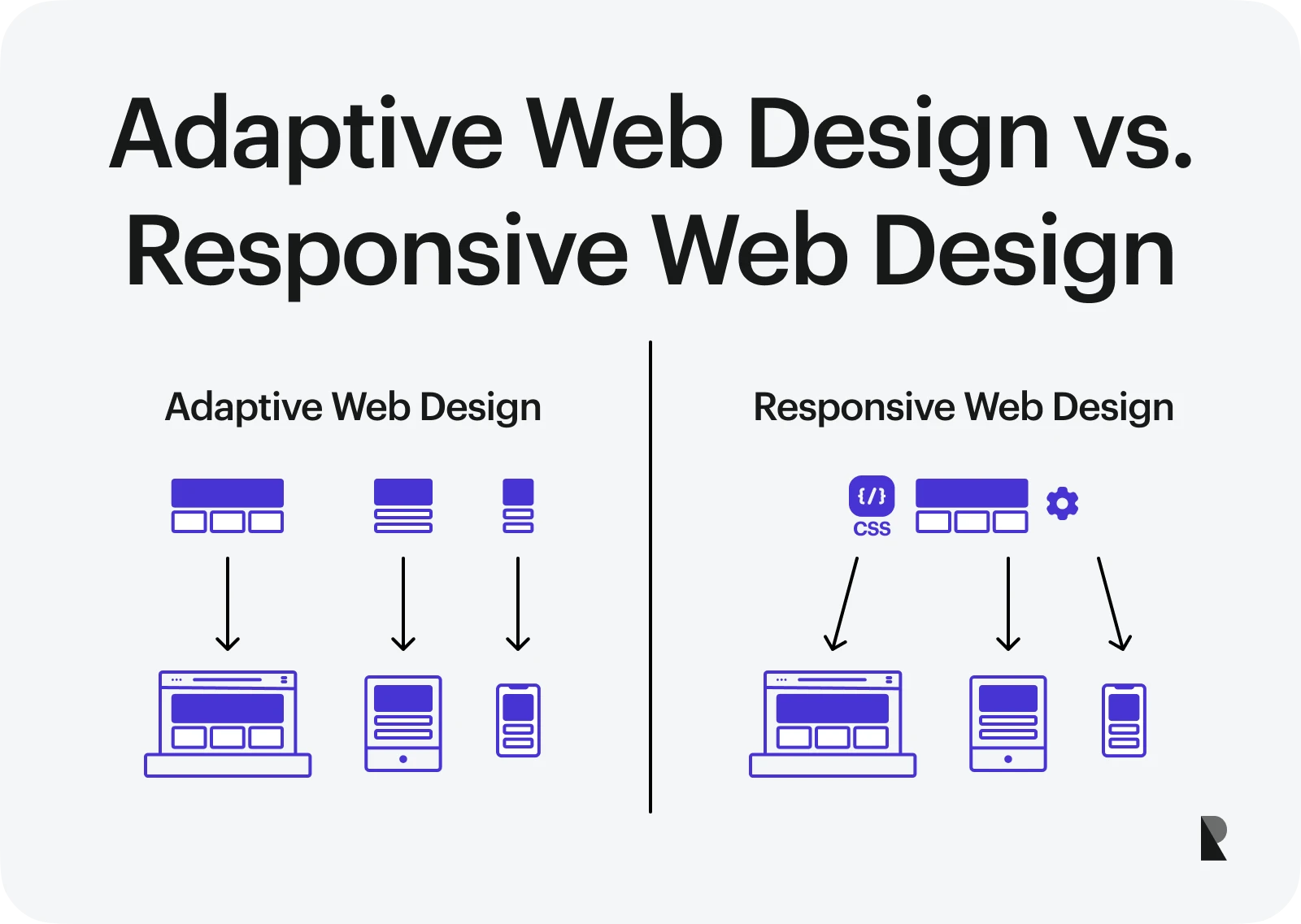
Adaptive Web Design relies on multiple pre-built fixed-width layouts, with each one customized for specific devices. (Image Source)
In the late 2000s, Adaptive Website Design became one of the most popular approaches for delivering layouts tailored to specific devices like phones, tablets, or desktops, as it handled the limited range of screen sizes available.
Is this the most practical solution? Well, it was.
But as technology advanced, the web expanded beyond just three major screen sizes. With the production of foldable phones, ultra-wide monitors, smart TVs, and countless other devices, adaptive design became harder to scale and less practical to maintain for some businesses.

In the late 2000s, adaptive web design has become a popular choice for delivering layouts. (Image Source)
In 2010, Ethan Marcotte first coined the term “Responsive web design.” He introduced creating websites that adapt to the user's screen size automatically by using CSS media queries, eventually fluid grids, and flexible graphics. The idea immediately became very popular because, unlike adaptive design, it didn't need to make various fixed layouts for different devices.
Of course, every project has its own goals and requirements, and each design strategy offers unique benefits. Adaptive Web Design and Responsive Web Design are handy for building websites that work across devices, but they have merits and demerits.
Let’s explore some of the key differences between these two design strategies:
Technology usage
Adaptive Web Design relies heavily on various pre-built fixed-width layouts (e.g., 320px, 768px, 1200px). It utilizes server-side or client-side detection to determine the user's device and then selects the best design for that screen size.
While this approach provides greater control over how a site appears on specific devices, it can become challenging for devices with overlapping screen sizes, such as tablets and notebooks, making it difficult to decide which layout to serve.
On the other hand, Responsive Design uses a flexible layout built with CSS techniques such as media queries, fluid grids, flexbox, grid, and scalable images. Instead of creating multiple fixed versions, the same HTML is delivered to all devices. Then, the CSS modifies the layout and content on the fly to fit any screen size.
Implementation process
Likewise, developers must create multiple fixed layouts for each site version when building adaptive websites. This can be achieved through server-side detection or client-side detection.
However, this method requires more initial development work than responsive design because it may require reconstructing existing websites and building alternative versions.
Responsive websites, on the other hand, automatically change based on how much space is available in the viewport. This is only possible on the client side, as the server delivers the same HTML to all devices, and the browser uses CSS to change the layout.
User experience impact
Regarding user experience, adaptive web design outperforms responsive web design in speed, personalization, and refined layouts.
In fact, according to BrowserStack, websites built with an adaptive design approach typically load 2 to 3 times faster than those using responsive design. This makes it more convincing to use adaptive design since the UX feels specifically made for the target device rather than relying on progressive changes.
Responsive Web Design is more flexible since it adapts to various screen sizes. It is also easier to maintain in the long run, as there is only one codebase to manage. However, for edge cases, it can be harder because the same site is reformatted for all devices, which can affect the user experience.
Best Practices for Implementing Adaptive Web Design
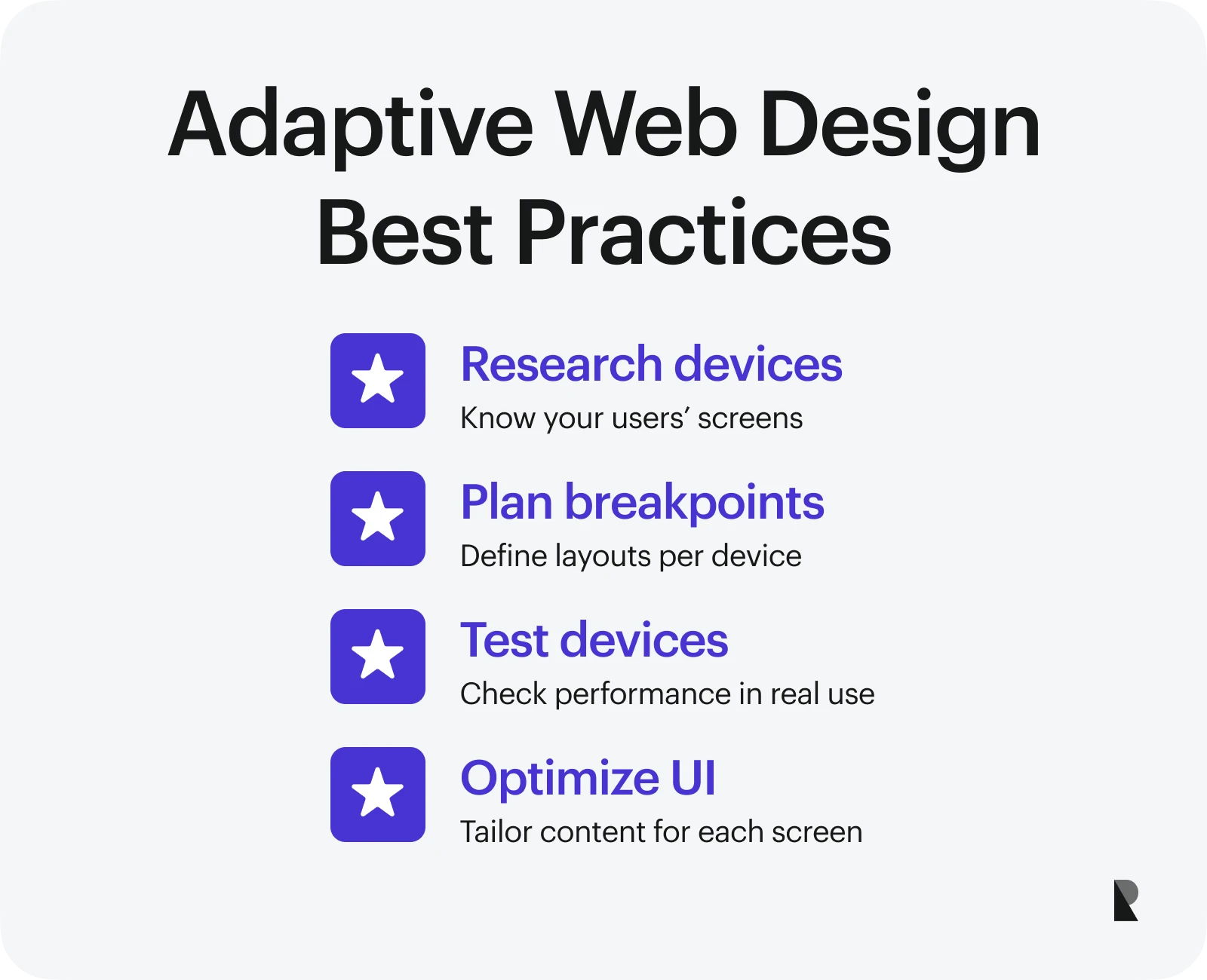
Following best practices when building an adaptive website is crucial for every business. This means ensuring each device has the best possible experience by carefully planning, thoroughly testing, and constantly improving the design.
Adhering to these practices can keep your website layouts up to date while ensuring that they look and work well on all of your target devices.
Here are a few best practices to follow when building an adaptive website.
Research user devices and behavior
Every device comes with its own specifications and user preferences.
Before designing an adaptive website, ask yourself: What devices are my users browsing on? Do they prefer mobile, tablet, or desktop? Do desktop users typically convert fast? Which screen sizes or features should I prioritize first?
You can use Google Analytics or similar tools to determine the kind of devices, operating systems, and screen resolutions your target visitors use the most. With that data, you can make smarter decisions about which layouts to optimize and adjust, ensuring each device gets the best possible version of your site.
Plan layout breakpoints strategically
In Adaptive Web Design, websites usually define fixed breakpoints for the most common devices: mobile, tablet, and desktop. Each breakpoint gets its own dedicated layout.
For example:
- Desktop: 1024px (with optional larger versions, e.g., 1200px or 1440px)
- Tablet: 768px
- Mobile: 320px (sometimes also 375px for modern smartphones)
Of course, you don’t have to limit yourself to just three breakpoints.
Remember to prioritize your target audience’s devices and identify where the majority of your business leads come from.
Test Thoroughly on Real Devices
As with any web design approach, testing before launch is very important.
While simulator tools such as BrowserStack, LambdaTest, or Chrome DevTools can give you useful insights about how well your site works, still nothing beats testing sites on real devices.
Testing on real devices can help spot issues with usability, performance, and interaction that simulators might not be able to capture.
Optimize content and UI by device
Unlike responsive design, which involves mostly scaling down elements, adaptive web design requires intentional optimization for each device.
Some specific content optimizations you can do include:
- Use larger, touch-friendly buttons for mobile.
- Serve compressed images (WebP or AVIF) to improve loading speed.
- Build a simple mobile-first navigation that is easy to use and feels natural.
This way, each device gets a more customized, user-friendly experience rather than a shrunk desktop site version.
Pro Tip: Don’t just resize elements, design for the experience!
Conclusion: When to Choose Adaptive Design
Adaptive Web Design can cost more upfront as it involves creating multiple layouts. However, it’s a great choice when your audience uses specific devices and you want complete control over what the user can see on those devices.
Conversely, although responsive design offers greater flexibility, its "catch-all screen resolution" nature can sometimes lead to more development costs when adjusting to different devices.
In the end, adaptive design gives you an edge in page speed, user experience, and design accuracy. The choice between Adaptive and Responsive Web Design will always depend on your project objectives, target audience, and business goals.
Sep 4, 2025

Creates insightful, strategy-driven content that translates complex design and branding concepts into accessible knowledge, supporting Ramotion’s mission to elevate digital experiences.