Did you know that Tailwind CSS has garnered over 91,800 stars on GitHub since its first release in November 2017? What is TailwindCSS exactly? It's an open-source, utility-first CSS framework that revolutionizes how developers style websites directly within HTML using concise utility classes.
Tailwind is indeed a framework, but unlike traditional CSS frameworks, it takes a utility-first approach. What is Tailwind CSS used for? Essentially, it enables developers to build user interfaces more quickly and easily by allowing them to utilize utility classes directly in their HTML, thereby eliminating the need for custom styles.
What is Tailwind CSS, and how to use it? The framework accelerates prototyping and keeps your focus where it belongs, on building the UI rather than switching between HTML and CSS files.
Furthermore, Tailwind automatically removes unused styles during build time, thanks to PurgeCSS, which is integrated by default. This optimization results in a remarkably small final CSS file, typically under 10KB in production, which leads to faster website load times.
Throughout this article, we'll explore Tailwind's key features, compare it with other frameworks, examine how it works under the hood, and discuss its advantages and limitations for modern web development.
What Is Tailwind CSS
Tailwind CSS represents a significant departure from traditional CSS frameworks. At its core, Tailwind is a utility-first CSS framework that provides low-level utility classes to build custom designs without leaving your HTML. Unlike conventional frameworks that offer pre-designed components, Tailwind gives you building blocks to construct your own designs from scratch.
The philosophy behind Tailwind centers on composability. Instead of writing custom CSS for each element, you apply pre-defined utility classes directly in your markup. For instance, rather than creating a CSS class for a blue button with rounded corners, you simply write:
<button class="bg-blue-500 text-white font-bold py-2 px-4 rounded"> Click me</button>Adam Wathan, the creator of Tailwind CSS, developed this approach after recognizing limitations in traditional CSS methodologies. The framework emerged from his experiments with utility-first CSS and was first released in 2017. Since then, it has grown tremendously in popularity among developers who appreciate its pragmatic approach to styling.
Tailwind operates by generating thousands of utility classes that control every aspect of your design, from spacing and colors to typography and flexbox. These classes follow a consistent naming convention that makes them intuitive to use. For example, pt-4 adds padding-top, text-lg increases text size, and flex applies display: flex.
Consequently, Tailwind eliminates several common frustrations developers face:
- No more context switching between HTML and CSS files
- No need to invent class names for every element
- No fighting with specificity issues
- No unused CSS accumulating over time
Additionally, despite having thousands of utility classes, Tailwind doesn't bloat your production code. It employs a purging system that removes unused classes from your final build, resulting in remarkably small file sizes.
The framework is highly customizable through a configuration file (tailwind.config.js) where you can define your design system colors, spacing, breakpoints, and more. This configuration-driven approach allows Tailwind to adapt to your project's specific design requirements while maintaining consistency throughout your application.
Overall, Tailwind CSS represents a shift in how we approach web styling. It prioritizes flexibility and development speed over pre-designed components, giving developers complete control while eliminating much of the tedium associated with traditional CSS.
Key Features
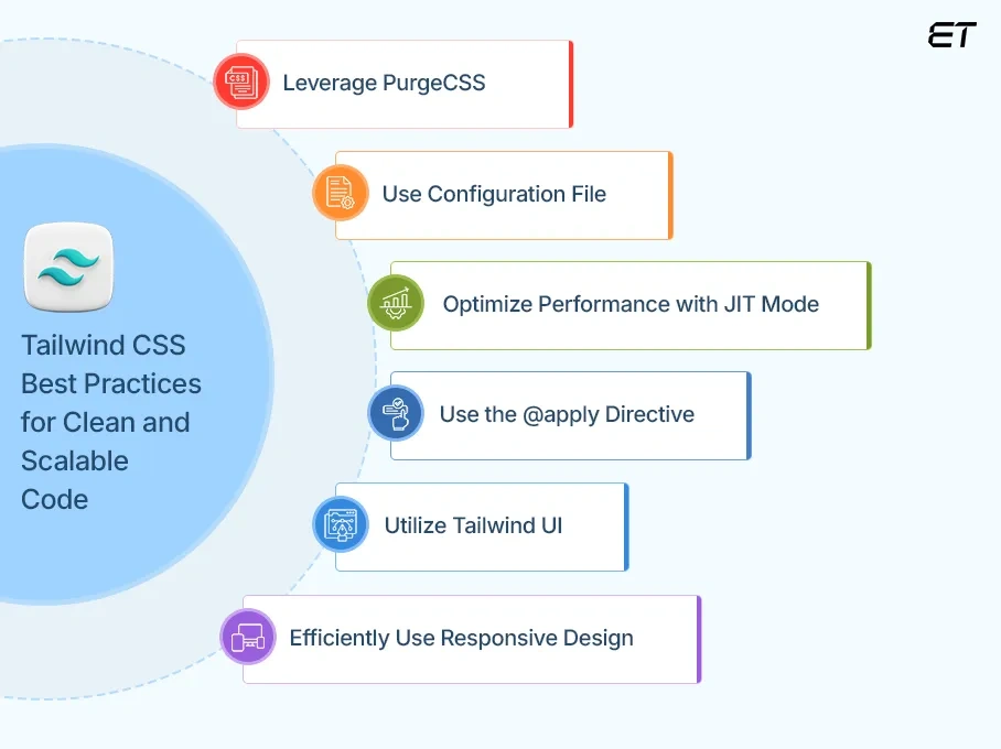
Tailwind CSS best practices (Image Source)
Tailwind's most powerful aspect lies in how it handles styling through a set of carefully designed features. Let's explore what makes this utility-first framework stand out from traditional CSS approaches.
Utility classes
Utility classes form the backbone of what makes Tailwind CSS unique. These small, single-purpose classes each handle one specific styling task, allowing you to build complex designs directly in your HTML. Unlike traditional CSS frameworks that require separate stylesheet modifications, Tailwind lets you style elements by applying predefined utility classes.
For example, instead of writing custom CSS for a button, you simply apply classes like bg-blue-500 (background color), text-white (text color), and rounded (border radius) directly in your markup. This approach eliminates the need to switch between HTML and CSS files, keeping your focus on building the interface.
The benefits are substantial:
- No need to invent custom class names
- Immediate visual feedback as you work
- Consistent styling throughout your project
- Reduced context switching between files
Customization & config
Tailwind has been designed from the ground up to be extensible and customizable, ensuring you never feel constrained by the framework. The configuration system centers around the tailwind.config.js file, which serves as your project's design control center.
This file allows you to define your color palette, spacing scale, typography, and breakpoints, essentially anything related to your site's visual design. For instance, you can extend the default theme with custom colors:
module.exports = { theme: { extend: { colors: { primary: '#FF0000', }, }, },}When you need to break out of these constraints for pixel-perfect designs, Tailwind offers square bracket notation for arbitrary values: top-[117px] or bg-[#bada55].
Responsive design
Tailwind embraces a mobile-first approach to responsive design. Every utility class can be conditionally applied at different breakpoints using prefixes like sm:, md:, and lg:.
For example, md:flex applies display: flex only on medium screens and larger. This eliminates the need to write custom media queries while maintaining full control over how your design adapts across devices.
By default, Tailwind provides five breakpoints:
sm:640px and upmd:768px and uplg:1024px and upxl:1280px and up2xl:1536px and up
The system also supports container queries, allowing you to style elements based on parent container size rather than viewport size, perfect for reusable components.
Performance optimization (Purge & JIT)
Tailwind prioritizes performance through intelligent optimization techniques. At its core, Tailwind generates only the CSS you're actually using, resulting in remarkably small production files.
The framework integrates PurgeCSS to automatically remove unused styles during the build process. This typically results in CSS files under 10KB, even for large projects. For example, Netflix uses Tailwind for its "Netflix Top 10" site with just 6.5KB of CSS.
Moreover, Tailwind v2.1 introduced Just-in-Time (JIT) mode, which creates styles on-demand as you write HTML rather than generating everything upfront. JIT mode provides several advantages:
- Faster build times
- Access to all variants without configuration
- Support for arbitrary values in any utility
- Ability to stack variants for complex styling needs
These optimizations ensure your projects remain fast and lightweight without sacrificing the developer experience that makes Tailwind so appealing.
Tailwind CSS vs Other Frameworks
When evaluating CSS frameworks for your next project, understanding how Tailwind CSS stacks up against the competition becomes crucial for making the right choice. Let's examine these differences to clarify what makes Tailwind unique in the CSS framework landscape.
Tailwind CSS takes a fundamentally different approach compared to established frameworks like Bootstrap or Foundation. Whereas these traditional frameworks provide pre-designed components (buttons, cards, navbars) with opinionated styles, Tailwind offers no pre-built components whatsoever. Instead, it equips you with utility classes to construct your own designs from scratch.
This philosophical difference manifests in several practical ways. Bootstrap, for instance, comes with a comprehensive component library that enables rapid prototyping with consistent styling, perfect for developers who prioritize speed over unique design.
Conversely, Tailwind prioritizes flexibility and customization, making it ideal for projects requiring distinct visual identities.
The learning curves differ substantially, too. Bootstrap has a component-based approach that might feel intuitive initially, simply copy-paste component code and modify as needed.
Yet, this apparent simplicity often leads to fights with the framework when attempting significant customization. Meanwhile, Tailwind requires learning its utility class syntax upfront, but offers greater flexibility once mastered.
Regarding file size, initial Tailwind builds can be larger than Bootstrap files. However, after optimization through PurgeCSS, Tailwind typically produces significantly smaller production files, often 10KB or less, compared to Bootstrap's larger footprint. This efficiency stems from Tailwind generating only the CSS you actually use.
The markup comparison reveals another stark contrast:
<!-- Bootstrap Button --><button class="btn btn-primary">Click Me</button> <!-- Equivalent Tailwind Button --><button class="bg-blue-500 hover:bg-blue-700 text-white font-bold py-2 px-4 rounded"> Click Me</button>Notice how Tailwind's HTML appears more verbose but eliminates the need for separate CSS files or overrides. This tradeoff between HTML verbosity and CSS simplicity represents one of the core differences between these approaches.
Ultimately, framework selection depends on your project needs. When working with custom website development companies, confirm the framework choice up front so delivery, handoff, and upkeep stay predictable. Choose Bootstrap or Bulma when prioritizing development speed with standard-looking interfaces. Opt for Tailwind when you need design flexibility, smaller production files, and don't want to fight against pre-existing styles.
How Tailwind CSS Works
Behind the scenes, Tailwind CSS operates through a sophisticated build process that transforms simple utility classes into optimized CSS. The engine that powers Tailwind uses PostCSS, a JavaScript tool that transforms CSS with plugins. These plugins scan your HTML files, identify the Tailwind classes you've used, and generate the corresponding CSS.
The build pipeline typically follows these steps:
- Configuration reading - Tailwind first reads your
tailwind.config.jsfile to understand your custom settings - Source scanning - It then examines your HTML, JavaScript, and other template files to identify which utility classes you're using
- CSS generation - Based on the classes found, Tailwind dynamically generates only the CSS needed
- Optimization - Finally, the output is minified, and unused CSS is purged
In practice, when you write a class like text-blue-500, Tailwind processes this directive and converts it to the corresponding CSS property and value: color: #3b82f6. This conversion happens automatically through the build system.
The Just-In-Time (JIT) compiler, introduced in version 3.0, fundamentally changed how Tailwind works. Previously, Tailwind generated all possible utility classes upfront, resulting in large development builds. JIT flips this approach by generating CSS on demand as classes are discovered in your templates.
Importantly, Tailwind integrates with all major JavaScript frameworks and build tools. Whether you're using webpack, Vite, or Next.js, Tailwind provides official plugins that seamlessly integrate with your existing workflow.
To implement Tailwind in a project, you'll typically:
npm install tailwindcssnpx tailwindcss initThen create an input CSS file with Tailwind's directives:
@tailwind base;@tailwind components;@tailwind utilities;These directives tell Tailwind where to inject its generated styles. The @tailwind base directive injects normalize.css-like styles, @tailwind components adds component styles, and @tailwind utilities adds all utility classes.
Throughout this process, Tailwind prioritizes developer experience without sacrificing performance, giving you the tools to build designs efficiently with minimal CSS knowledge required.
Pros and Cons
The practical benefits and limitations of Tailwind CSS become apparent once you start implementing it in real-world projects. Understanding these tradeoffs helps determine if this utility-first approach aligns with your development needs.
Advantages of Tailwind CSS
Tailwind excels at providing exceptional development speed once you've memorized common utility classes. Most developers report significant productivity gains after the initial learning phase. The framework shines when making design adjustments, as changes happen directly in your HTML without context-switching between files.
Certainly, one of Tailwind's greatest strengths is design consistency. By working with predefined constraints from your configuration, designs naturally maintain visual harmony across your application. This constraint-based system actually enhances creativity rather than limiting it.
Furthermore, the framework's modular nature means you only ship what you use. Despite having thousands of utility classes available, production builds typically weigh under 10KB, dramatically smaller than traditional frameworks.
Collaboration improves as well, particularly in teams with both designers and developers. The shared language of utility classes creates a common vocabulary that bridges the gap between design assets and implementation.
Limitations to consider
Admittedly, Tailwind presents a steep learning curve initially. Memorizing utility classes and their syntax requires investment before productivity benefits materialize. This curve can be particularly challenging for developers accustomed to traditional CSS methodologies.
The HTML verbosity issue remains contentious among developers. Critics point to cluttered markup with numerous classes that can hinder readability:
<button class="bg-blue-500 hover:bg-blue-700 text-white font-bold py-2 px-4 rounded focus:outline-none focus:shadow-outline"> Sign Up</button>In particular, this approach blurs the separation of concerns between structure (HTML) and presentation (CSS), a principle many developers value. Teams must weigh if this tradeoff is acceptable for their workflows.
Naturally, Tailwind might feel limiting in highly custom designs that fall outside its utility system. Although arbitrary values help address this concern, some projects may still require custom CSS for certain components.
Above all, choosing Tailwind involves embracing a different mental model for styling. Yet for many developers, these limitations are outweighed by the practical benefits and development efficiency the framework provides.
AI-Driven Development With Tailwind
The synergy between artificial intelligence and Tailwind CSS is opening new frontiers in development efficiency. Nowadays, AI-powered tools specifically designed for Tailwind are reshaping how developers approach UI creation.
Modern code editors like Cursor and Zed now offer built-in Tailwind support coupled with AI capabilities. These tools provide context-aware autocompletions, linting, and hover previews without requiring separate extensions. Accordingly, developers spend less time configuring their environment and more time building.
Beyond basic editing assistance, specialized AI platforms have emerged:
- v0.dev - Transforms natural language descriptions into production-ready React components styled with Tailwind
- Layout.dev - Converts text prompts into full React prototypes with clean, editable Tailwind code
- AskBlake - Generates Tailwind components from simple descriptions like "data table with filters"
In effect, these tools supercharge development speed. Developers can write prompts like "Create a product card with image, title, price, and buy button" and receive clean, styled components using Tailwind utility classes. This approach enables immediate iteration switching from light to dark mode happens in seconds rather than hours.
Most notably, startups leveraging this combination report launching MVPs in just 48-72 hours, proving that Tailwind's utility-first approach perfectly complements AI's ability to understand and generate structured code.
Conclusion
Tailwind CSS stands as a revolutionary approach to web styling, fundamentally changing how developers build modern interfaces. Throughout this article, we've explored how this utility-first framework empowers developers to create custom designs directly in HTML markup without switching between files.
The framework's extensive utility class system paired with robust customization options through the configuration file gives developers unprecedented flexibility. Additionally, the responsive design features make adapting interfaces across different screen sizes remarkably straightforward.
Undoubtedly, Tailwind differs significantly from traditional frameworks like Bootstrap or Foundation. While these alternatives offer pre-built components, Tailwind provides low-level building blocks that allow complete design freedom.
Tailwind CSS has clearly earned its place among the most influential frontend technologies of recent years. Its pragmatic approach to styling, focus on performance, and developer-friendly workflow explain why it continues to gain popularity among developers worldwide.
Whether you're building a simple portfolio site or a complex web application, Tailwind offers a compelling solution that balances flexibility, performance, and development speed.
Jan 15, 2026

Creates insightful, strategy-driven content that translates complex design and branding concepts into accessible knowledge, supporting Ramotion’s mission to elevate digital experiences.