Introduction
One of the most common questions when designing an app; How to design a color palette for an app? Colors are one of the main important issues in mobile user interfaces. Even by using just the right colors, you can show an average design much better. When deciding on the mobile app color schemes; brand identity, popular designs, color palette creation techniques, and user audience are taken into consideration.
A good mobile app design company is essential for a good user experience. The use of color in mobile design will be explained to you and your team. In this article, you will have a full guide on creating the best color palette for mobile apps, and what you need to pay attention to in mobile app UI design.
The importance of colors in mobile app design
Colors; It is directly linked to your brand and your mobile app. If you choose a unique color, it will be more memorable. For leadership teams coordinating internal stakeholders and external collaborators, patterns seen across best UI/UX design agencies can inform how color decisions are documented, validated, and scaled without diluting brand. When you think of popular apps, the thing that comes to mind the most after the app’s name is the app’s color. Color is distinctive.
There is also a concept called color psychology. This concept can directly convey to your user which sector your app is related to. You may have noticed that green tones can be environmentally friendly and blue tones related to health. Of course, it is wrong to say that these color tones belong to a single sector. You can use almost any color in your mobile app if it fits your branding and you know what you’re doing.
Today, color psychology is not as prominent as it used to be, especially in mobile app and interface designs. Of course, the sector of your brand is important, but it is not right to choose a color only by sticking to it. Now, the important thing is to find the “right” color or even the right color combination.
From time to time, popular color tones mark the designs, this is a very natural process. At this point, the issue to be considered is; to determine the color scheme for the app of your industry. For example; Projects like NFT, which are very popular these days, use neon colors — exploding colors — preferred by designers. Or meditation mobile apps generally use neutral and pastel tones. In this way, the user also feels the calmness in the interface.
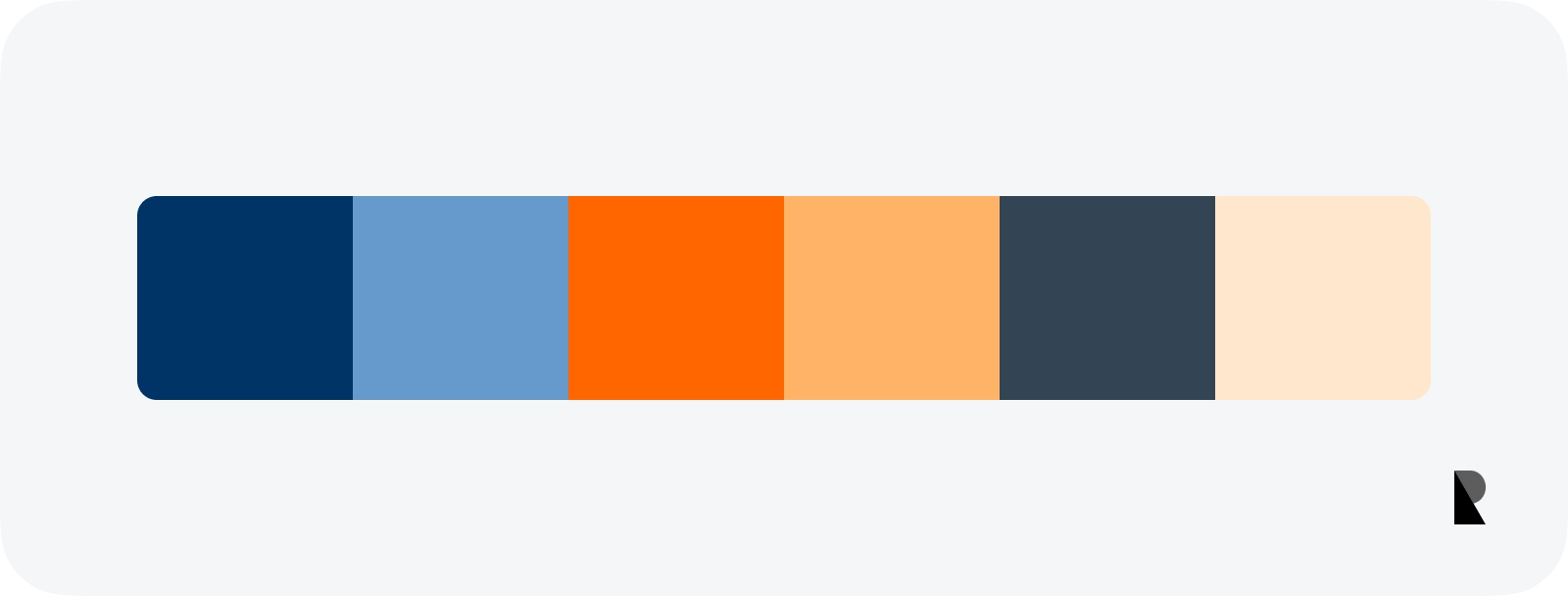
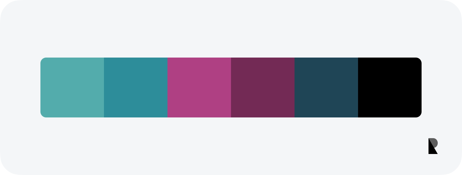
Creating a color tone is all about catching all these mentioned balances. To achieve this balance, you should spend some time with hue, tint, tone, shade, and temperature in the color palette. Creating a color palette for apps requires experience. To gain experience, ready-made color palettes can be examined; In mobile design, Apple’s color palette and material color palette can be an example. Material design colors are very well balanced and can be used in custom designs.
Technical details in colors
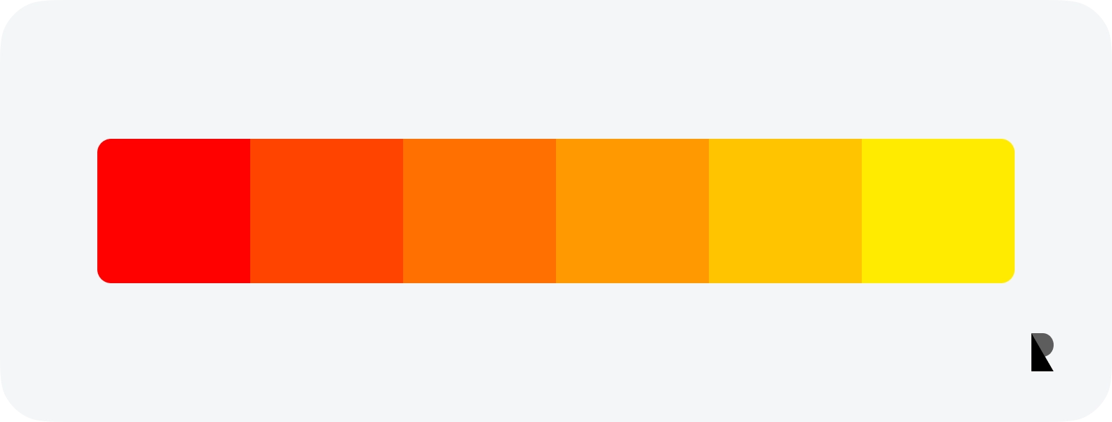
Hue
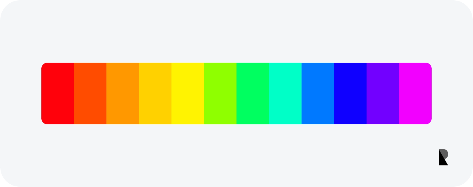
Speaking of colors; Simple nomenclatures such as blue, green, and yellow are preferred. But these colors have tones. The hue value is the color itself. With a clearer expression; the hue changes the color itself. It determines the dominant hue of a particular color. That’s why we can’t talk about white, black, and gray when talking about hue.
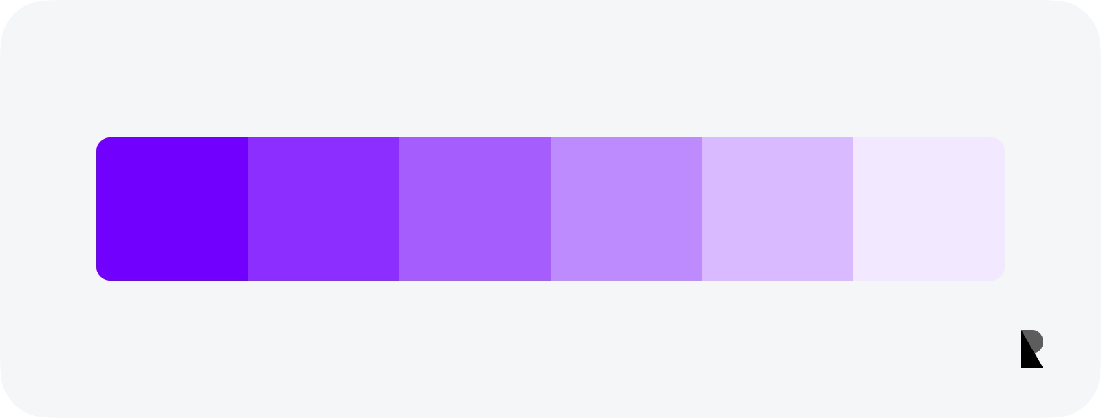
Tint
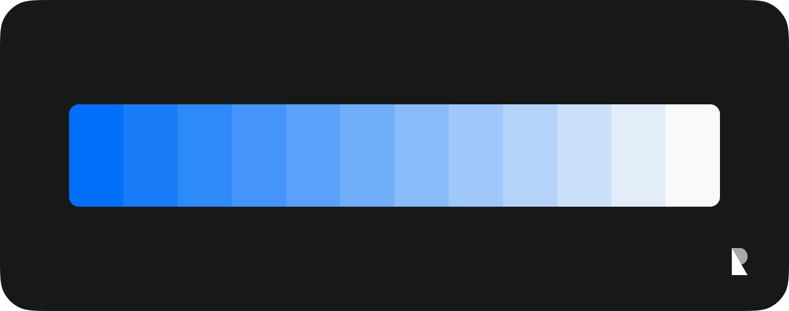
It is a mixture of a specific color with white color. Adding white to the color, allows you to obtain light appearances of the specific color you have determined. As the white ratio increases, the color approaches pure white.
Tone
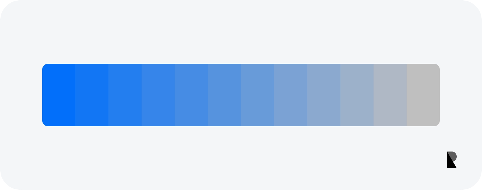
It has a similar technique to Tint. This time it is a mixture of gray color with the specific color you have determined. The dominance of the specific color decreases and the dominance of the gray color increases, approaching pure gray. So technically, it’s moving closer to gray.
Shade
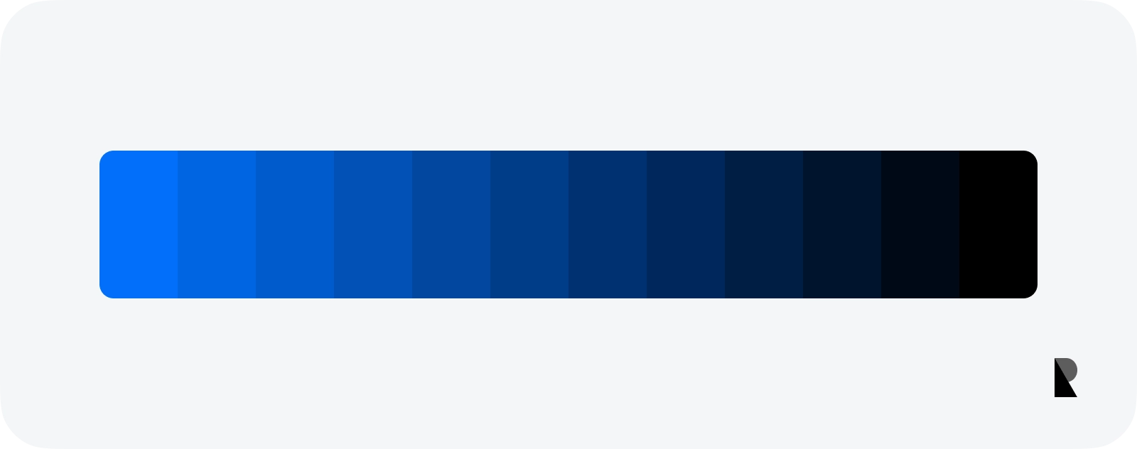
It refers to getting closer to black. Pure black is mixed into the specific color. As the dominance of black increases in the mixture, pure black emerges.
Temperature
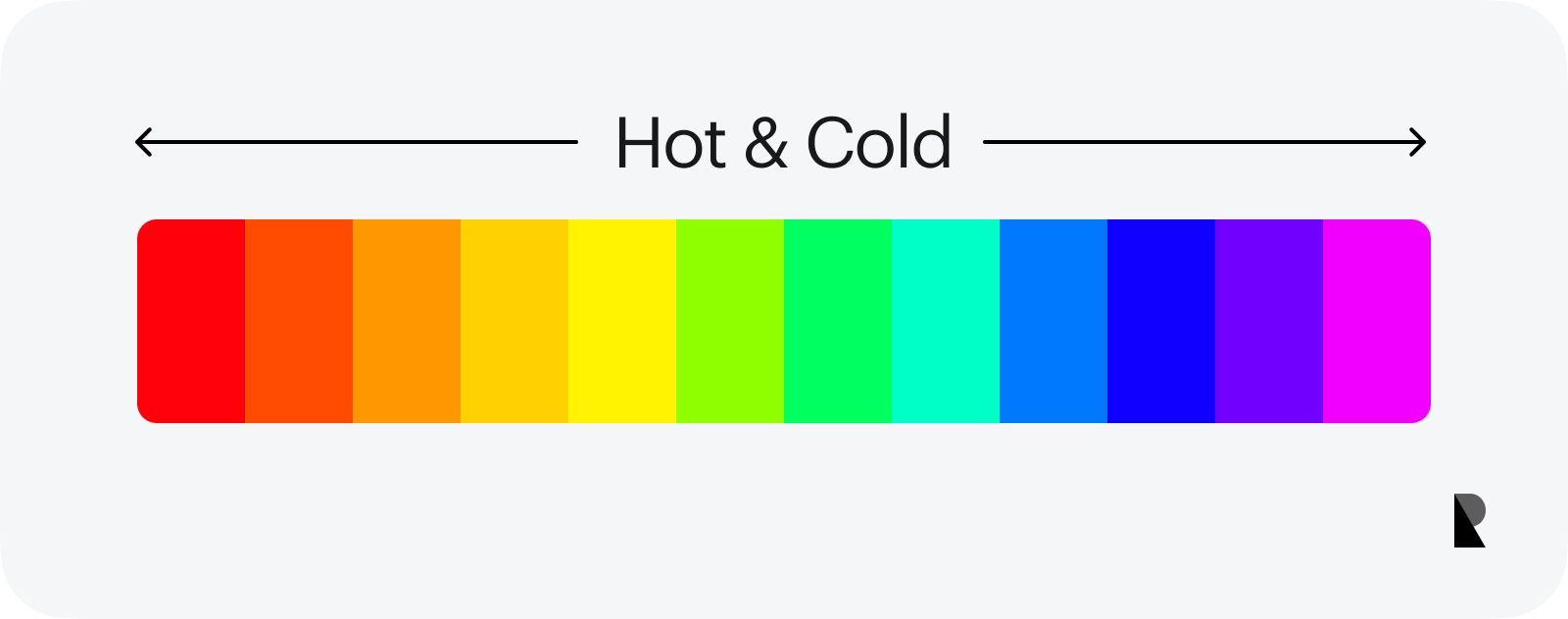
The temperature in colors; is divided into hot and cold. Considering the color wheel, the colors are divided into two exactly at the midpoint. One half of them creates warm colors, while the other half creates cool colors.
Mobile app design principles for color patterns
Color harmony
Monochromatic colors scheme
It consists of different shades of a single color. For example; You can create a monochromatic scheme by changing the saturation and brightness of the same hue value. It is the most preferred color choice in mobile apps, especially in dashboard designs. There may be a need to maintain balance and maintain the hierarchy.
Analogous colors scheme
It is obtained by using 2 or 3 colors that are next to each other in the color scheme. You can create a balanced and truly eye-pleasing palette. It is very difficult to get colors that are technically incompatible with each other. Therefore, it is a safe choice.
You can try to create an analogous color palette by keeping the saturation and brightness values constant and increasing/decreasing the hue value — keeping them close to each other.
Complementary color scheme
It is the color palette obtained by using the contrasting colors in the color wheel. Although it is preferred in illustration and various graphic arts, it is better not to prefer mobile app interface designs. Because it makes the eyes tired, and distracting, and because there is no balance between colors, both colors are dominant.
Split-Complementary color scheme
It is created by selecting 1 primary color and 2 opposite colors in the color wheel. So there is a contrast between primary and secondary colors. It is a color palette that is frequently used in mobile app designs. Because it is compatible and safe to use. When you change the saturation and brightness values and find the right colors, you can create 3 very balanced colors.
Triadic color scheme
It is quite similar to the Split-Complementary color scheme. Because, in the Split-Complementary color scheme, 1 primary color and 2 secondary colors are selected, while in the triadic color scheme, 3 equally spaced colors are selected on the color wheel. Balance is very important in Triadic. Because all 3 colors can be dominant to each other. And 3 dominant colors are too many for a mobile app design. Although the color schemes are similar, it is wise to choose the right color scheme for your mobile app.
Double-Complementary (Tetradic) color scheme
A difficult and risky choice compared to other color palettes. Keep in mind the choice of complementary color. Select another complementary color on the color wheel; These 4 colors form a double-complementary color palette. Because there are many colors; It is very difficult to find balance, ensure dominance, and use colors in the right proportions.
Contrast
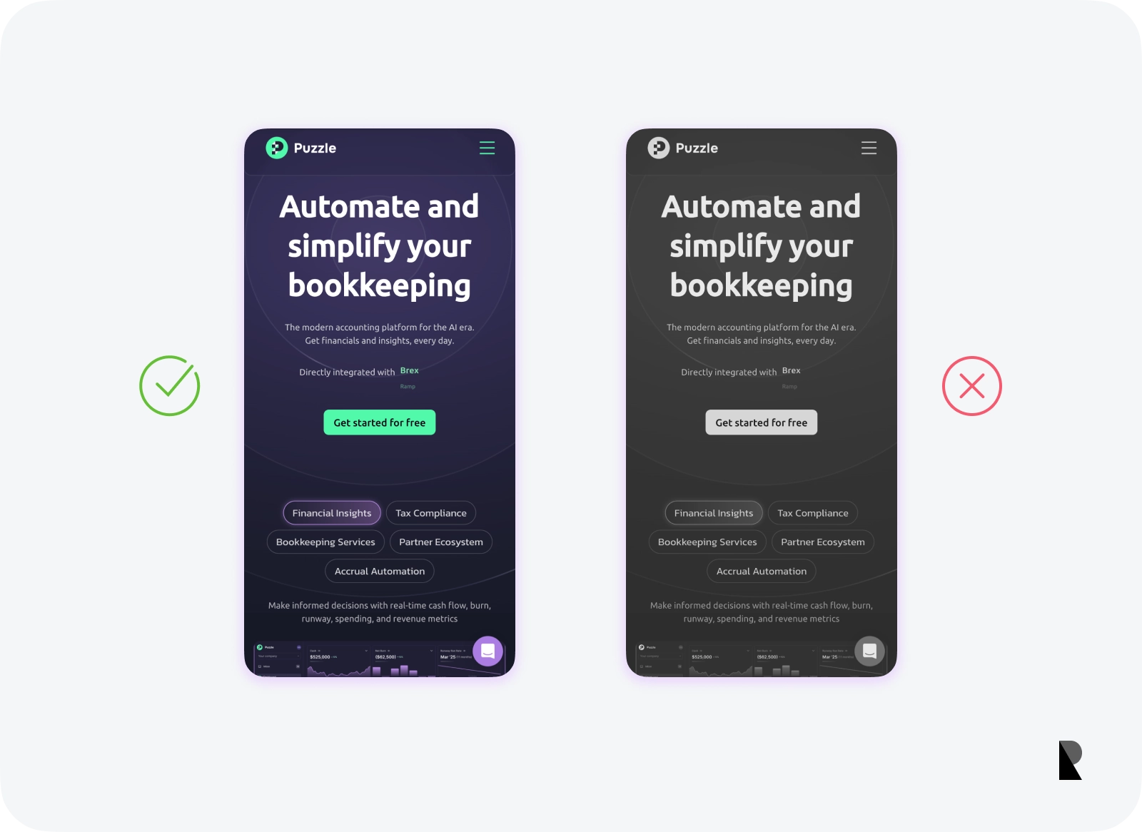
What is the contrast in mobile app design? Contrast is one of the core features of the design. As mentioned above, colors have to dominate each other. The dominant color should be less. Thus, you prevent distraction in the interface.
Creating high contrast is directly related to UX and accessibility. In more detail;
- The text is not visible in the background color.
- The CTA button is not the most noticeable element in the section.
- The combination of colors (such as blue and red) that will tire the user’s eyes, is a contrast problem.
Mastering the contrast is a very important detail that you will master by working on it and gaining experience.
Balance
When it comes to balancing mobile app design, it is possible to talk about many concepts. Visual weight, colors, texts, spaces, and all remaining elements must be in balance. But especially in terms of color, balance is your rate of using color.
It doesn’t matter if there are more or fewer colors, balance matters. Colors must be in balance to achieve contrast. Some colors can be in harmony with more than one color. White is an example of a color that can go well with many colors. For this reason, white is used much more in design than other colors (do not confuse it with white space). It is frequently preferred as a background color in light mode.
Color scheme trends in mobile app design
60–30–10
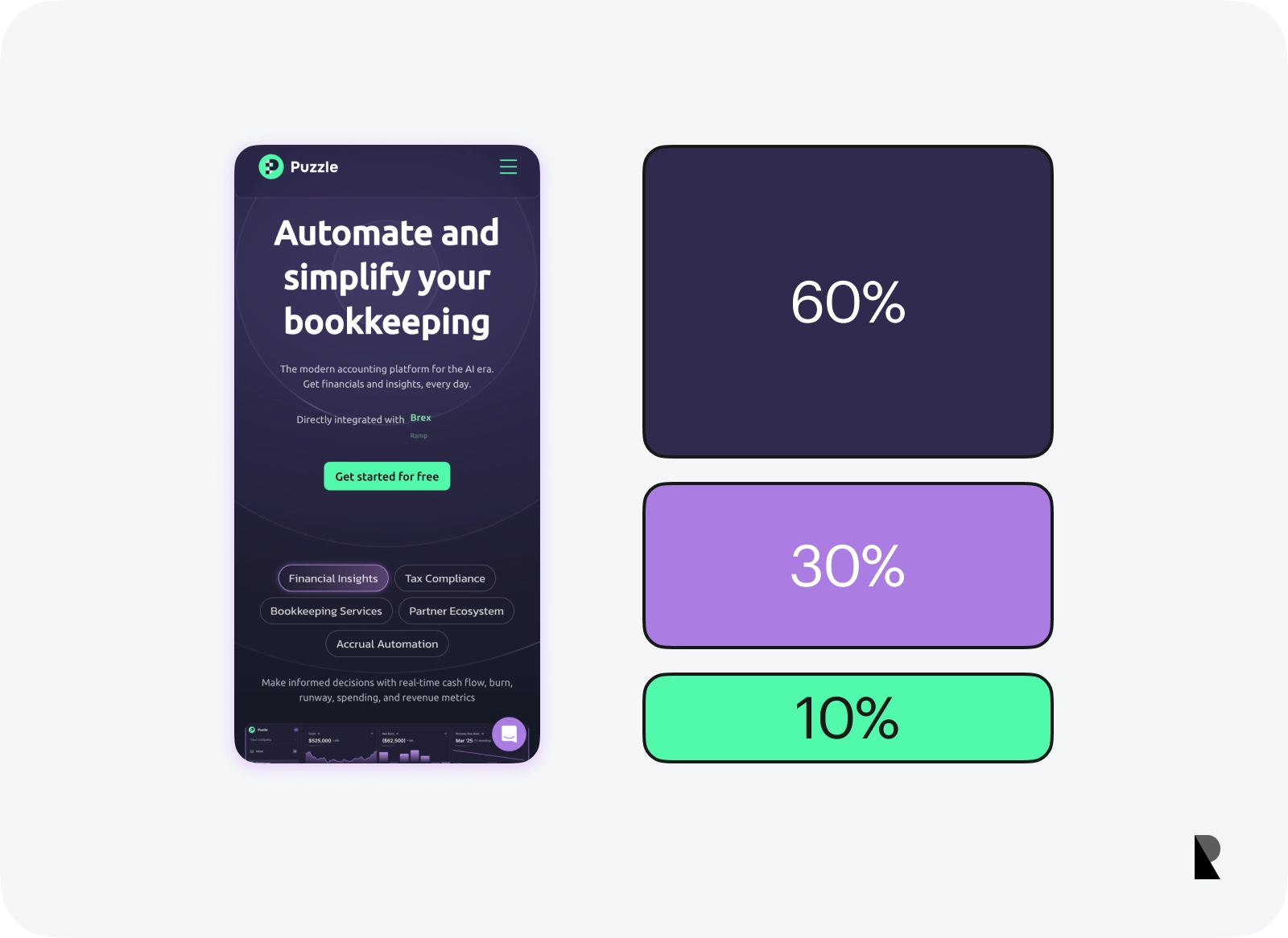
There are some techniques for balancing color. One of these techniques is the 60–30–10 technique. Briefly; The most used color tones in the color palette are 60%, this can be the background color. The most noticeable color tones, called Primary, are used at a rate of 10%, this color tone can be used for buttons and elements with action. As you can imagine, the secondary color is used at a rate of 30%.
White space
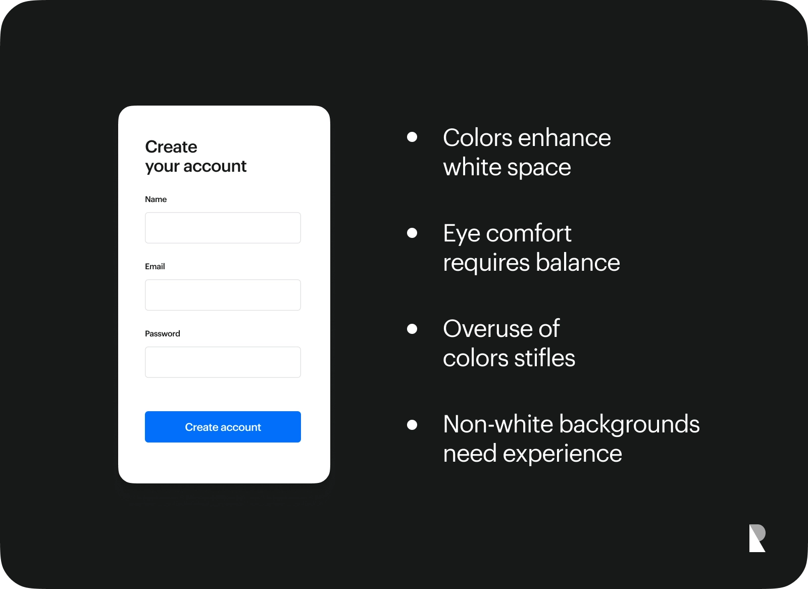
Although it is a closer detail with spacing, colors are also important in white space. In the design, it can be useful to get help from colors in white space to appeal to the eye and allow the eye to scan comfortably. In overused colors, the design can be stifling, even with well-designed spacing. When you choose not to use white as the background color, you are out of the safe area and you should trust your experience at this point.
Color categories
There are preferred color categories in designs. Although these differ according to the design criteria, this article will focus on 6 different color categories for mobile design. The categories may be the designer’s decision but also depend on the sector of the designed app.
Pastel colors
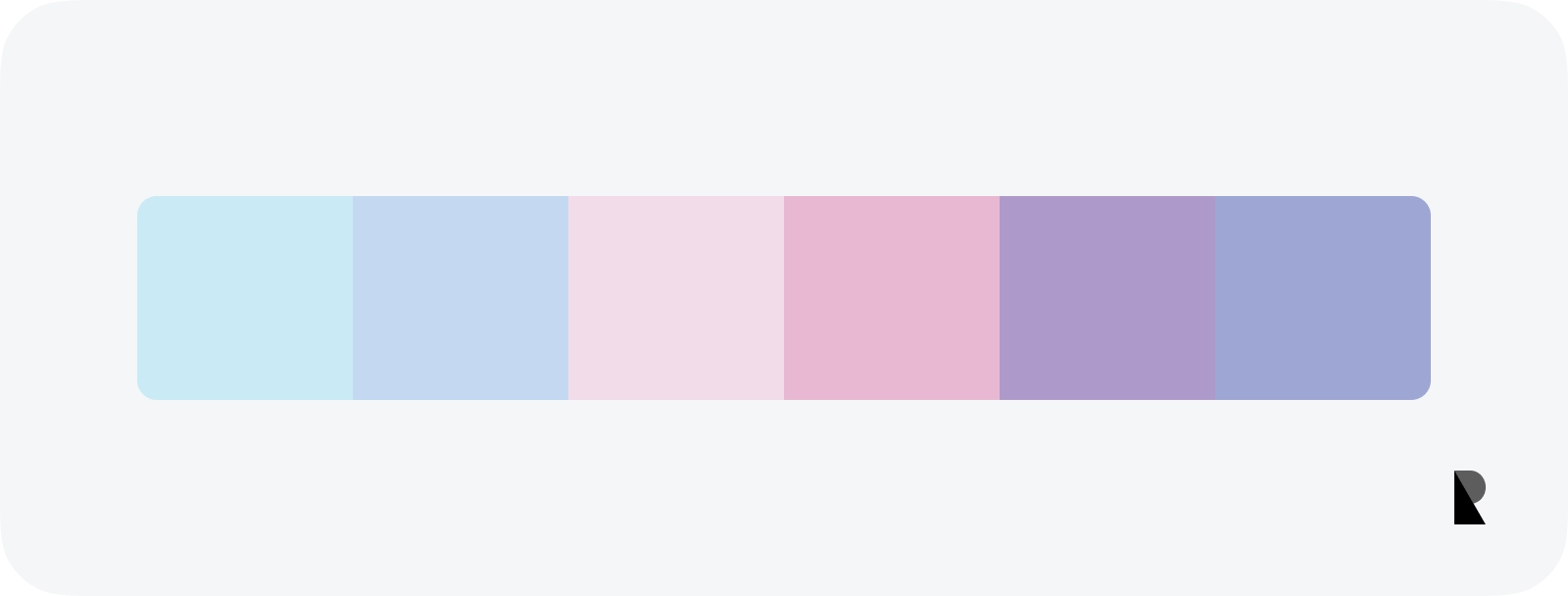
It has very low saturation and very high brightness. Even if the hue changes, the softness of the colors is remarkably close to each other. In short, the color is moved to white by increasing the tint.
Earth colors
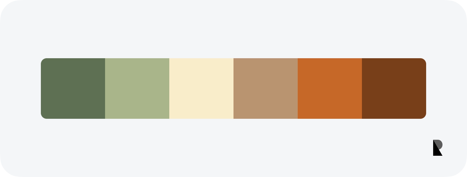
One of the best ways to be inspired is to look at nature. Almost every area of design carries examples from nature and real life. Of course, colors can also be inspired by nature. The main color tones that can be inspired by nature are the colors of natural structures such as soil, sky, sea, and trees.
Black and white are added to the pure hue value to achieve earth tones. In other words, colors are obtained by bringing them closer to gray. Nontechnical detail; In apps such as Figma and Sketch, earth tones can be created if the color is selected from the middle area of the color picker.
Neutral colors
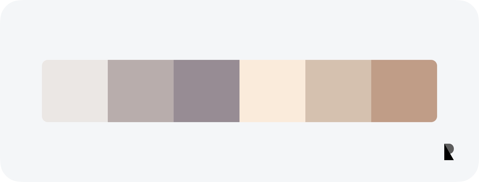
It is a popular category. It has a wide range of uses from text colors to muted colors. While creating the color palette; A palette is created from black, white, beige, and gray colors. Saturation is quite low and brightness is quite high. But the difference from pastel tones is; neutral tones are not moved to white.
Desaturated colors are the key to a neutral color palette. After adjusting the saturation, there is a balance between white and black. This means that the hue value in the color picker is dragged towards the black, white, and gray areas.
Neon colors
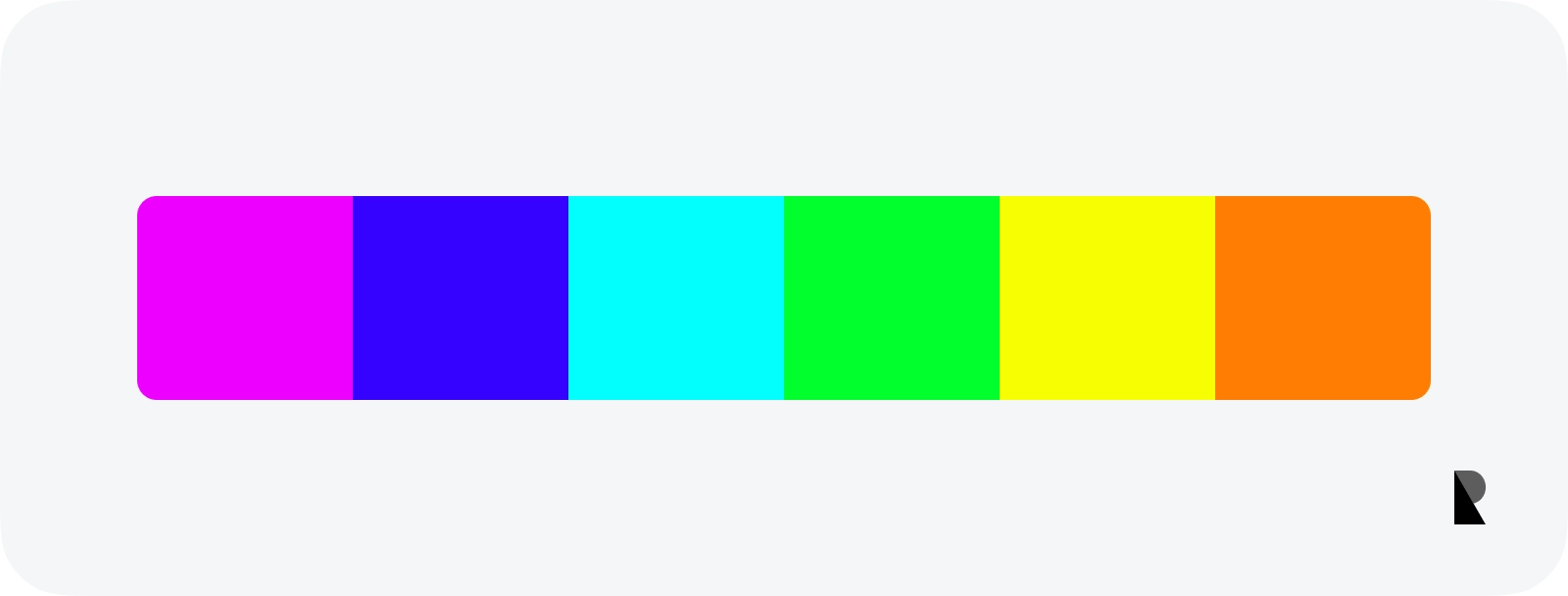
Both saturation and brightness are quite high. It is used almost 100%. A color palette is created by changing the hue values. Like neon colors in real life, the purpose of design is to create colors that stand out directly. It is remarkable, it can dominate other colors. Neon tones are bright colors and eye catching.
Jewel colors
It can be used in designs that look rich and luxurious. It has high saturation while designing. Brightness shouldn’t be too low either — but if it’s too high, it can go neon colors this time. Then you can change the hue to get the actual colors.
Shade colors
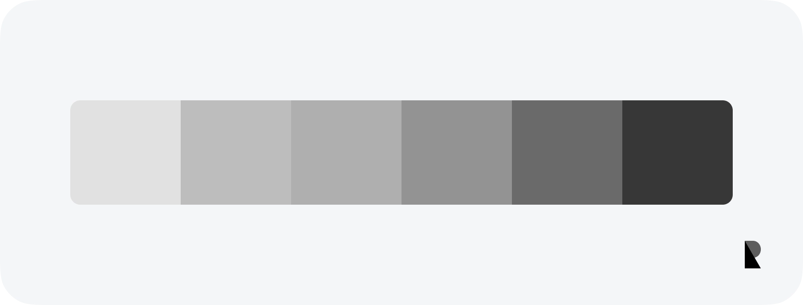
The color palettes created over black and white colors are shade tones. In these tones, the hue does not affect the color. Because saturation is 0. The only value that changes is brightness. This means that a palette is created by specifying colors between bright, white, and black.
Color Palette Tips & Tricks
Creating a color palette is not just about technical details. Sometimes the designer has to trust the “design eye”. This also requires experience. Some notes can be noted:
Don’t forget cultural changes
Colors have very important values in cultures. For example, there are great differences between colors familiar to Brazilian culture and colors familiar to Japanese culture. Before starting the design, the usage area of the app should be considered. As can be expected, a “cultureless” design language should be preferred in designs that will be used globally.
Don’t forget dark & light mode
It is now one of the sines qua non in mobile app designs; specifying a color mode according to the system. The light mode view is generally preferred if a single color mode is designed. But dark mode has become a feature that users are getting used to. It may also be useful to create a dark mode color palette for your designs.
The most important thing to pay attention to in dark mode is contrast. Compared to light mode, the contrast of dark mode is more difficult. A poorly designed dark mode causes a readability issue. It also indirectly causes accessibility problems. As a footnote, consider not using pure black and pure white for contrast.
Using too many colors is distracting
The more colors selected, the harder the control. Experience plays an important role in the use of multiple colors. Generally, using many colors is the negative factor that makes it difficult for the user to navigate the interface and take action.
As a suggestion; If it is necessary to use many colors due to the app's characteristics, you can use dominant colors together with soft colors such as neutral and pastel. Thus, even if more colors are used, the number of dominant colors is less. It provides both contrasts and does not tire the eyes.
When modern design examples are examined, you can see how beautiful harmony is created by shade, pastel, and neutral tones. Instead of using oversaturated colors in your next designs, try using pastel or neutral tones together with shade tones.
Take advantage of the tools’ features and plugins
The tools used in the mobile design process are pretty advanced. Examples of these tools are Figma, Sketch, Adobe XD, and InVision. To make things easier, there are plugins developed by the community for the tools. Since design factors are considered when developing plugins, it can create almost perfect color tones. You can also find a lot of color palette generators with a Google search.
Choose a color gamut suitable for digital projects
Different color gamuts are preferred when working with printed and digital products. It is chosen between RGB and CMYK. RGB is preferred in digital. Because RGB stands for Red Green and Blue colors. On the digital screen, all colors are obtained by mixing these three colors in a certain ratio. Mixing all of them produces a white color.
CMYK; Represents the colors Cyan, Magenta, Yellow, and Key. It is used for printed media. Since these colors are not obtained purely on digital screens, they are not preferred.
There are a few more technologies and classifications such as RGB and CMYK. For example P3 and Pantone, Adobe RGB, and much more. But when choosing colors, popular ones should be preferred. Since each user has different screens, they literally cannot see the colors you see. Yes, each sees the color offered by the screen of the mobile phones they are using. Even though there are color standards in the world, every screen makes unnoticeable changes in color tones depending on the technology it uses.
Another issue is to use codes such as HEX, HSL, and HSB in digital -Do not confuse this choice with color gamut- The choice of these is entirely up to you; The colors in this article are sampled using HSB to give you more control over the colors.
Don’t forget accessibility
There are many colorblind people in society. In addition, the age factor is an important criterion for understanding and evaluating the interface. Consider these factors when designing a mobile app. Plugins and extensions are also available for accessibility.

Creates insightful, strategy-driven content that translates complex design and branding concepts into accessible knowledge, supporting Ramotion’s mission to elevate digital experiences.