Website color schemes are always a subject of much debate. Although color theory is not rocket science, it is still one of the most common issues. It can ruin everything, starting with making website design cost look outrageous and ending with failing all the marketing missions.
The deal is entrepreneurs, even the tech-savvy ones, tend to believe that website color scheme has only a purely aesthetic impact. They invest money in all sorts of channels and ultra-modern third-party services that may improve their website presence on the web but overlook one of the most essential and influential user interface elements – coloring.
However, it may surprise you, but according to recent studies:
- Сolor is almost always the first thing users notice, so it has a considerable impact on forming your brand's first impression.
- More than 80% of customers place color as a primary reason to buy an item, so it plays a pivotal role in your product and overall marketing campaign's success.
- Color increases brand recognition by 80%, reinforcing the corporate image, increasing conversions, and amplifying reengagement.
Like it or not, but website color scheme is one of the most critical aspects of the user interface. You should not take it for granted. Let us consider more reasons why it is important to pick the right color schemes for websites.
Why Is It Important to Pick the Right Color Schemes for Websites?
Website color scheme influences how visitors interpret what they see. It also stirs visitors' emotions giving you an opportunity to achieve the emotional state that you find desirable. This ability to influence and control psychological aspects of a prospect's perception opens vast possibilities. With the right color combinations for websites, you can easily
- grab attention,
- direct attention towards essential details,
- gain a reaction,
- create a vibrant visual experience,
- strengthen the message,
- ensure good first and overall impression,
- express meaning,
- create desire,
- set priorities,
- make the right mood and atmosphere for your site,
- increase credibility,
- build personality,
- generate traffic,
- drive conversions.
On top of that, a website color scheme helps create a comfortable environment for all groups of people, including those who suffer from permanent or temporary disabilities. It stands behind good user experience and your ability to expand your target market by serving information to everyone.
Although we barely notice color's ability to dominate our actions and decisions because it is so deeply ingrained in us, however, its influence is undeniable. It is responsible for beautiful aesthetics, a comfortable environment, successful brand perception, and even conversions. Therefore, it is vital to put a lot of thought into the tones and hues you want to use.
Follow our guide to get some useful insights on how to create the best website color schemes.
First things first – let us break down the essentials of the successful color combinations for websites.
What are Website Color Schemes?
Anatomy of Color and Color Combinations for Websites
Anatomy of color is an extensive study. It covers everything: history, color systems, color standards, and much more. Not only is it crucial for professional website designers from top web design agencies seen but also all those who are up to some marketing success.
The good thing is, although this theory is quite vast when it comes to entrepreneurs, they need to know mostly the key moments to make a fully informed decision. The artists will do everything else. Let us enlighten them.
- The vocabulary of color theory: hue, tone, shade, tint – are all different things. While the first one defines what color something is, the last three are obtained by adding gray, black, and white to hue correspondingly.
- The color wheel is your North Star. The basic version includes 12 colors. Among them, you will find red, yellow, blue (that are primary colors), purple, orange, green (that are secondary colors), and combination colors made from mixing neighboring colors such as yellow and orange.
- Color systems. On the web, we use RGB and hex values. The former defines a shade from a combination of three different values of red, blue, and green. The latter describes it through hexadecimal value understandable by the computer.
- Hot and Cold. Depending on the amount of reds, yellows, and blues, we can define warm and cold hues.
Colors Combining Techniques
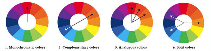
There are several colors combining techniques. However, for the website design sphere, it is customary to use complementary, analogous, and monochromatic
- The complementary technique implies using colors found opposite each other on the color wheel.
- The monochromatic technique implies using one primary color and a range of its shades with different intensity and lightness.
- The analogues technique implies using colors that are right next to each other on the color wheel. This option feels organic and more pleasing to the eye since it includes a combo of hues found in nature.
Three critical aspects are essential for creating a great user experience: contrast, complementation, and vibrancy.
- Contrast. Contrast means a very noticeable difference. It is vital for UX since it stands behind the readability and accessibility of your project. The excellent contrast ensures your target audience easily gets information. Every shade of color has an opposite shade that is at odds with each other. To find a pair of hues that will work together and distinguish elements, you need to locate the color on the opposite end of the circle.
- Complementation. Complementary colors accent each other creating a sense of harmony that pique interest. To find a pair of complementary colors, you need to locate the colors opposite each other on the color wheel.
- Vibrancy. Vibrancy is all about mood, the overall atmosphere, and the user's emotional state. It can be bright; it can be gloomy. The brighter and warmer colors may energize your target audience, whereas darker and cooler hues may relax and tranquil them.
Color theory is an endless subject; however, these key moments can be enough to come up with the best website color schemes ever.
Website Color Scheme
Armed with this knowledge, it is time to define what the website color scheme is.
What is a website color scheme?
A website color scheme is the choice of colors used to create style and appeal. It is a combination of hues found in the entire interface, including typeface, icons, glyphs, and even illustrations.
One false step, and the whole interface will be broken. Therefore, it is vital to give thought and carefully plan the choice of colors. For this, you need to combine the fundamentals with the best practices formulated by experienced website designers.
The Best Practices of Securing the Right Website Color Schemes
It only seems that creating color combinations for websites is child's play. In fact, everything is quite the opposite. The color theory requires a thorough understanding of the basics. To make matters worse, you cannot just blindly use modern color palettes like, for example, dark color palettes, since the best website color scheme should reflect your brand and product and, most importantly, resonate with your specific target market.
To find your perfect match, we are going to break down some of the best principles of picking the right color schemes for websites, as well as dive into examples of modern color palettes and some unique color combinations for websites used in real-life projects these days.
Identify Target Market
First and foremost, identify your target market to understand how it will respond to the color palette ideas you have in mind. Remember, color preferences not only differ between cultures but also genders and age groups.
For example, if you target women, your preferable choices should be blue, purple, green, and pink. If you target men, then your preferable options should be blue, green, and black. In both cases, stay away from brown and orange since people find them the most irritating.
When it comes to age, yellow and red are the preferable colors for small children. Teenagers may fall for gender-based color schemes created by marketers like pink for girls and blue for boys. In addition, visually interesting color palettes based on bright and playful hues will help to engage them better.
The older the target market is, the more you benefit from blue tones and grey tones. On top of that, you should remember that the older demographic requires from your website a perfect contrast ratio to distinguish information on the screen easily; therefore, black and white should also be involved.
Based on gender, age, and demographics, you need to pick hues that will best resonate with your target market.
Hint: if you want to play safe, focus on blue and red since studies show that they are consistently preferable throughout life.
Consider the Company's Competition
It is obligatory to conduct research regarding the market and the competition before creating a design. Knowing your competitors helps to build not only strategy but also brand identity. Drawing on the perspective of a creative web design company can reveal how subtle color shifts influence positioning and perceived originality. This information gives you insights into what color palette resonates the best with your target market.
Also, this analysis gives website designers some hints on how to stand out from the crowd by choosing a website color scheme with similar emotions and energy.
Focus on Emotions Your Products Express
Product may also dictate what colors to choose for your website. Every product bears its gamut of emotions. Your website design should match it to strengthen the message and reinforce the impression.
For example, if your product is dynamic and your business is young and energetic, you may benefit from bright tones. If you are doing business for a long time occupying quite a niche, you may consider some calm and cold hues or simply go for neutral combinations that scream businesslike appeal on all fronts.
Be Mindful of Psychology behind Different Types of Color Schemes
We could not help but include color psychology since it underlies everything. Emotions are what drives action. Every hue affects users in its way. Depending on the message and feeling you want your site to convey, you may use one or another primary color. Consider the basic emotional application of colors to make the right choice:
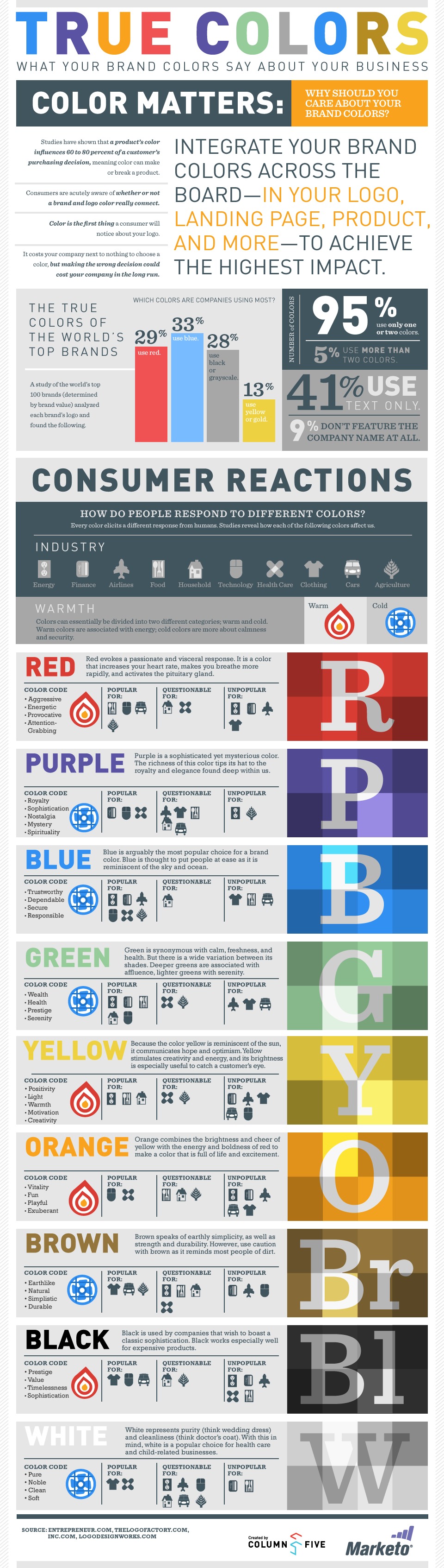
- Red – The most stimulating color. It attracts more attention. Therefore, it should be used with caution. It represents passion and power, promotes importance, hunger, and danger, and evokes a sense of urgency. Usually, it is used in such industries as food, sport, and entertainment.
- Orange – The hot color. It is associated with warmth, excitement, optimism, enthusiasm, creativity, and fun. It is used in transportation, entertainment, and sport.
- Yellow – The color of Sun. We associate it with warmth, cheer, and positive emotions. Industries that benefit from this hue are travel, leisure, transportation, and of course, food.
- Green – The color of nature. It signifies health, serenity, tranquility, eco-friendliness, and even wealth. It can be seen in such industries as real estate, banking, farming, non-profit.
- Blue – The color of the sky. We all adore it because it is so calm and serene. It brings us hope. Therefore, it is generally preferable by all genders and age groups. It evokes such feelings as freedom, wisdom, calm, trustworthiness, safety.
All kinds of industries capitalize on it, but we can often see it in communication, children's products, and technology. Note, even though this color is increasingly overused, nevertheless it works no matter what.
- Purple – The color of luxury. It is widely associated with wealth, success, creativity, mystery, and even spirituality. Companies that benefit from this color lie in such niches as humanitarian, art, luxury, religion.
- Brown – The color of earth and one of the most disliked colors according to stats. However, it still may come in handy, especially if you want to evoke such feelings as friendliness, naturalness, reliability, and stability. It is used in such sectors as agriculture, transportation, construction, and legal.
- Black – The color of sophistication. While artists strongly believe that black is an absence of color, we can still use it to provoke such emotions as exclusivity, mystery, elegance, power, authority, discipline, creativity. It is one of the base colors that is used in all niches.
- White – The most neutral color of all. It is associated with faith, purity, safety, cleanness, simplicity. Much like black, all industries use it in their websites.
One important thing to note, some colors may have different meanings in different parts of the World. For example, white is a neutral color, but it is associated with death in India. Therefore, analyze your target market thoroughly.

How to pick a color scheme for a website?
- Find Your Primary Color
- Decide on How Many Colors to Use
- Choose the Secondary Colors
- Decide On Accent and Neutral Colors
Step-by-step Routine to Pick the Right Website Color Scheme
It is natural to feel overwhelmed by the number of potential website color palettes and different types of color schemes since there are thousands of them. Follow this basic step-by-step routine to avoid confusion.
1. Find Your Primary Color
It all starts with finding the primary color that dictates rules for adding other hues. There are several ways to nail this step.
- The first way is to choose the primary color depending on your product's vibe or target market to fit the emotional constituent. Using your knowledge in color psychology, you can easily find the perfect match for you.
- The second way is to use color from your brand identity. It already matches the vibe and energy of your company and perfectly blends into your industry. So, choose the dominant color in your logo as your first primary color since it is a hue that your brand is associated with.
- The third way is to go off the beaten track and use something new depending on your current marketing goal. Use modern color schemes and field-tested color palette ideas as inspiration.
Some useful tools that may help you in this matter:
- Branding Color Quiz - It is a small 7-question quiz that figures out the best coloring depending on your answers to such essential questions as "how you describe your customers" and "how you describe your company."
- Brand Colors – The collection of official color codes of famous brands. From internet giants like Google to beloved food companies like McDonald's, it offers some crowd-approved color combinations for websites.
- Color Palette Generator – This instrument will extract colors from your favorite photo and come up with beautiful color palette ideas.
2. Decide on How Many Colors to Use
So, how many other colors should you add to the primary one to get the beautiful, harmonic, and at the same time, unique color palette?
That is a tricky question. You can survive even with one color and a range of its tints. However, what if you need more than that?
Start with choosing just two colors so that at the end, you have three hues. Artists highly recommend this approach all around the World. In this case, you may benefit from a triadic principle, which implies using three colors that are equally spaced around the color circle.
If you feel that three colors are not enough, this is especially true for content-rich projects where you need to separate logical divisions and draw attention to critical points more efficiently; you may extend this palette by adding some more hues. However, do not use more than five different options.
3. Choose the Secondary Colors
Choosing secondary colors is as vital as selecting the primary ones. It is here where color theory comes into play. You need to decide on a color combining technique (complementary, analogous, triad) to nail it.
As we have already said, you can use your primary colors' shades and tints in case you have decided on two dominant options. However, what if you have just one?
The first way is to stick to a monochromatic scheme and exploit its range of tones.
The second way is to pick complementary colors, analog colors, or use the principle of triade. To save yourself from much trouble, use one of the time-proven tools like Color Space or Muzli Color Generator that may come up with fantastic harmonious color schemes depending on your primary option.
4. Decide On Accent and Neutral Colors
Links, buttons, icons, and of course, typography require some emphasis. Therefore, you need to decide on your accent colors. For this, follow these general recommendations.
- The background has to be neutral and unobtrusive since it will occupy the lion's share of the design. You can go for a pale version of your primary color to match branding. Alternatively, you can go for neutral tones (black or white) like the majority of professional website designers do since they give users a break and let them focus on content rather than graphics.
- Play smart with typeface color. Generally, artists prefer to use black typeface on a white background that ensures the highest contrast ratio, leading to optimal readability. However, if you want to make the content look softer, you can use dark shades of grey. If it is a heading or a small text block that requires extra attention, you can go for vibrant colors.
- Links, buttons, and important bits of information should have eye-catching hues since they need to stand out from the reading flow and catch the user's eyes without much effort. You could benefit from daring and attention-grabbing accent colors.
Last-minute Advice
Do bear in mind these helpful tips formulated by the best website designers:
- Use no more than two dominant colors.
- Use consistent saturation.
- Use colors from the same family since they work well together.
- Use your color scheme everywhere in your marketing since repetition is the key to success.
- Never choose a website color scheme based on your preferences.
- The website color palette must not contradict your brand's philosophy.
- Never use complementary colors for text.
- Always ensure the optimal contrast ratio.
- Always try to achieve color harmony or a visually pleasing arrangement of colors.
- Test multiple variations of new colors in existing designs to define the best option.
Finally, according to studies, colors are most effective when consumers believe that the brand's color "fits" the brand. Therefore, ensure the final website color scheme goes well with your company's overall image and meets target market expectations.
How to Use Color Combinations for Websites
So, you have come up with several good color palette ideas. However, how to apply them to see what works the best?
The first way is to stick to the traditional rule of 60-30-10. It means the primary color takes up around 60% of the design, secondary colors take up another 30%, and accent colors take up only 10%.
Another way to use a color palette is to stick to these rules:
- Primary colors go to the "hot spots" on your web page. CTA buttons, headlines, features, icons, download forms, and other crucial elements that are lead magnets or attention catchers should be set in it.
- Secondary colors highlight less important information like subheadings, active menu items, supporting content. Note, use secondary colors only when needed.
- Neutral colors occupy the lion's share of design.
Collection of Modern Color Schemes and Best Color Combinations for Websites
The theory is for a perfect world. However, what about the real one? It is here where we need some practice. Get insights from successful brands and the leading web design companies. Set your focus on the modern color schemes in the best marketing websites and the types of color schemes used in the best website dashboard UIs.
As for us, we are going to start our collection of the best color schemes for websites with five successful companies whose coloring does lots of stuff, from creating beautiful aesthetics to achieving marketing goals.
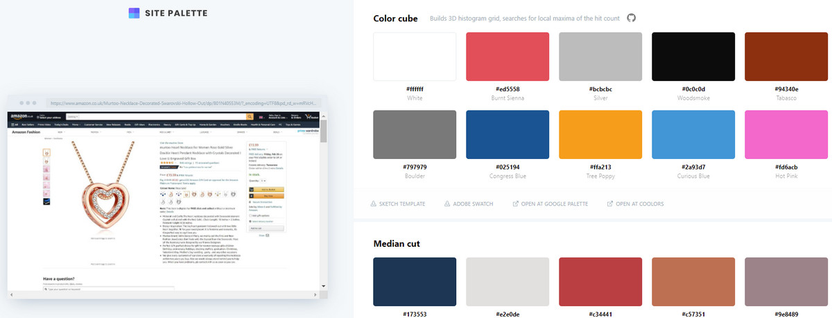
1. Amazon
The first one is Amazon, the biggest marketplace in the World and the child of the World's top billionaire, Jeff Bezos. So, what can it teach us?
First and foremost, it teaches us that if you want to embrace the entire World and cater to various nationalities, you need to stay neutral as much as possible. It also implies the utilization of time-proven and crowd-approved techniques.
For instance, the black and white combination should lie in the core. Although many creatives find it boring, nevertheless this safe bet is ideal for the international target market. It evokes a neutral gamut of emotions and sharpens a sense of authority, power, and safety.
Besides, black and white provide the optimal contrast ratio that creates a comfortable environment for users. As for accents, the website uses blue and yellow that have positive meanings.
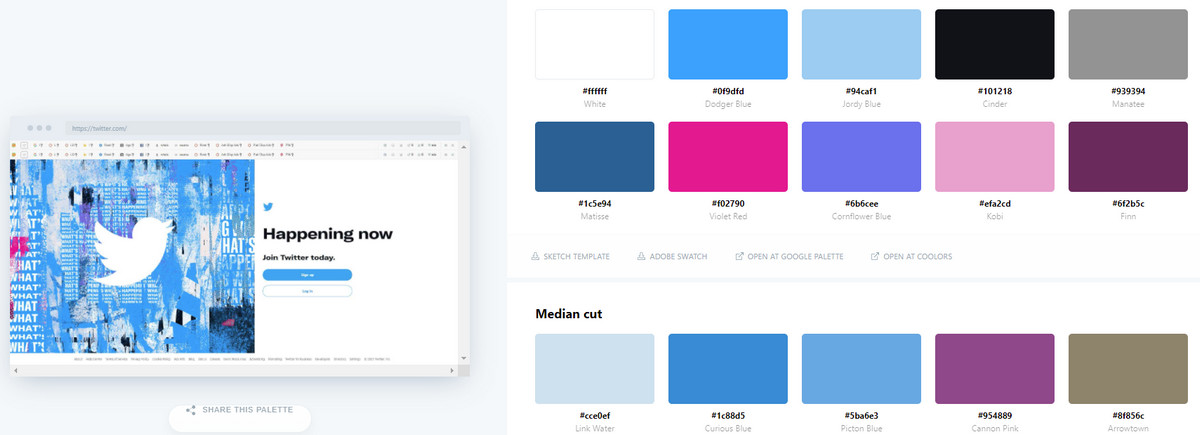
2. Twitter
Another big name in our collection from the digital World. Twitter is a good source of inspiration for all tech startups. So, what tips can we take from it?
As you can see, Twitter, much like Facebook and some other social media goliaths, use blue as a primary color. This choice is not accidental. According to stats, 57% of men and 35% of women say it is their favorite color. On top of that, the blue color is associated with business, reliability, trust, loyalty, and stability. Therefore, this is another safe bet that works pretty well for the company.
As for other colors, Twitter has white as a neutral color that makes the entire background. This is another predictable choice since the website has to deal with lots of content and visuals.
The secondary colors include black and several grey shades that give diversity to the interface but still provide a safe and comfortable environment for users naturally focusing their attention on the content.
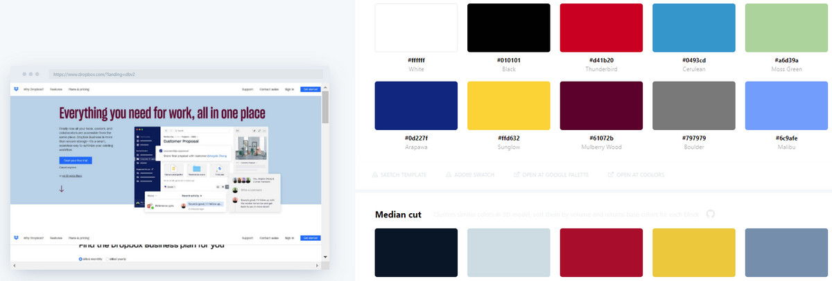
3. Dropbox
Although Dropbox lies in a different niche, representing client software, it still adopts the same practices as two previous examples. You will find here some similarities in website color schemes. Let us break it down.
The Dropbox color palette features three main colors: blue, black, and white. It also has 15 more complementary hues, among which you can find gold, black cherry, and sapphire to create beautiful pairings. White is for the background; black is for text. Several shades of blue are used for accents.
Note the hero area. It perfectly accommodates three colors that complement each other and at the same time throw a spotlight on crucial details.
Again, we can see how digital brand capitalizes on a time-proven trio: blue, white and black. However, thanks to additional 15 complementary hues that emphasize each other's qualities, the interface does not feel regular nor boring; on the contrary, it looks visually interesting.
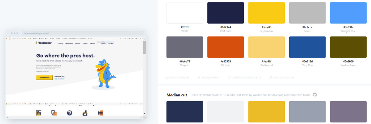
4. Hostgator
Let us make things a little bit interesting and give some spice to the previous trio. Hostgator is one of those brands that was managed to take the previous website color scheme to the next level by adding some splashes of bright and warm yellow color.
More so, the design team has successfully made some extra changes. For instance, they have shifted from white to light grey in terms of neutral color that underlies the entire interface; and give some shake to the text, choosing navy blue and blue for text instead of black. As a result, the website looks refreshing and memorable; and, it certainly has charisma and personality that is so necessary to stand out from the crowd.
One more thing, note how the team has skillfully combined cold and warm colors. It is just brilliant.
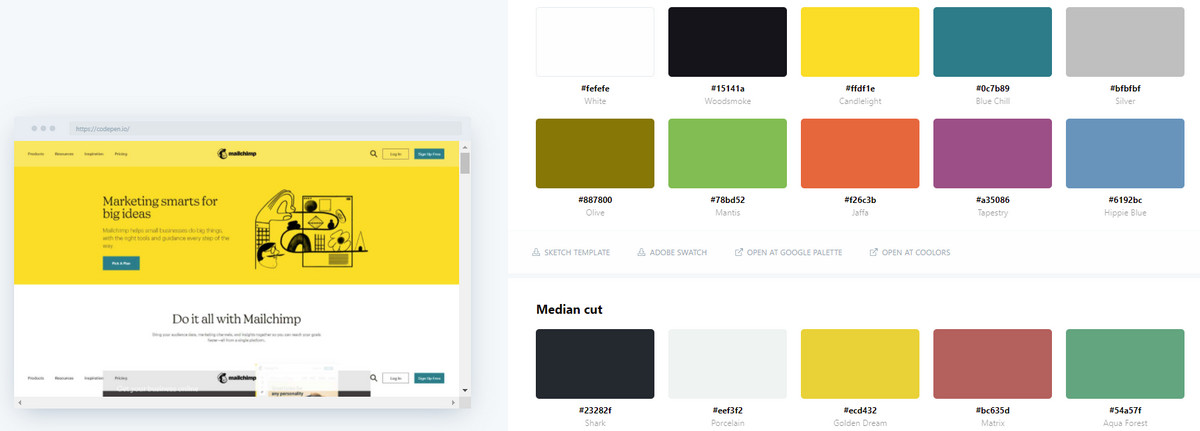
5. Mailchimp
If the episodic splashes of yellow color in Hostgator is not enough for you, then consider the website color scheme in Mailchimp, where the color of Sun occupies a dominant position. It greets users from the get-go establishing a proper positive atmosphere right away.
As for other hues in the palette, the team uses white for background, dark grey for text, pale yellow for promo blocks, and blue lagoon for buttons and accents. The combination is marvelous: all the hues harmoniously collaborate. The interface feels friendly, encouraging, and energetic yet without being overwhelming – precisely what is needed to spur some action in potential clients.
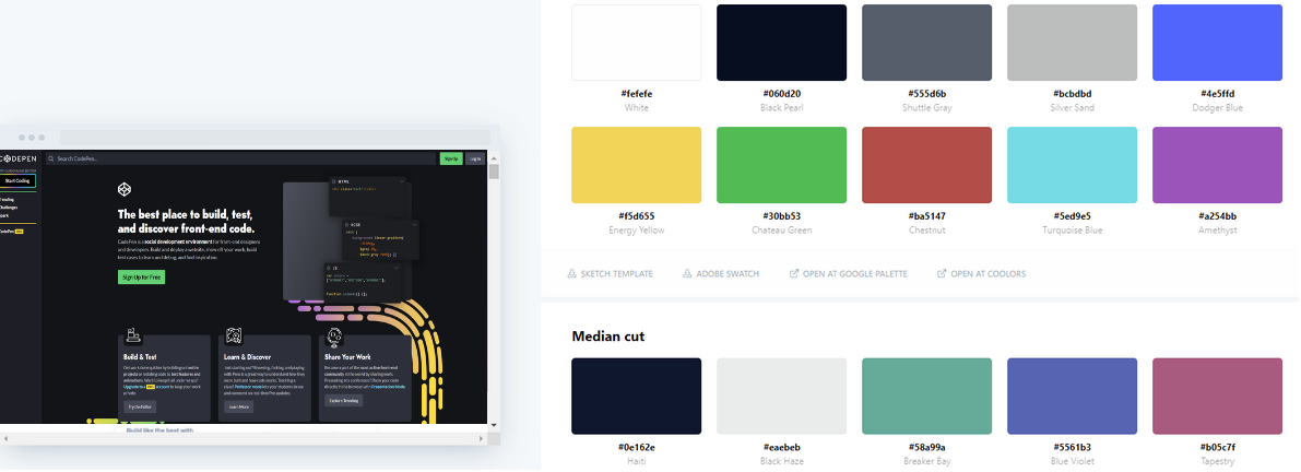
6. Codepen
Codepen is a mecca for all the developers in the World. It is a place to find inspiration, share your works and thoughts. However, we have included it in our collection for another reason. The deal is, unlike the others, it skillfully capitalizes on black color. It may seem bold at first; however, in fact, it is only for good.
The recent studies show that dark mode is much more preferable for users since it can reduce eyestrain in low-light conditions, making interfaces more comfortable to handle. Therefore, a dark color palette is a trendy solution now.
As for the rest, the team uses white for text to secure good contrast, neon green to direct attention to buttons naturally, yellow to put some accents, and grey to use as a secondary tone. Besides, the homepage features some beautiful gradients.
The key takeaway is, you can ditch conventions and modern color palettes and go for your bold website color scheme, especially when it provides a comfortable environment for your users.
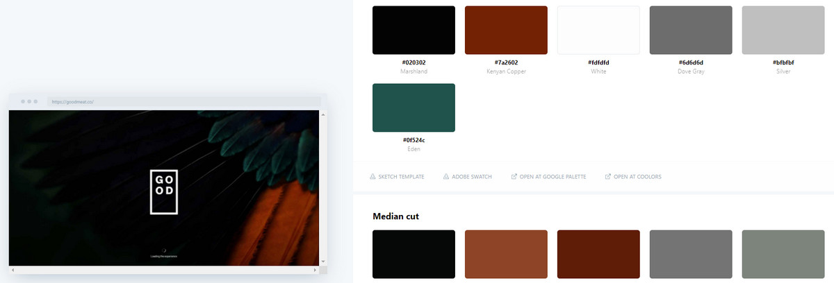
7. Good Meat – An Example of Popular Dark Color Schemes
For those who adore dark mode, we have included one more example of a website color scheme where black is the aesthetics' heart and soul.
Here you can see the classic black and white coloring that generates its gamut of emotions. It also provides a solid foundation for bright visuals that are skillfully scattered throughout the entire layout.
White is used for text, brand identity, and even buttons that nicely stand out from the black canvas.
The key takeaway: you can easily use a large dose of black in your website and still set accents, hit optimal readability, and even create an energetic vibe.
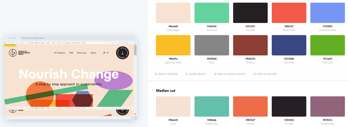
8. Nourish Change – An Example of Bold Modern Color Palette
If safe bets are not your cup of tea and you feel like your company's soul is painted like the wings of butterflies and the website color scheme should reflect this, then you are welcome to test the limits. Mix and match more than three safe colors like the team behind Nourish Change did.
The team uses more than five colors. Champagne beige, shamrock green, persimmon red, cornflower blue, classic yellow, grey, green, and one more blue shade– the spectrum is radiant, but it works.
The key to success lies in the well-thought-out utilization of other design solutions.
- First, the team has reserved black for text and white for accents - a safe choice.
- Second, each section that occupies the entire screen uses only a pair of colors. As a rule, the background is painted in a vibrant tone, whereas the text is set in black.
- Third, the team is very generous with whitespace avoiding clutter and visual overload.
- Finally, colors are used in big blocks that help to heighten a sense of compositional harmony.
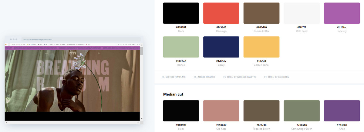
9. Make Breathing Room – An Example of Bright Modern Color Schemes
While the previous example features some bright hues, this one gets its beauty from soft, pastel colors. Again, the website color scheme includes not three but nine colors, among which you can find tints of red, blue, green, and grey. However, they work together perfectly, creating a harmonious environment.
Again, the success of this mixture of colors has not been without some design tricks.
- Each section includes no more than three hues together.
- There are no same combinations.
- Blocks alternate, creating a sense of diversity.
- There is a generous amount of whitespace.
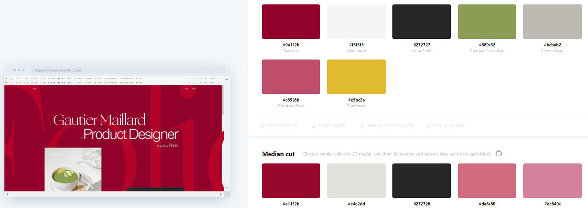
10. Personal Portfolio of Gautier Maillard – An Example of Daring Modern Color Palettes
We end our collection with a controversial website color scheme in the personal portfolio of Gautier Maillard.
Here red is a primary color. It occupies more than 60% of the whole interface, making everything about itself. This choice is increasingly unusual for websites in this niche. While it may work for the food industry, but for the tech industry that caters to another target market, it can be a bit outrageous.
Let us be honest; it is difficult to stay for a long time in such a surrounding since red background begins to stimulate our nervous system. Nevertheless, this solution makes the interface stand out from the crowd and certainly leaves a long-lasting impression. So, at some point, this bold move pays off.
Conclusion
As we have said earlier, color is usually the first thing users notice. Add to this fact that people prefer scan rather than read, and the color palette will be the one that influences the overall impression from your website.
Indeed, being the easiest and quickest aspects of a user interface to "understand" and the first meaningful thing that visitors notice on the landing page, the website color scheme could have a game-changing effect on your business. Therefore, it should not be taken lightly.
Although picking the right website, the color scheme can be a challenge. Nevertheless, you need to see it through. To help you in this matter, stick to this plan:
- Familiarize yourself with the basics of color theory.
- Stick to best practices.
- Study your company, product, and target market to understand what emotional component you need to create in the interface.
- Use professional tools wherever you need them.
- Create several color palettes and test them to see what option resonates the best.

Creates insightful, strategy-driven content that translates complex design and branding concepts into accessible knowledge, supporting Ramotion’s mission to elevate digital experiences.