Introduction
Think of when you looked at a greeting card; the warm colors made you smile. Now, think of a website you visited, and the choice of colors was so warm and welcoming that you were tempted to explore and learn more about the business.
On the contrary, you may also have visited websites and used mobile applications where the information is so cluttered, and the color palettes are all over the place, making you want to run away as soon as you sign on. This is not just you; everyone feels a certain way just by the visual appearance of a design, whether a physical or a digital product, and a lot of this has to do with the choice of colors.
Colors play a significant role in UI design. Choosing a color palette for design elements, such as the color preferences for a button or a call to action, can significantly impact user behavior and experience. An essential role of UI designers is understanding users’ perceptions of any design and making the most of them to create a valuable and pleasurable experience. This is where colors significantly influence the design process and choices.
Learning about colors and their psychology is essential for experiences and aspiring designers. This knowledge can be helpful for UX designers to add a new dimension to their skill set, thus improving their chances in the job market.
Partnering with a data-driven UX/UI design firm allows brands to build consistent color systems grounded in research. From palette selection to accessibility testing, these teams ensure every hue supports a clear visual hierarchy and user intent.
This article discusses the importance of colors in UI/UX design. We introduce the concepts of color wheel and color psychology and their role in design. We then discuss applying these concepts to a design by picking an appropriate product color palette.
Read along as we explore this colorful aspect of UI/UX design.
Defining Color Theory
One of the best ways to understand and categorize color is to go to the well-established theory called color theory. For product leaders hiring or partnering with top UX design agencies, this shared foundation makes it easier to assess how design teams justify palette decisions across brand, usability, and accessibility. Color theory is a collection of fundamental principles and guidelines about the use of colors.
Several areas are explored in color theory, such as the essential elements and characteristics of colors and the organization of colors in the form of a wheel – the color wheel. Designers can get helpful information about the use of colors by focusing on this theory.
For example, color theory gives a good perspective on the choice of accent color, the use of primary, secondary, and tertiary colors in design, and the choice of color palettes to keep designs consistent.
What is color theory?
Color theory is a set of rules and guidelines focusing on using and mixing colors effectively. This theory is critical for UI/UX designers as they can improve the visual design and aesthetics by using colors appropriately.
Basic elements of color theory
Color theory includes three essential elements: hue, saturation, and brightness. These characteristics of colors contribute to the visual appearance of any object or design, impacting the audience's perception.
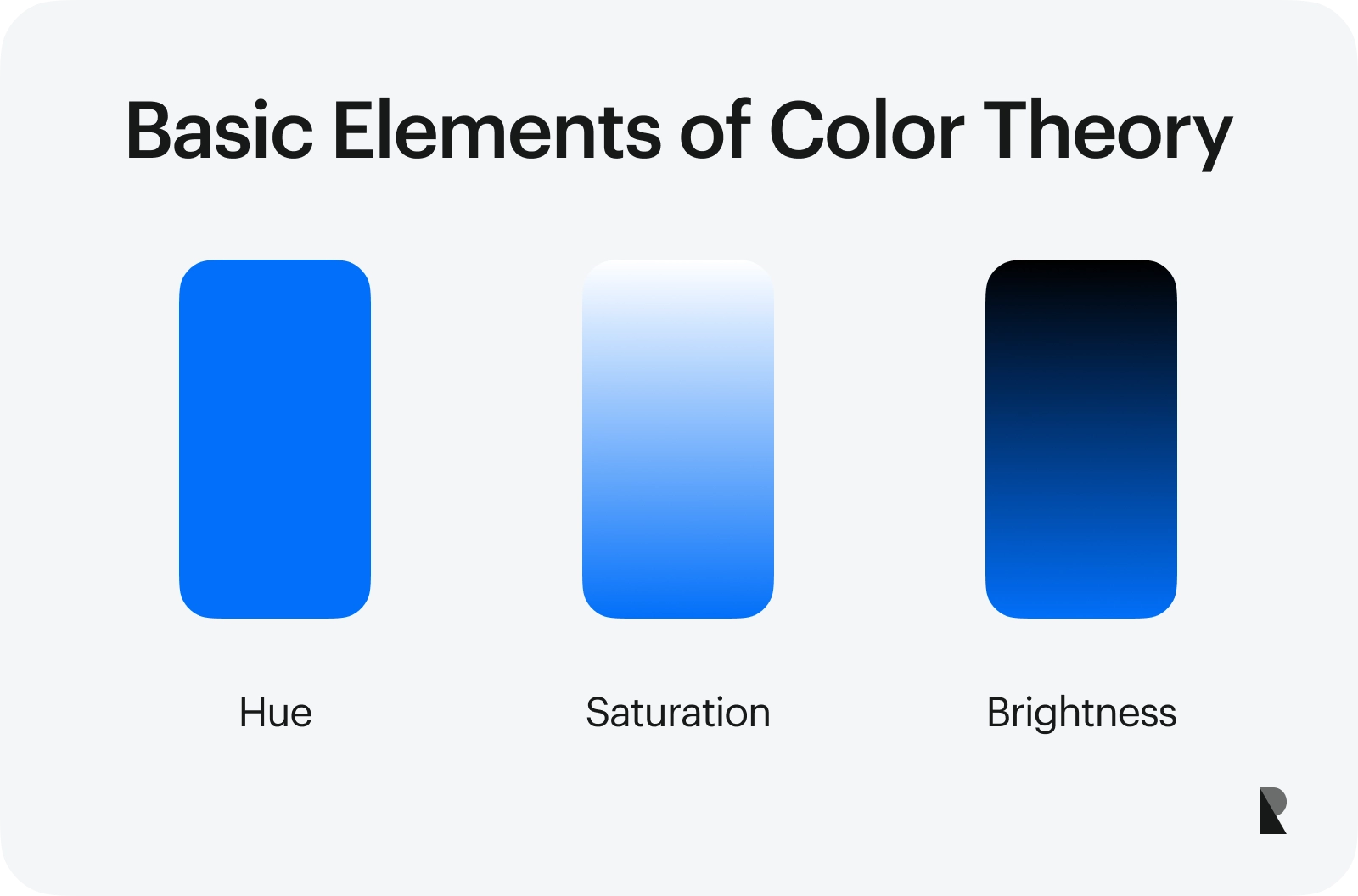
Hue, Saturation, and Brightness
Hue
In simple terms, hue is the color we see. This is the visual part or aspect of any color. Hue relies on three primary colors (red, yellow, and blue) and secondary colors (orange, green, and violet). In other words, the colors we see have some shade of these six colors, thus making up the hue.
Saturation
Saturation, as the name indicates, is the intensity or strength of any color. The purity level in any color makes it more – or less – saturated. For example, designers usually choose more saturated accent colors to draw users to them.
Brightness
Brightness, also referred to as lightness in some cases, is the luminosity of any color. The amount of light emitted by any object impacts how the color is perceived. For example, in any color palette, you will notice some very light – or bright – colors and some darker ones. Designers need to understand this aspect and choose a good mix of bright and dark in a color palette.
The color wheel
The color wheel is a valuable tool for UI/UX designers as it helps distinguish colors and allows one to look at them collectively. This helps select the right colors and combinations when working on a design.
There are several different types of color wheels. For example, the RGB (red, blue, green) color wheel and the CMYK (cyan, magenta, yellow, and critical or black) color wheel. However, this section refers to the color wheel based on the primary, secondary, and tertiary colors.
Such a color wheel organizes and arranges colors starting from the three primary and three secondary colors. The wheel then grows and incorporates tertiary colors.
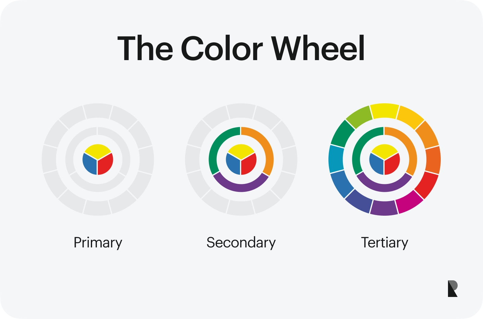
These bands of colors, once viewed together, can help understand color harmony and answer a simple – yet complicated – question: Which colors go well together? This is where the idea of complementary colors comes into play. The concept of complementary color is central to establishing harmony in colors and creating visually appealing designs.
A simple rule when choosing a color palette is that the complementary colors often reside opposite each other in a color wheel. For example, the colors red and green are complementary to each other. Similarly, green and magenta would go well together. This information helps choose the accent color for any design, whether a website or a mobile application.
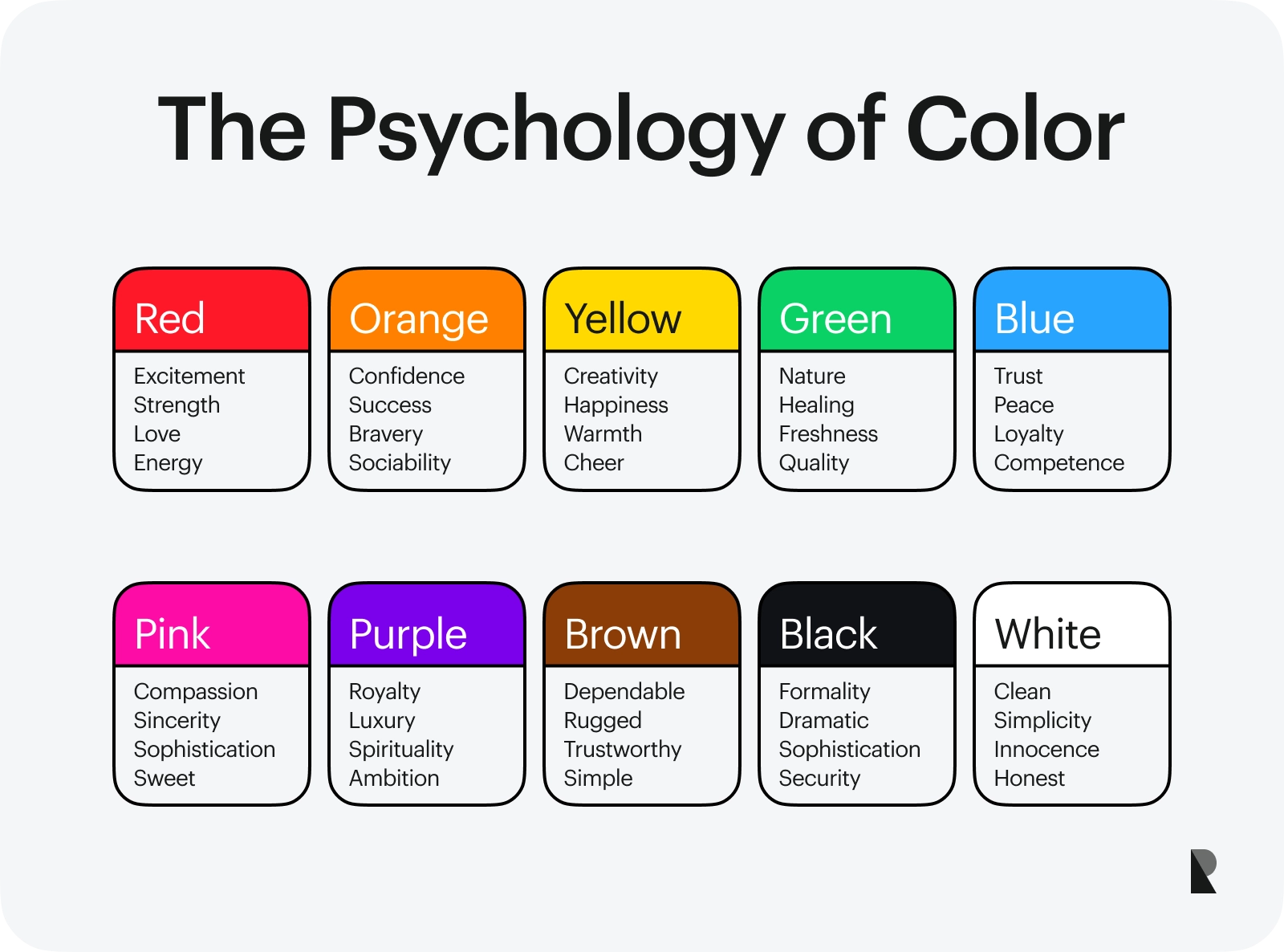
The Psychology of Color
Understanding color psychology is critical for UI/UX designers. All colors have associated meanings, and when used together or in contrast, these color meanings become more significant.
Using colors in harmony brings all sorts of new meanings, impacting the behaviors and perceptions of users.
Why is color psychology important for UI/UX designers?
Understanding colors and their psychology can help designers achieve the following goals.
- Invoke the desired emotions
- Design memorable experiences
- Improve sales and conversions
Color harmony and intelligent use of color palettes leave a strong impression on how users interact with any design. Even the four neutral colors must be used strategically to ensure maximum engagement and a positive experience.
1. Invoke the desired emotions
One of the most essential things that color psychology teaches us is that with the appropriate selection of a color palette, designers can invoke desired emotions in users, driving them to act a certain way.
For example, using bright colors on a website homepage or cool colors on an infographic tells a lot about the message's nature. These color preferences can attract or repel the users’ attention.
Colors and Emotions
If a website uses a lot of different shades with no sense of color harmony, the users are likely to move away without spending much time. For example, when designers use three colors on a website's homepage, all three must complement each other. If even one of these, say the third color, does not work well with the others, the entire color palette would seem off.
This is why using an analogous color scheme can always be a little tricky, where the impacts on visual design must always be taken into consideration.
Design memorable experiences
Regarding color psychology and its relationship with human cognition, memory plays a critical role in defining the quality of experience. An essential task of a UI/UX designer, focusing on the visual elements, is to choose a color palette that aids in creating a memorable experience instead of overwhelming the users and complicating their tasks.
A good mix of warm and cool colors is necessary to create such an experience. It is also essential to consider color usage in different design elements. For example, the colors in the banner of an e-commerce website would be different from an infographic designed to raise awareness about a disease.
This clarification plays a crucial role in color preferences and the choice of color palettes.
Improve sales and conversions
When it comes to the design of products and services, particularly in the digital environment, sales and conversion rates always come up. A good understanding of color psychology can also help in taking care of this aspect.
When designers employ a color palette-based approach, they always make sure that the overall goals and objectives of the organization are given due consideration. This helps in choosing a suitable color scheme and sticking to it while meeting the needs of the audience and the business.
Applying Color to Designs
Now that we’ve discussed color theory and the importance of understanding color psychology, let us look at some practical ways of applying colors to a design project. What do designers need to know when picking a color scheme? What essential guidelines can ensure the effective use of colors in design?
What are the best practices to apply color in UX design?
Some of the best practices to apply colors effectively in designs are as follows.
- Follow brand and style guidelines
- Ensure consistency in the use of color
- Use the 60-30-10 rule
- Ensure better localization
- Use good contrast
- Test your color choices
Designers are either associated with a particular brand or designing for a specific culture when working on design projects. However, it is essential to keep an eye on the market trends and the values of other cultures so the design is both inclusive and valuable for a wider audience.
Here are some of the best practices that UX professionals should use when choosing a color palette and aiming to improve the visual aspects of their designs.
1. Follow brand and style guidelines
The first and arguably most important aspect regarding the use of colors is to follow the already established guidelines. When designing for an organization, brand and style guides become extremely important. More often than not, companies have specific colors they stick to.
The designers should ensure that the chosen palette adheres to these brand colors and that the dominant color in design reflects the same in the brand identity. One way to focus on brand identity is by using a monochromatic scheme. However, this strategy should be employed carefully so the design retains its visual appeal.
2. Ensure consistency in the use of color
Consistency is a key design principle, and it is equally essential to the choice of colors. It is important to note that it is almost impossible to pick the perfect color palette with so many color palettes. However, color harmony and complementary colors can help address this aspect.
Designers must stay consistent with their choice of colors throughout the design. For example, if a red-orange combination is used on the homepage of a website, the main theme should also be followed on other pages.
3. Use the 60-30-10 rule
The 60-30-10 rule is an important guiding principle for UI/UX designers. According to this rule, in any design, 60 percent of the area should be covered by the dominant color, 30 percent by the secondary color, and 10 percent by the accent color. This

Ensure better localization
Most modern technological designs are created in Western cultures, with little thought given to cultural differences. Colors can have different meanings in different cultures, and it is essential to prevent negative cultural connotations. Localization is an important strategy where colors are chosen and applied in a way that designers account for cultural differences.
With the help of localized designs, UI/UX professionals can meet the needs of a wider audience living in different regions without succumbing to negative cultural connotations and stereotypes.
Use good contrast
When picking a color palette, color contrast is critical to visual design. A simple question about choosing primary colors that go well with the other chosen secondary or tertiary colors can take a long time and for the right reasons. The choice of contrasting colors significantly impacts the overall perception of any design.
This is where a color palette generator, such as Coolors, can come in handy. These color palette generators ensure that the color combinations in a palette have good contrast. Designers can then use their expertise to decide which colors can go in the buttons, which should be used to write the text, and which will be in the background. All of these choices require consideration of contrast and branding guidelines.
Test your color choices
When it comes to UI/UX design, designers alone can do only so much. It is, therefore, essential to test the color choices with real users. This is where A/B testing comes into play.
A well-designed A/B test, where groups of users interact with different color choices, can reveal a lot about the efficacy of the design.
For example, if one group of users interacts with the red-yellow theme and the other with the red-violet color scheme, the overall experience and observations can tell a lot about the success of each color combination.

Evaluating the Use of Colors with A/B Testing
How Color Affects Conversion Rates
So far, we have established that understanding color meanings, psychology, and application is vital for designers. However, we haven’t discussed the impact of color choices and color harmonies from the perspective of conversions and the value this brings to any business.
According to True Conversion, 92% of business owners believe that a good choice of colors in their brands presents an image of good quality.
How does color impact conversion rates?
There are several ways in which color choices impact conversion rates.
- Improve CTAs
- Present a consistent brand image
- Improve accessibility of designs*
Some of the ways in which color strongly impacts conversions are as follows.
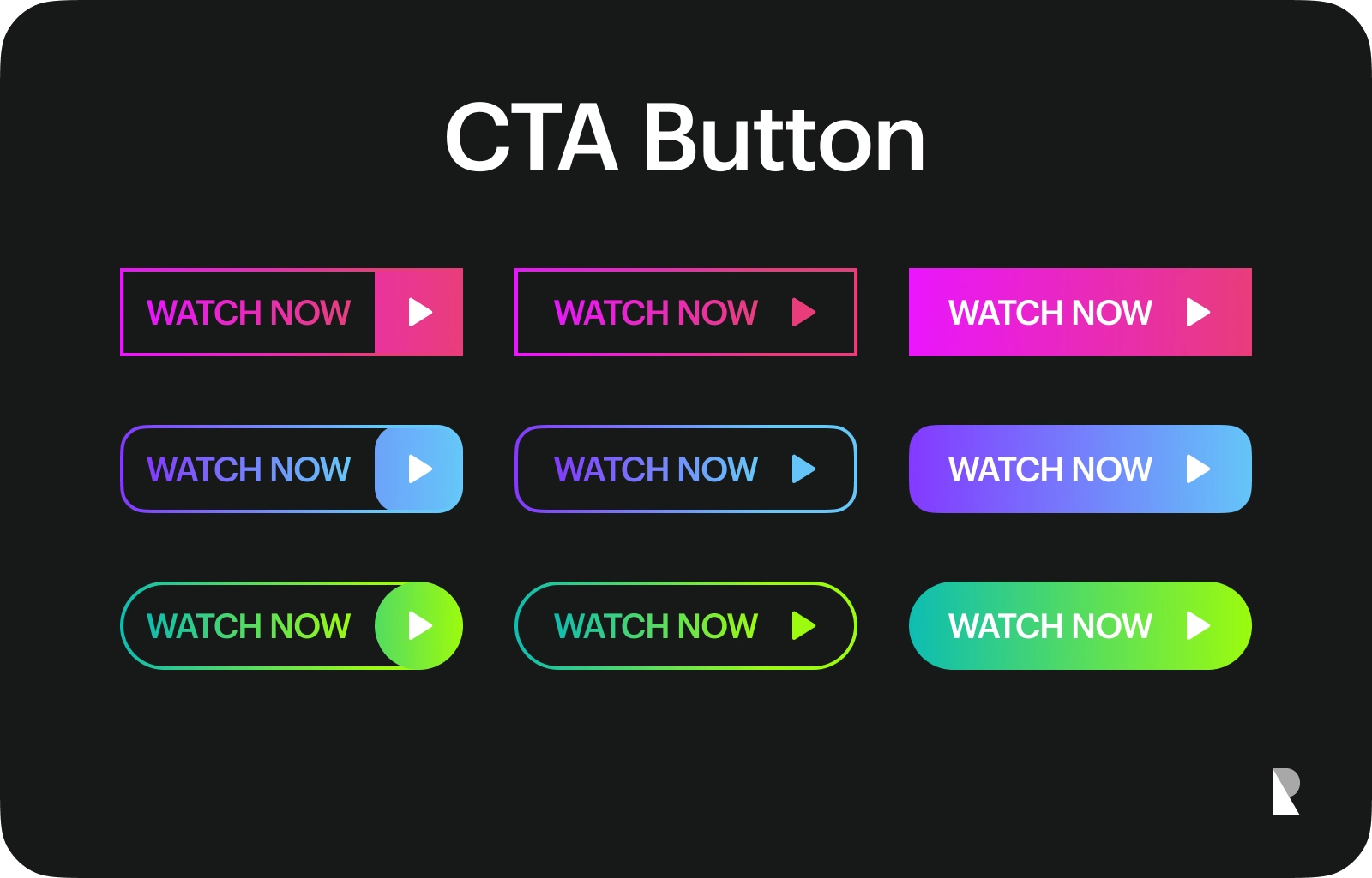
Improve CTAs
The choice of colors for CTAs, such as buttons and links, plays a critical role in conversions. HubSpot conducted an interesting study about the impact of changing button colors. Sometimes, just by changing the color of a button or giving buttons and links the same color, designers can significantly increase conversion rates.
Present a consistent brand image
Successful businesses are those that have a strong image in the minds of their target audiences. This is where brand color and brand palette become highly important.
With the help of consistent color schemes and an effective color palette, designers can create a strong brand image that lives in their users' hearts and minds. Choosing primary and secondary colors might seem like a small step, but it can have long-term effects on any business.
Improve accessibility of designs
Another significant difference made by the right choice of colors is the accessibility of any design. Appropriate color contrast helps people with color blindness and other cognitive or physical limitations interact with designs enrichingly.
When the colors are chosen carefully, keeping the needs of all audience groups in mind, accessibility always plays an important role.
Conclusion
Colors play a significant role in the design of products and services, both in the physical and digital environments. Whether the choice of a color palette or the simple selection of primary and secondary colors, designers need to be careful about these decisions, as these can have a lasting impact on the brand image and user experience.
Choosing the right colors is essential to ensure the designs are easy to use and navigate, particularly in digital environments such as websites and mobile applications.
This article focused on the importance of colors in designs and their significance in shaping users’ behaviors. For experienced and aspiring UX designers, this information can prove critical to improving the quality of their projects.

Creates insightful, strategy-driven content that translates complex design and branding concepts into accessible knowledge, supporting Ramotion’s mission to elevate digital experiences.