Do you know that almost 40% of online visitors give color the greatest importance? According to neuroscientists, brand colors can impact sales or performance more than product characteristics. The reason is simple: consumers' feelings about a brand have more pull than what they think about a company.
There is more; consider some other interesting facts:
- Color influences up to 90% of an initial impression.
- Color affects 85% of shoppers' purchase decisions.
- Over 80% of business owners agree that the right color gives them a competitive edge and helps them attract new customers.
Color has the ability to evoke certain emotions and affect the decision-making process. It has the same significance for the success of a brand's development as getting the right vision, mission, goals, and strategy. Every professional design system agency will tell you that choosing the right colors is a crucial step in brand building, without which the company cannot move safely to another stage. Therefore, it is a top priority for businesses regardless of their scale, age, and niche.
Let's dive into this subject a little bit deeper - get the basics of building a color palette, consider its importance and benefits and go through a guide that shows what it takes to develop a strong color system.
Building a Color Palette
Building an effective and strong color palette that reflects the brand's mission and vision and assists the company in achieving its prime goal requires proper knowledge and guidance.
Start with getting an understanding of design systems. In a nutshell, they are a set of standards, best practices, patterns, and reusable components developed to create a shared language for building coherent designs across multiple touchpoints. Many forward-thinking brands now collaborate with a design system agency to transform these abstract principles into living systems that evolve alongside their digital products. The well-thought-out design system does these things:
- It ensures the design is visually consistent across multiple distribution channels.
- It brings in consistency, scalability, and efficiency.
- It creates a unified language within and between cross-functional teams, making collaboration among departments productive.
- It is the foundation for maintaining and scaling design eventually.
After defining the design system, it is crucial to understand color in the design system and its role.
What Is Color In a Design System?
Color in a design system is actually a system. It is a set of principles that define base colors used to build all sorts of designs. It instills meaning and purpose into every design, echoing with brand personality.
The essential elements of color systems are:
- Primary palette and secondary colors.
- Hex codes with established color names, which describe their intended usages.
- Validation rules for adding or removing new tones and hues.
- Usage guidelines.
The result of the building color system stage should be a controlled (and consolidated) environment with a palette of acceptable colors, rules for maintenance and adding new tones, and a consistent and meaningful usage guide.
Why Choosing the Right Color Is Crucial?
Do you know that yellow and red put together make viewers feel hungry? According to psychologists, these two warm colors naturally increase the heart rate and ipso facto hunger. Some popular fast-food chains like McDonald's and KFC employ this combination as their primary brand colors. And this pays off generously – these companies generate a colossal revenue yearly. While numerous factors have pulled their vast success, nevertheless, when it comes to branding, their brilliant color palette makes a significant contribution to that.
There are more interesting facts to consider. For instance, a study by the Institute for Color Research (CCICOLOR) states that the average person makes a subconscious judgment about a product and brand within 90 seconds. More than 2/3 of that judgment is based on color alone. The latter plays a crucial role in consumers' perception of the brand. Therefore, it needs to be taken into account.
To make this case even more convincing, consider other good reasons why creating a strong color system for the company is critical.
- Color may affect users physically, making them feel a certain way about something. The research indicates that the light of colors can affect the center of emotions, which controls the endocrine system, that in turn controls the hormone levels responsible for the user's mood.
- Color may affect users mentally. Again, according to studies, color has the capacity to influence the mood and emotional levels of the person.
- Color produces the right first and last impression, providing a shortcut straight to your clientele's hearts.
- Color creates a rich visual experience, making things more attractive and memorable.
- Color can subconsciously shape the action of a user.
- Color can drive the user's decision-making process.
- Color sets the mood of brand expression.
- Color cultivates strong emotional connections between brand and their customers.
- Color reflects and maintains the brand's personality.
- Color strengthens brand awareness.
So, affiliations to colors go beyond mere preference. However, it is essential to note that these qualities and abilities of color can be primarily affected by such factors as an individual experience, upbringing, cultural differences, and context. For instance, while white is widely known as the color of brides, in India, it is a color of mourning.
On top of that, connections with specific colors usually develop after years of associating them with particular objects. For instance, the browns of dirt tend to be unappetizing. Therefore, obtaining a more significant result may require time, patience, and repetition.
Nevertheless, this does not diminish the importance of color. It is a powerful tool that requires responsibility to play with. It may easily ruin everything or vice versa, taking your design system and ipso facto brand's presentation to the next level, effectively forwarding the company in digital expanses. Many professional marketers and top UI/UX design agencies use it to manipulate to their benefit.
Benefits of Choosing the Right Color Palette
The benefits of choosing the right color palette are difficult to assess fully because it does so much good for the company. For instance,
- It enhances the brand experience at every touchpoint.
- It differentiates the company from competitors in both Worlds: digital and real ones.
- It cultivates a particular emotion and reinforces brand value.
- It increases conversions and sales.
- It provides a sufficient contrast to avoid cognitive load.
- It ensures accessible contrast, which is crucial for people with disabilities to perceive information without much effort.
- It makes things easier to understand and helps people to recall information quicker.
- It makes the overall picture more attention-grabbing and stimulating.
- It establishes a visual tone.
- It creates consistent branding and visual interest.
- It establishes a visual hierarchy that elevates readability and usability.
- It provides a unified look and feel.
- It opens the door to a broader array of accessibility considerations.
Deriving those benefits is not rocket science, but no single color will magically bring these advantages to your door. You must think strategically and intentionally about how you use color – for this, you need to develop a color system and well-thought-out color usage guidelines.
Design System Color Usage Guideline
Defining usage guidelines is crucial because it helps avoid some drastic errors in design solutions, like featuring dark text against a black canvas, creating a light theme without proper contrast, or using too many dark backgrounds that eventually upset consumers.
Building a harmonious, unified, brand-tailored, and scalable color system requires the company to take eight crucial steps.
Step 1 – Get to the basics of color theory
Although the web is teeming with shortcuts like color palette generators, still, without proper knowledge, you will not be able to make an informed decision. Therefore, start with studying these:
- The color theory. It uncloses information about primary colors, tertiary colors, extended palettes, color values, etc.
- The color theory wheel.
- Additive and subtractive color theory.
- Major color schemes. It includes monochromatic, analogous, triadic, complementary, and other approaches.
- Guides created by respected designers and brand agencies. They feature recent information about creating trendy dark and light themes.
Last but not least, color psychology and the meaning of every base tone.
Do not neglect this subject. It is increasingly powerful in what it can do. You do not have to bury your nose in the story of each tone, but you should know the basics. For instance, it would certainly help if you knew that
- Red is the color of love, passion, danger, excitement, hunger, and energy.
- Orange is the color of bravery, confidence, sociability, creativity, and adventure.
- Yellow is the color of happiness, warmth, creativity, optimism, and playfulness.
- Green is the color of prestige, wealth, nature, freshness, and quality.
- Blue is the color of trustworthiness, reliability, serenity, peace, loyalty, and competence.
- White is the color of innocence, simplicity, minimalism, and honesty.
- Black is the color of sophistication, elegance, luxury, and formality.
- Purple is the color of royalty, mystery, spirituality, ambition, and luxury.
- Pink is the color of sentiments, romantics, compassion, and sweetness.
- Brown is the color of simplicity, trustworthiness, honesty, and nature.
Step 2 – Define brand colors.
As a rule, a brand agency does all the heavy lifting at this stage. However, they still require close cooperation and commitment from the company because the success of this step largely depends on how well are defined these aspects:
- Brand's vision and mission.
- Brand's goals both short- and long-term.
- Brand's personality and characteristic traits.
- Target audience.
On top of that, this stage involves analysis of competitors and finding options that help the company stand out from the crowd.
Step 3 – Bring all colors under one roof.
At this point, a company needs to organize these crucial aspects of the color system:
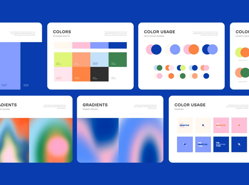
- Primary colors. They are most frequently used across all design projects, packaging, UI, advertising, marketing, etc. As a rule, they are brand colors since they need to impart a distinct identity to the design.
- Secondary colors. They complement every primary color and add a cutting-edge feel to the design.
- Tertiary colors. They are combinations of primary and secondary colors that spruce things up by providing variety.
- Neutral colors. They are white and black and shades of grey. Their primary purpose is to ensure that users never grow tired of the company's design choices by offering comfortable reading and user experience. For instance, dark neutrals reduce eyestrain and provides a sufficient accessible contrast that is crucial for customers who adore surfing the web in the evenings. Therefore, never neglect them.
- Semantic colors. They are those that convey a message and give visual hints. For instance, they can indicate hover states, disabled elements, an important consideration, and other elements.
- Extended palette. Catering to various use cases and bringing brand-tailored design requires more than just a basic color palette. The company needs more tones. For this, the team has to define a set of rules or algorithms to generate new shades and hues coherent with brand identity.

Step 4 – Extend the color palette with accessible colors.
Accessibility is of top priority. WCAG guidelines clearly state that people with all disabilities should easily perceive the design these days. At a minimum, the company should ensure a stark contrast between foreground and background elements. For this, it is highly recommended to explore color contrast that meets current accessibility standards and create a range of choices so that the team has options to choose from. It is essential to experiment with light and dark themes and try different approaches to achieve the best result.
On top of that, companies are encouraged to open the door to a broader array of accessibility considerations and advocate for accessibility across all distribution channels.
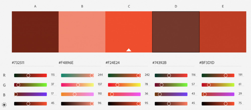
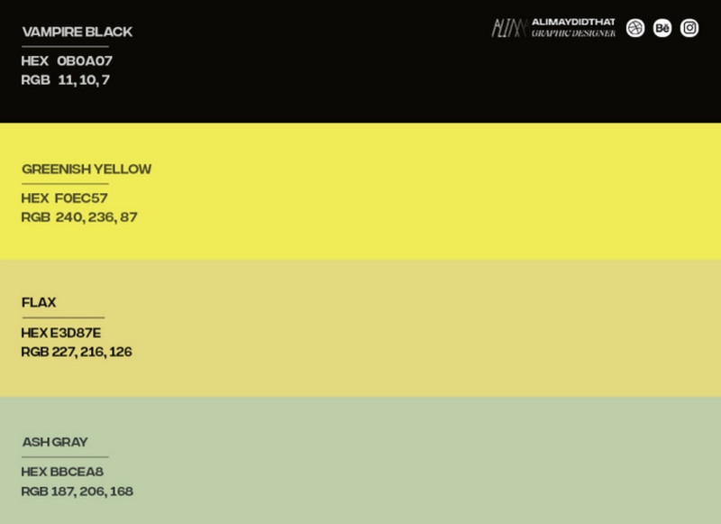
Step 5 – Come up with proper color names.
There are literally hundreds of shades and hues. Describing and communicating them to stakeholders can be challenging since they are presented as hex codes. However, naming colors addresses this problem.
Create rules for naming colors to communicate their meaning and functions without much effort.
Step 6 – Validate and test color palettes.
The time has come to put everything into action. However, no rush. The deal is that there are a dozen of touchpoints to consider:
- Logotype;
- Website;
- Digital newsletter;
- User interfaces;
- Social media;
- Advertising;
- Marketing materials;
- Stationery;
- Staff uniforms;
- Instore.
Before putting everything into production, validating and testing primary coloring and all other palettes is crucial. Run A/B tests to see
- Whether they look great in light and dark themes.
- Whether they serve the purpose, they intend to.
- Whether they meet WCAG Color Contrast guidelines.
- What combination resonates the best with the audience?
- What options make the company stand out from the competition?
- Which stylistic option delivers the message most effectively?
You can even print some branded material like flyers, brochures, or business cards to see how it goes.

Step 7 – Create color usage guidelines.
Defining colors is one thing, but applying them to touchpoints across various distribution channels is another story. Companies need a book of rules to explain to designers and marketers how brand colors should be applied to achieve clean, comprehensive communications that are instantly recognizable.
At a minimum, the usage guide should cover these:
- Thorough explanation of how the color palette reflects the brand's personality. It should note what purpose it pursues and what kind of consumers it is designed to attract.
- Description of all color categories, including primary, secondary, and tertiary colors, neutrals with proportions for black and white.
- Rules for color combinations. It should state how to work with multiple colors.
- Color proportions. As a rule, it is represented as a scale realized through a circular diagram, rectangular layout, or chart. It should include how much the colors should be used in various scenarios.
- Choose the proper color format. Colors can be communicated in different forms (HEX, RGB, CMYK, Pantone Matching System, Natural Color System, and RAL); choosing one that instantly communicates information for every person is vital.
- Create color swatches. Determine a predefined collection of colors to use freely across media editing tools.
- List all Do's and Don't's with some clear examples.
Step 8 – Keep evolving.
Although the best practices suggest that the brand colors should stay intact, when it comes to secondary palettes and others, they may and should undergo some changes to meet the ever-changing demands and expectations of the target market. It is crucial to revisit your color system to avoid an outdated and inappropriate look and feel. Therefore, follow this advice to keep the color aspect of your design system at the top level:
- collect feedbacks,
- listen to your target audience,
- follow the mainstream,
- do not be afraid of making changes.
Conclusion
For most of us, the color remains, by and large, an unknown and underrated element of design. However, it turns out to be a fundamental pillar of massive importance for the brand's existence.
Color in the design system reflects the brand's personality, differentiates the company from the competition, and reinforces brand value. On top of that, it comes with a long list of advantages. It creates a unified language, establishes a visual tone, strengthens user experience, ensures consistency across all distribution channels, and even unobtrusively compels visitors to fall for your brand and stick to it during uncertain times.
That is not all. Along with bringing benefits, color has the capability to affect all parts of the system and even change their notion and perception. Indeed, it has vast power. Therefore, it needs to be organized first. Follow our guide, test and validate color palettes and never stop improving them to meet new standards and ever-changing target audience's requirements and expectations.

Creates insightful, strategy-driven content that translates complex design and branding concepts into accessible knowledge, supporting Ramotion’s mission to elevate digital experiences.