A Contact Us page is one of the most underestimated conversion points of your brand’s website. Many teams treat it like a utility screen, a place to park a form and basic details after the story has been told. For a brand-led business though, that view leaves value on the table. The Contact Us page is often where interest becomes intent, where a visitor decides whether the company feels responsive, credible, and worth approaching.
A strong Contact Us page has three jobs.
- Helps users act fast, so they never have to hunt for the right next step.
- Protects the brand experience, so the final interaction feels as considered as the work section or the services page.
- Reduces friction, so a qualified lead, partner, applicant, or press request can move forward with confidence.
The best version feels like a handoff from curiosity into conversation, with enough simplicity to feel immediate. This article starts with practical principles for Contact Us page design, then moves into what a high-performing contact page should include, what makes the experience frustrating, and which real-world examples are useful references for brand, creative, and B2B teams.
What Does a Contact Us Page Design Look Like?
A Contact Us page design is the structure and presentation of a brand’s communication flow. It shapes how visitors understand their options, choose the right route, share the right context, and know what to expect after they reach out. A strong Contact Us page should make three things clear right away: where to write, what to submit, and what happens next. This clarity helps the experience feel intentional, trustworthy, and easy to navigate from the first moment.
The business role is bigger than the usability. This touchpoint can affect conversion, UX, and brand perception at the same time. For agencies, consultancies, SaaS companies, and B2B service brands, the contact page is often the first direct interaction after a visitor has formed an opinion. If the page feels careless, slow, or vague, the brand starts the relationship with doubt.
Usability research shows that people often look for the Contact Us link in expected places such as the top-right navigation or footer, and brands that hide that route can feel evasive or unreliable. The same guidance notes that showing a phone number can signal availability, while leaving users with no direct channel can weaken trust.
How to Design a Premium Contact Us Page
A premium inquiry experience balances clarity and brand feel. The goal is to make the experience look polished without adding decorative noise that slows down action. Every creative choice should help the visitor understand the path faster, feel more confident, or submit a better inquiry.
The following contact us page best practices are useful for teams that want the page to feel strategic, purposeful, and easy to use.
Write a clear headline
A Contact Us page should open with a headline that explains the purpose instantly and reflects the brand voice. A generic "Get in touch" can work, but a more specific line often performs better when it helps users self-identify. "Tell us about your next brand project" is clearer for an agency because it names the reason the visitor is there.
Supporting copy should stay short. One or two sentences can tell users who they are contacting, what kind of inquiries are welcome, and why the conversation is worth starting. The best Contact Us page copy feels calm, direct, and human. It gives permission to act without sounding desperate for leads.
Keep the layout clean and easy to scan
A strong Contact Us page uses whitespace, hierarchy, and clear block separation to guide attention. The main action should be obvious within seconds. If the primary goal is a project inquiry, the contact form or booking path needs visual priority. If the goal is routing, the contact options should be grouped by intent before the form appears.
A clean layout also protects credibility. When every element competes for attention, users spend energy interpreting the interface instead of taking action. A premium page should feel composed. Use headings, short labels, and enough spacing to create rhythm. Remove secondary links, dense legal copy, and visual clutter that weakens focus.
Add brand elements without distraction
Brand expression still matters. The experience should feel as considered as the rest of the site. Typography, motion, photography, illustration, and color can all support the experience when they reinforce the contact flow. For a design agency, the page can carry personality through a distinctive headline, confident spacing, thoughtful interactions, or a small visual moment.
The limit is clarity. If a transition delays the form, if a hero image pushes the main action too far down the screen, or if a playful layout makes the next step harder to find, the design is working against the conversion. Brand elements should make the experience feel intentional and simple to use.
Use strong microcopy and set expectations
Microcopy is where a Contact Us page becomes more reassuring. Labels should be concise. CTA text should describe the action with confidence. Helper copy should explain what belongs in each field without making the visitor feel examined.
Set expectations wherever uncertainty might appear. Tell users which request types belong on the page, how long a response usually takes, and what happens after submission. A line such as "We review new project inquiries within two business days" reduces anxiety and makes the experience feel managed. For many small businesses and freelancers, the Contact Us page is the lead-driver of the website, because it is where future customers choose to contact the business through a contact form, scheduler, phone number, or email address.
What Should a High-Performing Contact Page Include?
A high-performing inquiry experience needs a few essentials arranged in a way that feels obvious, useful, and brand-consistent. Use this framework to evaluate whether the journey helps qualified visitors move forward without confusion.
The right structure depends on the company, but the best contact us pages usually combine clear routing, a short first step, trust-building context, and practical contact information.
Create clear contact paths
Not every visitor has the same intent. A Contact Us page should route users by need: sales, support, press, partnerships, careers, billing, office visits, or general requests. This matters because one generic form can create friction for users and extra sorting for internal teams.
Clear paths can be simple. A row of cards, a short selector, or a few labeled links can help visitors reach the right team faster. For a brand agency, routing might include "Start a project," "Press and speaking," "Careers," and "General inquiries." Each path should have a distinct purpose, a short explanation, and a next step.
Keep forms short and offer alternatives
A contact form should ask for the minimum information needed at the first step. Name, email, company, request type, budget range, timeline, and a short message may be enough for a project inquiry. If the first step asks for everything a sales team might eventually want, the visitor may leave before the relationship begins.
Alternatives matter too. Some people prefer email. Some want a call. Some need a booking link, office address, help center, or social profile. The most useful inquiry flow presents relevant contact options without overwhelming users. Contact information should be easy to find, especially when the visitor has a specific operational need.
Build trust with context and tone
Trust is created through small signals. A short intro can make the request feel welcome. Real team names, response expectations, office information, logos, awards, privacy notes, or proof points can show that the message is going somewhere legitimate. The tone should match the rest of the brand: polished for premium services, direct for enterprise software, warmer for independent creatives.
The page structure also affects trust. If a company claims to be strategic and detail-oriented, the inquiry experience should feel strategic and detail-oriented too. Consistent spacing, clear contact information, and honest microcopy help the experience feel credible.
What Makes Contact Pages Feel Frustrating or Generic?
Most weak inquiry experiences fail in predictable ways. They ask for too much, route every request through the same path, overload the interface, or leave people unsure about what happens next. The fixes are usually practical and immediate.
Ask for too much too early
A long contact form can make a cold prospect feel like they are doing administrative work before receiving any value. Remove fields that are only useful later in the sales process. Keep clarifications optional when they are helpful but not essential.
The first step should create momentum. After a conversation begins, the team can gather deeper context. The first step should also make starting easy, especially for visitors who are interested but still evaluating fit.
Avoid one-size-fits-all flows
Sales, support, media, and career requests need different paths. A single generic form may look efficient from the inside, but it often feels vague to the user. It can also create internal confusion when teams receive incomplete or misrouted messages.
A better contact page separates flows and uses plain language to guide selection. Visitors feel respected because they can choose the right path. Teams get cleaner information because each route asks for the details that actually matter.
Don't let style reduce clarity
Visual creativity should support usability. A crowded hero, hidden form, experimental cursor, or unclear CTA can turn the inquiry flow into a portfolio moment that fails at its core task. The contact action should never feel like an Easter egg.
Creative brands can still be expressive. The key is sequencing. Let the first screen state the purpose, show the main action, and make the contact options clear. Then use brand moments to add emotion around that structure.
Explain What Happens Next Silence creates doubt. After submission, users should know that the request was received, who will reply, and when they should expect a response. The confirmation message is part of the contact experience, not an afterthought.
A good inquiry flow can also explain what users should do if the request is urgent. This is especially important for support, enterprise sales, and service businesses where timing can influence trust.
Contact Us Page Examples
These examples are quick references, not deep case studies. Each one shows a reusable principle that brand and B2B teams can adapt to their own site.
Zendesk
Zendesk is a useful reference for request separation. Its inquiry experience points users toward support resources and sales conversations, which helps people choose the path that fits their need. That split is especially useful for larger companies where customers, buyers, and partners arrive with different goals.
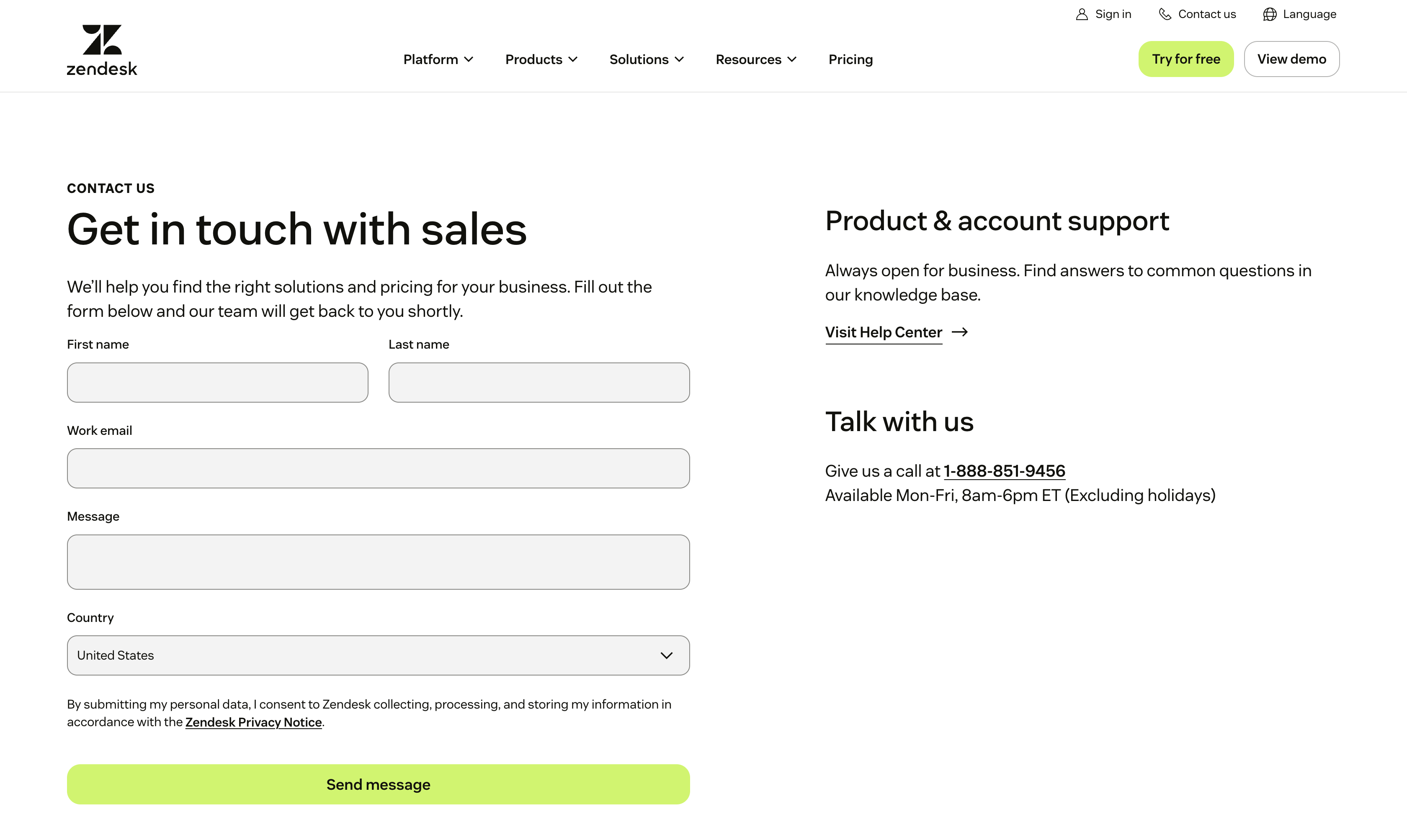
The takeaway is simple: divide the journey by intent before asking for details. A clear split between sales and support reduces friction and improves routing.
Squarespace
Squarespace shows the value of task-based self-selection. Its inquiry experience directs users toward the relevant team or support topic, which keeps the journey from feeling like one broad inbox. This is useful for brands with many products, services, or user situations.
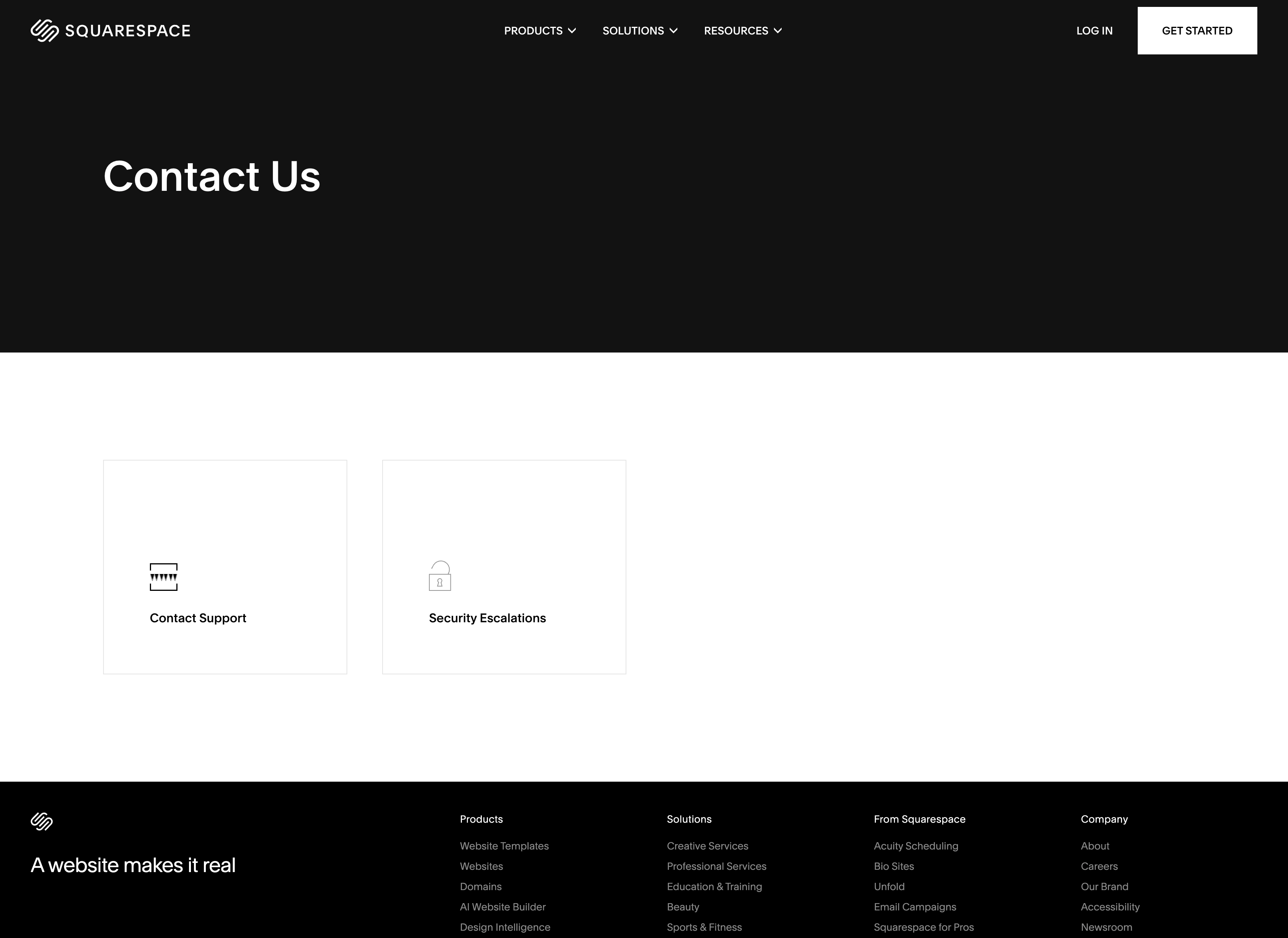
The lesson is to guide without overwhelming. A clear set of choices can feel more helpful than a single open-ended message field.
Stripe
Stripe's contact experience is confident because it gives users distinct routes for sales, support, media, and developer questions. Its sales path also uses scheduling, which lowers friction for prospects who are ready to speak with a representative.
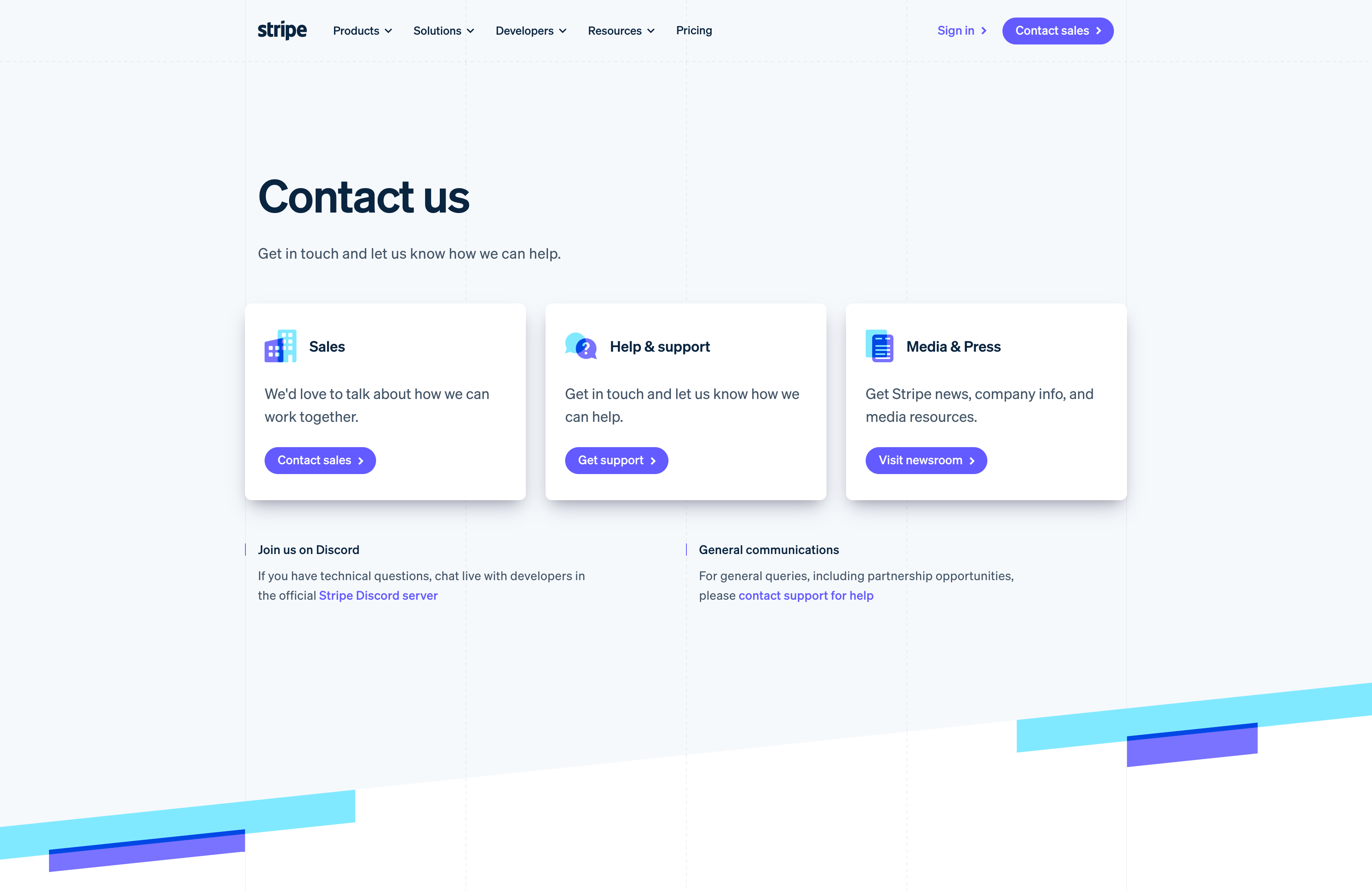
For B2B brands, the takeaway is to match the method to user intent. A buyer may want a meeting. A customer may need support. A developer may need community or documentation. Different paths can still live within one polished journey.
Buzzworthy Studio
Buzzworthy Studio is a strong agency reference because its inquiry flow supports positioning. It asks "How can we help?" and separates paths such as starting a project, joining the team, or dropping a line. That simple structure makes the inquiry feel more tailored.
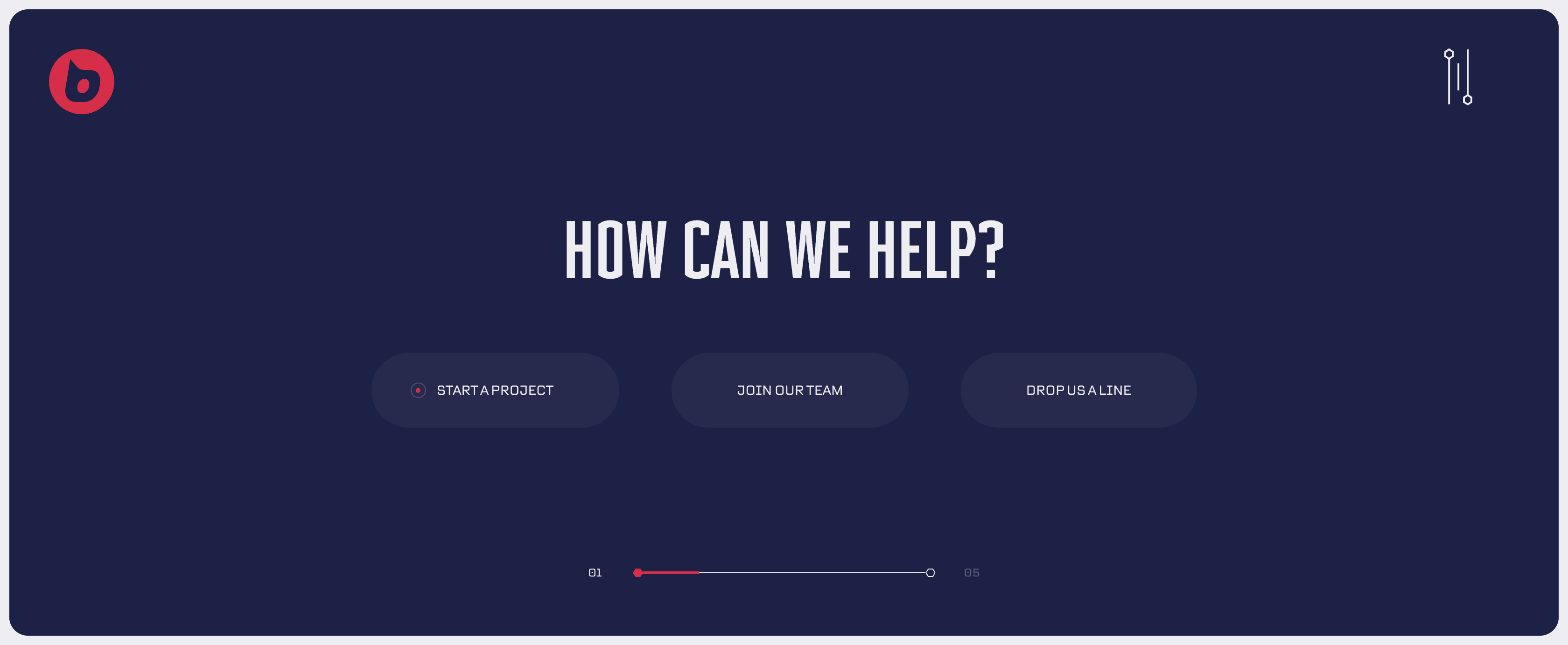
For agencies, this conversion moment is part of the pitch. It can reinforce confidence before the conversation begins by showing that the studio understands different visitor intentions.
Sophie Westfall
Sophie Westfall offers an approachable but professional reference. The site uses a softer personal tone and visible contact cues while still presenting a credible creative profile. This matters for independent designers and boutique studios that need warmth without losing structure.
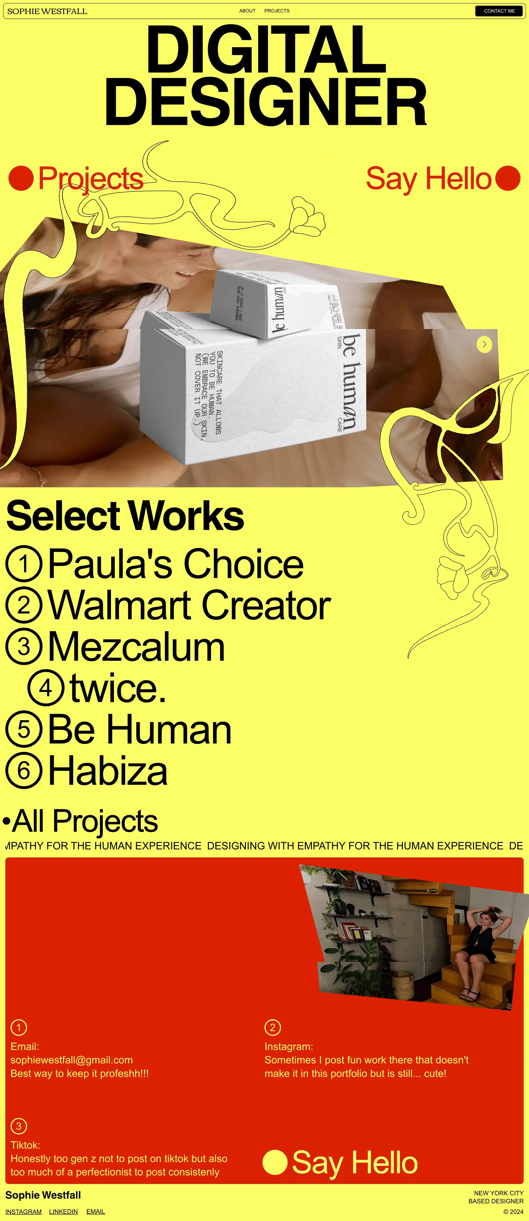
The lesson is that personality can make a contact moment feel safer. A human tone, paired with clear ways to reach out, can make outreach feel more natural.
Young Na Kim
Young Na Kim is useful as a minimalism reference. The site communicates brand identity through restraint, focused language, and selected work rather than heavy interface complexity. For a contact experience, that approach shows how fewer elements can still create a strong impression
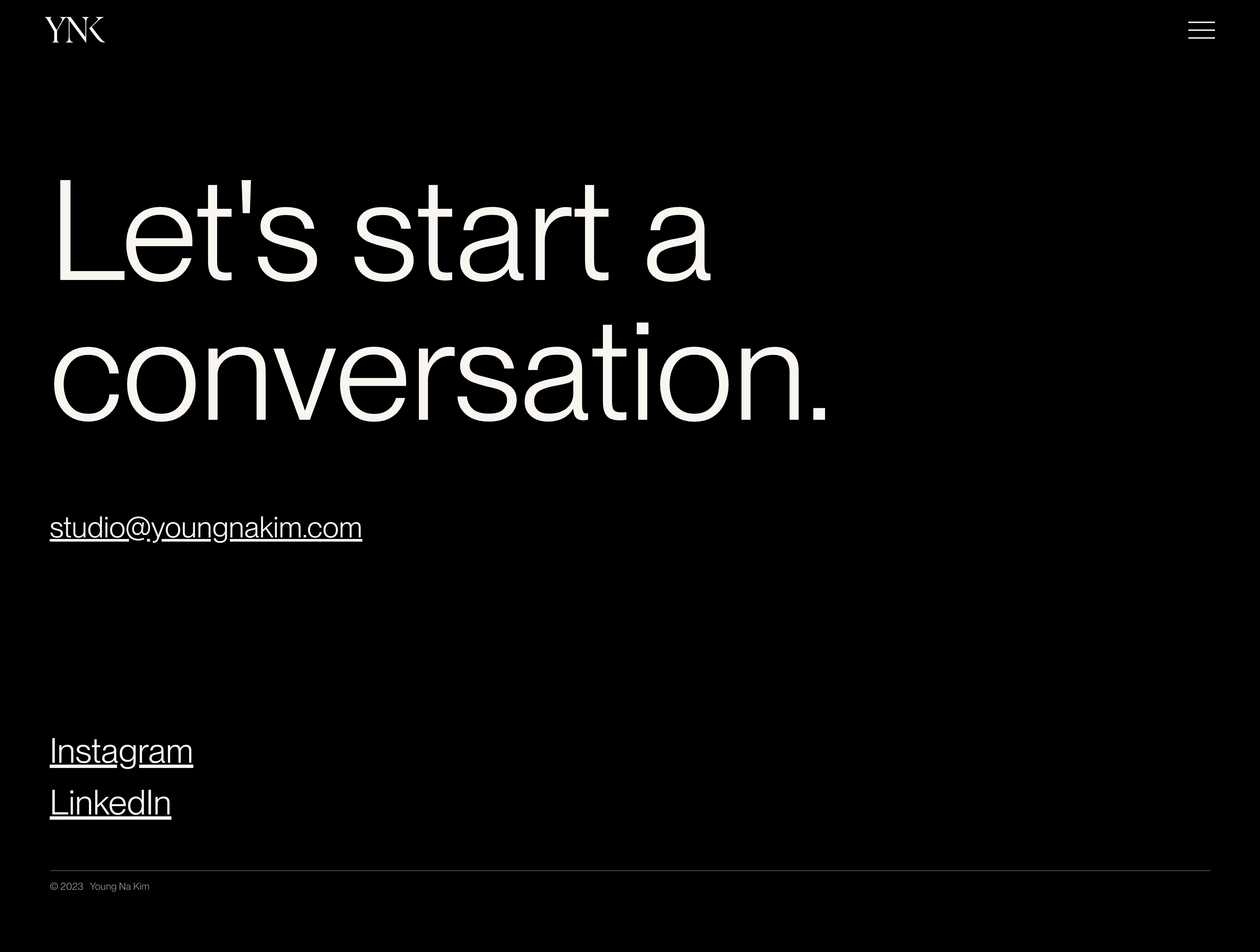
Minimalism works when the next step is clear. The route does not need excess decoration when the brand system, language, and path are already disciplined.
Extraweg
Extraweg shows how a contact experience can extend a brand point of view. The studio's world feels distinct, surreal, and artist-led, and the route supports that identity rather than breaking it with a generic business template.
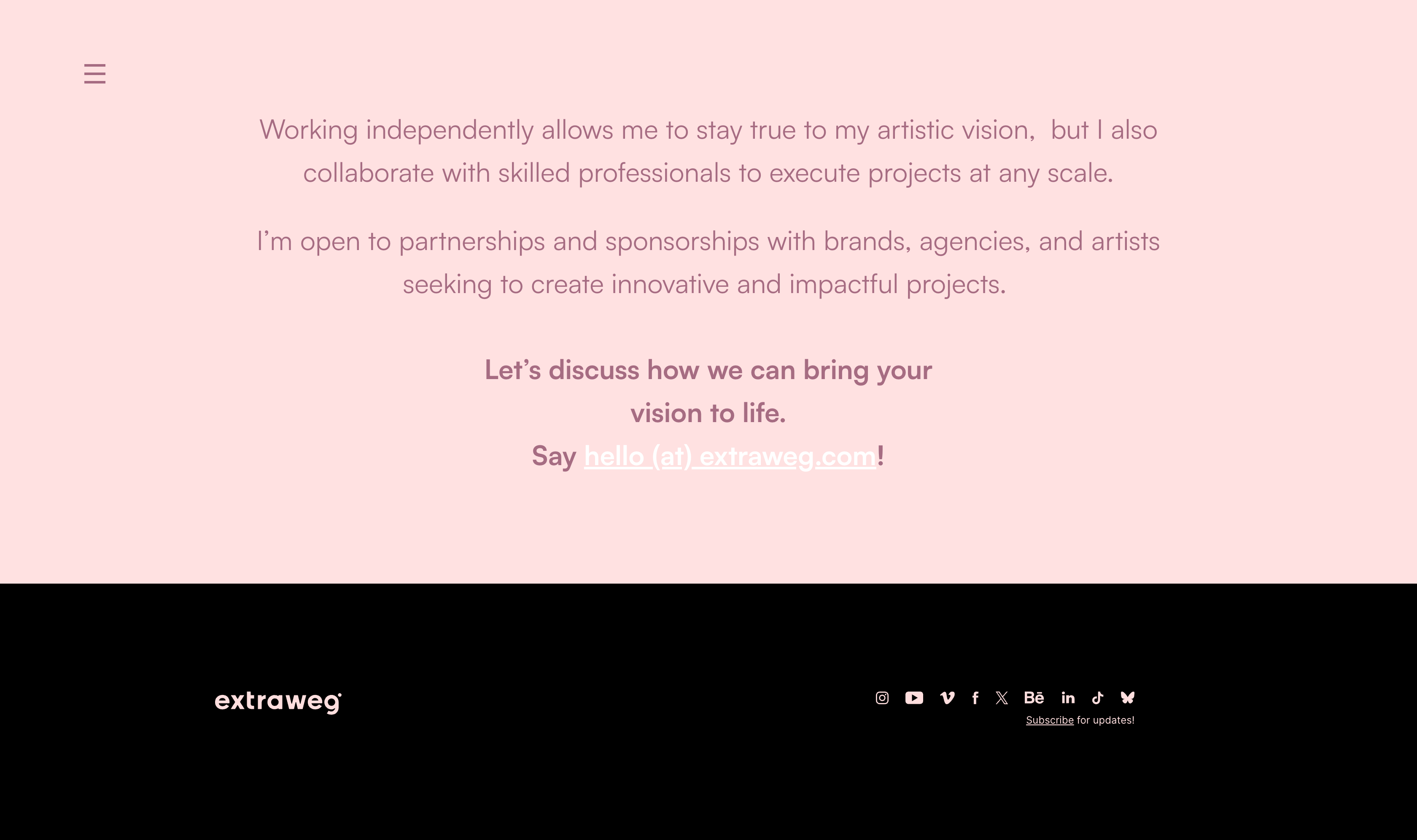
The takeaway is that tone and positioning shape the first interaction. A page can feel memorable while still making the next step obvious.
Conclusion
A strong Contact Us page makes the next step obvious, easy, and on-brand. It treats the final conversion moment with the same care as case studies and service narratives. The winning combination is clear structure, low friction, helpful choices, and confident presentation.
For brand-led companies, the Contact Us page is a trust moment. It should show people where to go, what to say, and what to expect. When the experience does that well, the brand feels more responsive before anyone on the team has replied.
This is also where thoughtful design becomes practical business value. A polished Contact Us page can help qualify inquiries, reduce internal confusion, and make every message easier to handle. It gives prospects a clearer path into the company while giving teams better context from the start. The result is a more focused conversation, a stronger first impression, and a website experience that feels consistent from the first visit to the first reply.
In conclusion, if a company needs a stronger website system behind this experience, choosing one of the best B2B website development companies can help translate brand strategy into a contact flow that is clear, credible, and built to convert.

Creates insightful, strategy-driven content that translates complex design and branding concepts into accessible knowledge, supporting Ramotion’s mission to elevate digital experiences.