Introduction
Do you know that the overall amount of data generated worldwide was estimated to be around 79 zettabytes (79 trillion gigabytes) in 2021? Studies show that this number will double by 2025.
Though no surprises. With quick and simple access to the internet and digital means of communication, data has successfully invaded our lives, meeting us in websites, emails, social media, phone calls, text messages, billboards, digital books, etc. It brings numerous benefits. For instance, it revolutionizes the business World, enriches personal communications, and pushes our community forward by providing necessary information to make the right decisions.
However, there is a catch. Big data comes with certain drawbacks. One of the biggest (if not the worst) is difficulty interpreting large amounts of information to locate critical points, see trends, and ipso facto derive benefits. The good news is that website data visualization techniques are the way out. They are great at handling mass amounts of data and serving them in digestible form. Professional website visual designers use them to help companies understand data and move forward.
Let's explore this concept closely by diving into its structure and basic foundation and considering some fantastic interactive data visualization examples.
Defining Data Visualization in Web Design
Data visualization is translating too complex or numbered information into a visual context using graphical elements. In many organizations, it’s treated as a strategic capability, one that benefits from early collaboration with best website design companies so the data story, interface patterns, and implementation constraints evolve together. It communicates complex data relationships in a form more straightforward to comprehend by people.
It naturally highlights the trends and outliers, breaks data-driven insights into digestible pieces, and provides accessible ways to see and analyze patterns. This approach is realized through various data visualization tools: charts, bars, graphs, icons, illustrations, and animations.
Why Is Data Visualization Important?
- Perfectly fits our culture and fast-pacing information-obsessed World.
- Grabs people's interest and maintains attention for a while – critical quality for businesses that deliver messages to customers with a golden fish attention span.
- Helps people navigate a mass of valuable data and get key points quickly simply because, by nature, people identify the colors, shapes, and graphics on the page instantly.
- Transmits information to the brain faster.
- Increases the ability to act on findings efficiently.
- Helps non-technical audiences to understand complex data.
Data visualizations can do many crucial tasks. For instance, it uncovers and explains patterns and trends, conveys organizational structure and processes, establishes hierarchy, and creates storytelling with a purpose.
It also spurs idea generation across teams and shares information accessible to boost the bottom line with actionable insights.
In a word, its scope of use-case scenarios is enormous. It can be utilized for various purposes by marketers, psychologists, sociologists, scientists, data analysts, data architects, designers, web developers, and others.
Advantages of Data Visualizations
Data visualization shows rather than tells is a crucial instrument for delivering a message to the crowd because, according to studies, visuals are processed 60,000X faster in the brain than text.
There are numerous examples of when data visualizations bring benefits, from improving accessibility to promoting data-driven decision-making to enhancing the brainstorming and learning process. However, we will highlight the most common advantages. It:
- surfaces opportunities and lets people explore them without being overwhelmed.
- facilitates communication between individuals and teams.
- increases efficacy.
- encourages correct conclusions.
- stands behind the visual discovery.
- helps businesses fight competition.
Disadvantages of Data Visualization
Website data visualization tools let us comprehend and digest information quickly and efficiently. They seem perfect. What downsides may they have? Unfortunately, there are some severe flaws to face.
For instance, misrepresenting data and delivering a wrong key message are common issues. Sometimes, scientists may lose vital details in translation, which leads to an inaccurate perception of the data. At the same time, non-tech-savvy audiences may need to correct correlation for causation resulting in wrong assumptions.
To mitigate these flaws, it is highly recommended to explain your visuals, use data visualization tools thoughtfully and do A/B tests.
Forms of Data Visualization
Data visualization form is a graphical representation that transforms complex datasets into a combination of understandable visuals. It illustrates key points, interprets complex concepts, helps to see the overall picture, and allows viewers to interact with data.
Since organizing large quantities of complex information into visuals can be done in various ways, there are numerous types of data visualization. The most famous examples are line graphs, pie charts, bar charts, heat maps, area charts, scatter plots, flowcharts, dual-axis charts, tables, and histograms.
Not so popular but undoubtedly helpful and preferred by data scientists are these types: arc diagram, area graph, bubble chart, donut chart, funnel chart, radar triangle, radar polygon, polar graph type, tree chart, timeline, Gantt chart, and mind map.
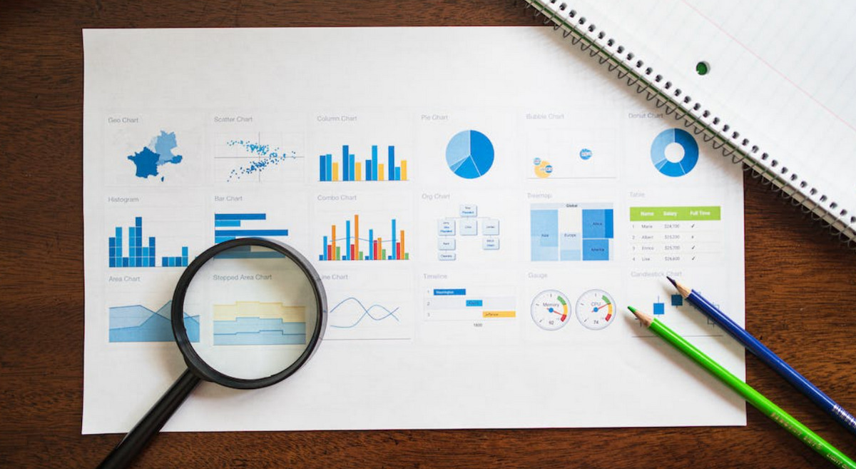
Different data visualization types (image by RDNE Stock project)
This vast diversity allows users without technical skills to create visualizations, interpret diverse data sources, and ipso facto accomplish various tasks and forward directions. Let's consider specific use case scenarios for the most common types of data visualization.
A bar chart or column chart
It compares data along two axes. It is the simplest and the most popular option. It can be seen everywhere, from websites to dissertations to emails.
Pie chart
It represents parts of a whole. It is beneficial when you need to show that one category outweighs the other by a significant margin. Again, it can be seen everywhere. For example, marketers use it to show the percentage of total sales per regional market.
Donut chart
In a nutshell, it is a pie chart with an empty center area. It has the same purpose but with one huge difference. It may have more than five sections and still keep the readability level high. For example, salespeople use it to study the number of open opportunities.
Line graph
It showcases changing data over time. It may have several lines but up to five. For example, teams use it to share real-time data from Google spreadsheets with others.
Scatter plot
It demonstrates the correlation between variables. It helps users to see how variables are related to each other regarding a group and observe the nature of this relationship. For example, e-commerce specialists use it to see the overall picture of orders, sales, and stock availability based on different products, thereby defining market trends and preferences.
Pyramid chart
It shows parts of the whole from the highest value to the smallest in descending order, thereby visualizing hierarchy. For example, business owners use it to explore the market share breakdown of a specific niche or market sector.
Flowchart
It stands in stark contrast to others. It describes a process or hierarchical data of items creating a map or path. For example, HR uses it to visualize the hierarchy of the company's departments to streamline the workflow.
An Overview of Data Visualization Tools
Data visualization is an increasingly beneficial approach for presenting data; however, implementing it in practice is challenging. Even for tech-savvy users, wrangling raw data into an interpretable format is tricky. It is here where data visualization tools come into play. They provide a comfortable environment to work with massive amounts of useful data through graphical assets and units.
When properly configured, they do lots of heavy lifting. For instance, they sift through vast information stores, filter and group a large volume of data fast and error-free, present only the most meaningful and relevant data, and discover the relationships among independent variables.
On top of that, they may track connections between operations and overall business performance, draw a broad picture, and, vice versa, break it into pieces letting the team handle it efficiently. Finally, they even harness the power of data storytelling and drive impactful narratives using the most relevant and reliable approaches.
The best part is that data visualization tools come in all shapes and sizes, from oversimplified solutions that prioritize ease of use to all-in-one platforms that cover numerous case scenarios but require more technical skills. The best data visualization tools are Google Charts, IBM Cognos Analytics, Microsoft Power BI, Oracle Visual Analyzer, D3.js, and Tableau.
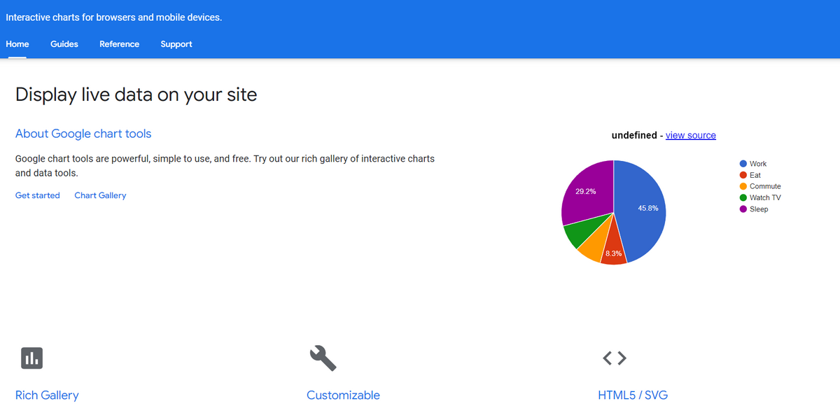
1. Google Charts
We could not help but start with Google and one of its proudest possessions – Google Charts. I bet every digital worker knows what it is because it is the oldest and best-known program on this list.
Google Charts is a web-based tool that efficiently deals with extensive data sets translating them into various graphical representations. It has such helpful features as a super intuitive interactive dashboard, flawless cross-platform compatibility with iOS, Android, and even some old versions of Internet Explorer, and dozens of graphical and creative data visualization units, including interactive charts.
The best part is it integrates with other Google data sources and solutions for better scalability. And with all that, it is free.
Google Charts is one of the best tools for data visualization for beginners.
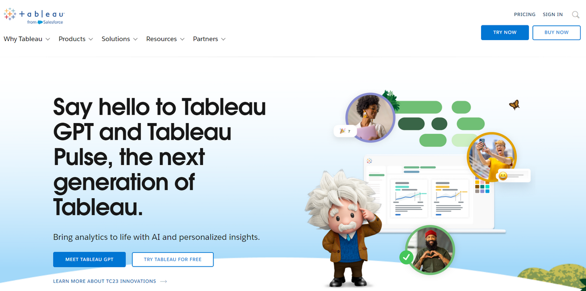
2. Tableau
Owned by non-other than Salesforce, Tableau is one of the best tools in the niche. Its main advantage is AI solutions that have transformed it into a multifunctional platform that can efficiently assist non-tech-savvy users in their endeavors.
Thanks to a wide range of mesmerizing charts and graphs and the native ability to import data from various places, it can create stunning visualizations based on the user's prompts, explain outliners and their appearance, and even answer fundamental questions concerning the dataset.
Tableau might not be the most straightforward software due to its sophisticated arsenal of tools, but it is undoubtedly the one to use for scalability. Plus, it is free for beginners.
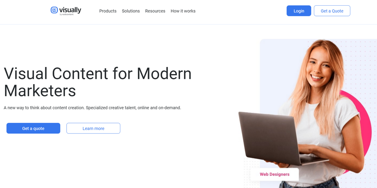
3. Visual.ly
Visual.ly is one of the most popular platforms among digital marketers and designers. It is here where the majority of infographics found on websites are created. It prides itself on its ability to help companies convey messages through unique visual content.
The platform ships in a whole bunch of visual assets to represent data. Everything from bar charts and graphs to 3D Cat Scans can be found in the library. Its professionally created automated tools allow users to operate and analyze large data sets with minimum effort and errors.
A considerable benefit of the solution lies in its intuitive environment with all the necessary settings. The team regularly improves it to meet the demands of the rapidly-growing community.
As for pricing, it is free for simple infographics.
The features of these best data visualization tools vary. Still, they pursue a common goal – to help users demonstrate a dataset in a digestible form.
Characteristics of Effective Data Visualization Tools
Choosing the right data visualization tool can be tricky. Let's identify the standard features in the best data visualization tools and some must-have characteristics that help find the "best fit" for your particular case. So, what should you seek in such platforms?
First, the service should have a wide range of visualization capabilities, including interactive charts and 3D graphs that work not only with regular-size databases but also with massive data sets. Users should be able to play with them by extracting, displaying, modifying, arranging, and reading data. This also includes online editing of charts.
Another crucial aspect of a good visualization tool is scalability options and native integration with other popular platforms to fetch real-time data or import large data sets. It should work with different data sources and offer sharing features crucial for productive teamwork.
It would also help if the service promises a top-class performance with 99.9 uptime and has a prompt and responsive support team that immediately addresses all sorts of issues.
Professional tools should be compatible with different browsers, operating systems, and devices, meet accessibility principles, and have mobile-friendly behavior. An intuitive dashboard with flexible customization options, complete control for configuration, and fine-grained adjustments of visualization design is a must-have for such platforms.
Lastly, having these features is highly recommended but not critical: a collection of pre-made templates, AI tools, advanced analytical capabilities, and an active community.
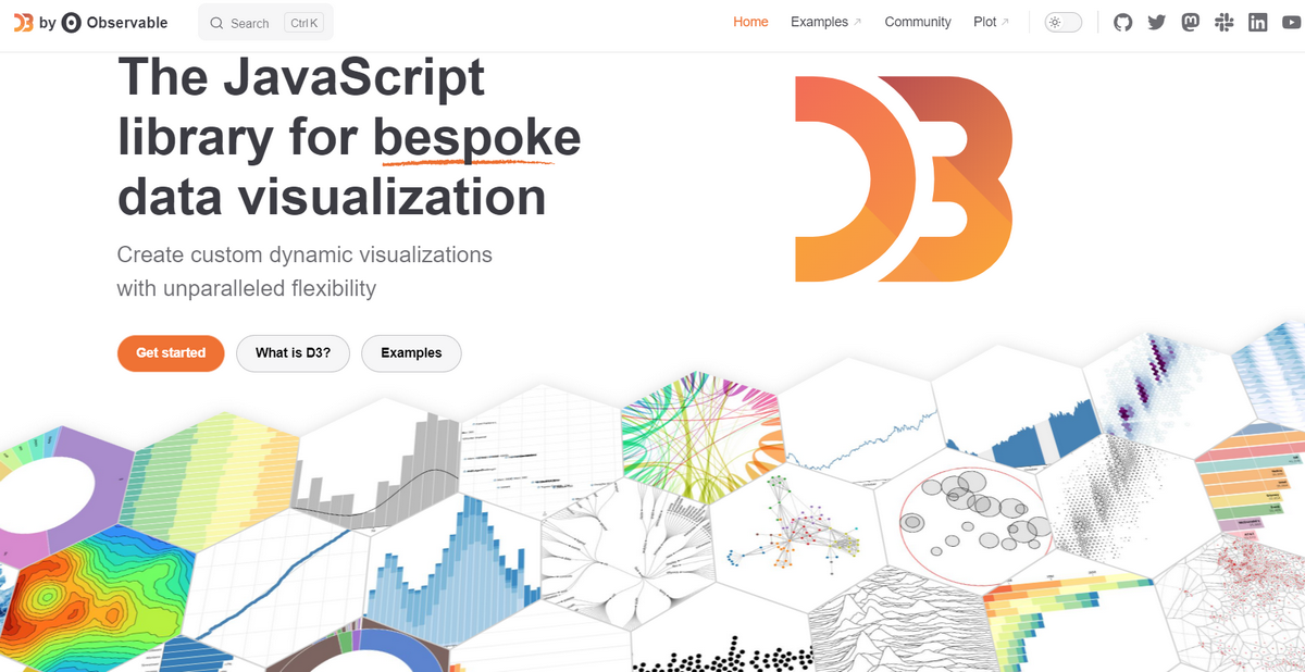
D3.js – Popular JavaScript library with all crucial tools on board
The Best Practices for Creating Effective Data Visualization
Visualizing small or big datasets is always challenging, even for seasoned data scientists. The deal is, having a suitable platform is just half of the battle. Creating a graph that accurately translates data into easily digestible illustrative form calls for following the best practices in the niche.
According to professionals, you should start by choosing the correct type of data visualization. Remember, one size does not fit it all. Each graphical representation was designed to work with a specific set of data. For instance, if you need to define changes in data, then a line graph is your guy, but if you need to show parts of the whole, then a pyramid chart is the best option.
While choosing the best chart, it is crucial to consider the limitation of the data visualization type. For instance, a pie chart should have at most five or six parts because more than this makes the wedges too thin and confusing to interpret. Always opt for a less sophisticated data visualization type. This is crucial to ensure optimal readability level.
As far as optimal readability is concerned, professionals suggest using contrasting colors that fit well together. Keep coloring simple since it may easily create visual overload.
Visual overload can also be avoided by adhering to conventions. For example, ensure every category has a contrasting color and the description detailed in the legend. Incorporating contextual clues with shapes and designs lets viewers make sense of things quickly and efficiently.
It would also help to use data points thoughtfully and ditch distracting elements such as objects, labels, excessive use of color, or busy background patterns.
The next step is to take care of the visual experience. First and foremost, ensure the order or format in which you present data makes sense to your viewers. Second, introduce visual hierarchy to direct viewers' attention to critical information.
Third, avoid misleading visualizations - this can be done through the following tips:
- always start with 0 on your axes;
- never change the aspect ratio;
- group elements that relate to each other;
- follow Gestalt principles for design.
Finally, enhance the visual experience with interactive data visualizations through dynamic chart types, 3D bars, animated effects, and photographic backgrounds.
Interactive data visualization allows viewers to explore and analyze directly within the graph or data points, uncovering insights that lead to better, data-driven decisions.
The role of interactivity in data visualization is much more significant than that – we will cover it next.
The last step in every data visualization process is the A/B test to define what works best.
The Role of Interactivity in Data Visualization
We have already mentioned interactivity in data visualization as one of the best practices. However, what does stand behind being able to see and directly rearrange data?
First and foremost, interactivity in data visualization optimizes how information is shown to help viewers focus on relevant information, filter, and change the parameters to understand the situation better.
Second, it helps acquire and act on information accordingly, thereby identifying trends quickly and accurately. It may discern cause-and-effect relationships and introduce the much-needed order and control over the situation to surface valuable insights.
When used in tandem with analytical capabilities, it may track key performance indicators and metrics to make informative predictions as well as compare data points to discover patterns or trends that might be hidden or overlooked. If the dashboard is intuitive, non-tech-savvy users may conduct deep analysis without additional skills or support.
Lastly, interactive data visualization can be personalized and customized to meet the needs of people with ADHD, dyslexia, or autism.
Apart from elevating the user experience and surfacing new opportunities to make the most out of the data set, interactivity promotes accessibility, responsiveness, and scalability.
Interactive Data Visualization Techniques
The most common techniques to add interactivity to web data visualization are animated charts and graphs with one or several interactive features. There are also number counters that quantify data and convey its magnitude, UI elements like buttons or switches that help users move through panels, topographic interactive maps, scroll-triggered animations and hover effects, and tooltips that hide and reveal additional data.
On top of that, interactive data visualization can be done through traditional solutions like linking, which allows connecting selected elements on different plots; brushing, which lets viewers play with color on the graph; painting to draw right inside the graph and, of course, scaling to change a plot's aspect ratio.
Creating interactive data visuals can be done in various ways. Even animated three-dimensional objects that illustrate points may do the job. The sky is the limit.
Interactive Data Visualization Examples
To see what interactive data visualizations look like, let's consider two fantastic interactive data visualization examples.
1. Time Wasting at Home
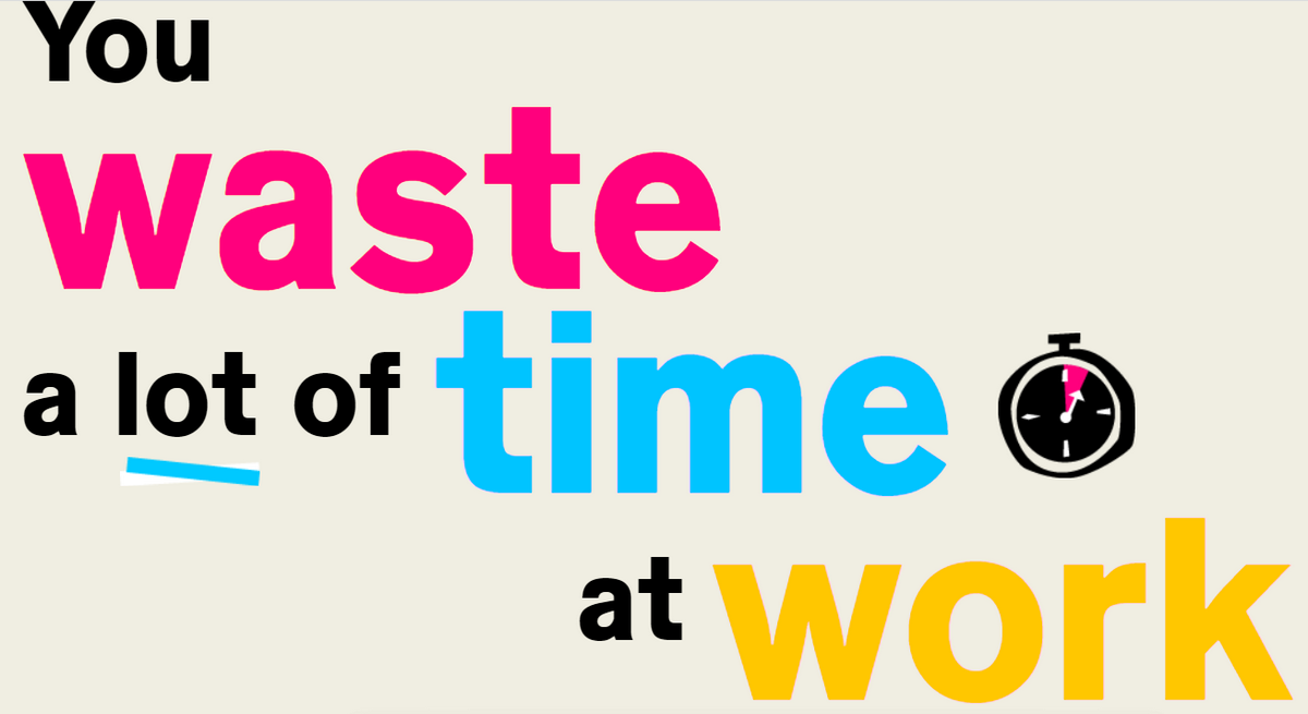
Time Wasting at Home is one of the examples of the best data visualizations. It is an outstanding project showing the beauty hidden in proper data visualization.
Although it does not use traditional line graphs or charts, it certainly makes the most out of other web-based data visualization instruments.
It is an interactive infographic that is a true symbiosis of data and graphical elements supported by interactive features such as scroll-triggered animations and dynamic units.
Not only do viewers enjoy some fancy play with typography and skillful use of illustrations that highlight the key points, but they get the message through well-placed labels and descriptions.
2. Where is Poland?

"Where is Poland?" is another stunning example that unlocks the potential hidden in interactive data visualization. It is a story about the nation told in such an engaging way that you are willing to waste 10 minutes of your precious time without much regret.
Web developers employ many sophisticated tricks and follow the best data visualization practices to pull this off. Text, illustrations, and numeric data create a fantastic user experience that entertains, informs, and enlightens.
Maps created with the help of WebGL let viewers directly interact with them, bringing value and pleasure.
There are numerous interactive data visualization examples in the wild. You may derive some exceptional insights from them to build your interactive visualization.
DIY Data Visualization
Translating your dataset into a visually-appealing easily-digestible graphical form is easily said than done. However, with the correct data visualization platform and this small guide that leads you through the essential steps, you may create a general framework to move on.
Step 1 - Start with ground preparation. Ask yourself whether the amount of data is sufficient to create a visualization. Does it provide meaningful, actionable insights? On top of that, ensure the accuracy and reliability of your data source and get all the permissions to use data to avoid legal issues. Remember, every good data visualization should be accessible, actionable, insightful, and legal.
Step 2 - Define a clear purpose and goal. This allows you to determine what primary and secondary questions need to be answered to make the data visualization effective and impactful.
Step 3 - Understand your audience. Ensure your data visualization fits viewers' needs, expectations, abilities, and capabilities.
Step 4 – Get inspired. Explore interactive data visualization examples to see how similar projects are done.
Step 5 – Choose the right type for your data. The type of chart you use plays a crucial role. Ensure you understand all the specifications and limitations of every data visualization type. If in doubt, choose simple visualizations and intuitive chart types over complex ones. Ensure chart types match the data literacy level of your audience and can be quickly, easily, and accurately read.
Step 6 – Clarification. Although a well-thought-out chart may explain a lot without saying a word, it is crucial to add labels and legends to make data visualization even more intuitive and understandable. Note that you may also need a summary paragraph and a title to enhance the interpretation of the visualization. However, exercise caution since too much text may clutter and distract attention.
Step 7 – Follow the best practices in visual interpretation featured earlier: play with color, shapes, and typography to highlight important information, differentiate critical points, help viewers quickly compare data sets, and engage and entertain.
Step 8 – Add interactivity. Let's be clear; not every chart requires dynamics; however, if you feel like brushing or tooltips may clarify the situation better, you should undoubtedly go for interactive visualizations.
Step 9 – Polish and refine data visualization. Stick to the "less is more" approach remove information that doesn't have meaning, do not use too much coloring, and avoid extra design features.
Step 10 - Get feedback. Present your visualizations to a small group of people within your target audience and collect their opinions. Also, ask colleagues for their outside perspectives. This provides insights into improvements and allows additional edits.
Conclusion
Data visualization is a crucial tool to make sense of the trillions of rows of data generated every day. It tells a great story, reveals hidden patterns, and surfaces new opportunities to grow and move forward.
Consider interactive data visualization examples: they show information turned into a pleasurable story to discover and read.
The importance of data visualization is difficult to underestimate: we would be lost without it. It meets the needs of various sectors: marketers, web designers, data scientists, startups, and others.
However, unlocking its benefits comes with specific challenges. To face them successfully, it is crucial to find a reliable tool, understand the basics of the concept, create a solid framework, and follow the best practices in the niche.

Creates insightful, strategy-driven content that translates complex design and branding concepts into accessible knowledge, supporting Ramotion’s mission to elevate digital experiences.